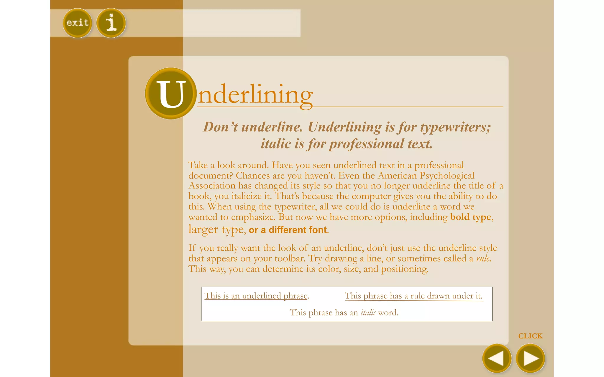
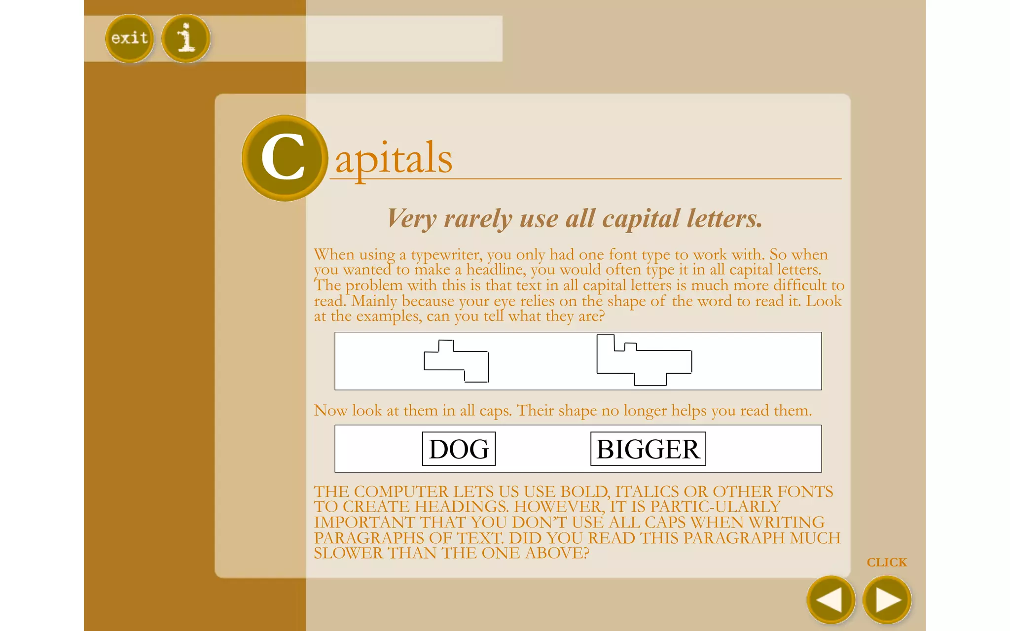
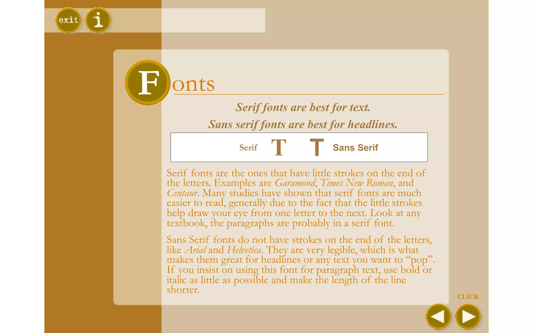
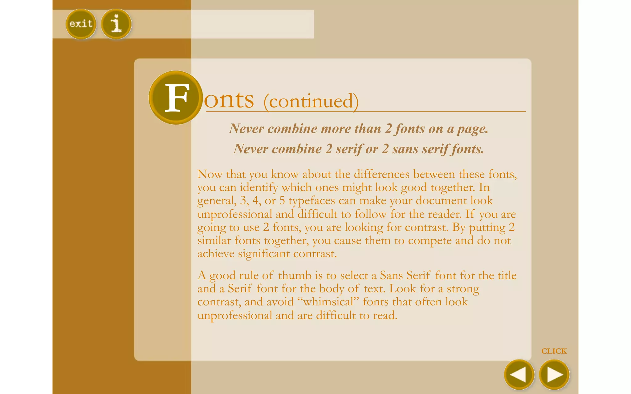
Download to read offline
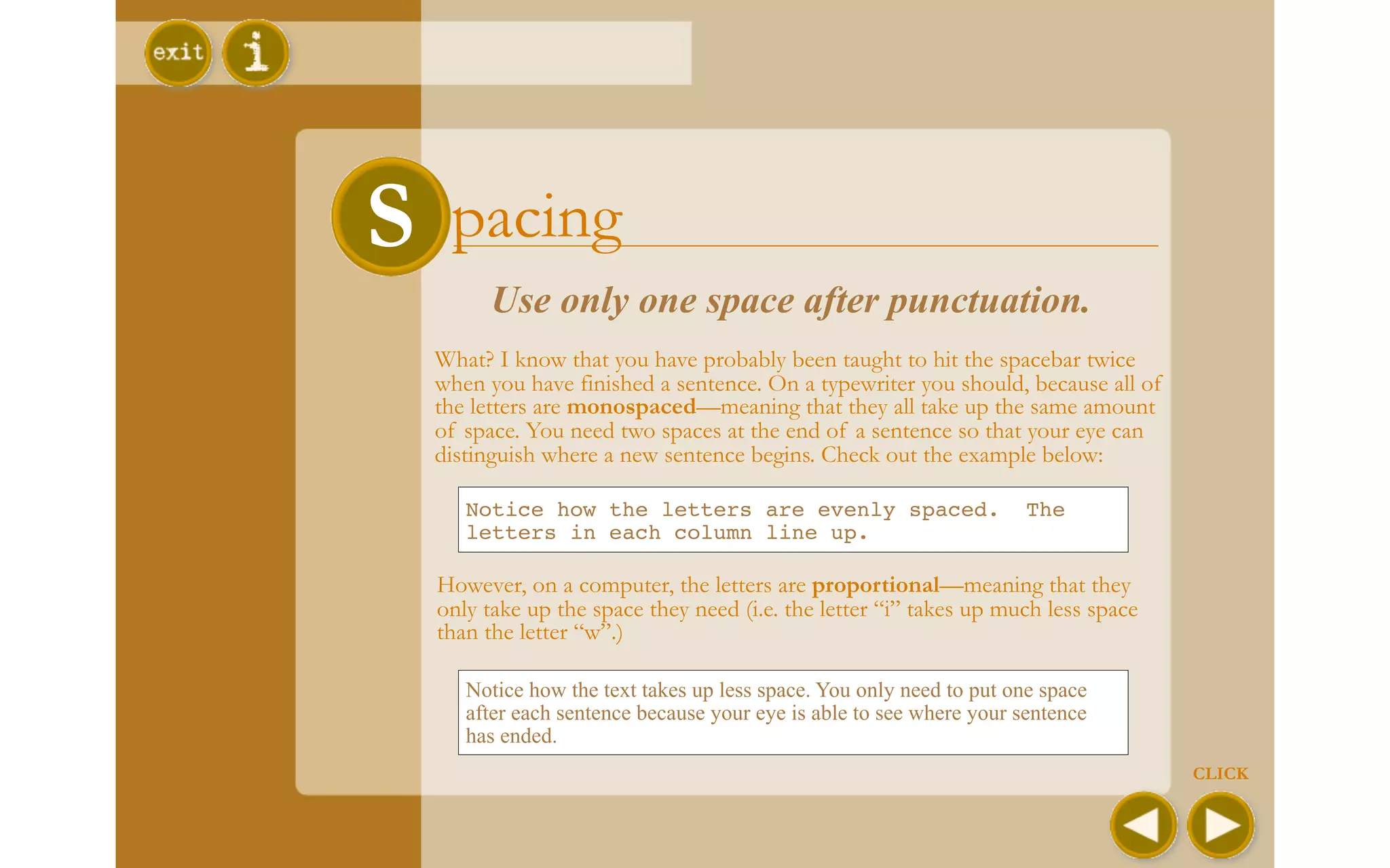
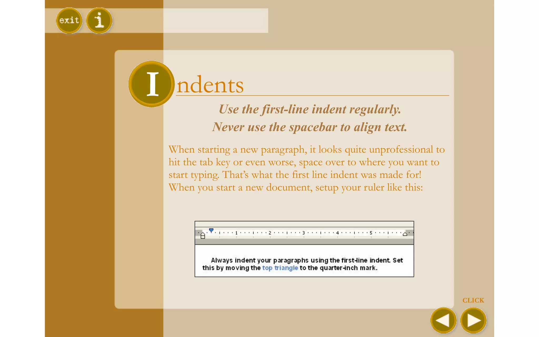
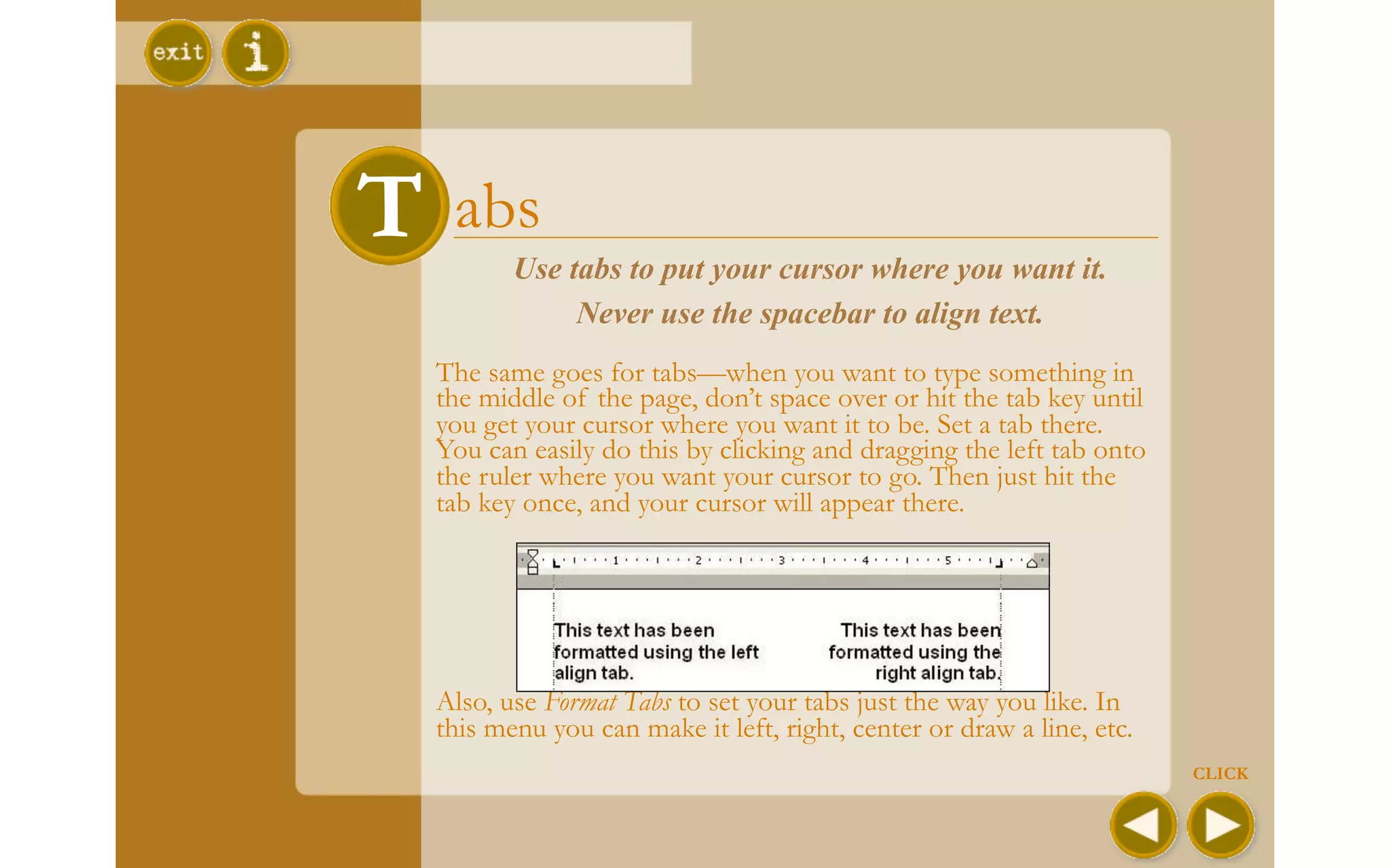
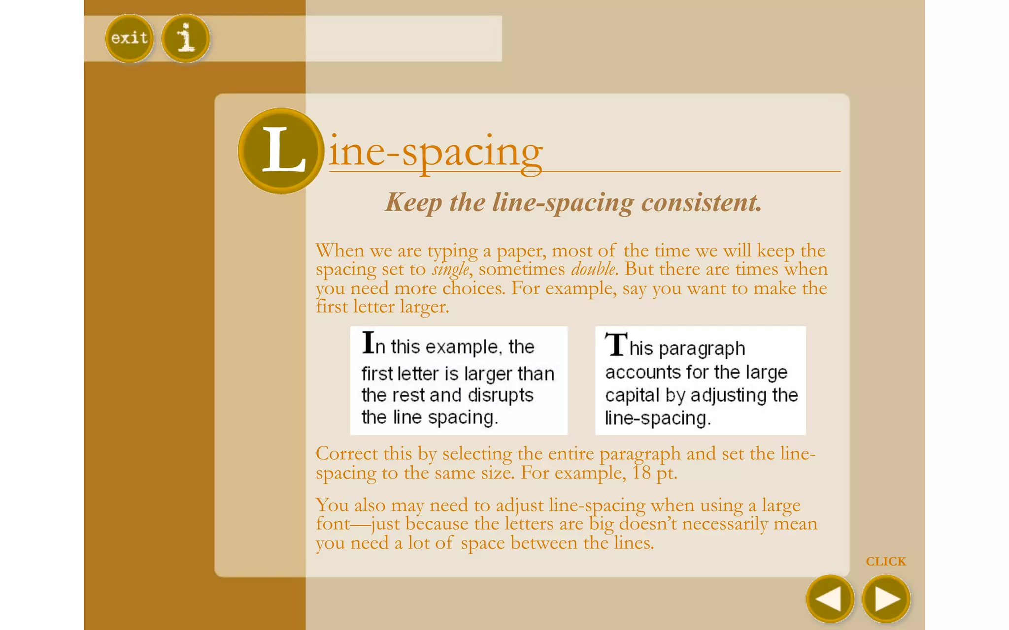
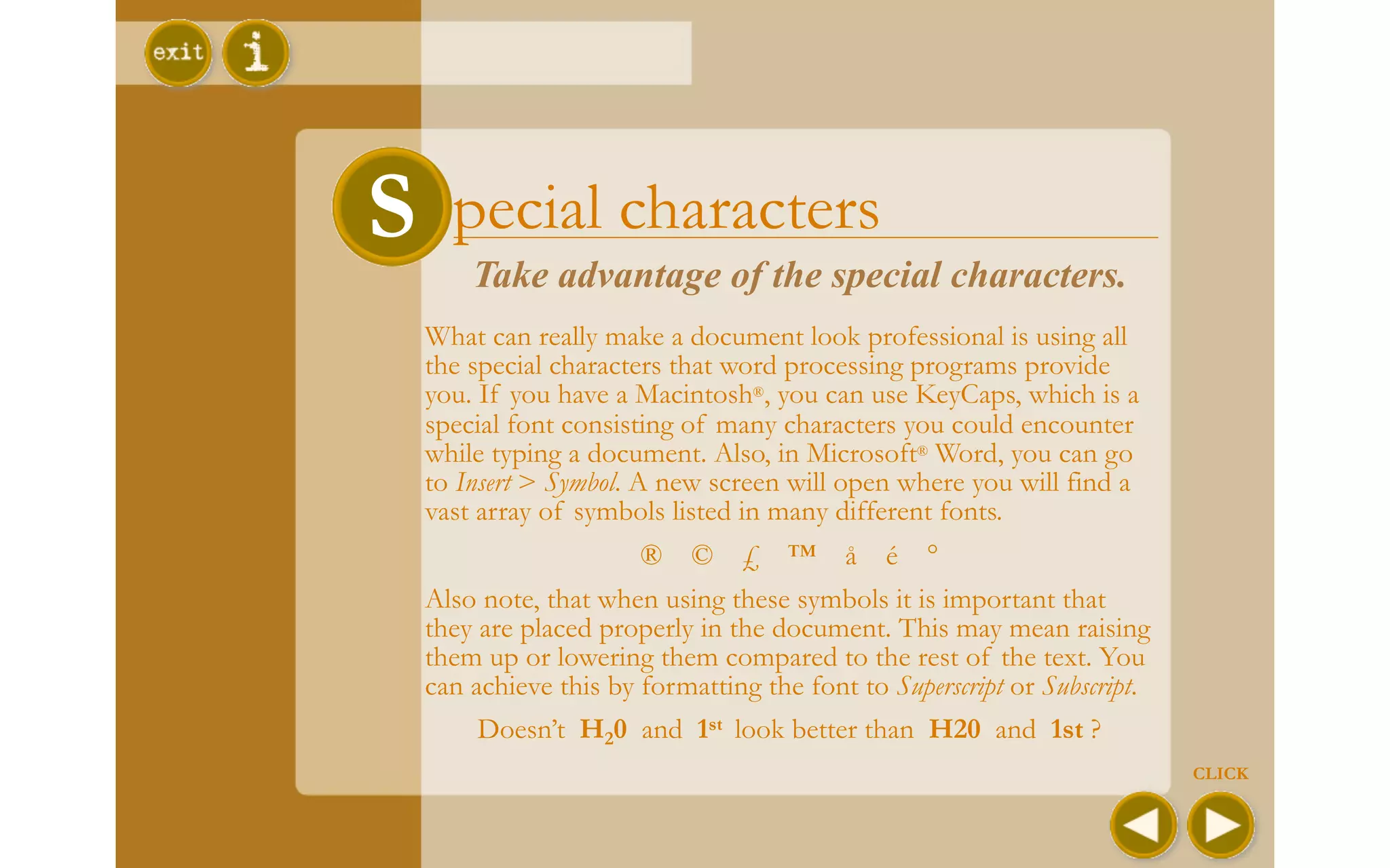
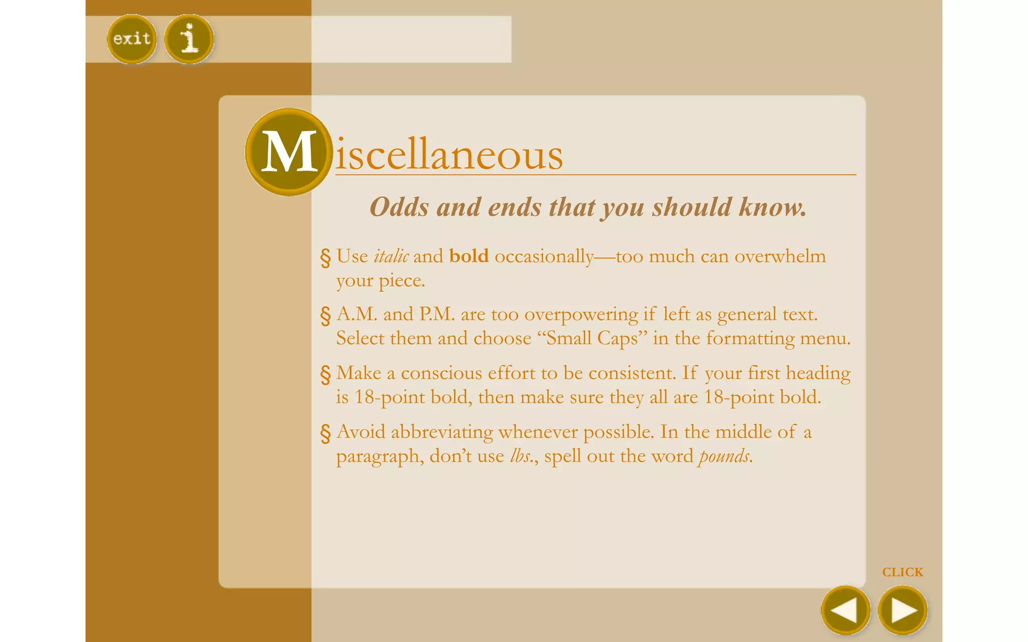
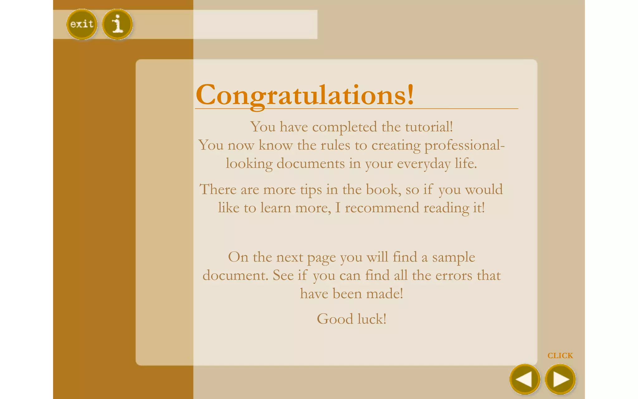
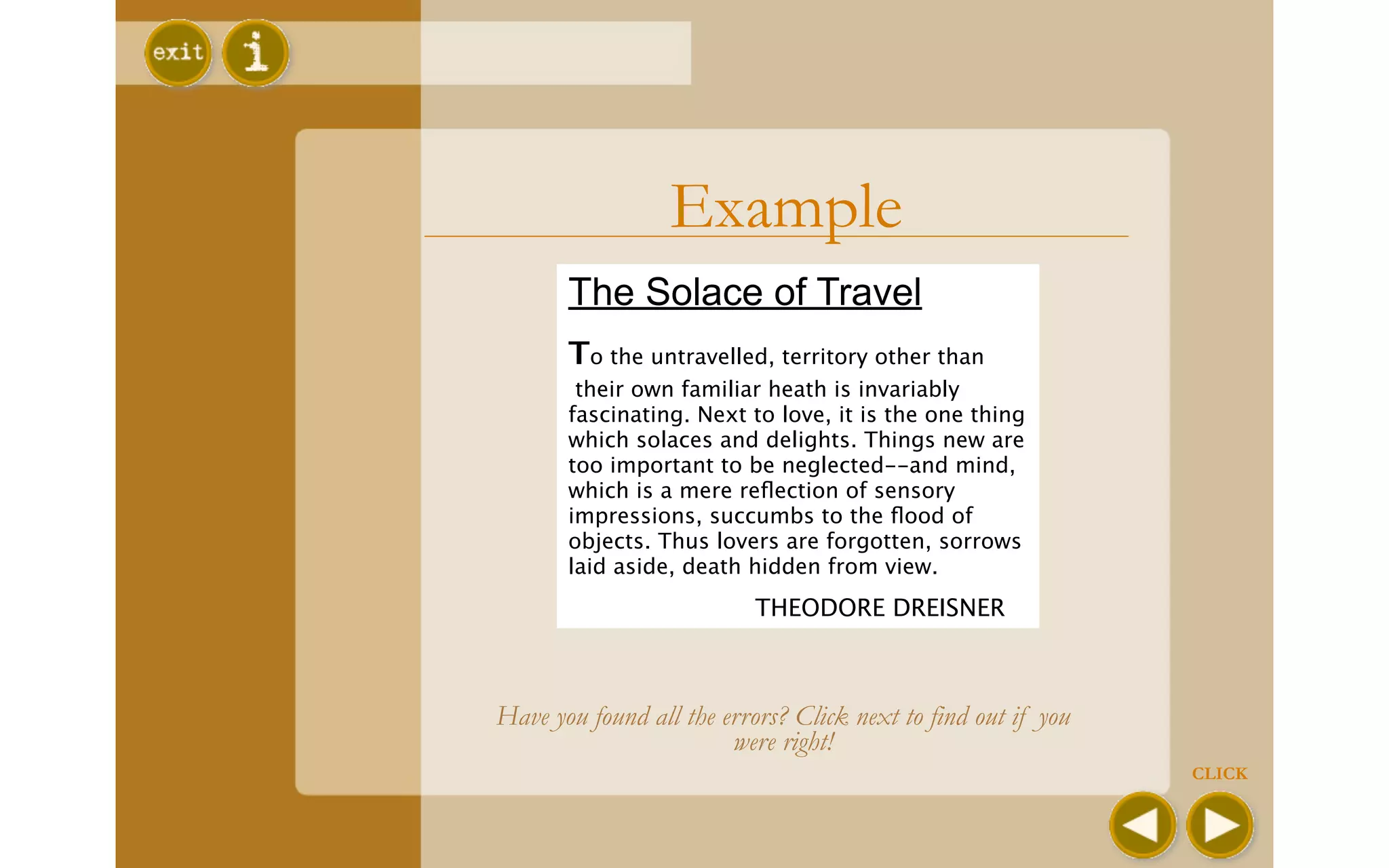
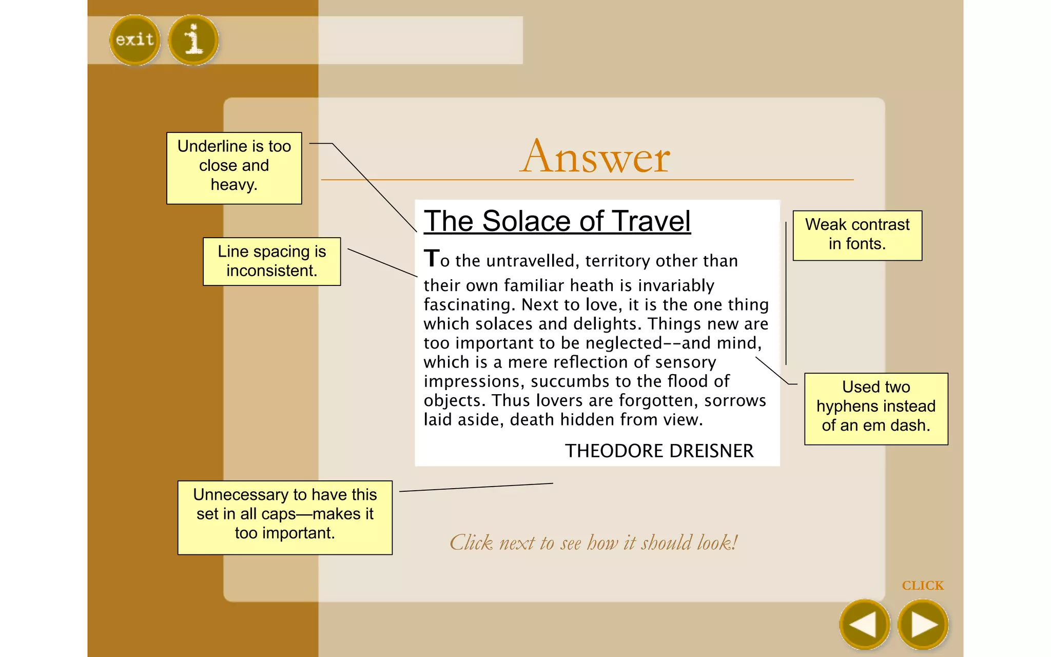
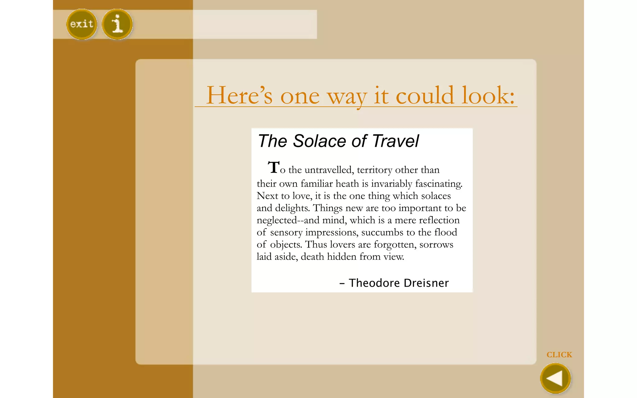
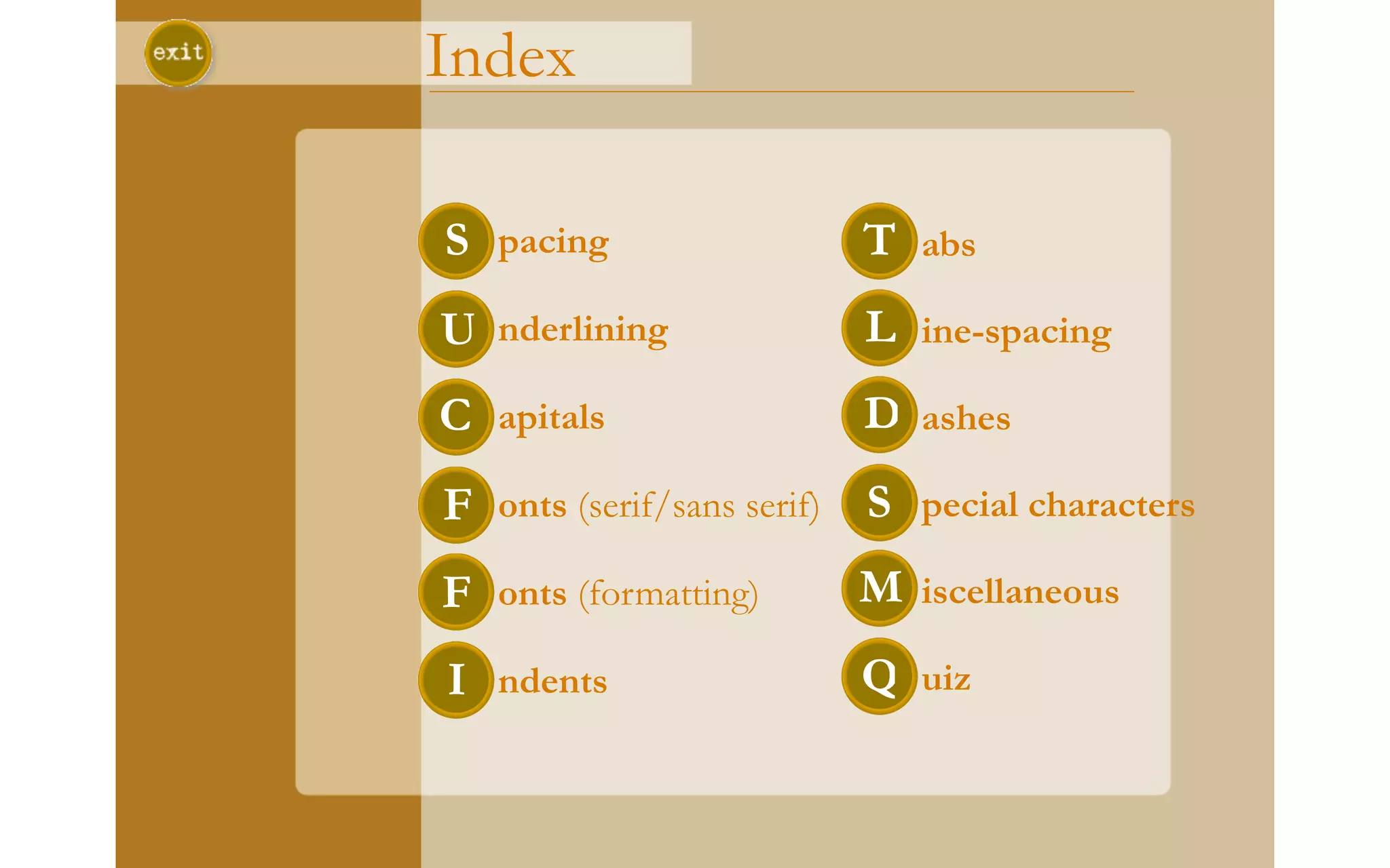

The document is a tutorial on proper formatting and style when creating documents on a computer. It provides guidance on topics like spacing, fonts, indentation, dashes and other punctuation. Key recommendations include using one space after periods, italicizing instead of underlining, limiting use of all caps, using serif fonts for body text and sans serif for headings, consistent line spacing and indentation, and taking advantage of special characters. The tutorial concludes with a sample document to identify errors and how it could be improved.


![Chapter4_Initiation_of_Sediment_Motion_v2[1].pptx](https://cdn.slidesharecdn.com/ss_thumbnails/chapter4initiationofsedimentmotionv21-251208223747-f94ef163-thumbnail.jpg?width=640&height=640&fit=bounds)
![Chapt_4[1].ppt very interseting and important](https://cdn.slidesharecdn.com/ss_thumbnails/chapt41-251208222956-7cf5e0fa-thumbnail.jpg?width=640&height=640&fit=bounds)
