Download to read offline


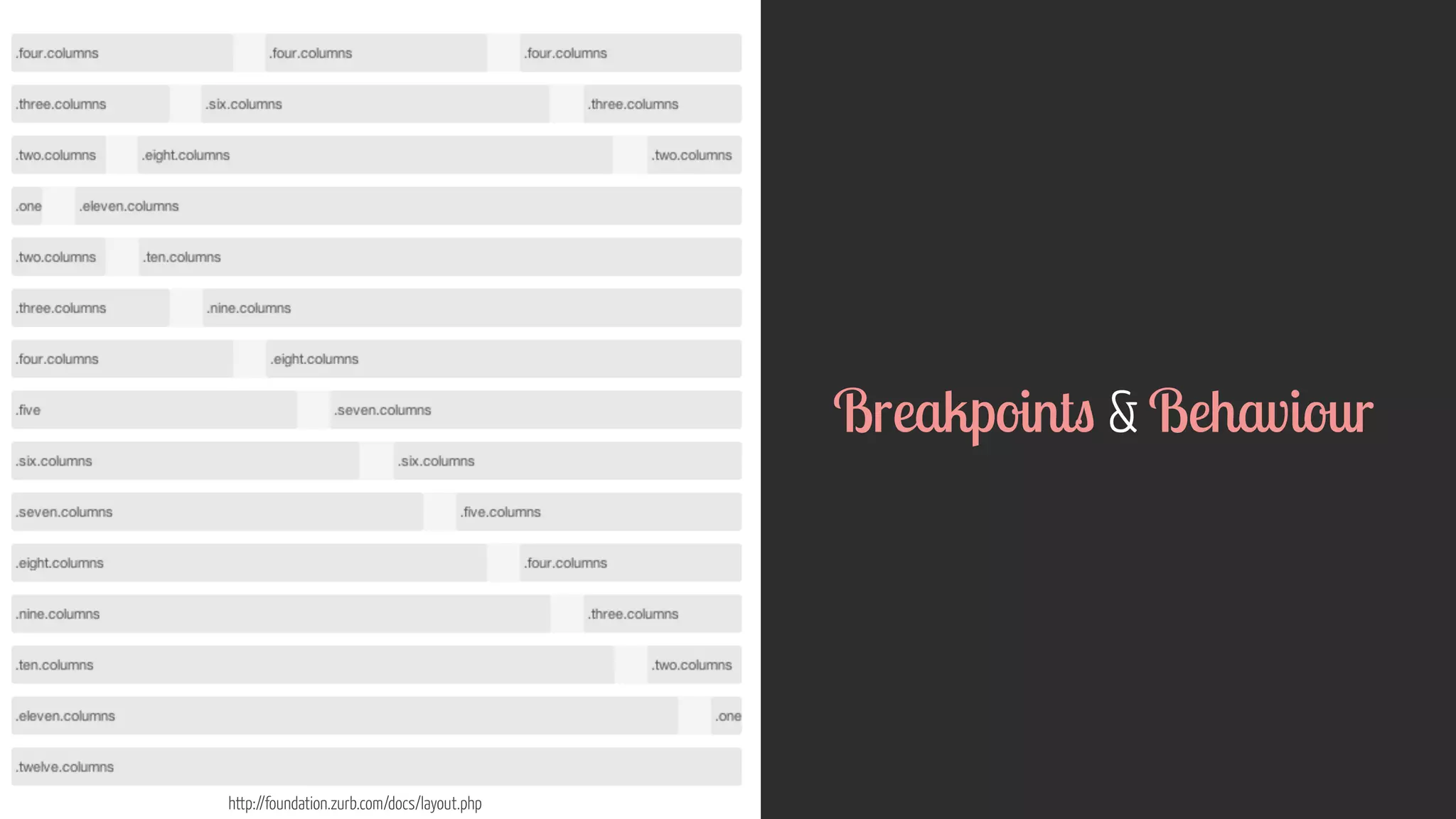
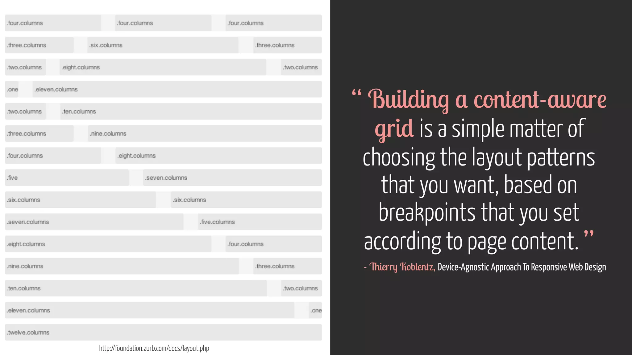
![http://foundation.zurb.com/docs/layout.php
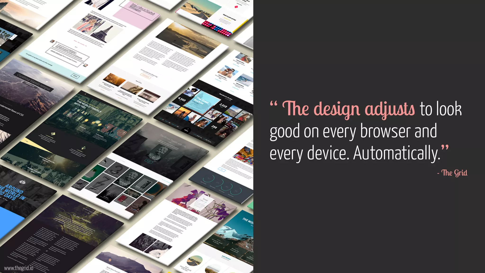
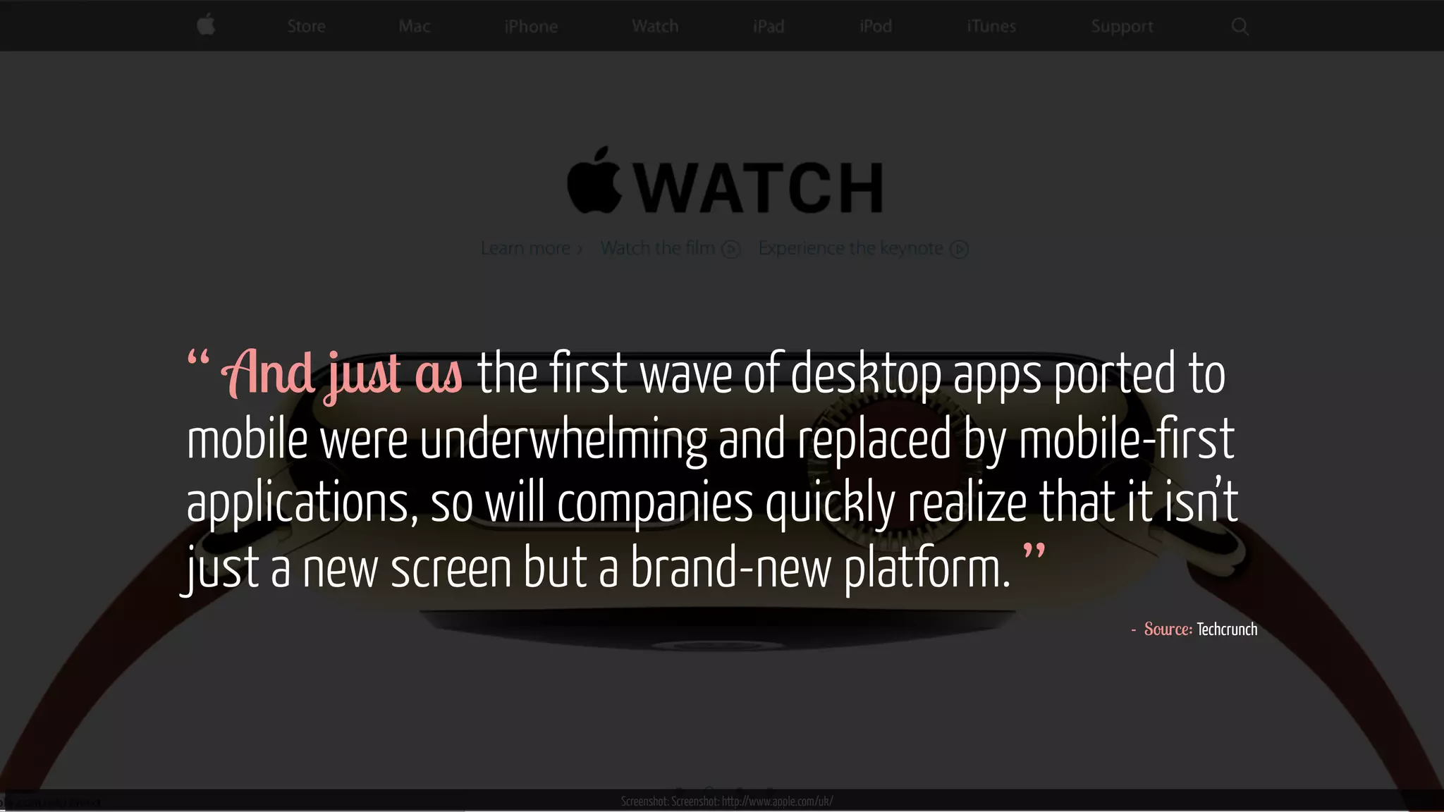
“ Design development
should respond to the user’s
behaviour environment based
on screen size, platform
orientation. [It’s]...a mix of
flexible grids layouts, images
an intelligent use of media
queries. ”
- Smashing Magazine](https://image.slidesharecdn.com/ucddeviceagnosticdesign25oct2014-141025092951-conversion-gate01-141107060019-conversion-gate02/75/UCD14-Talk-Anna-Dahlstrom-Device-Agnostic-Design-How-to-get-your-content-to-go-anywhere-35-2048.jpg)


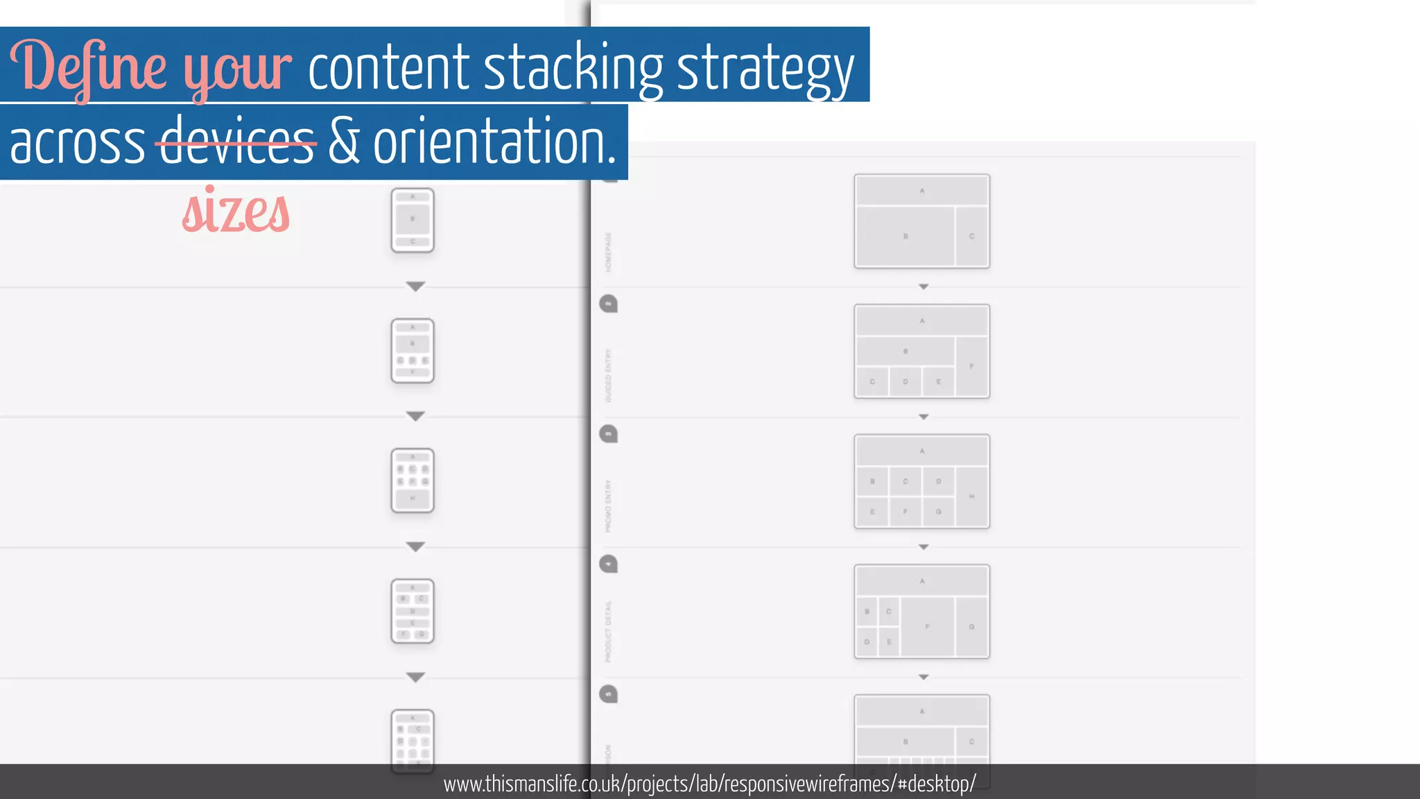


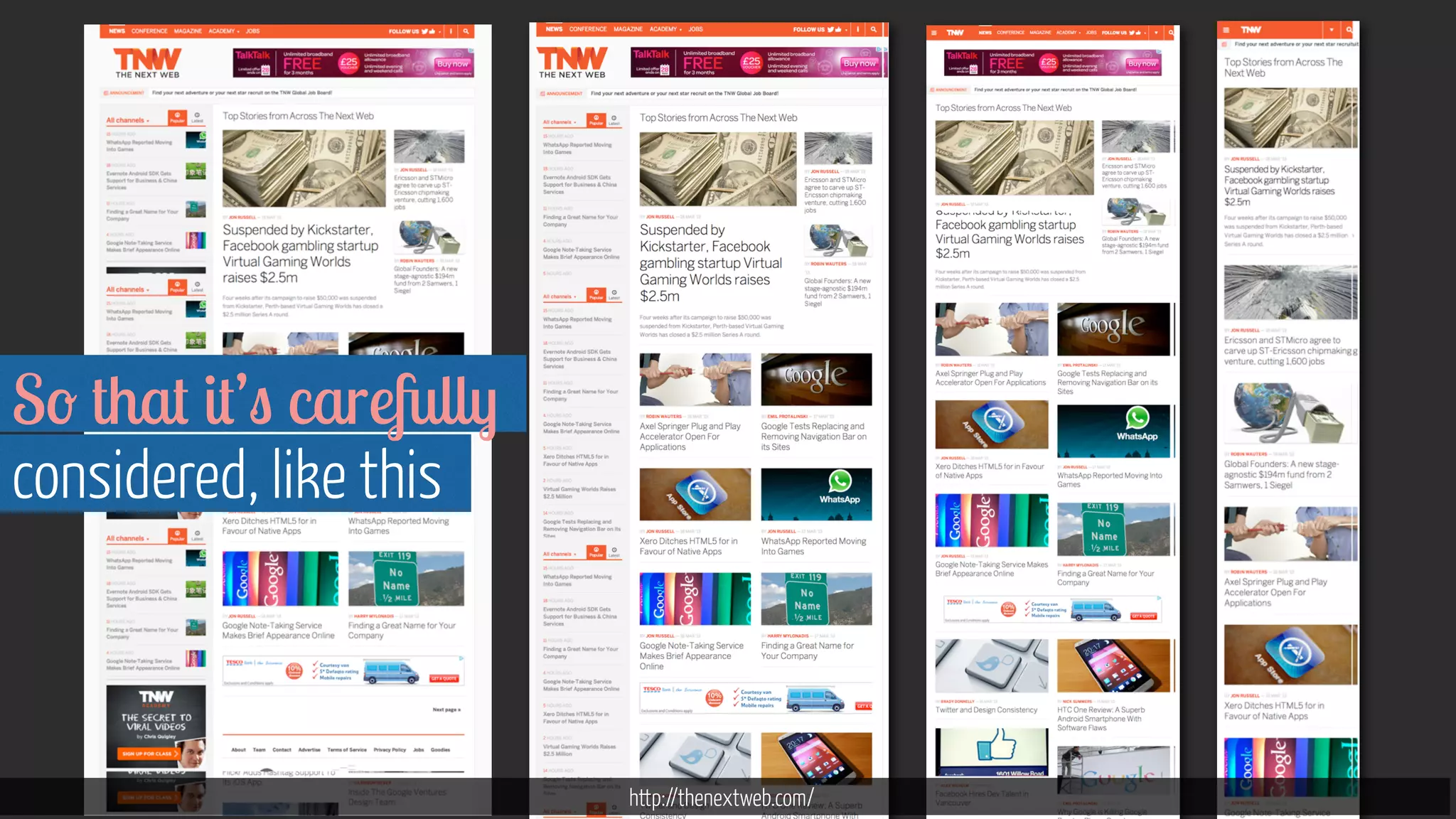


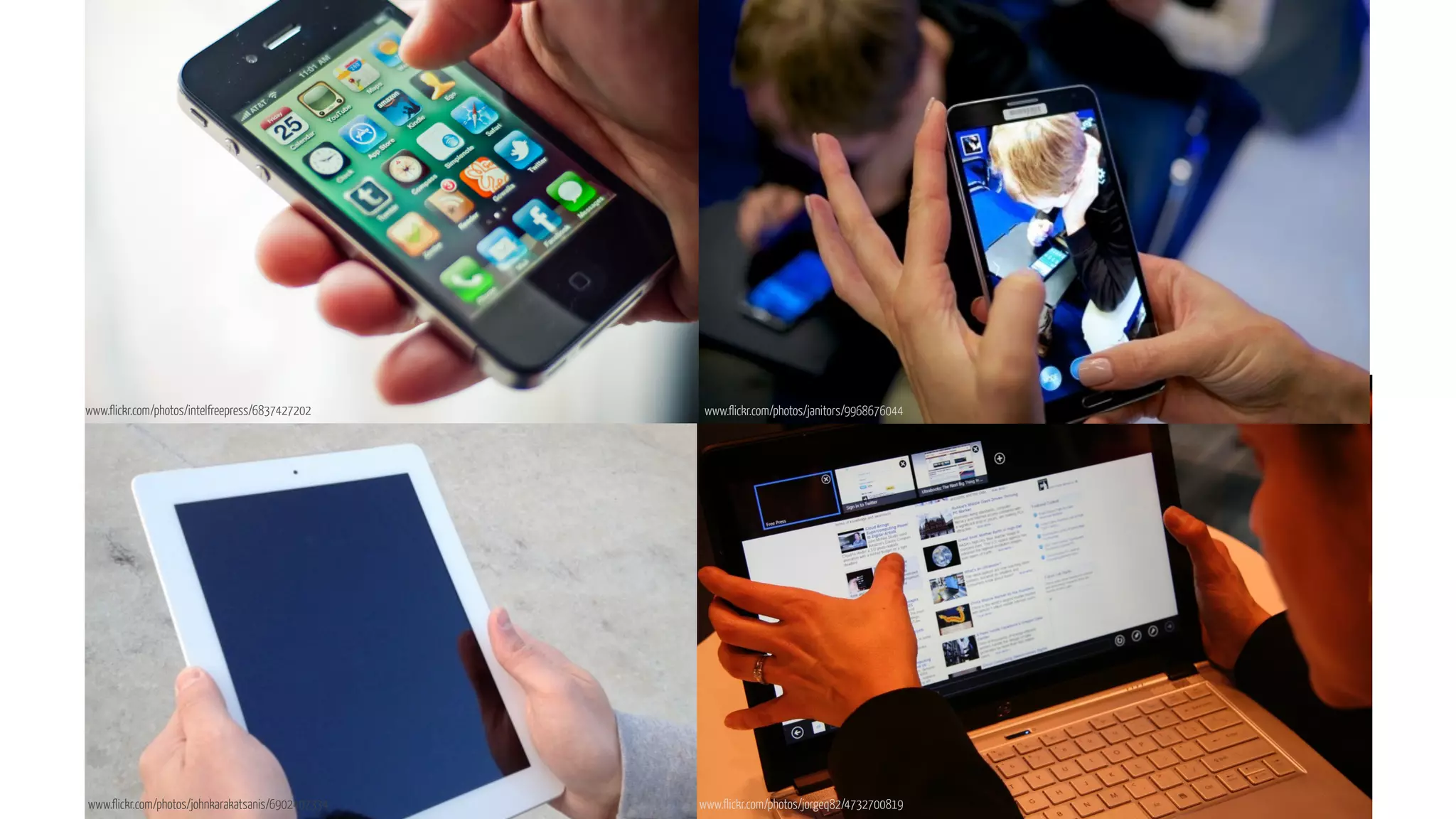


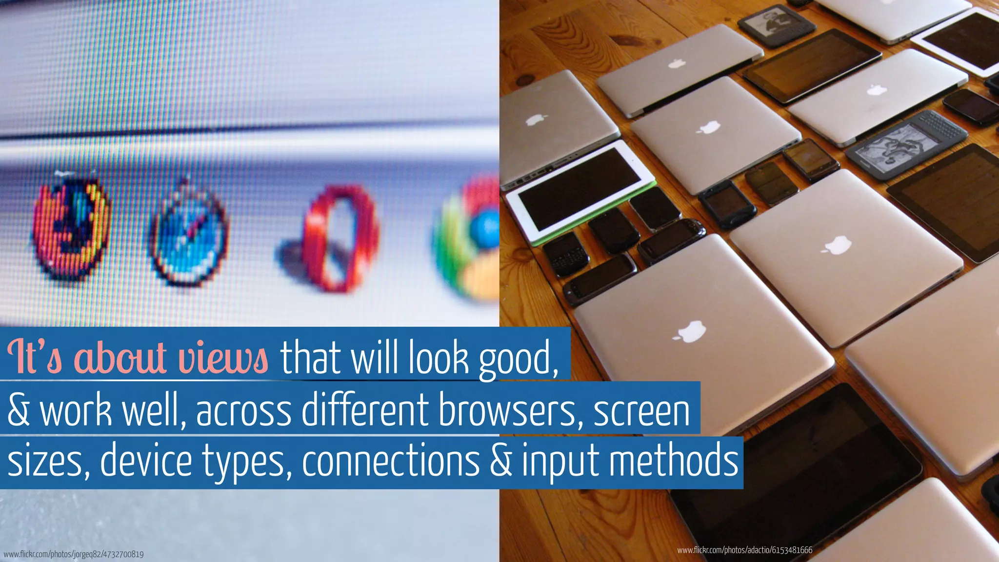

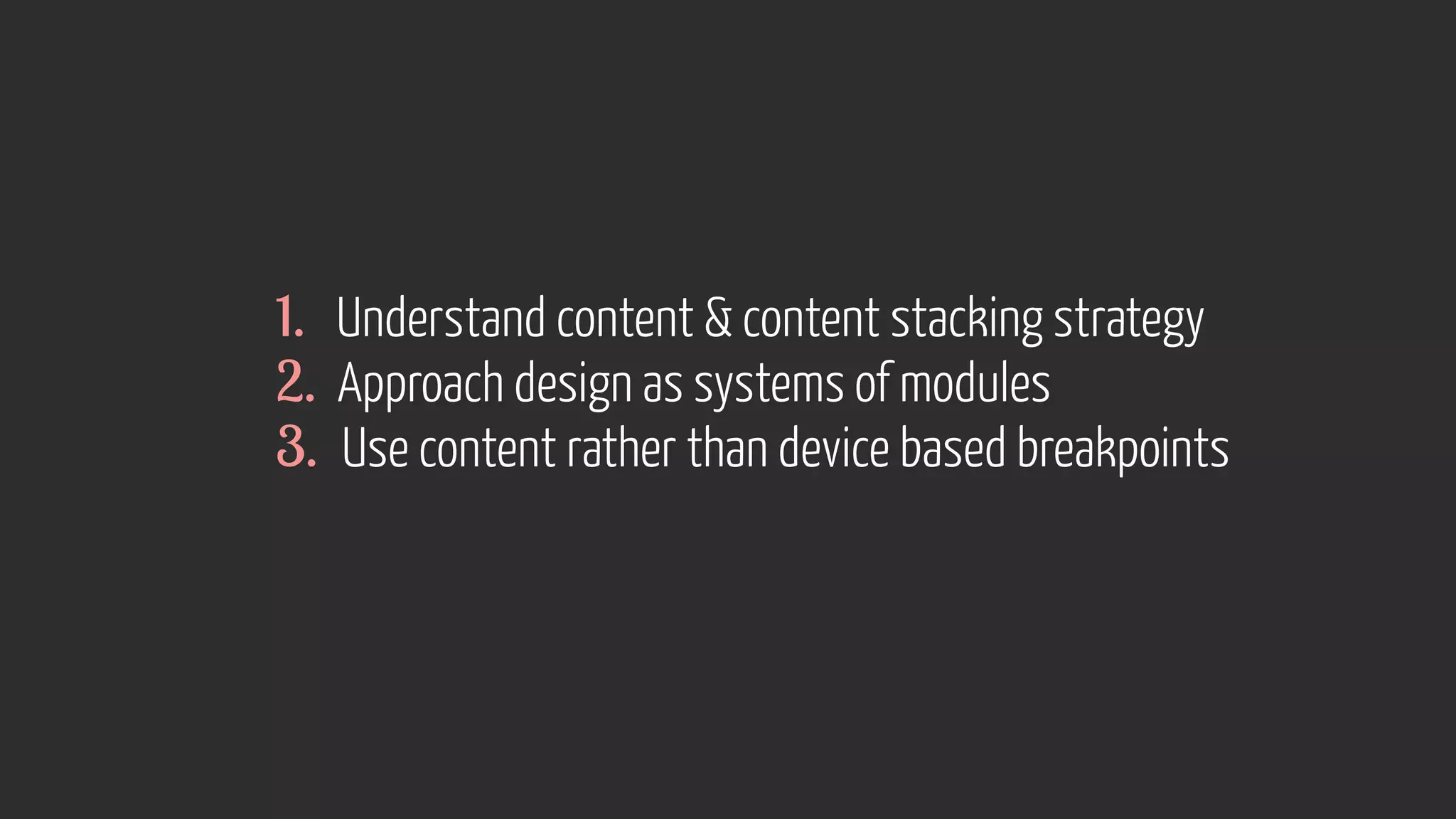
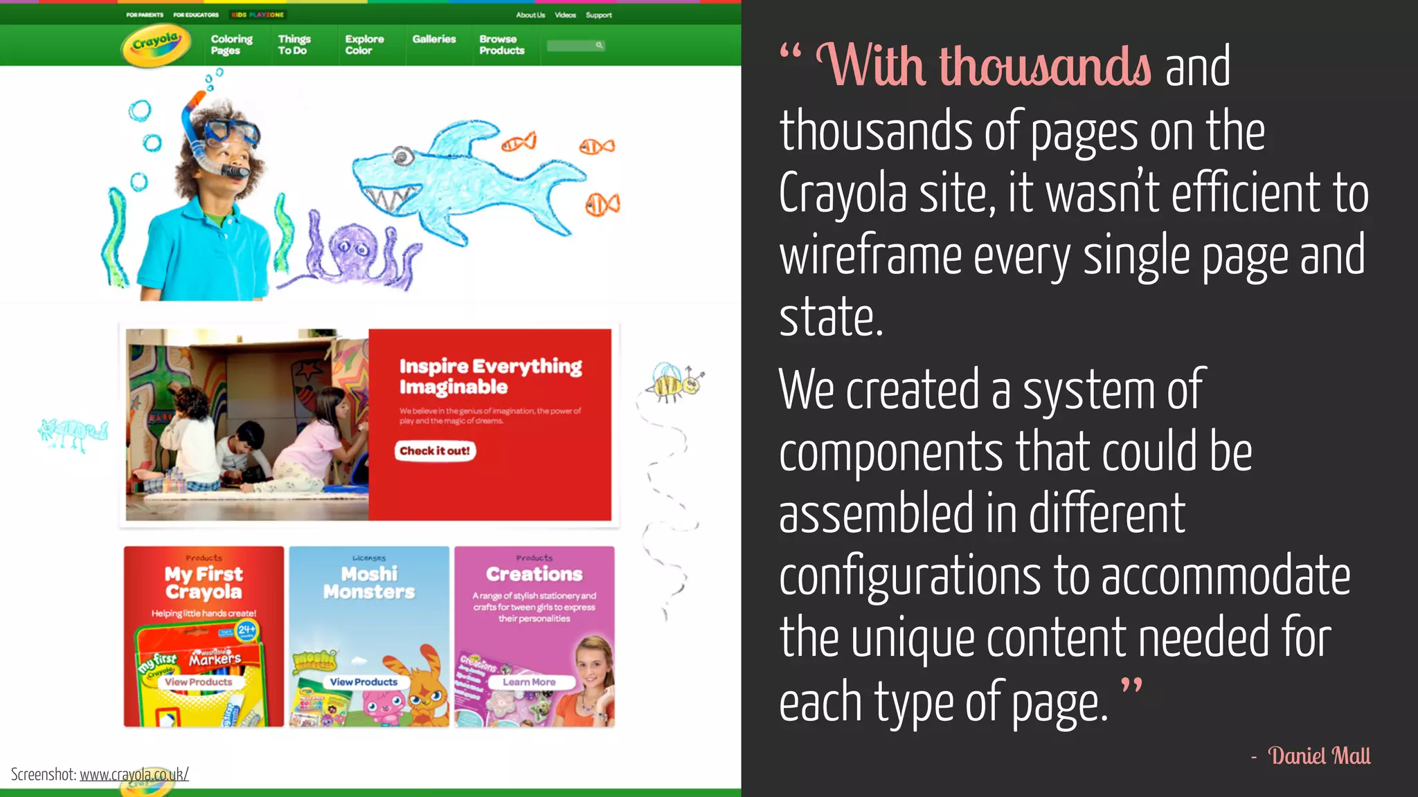
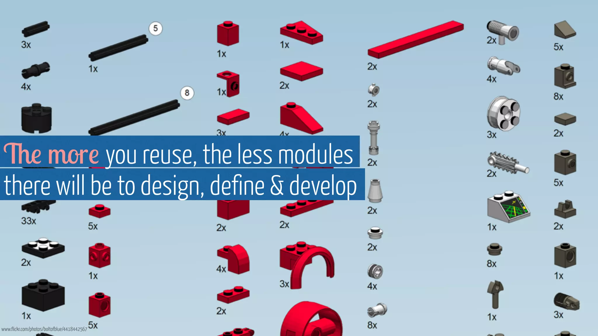
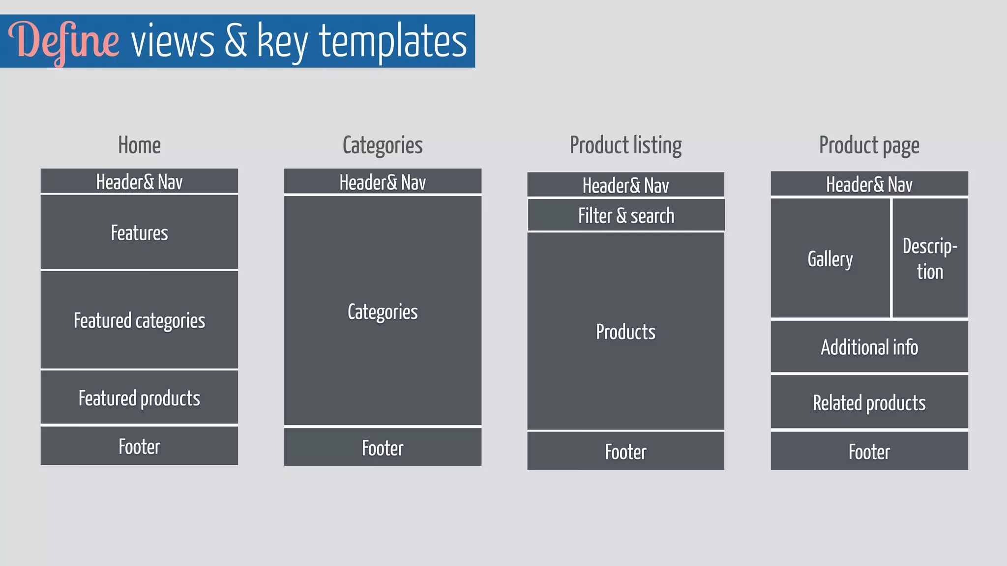
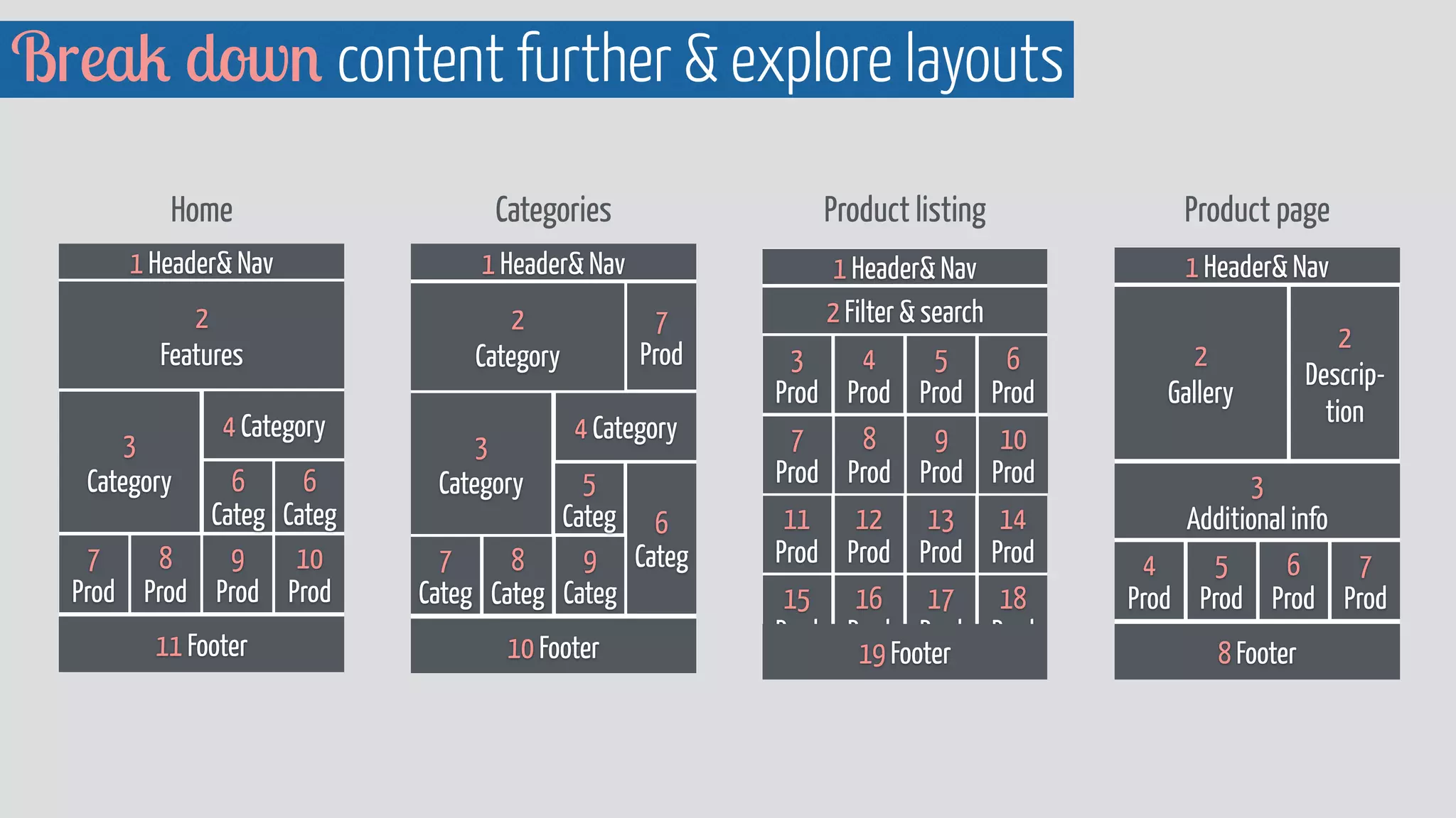
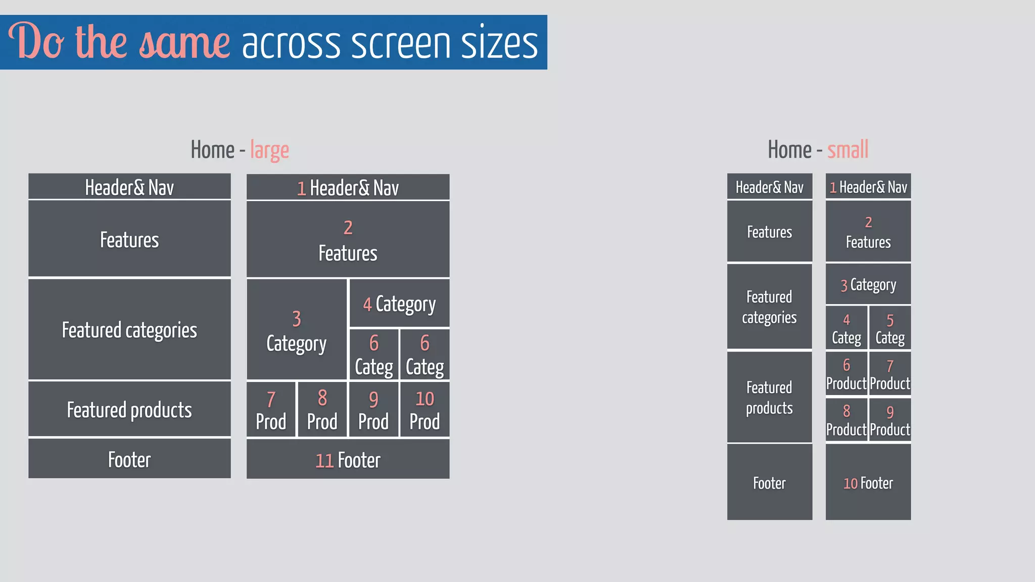
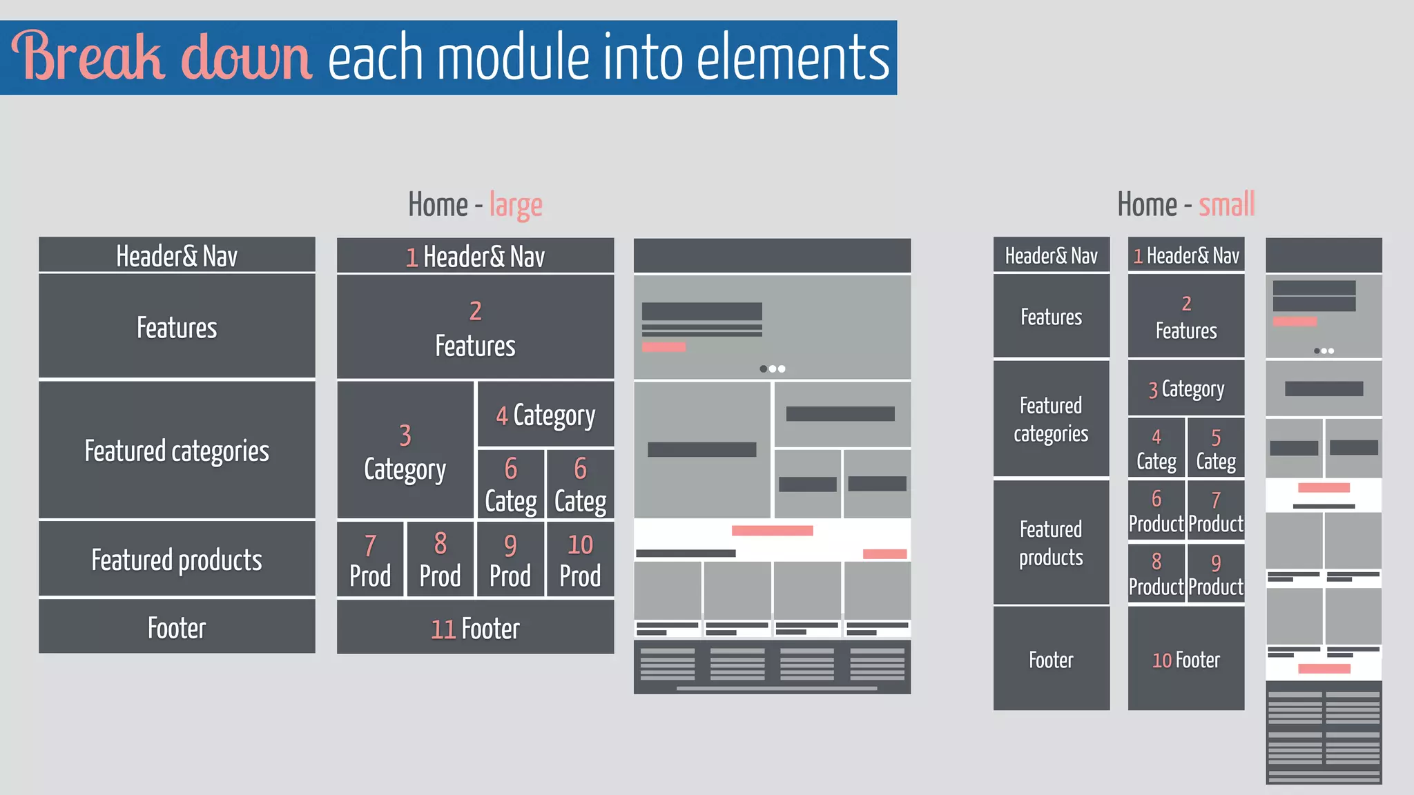
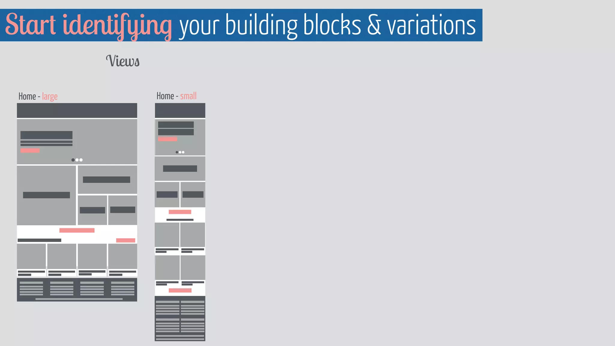
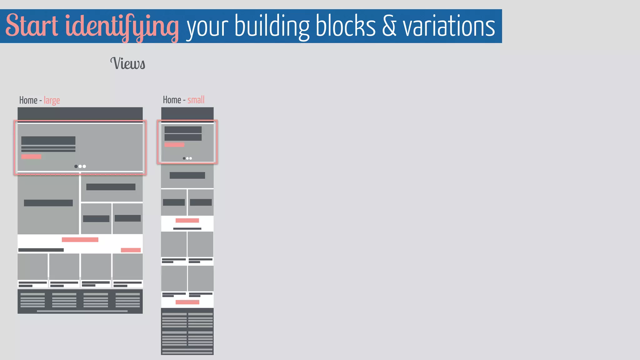
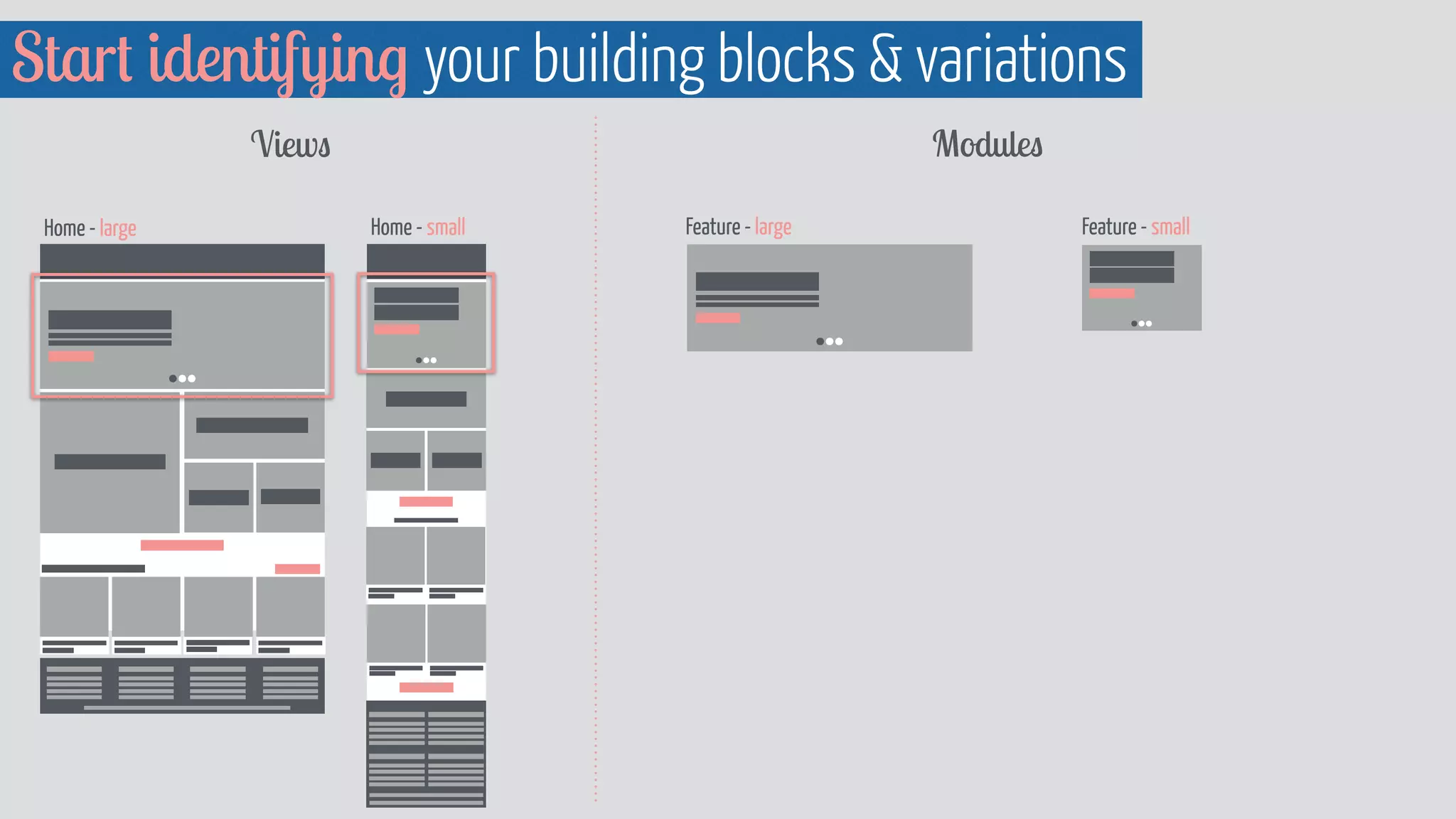
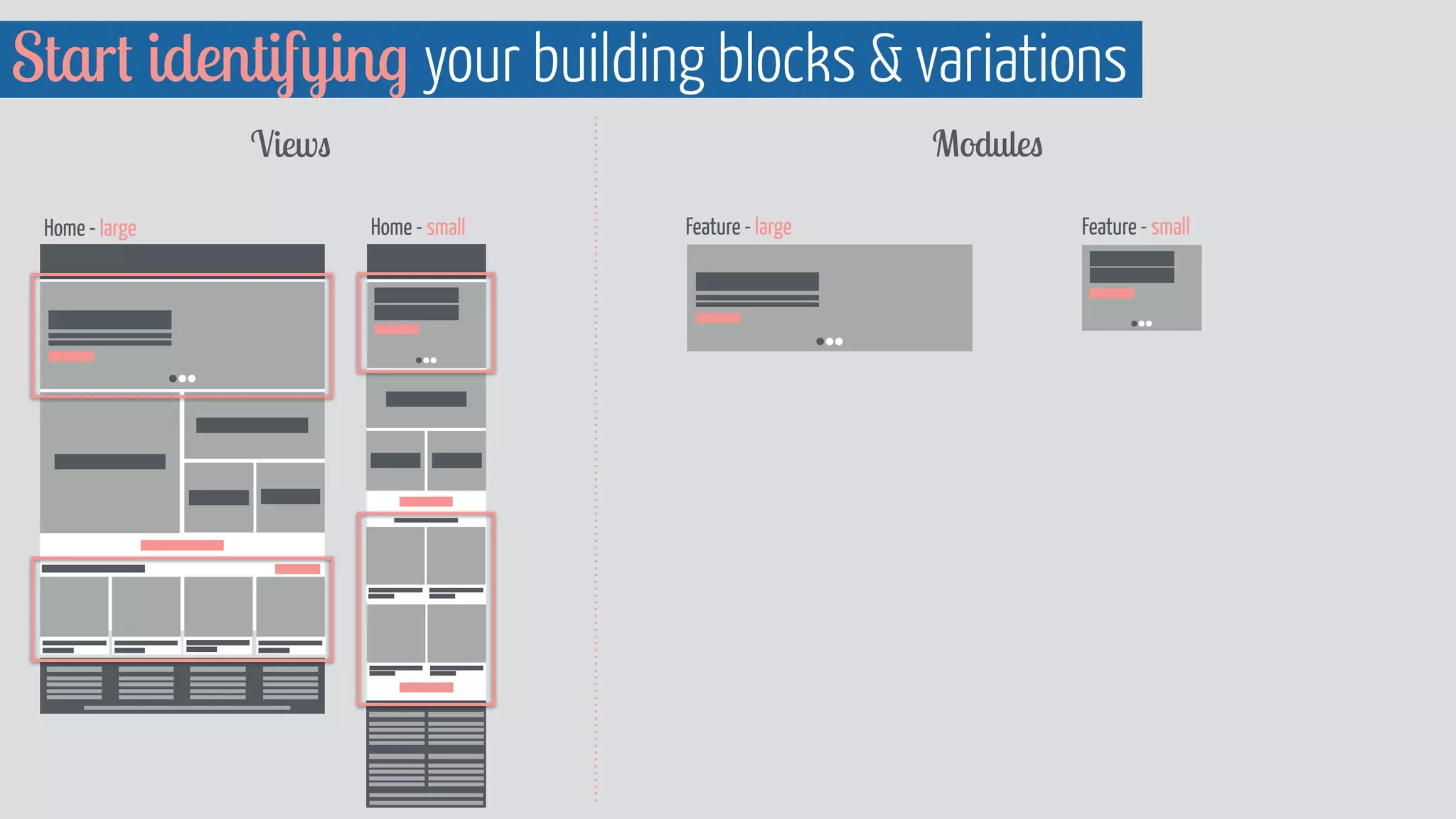
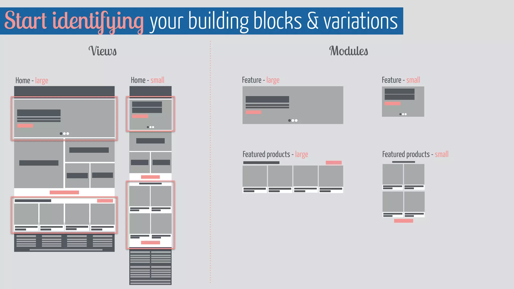
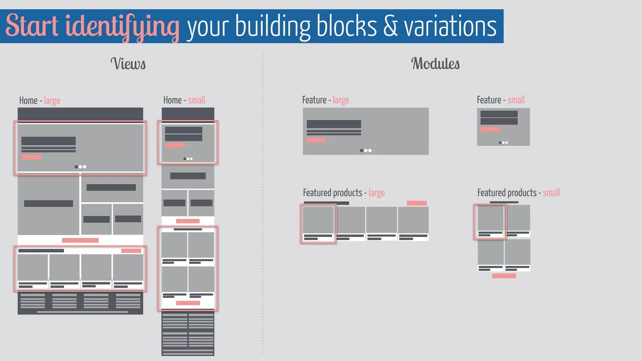
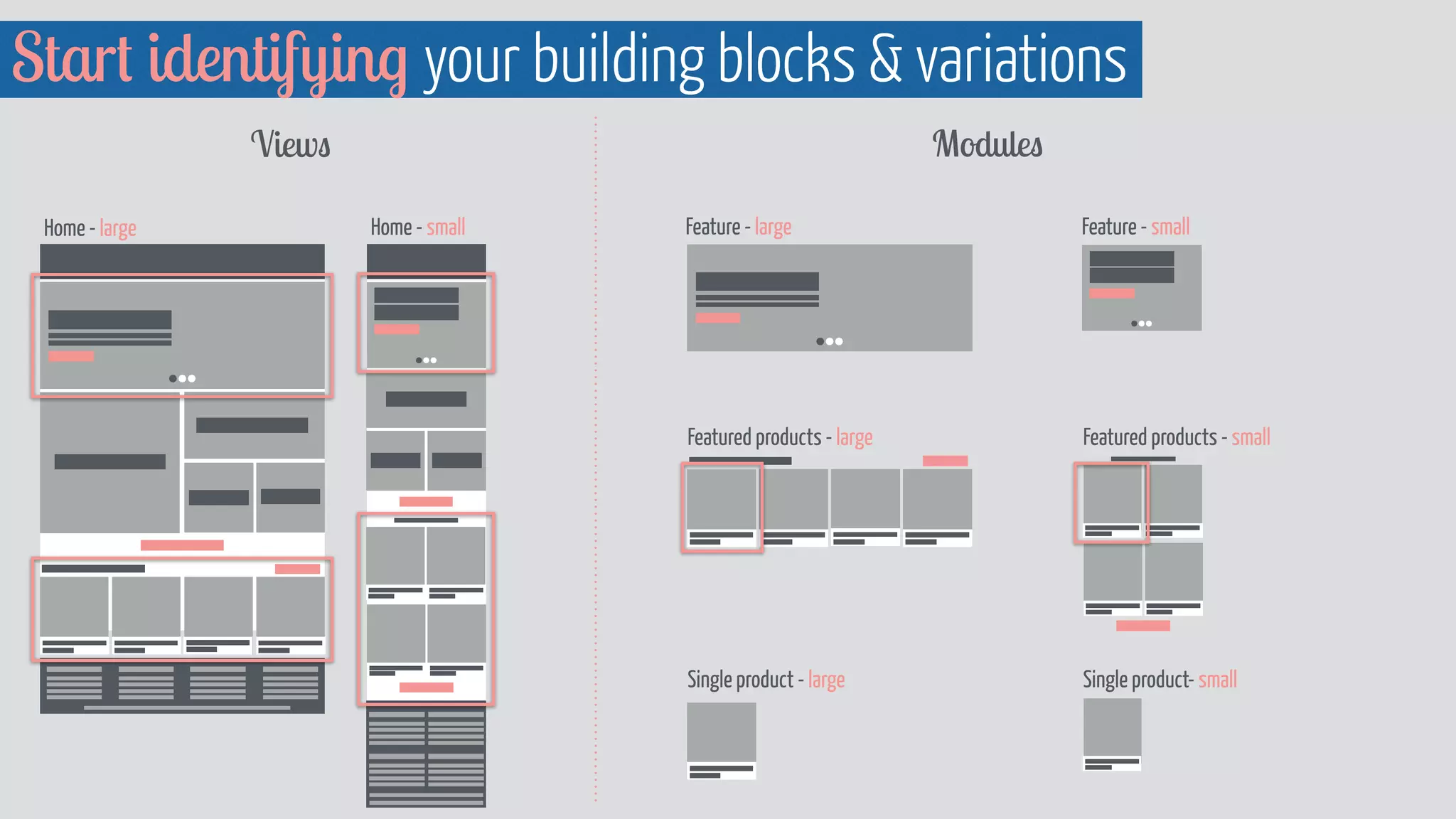
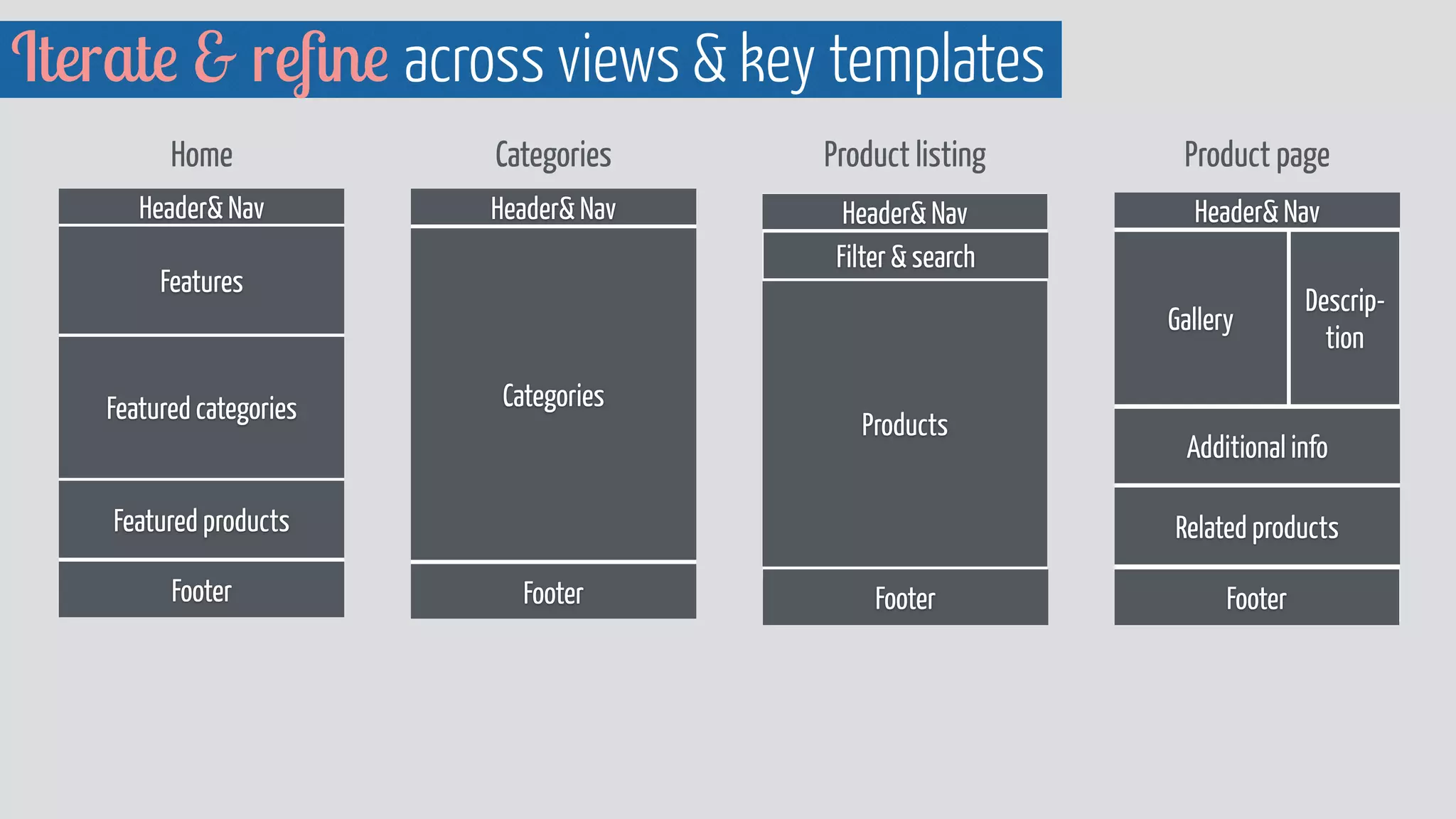

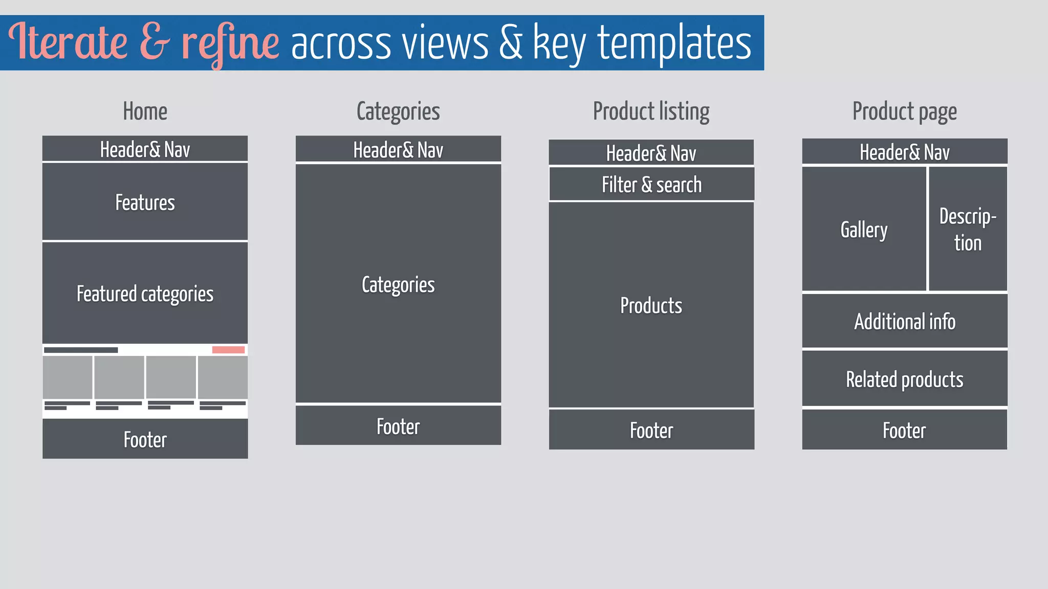
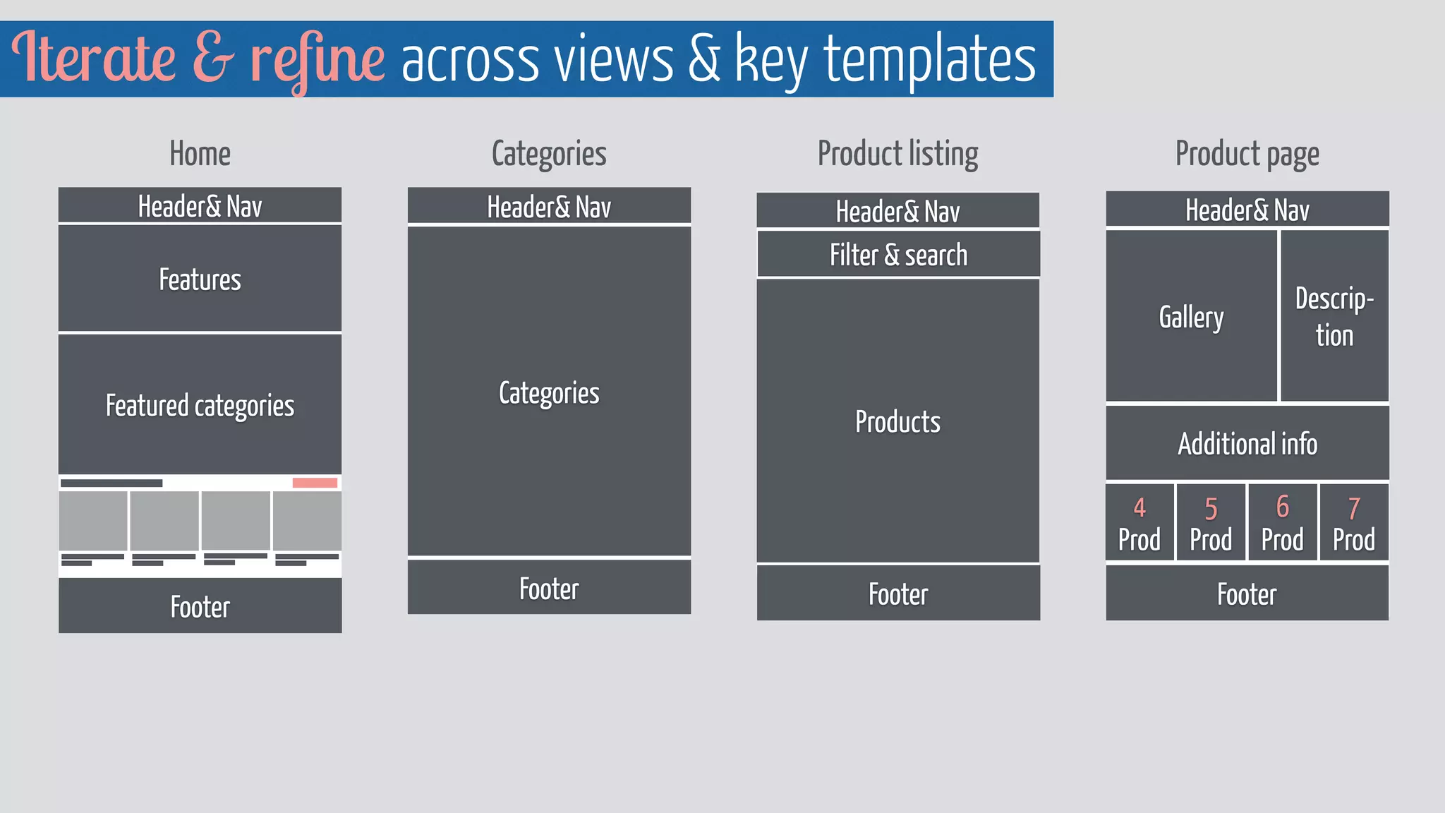
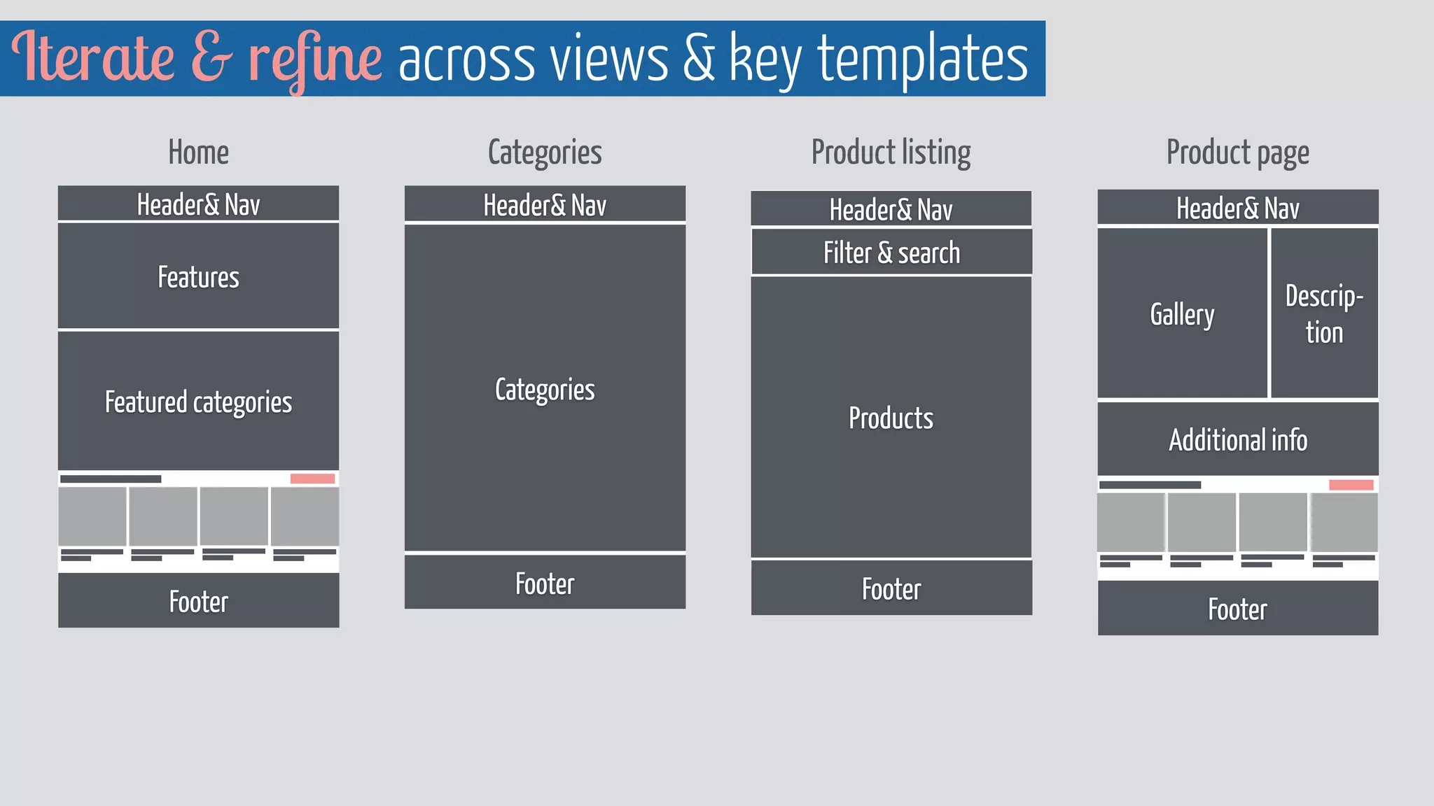
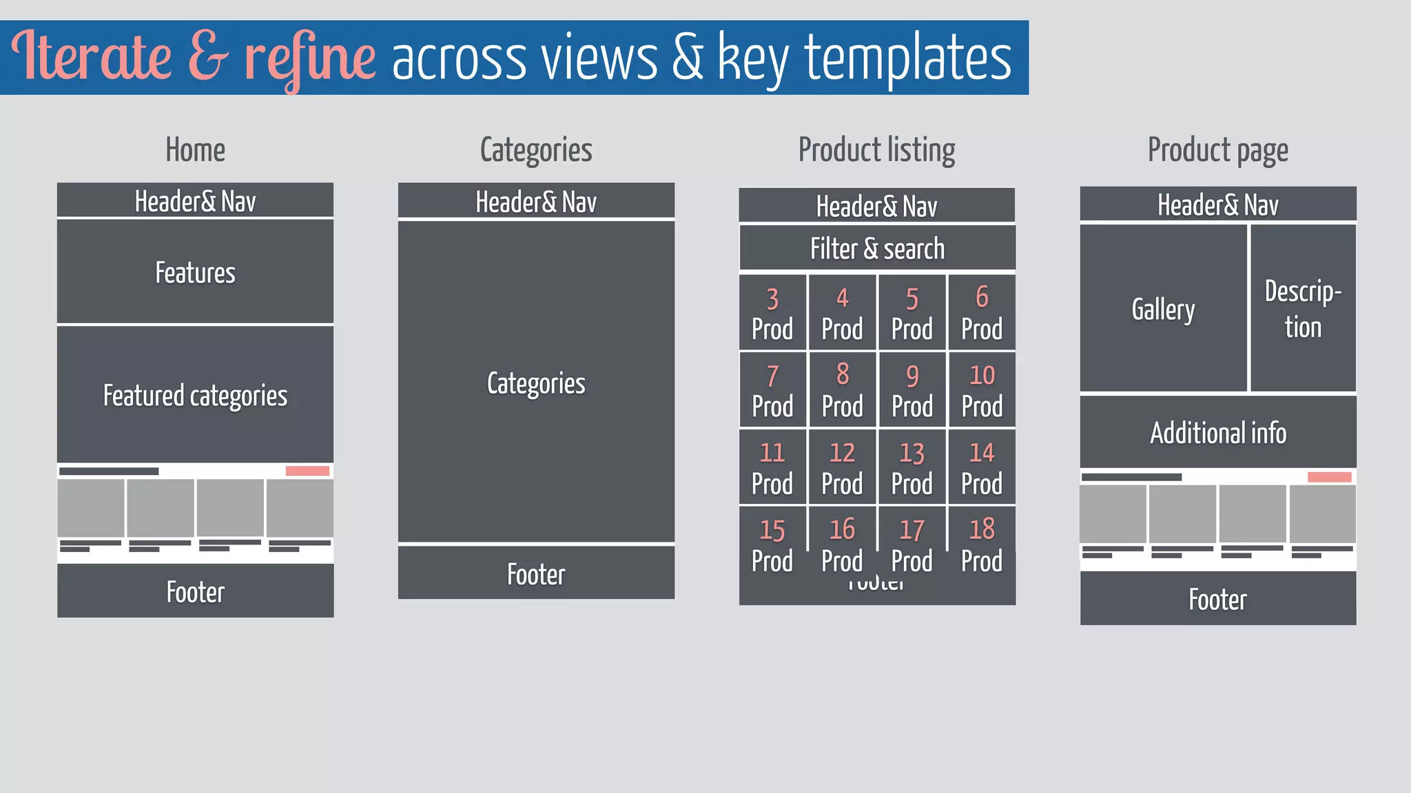
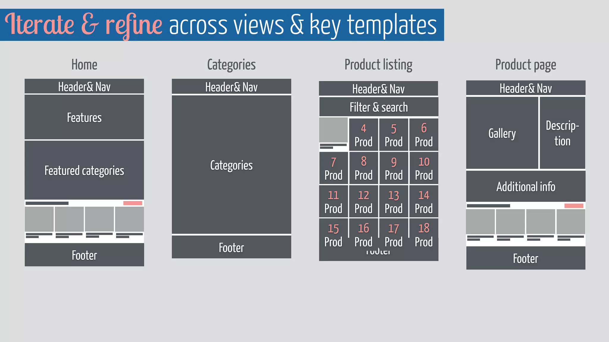
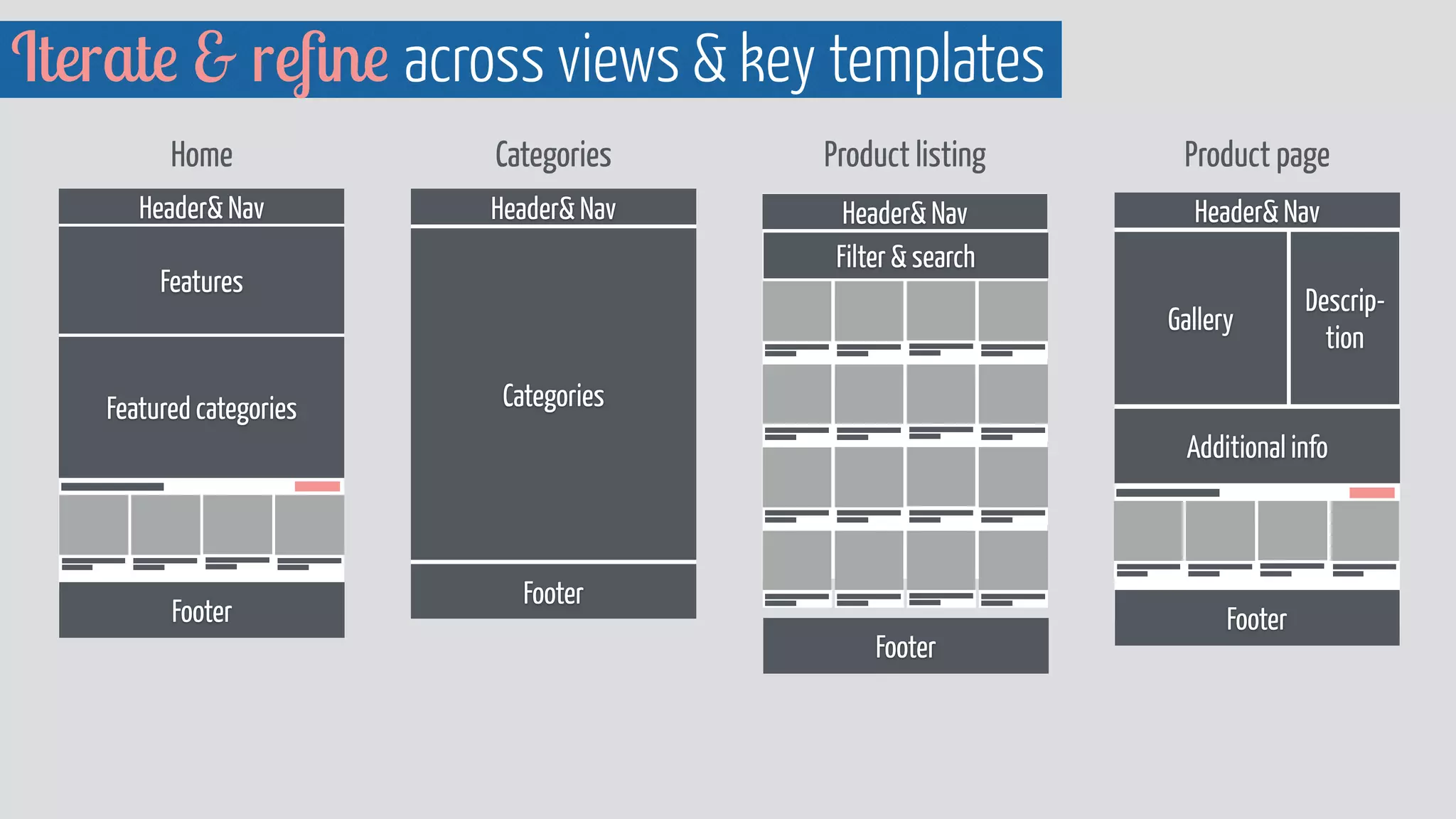
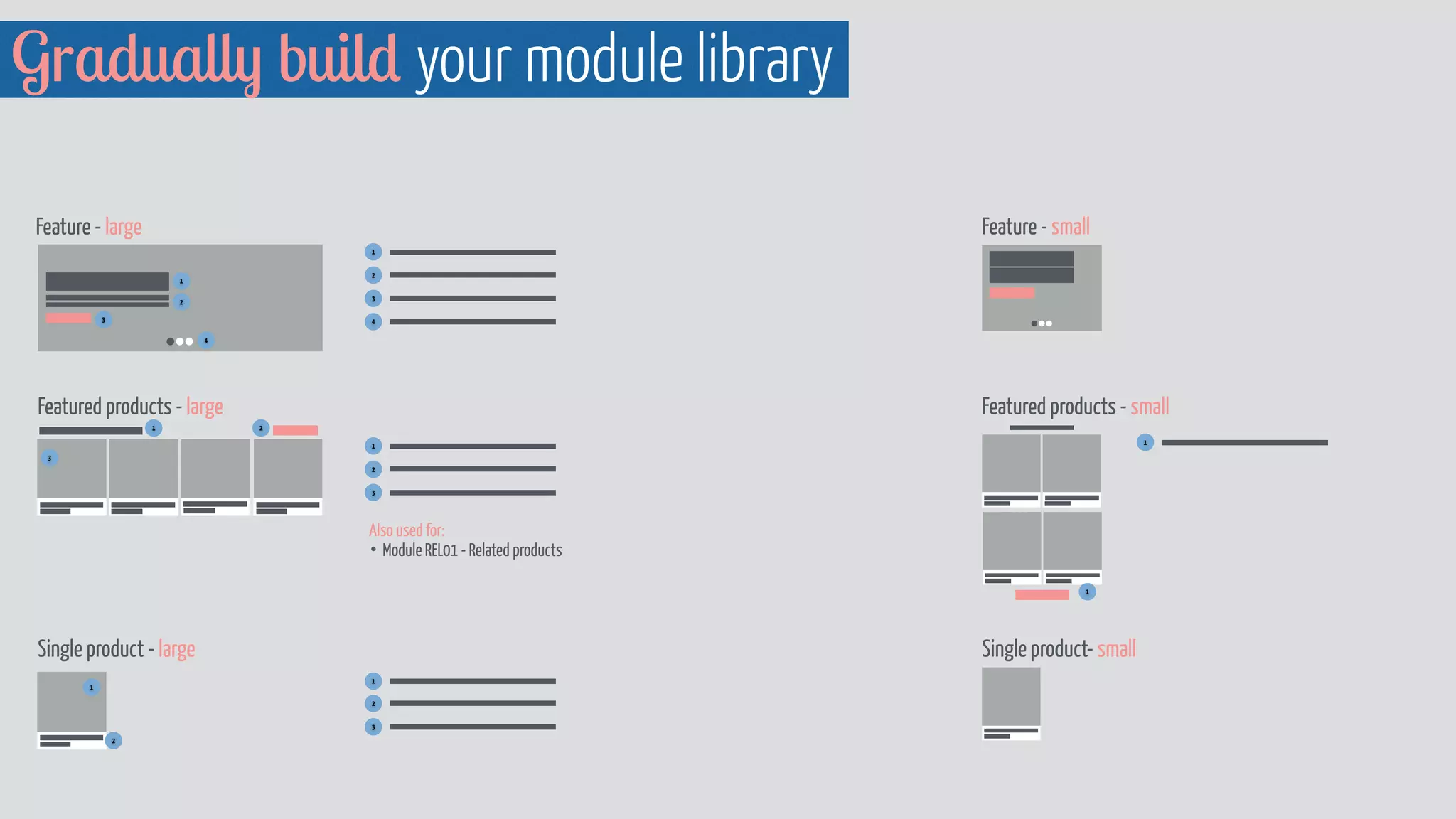
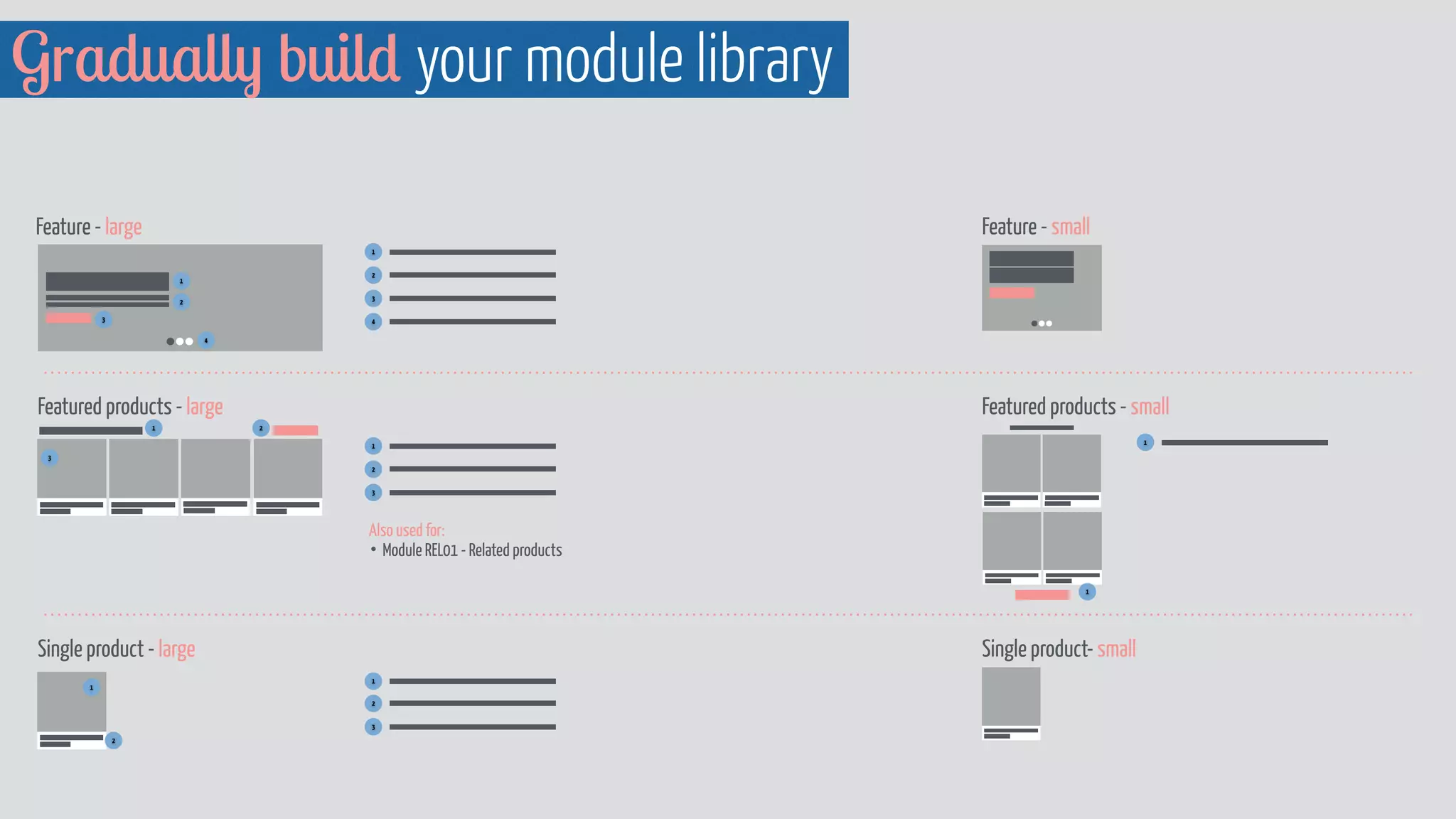
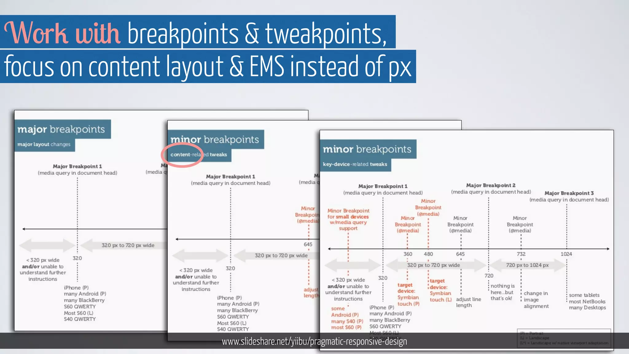
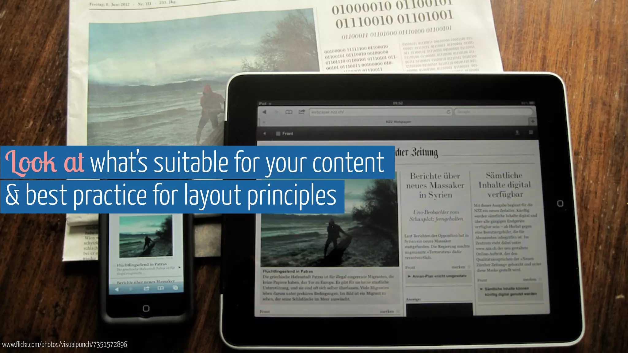

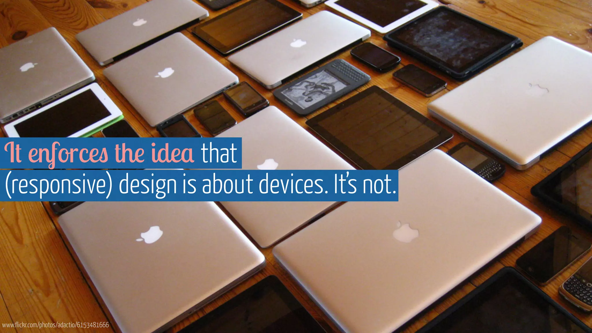

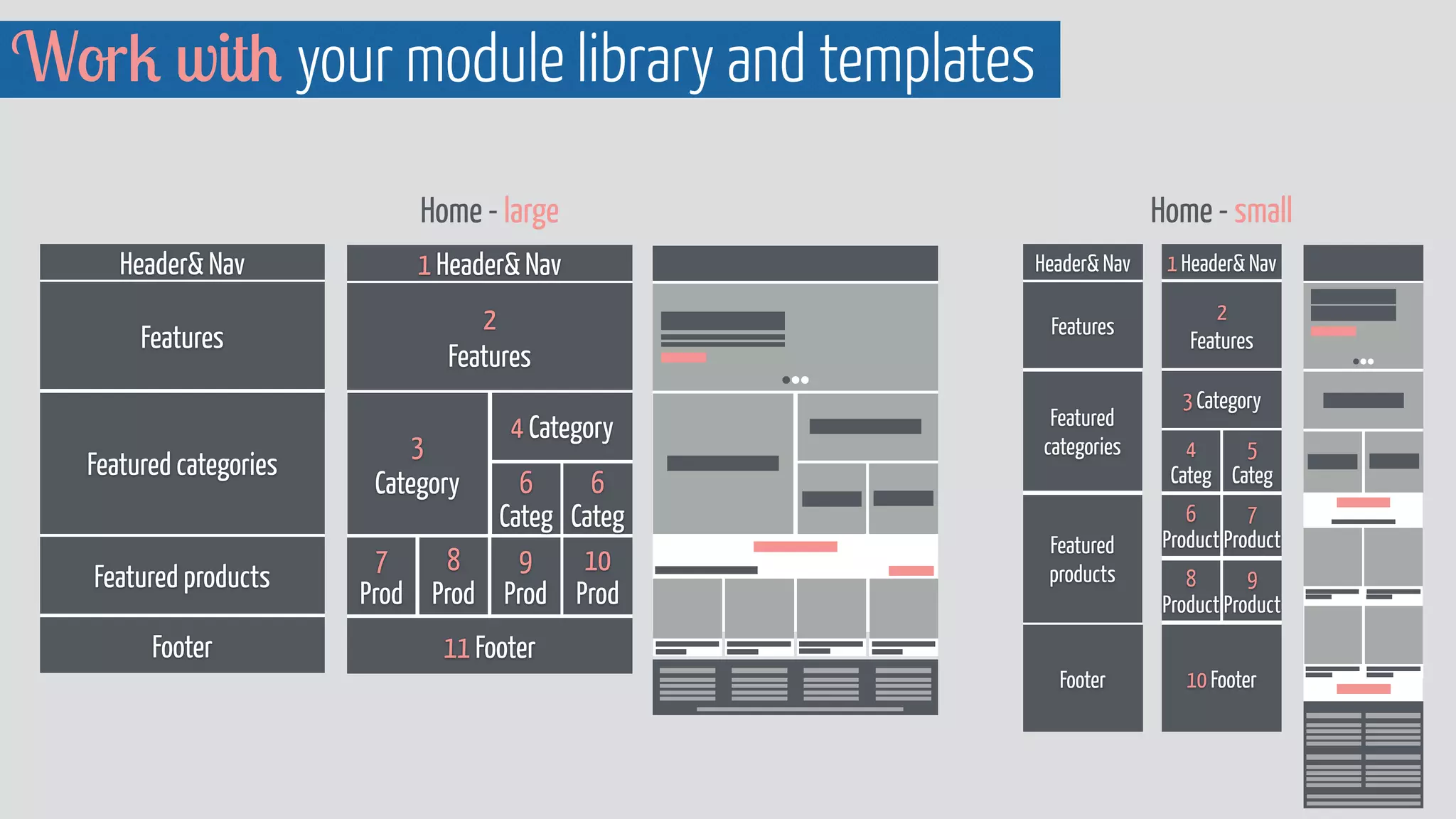


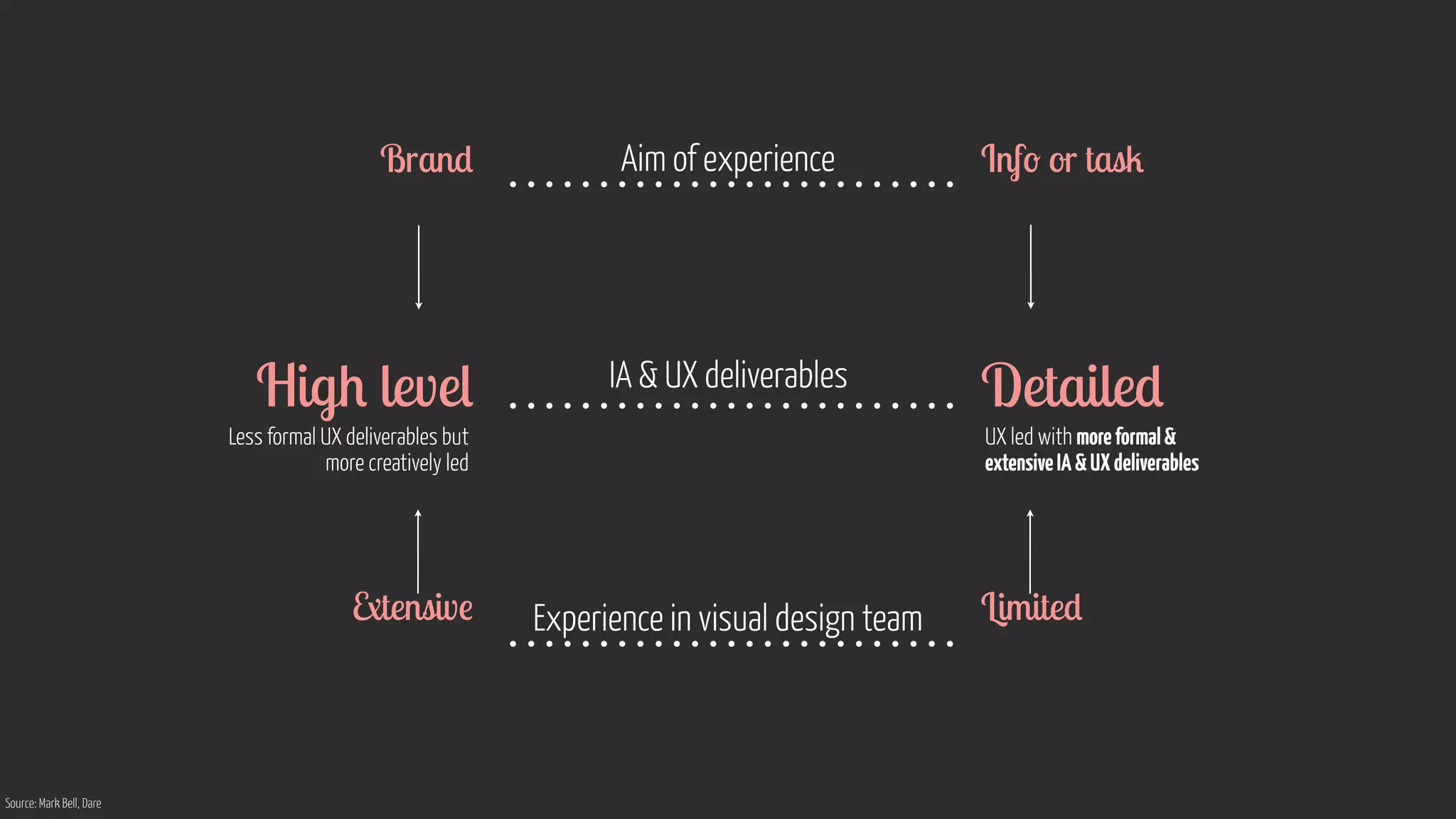


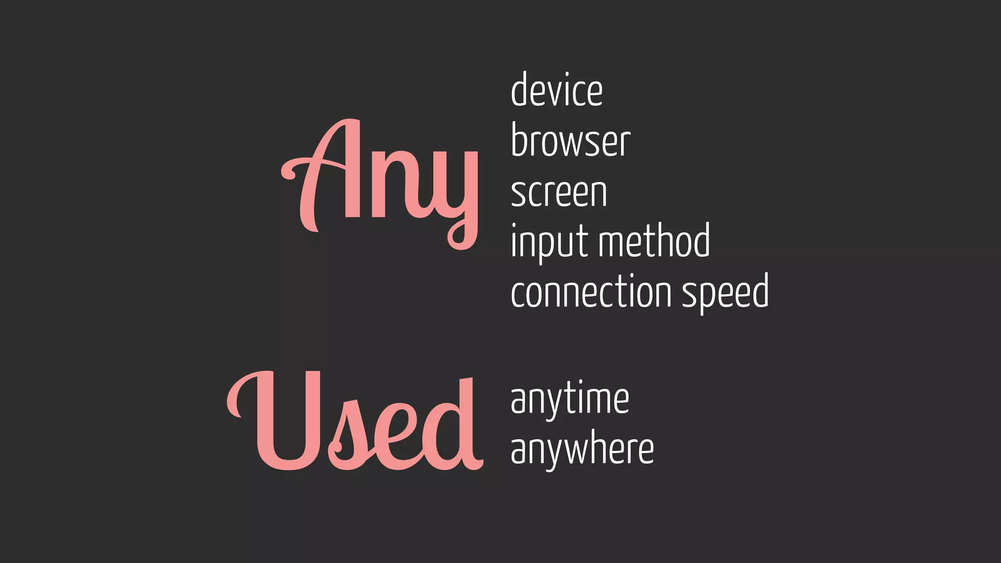


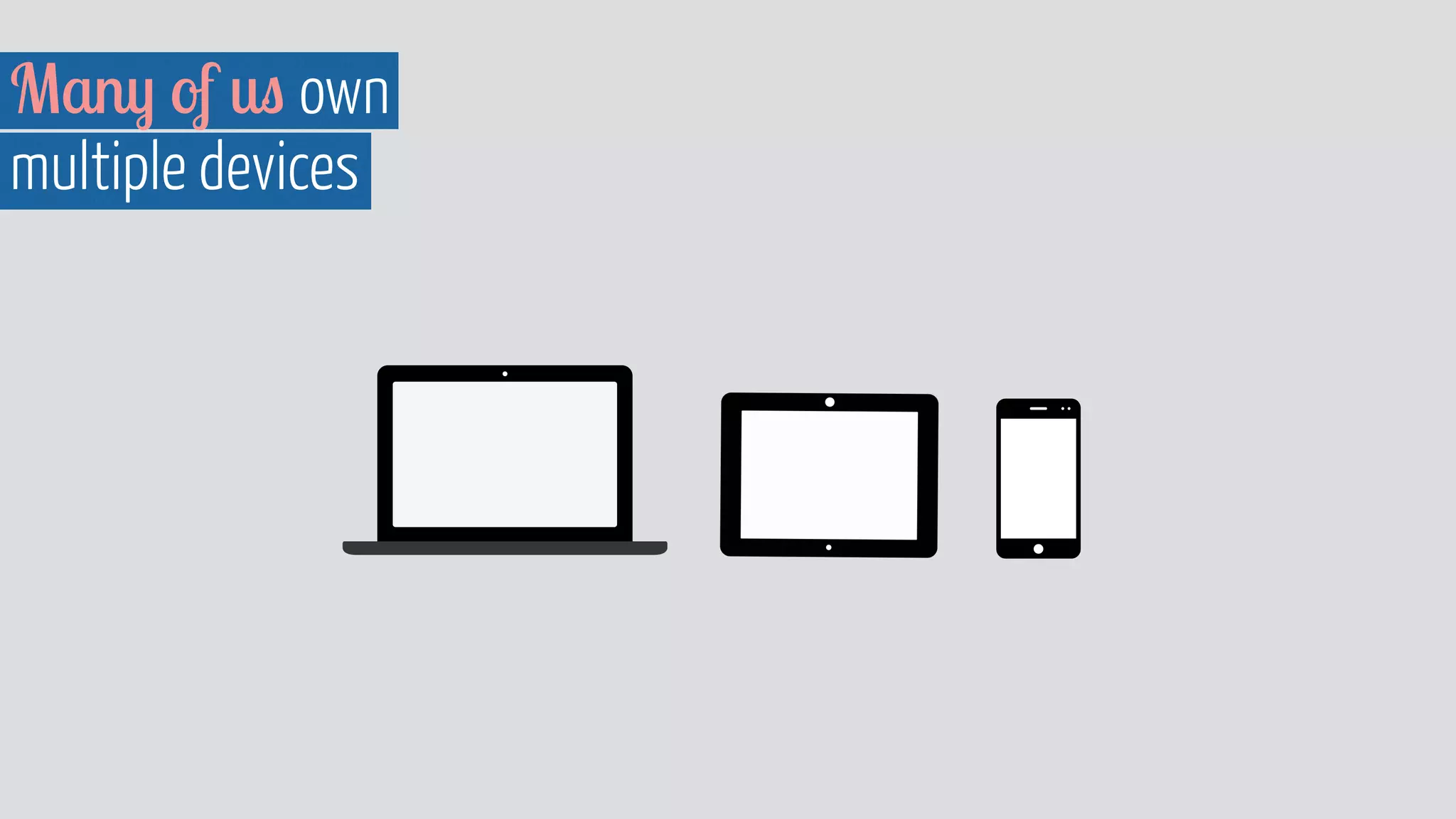
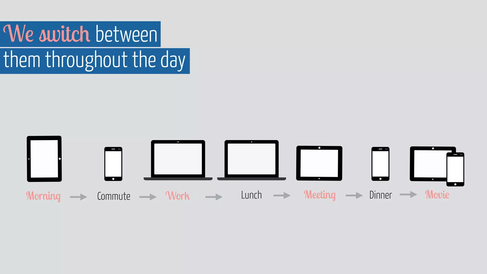
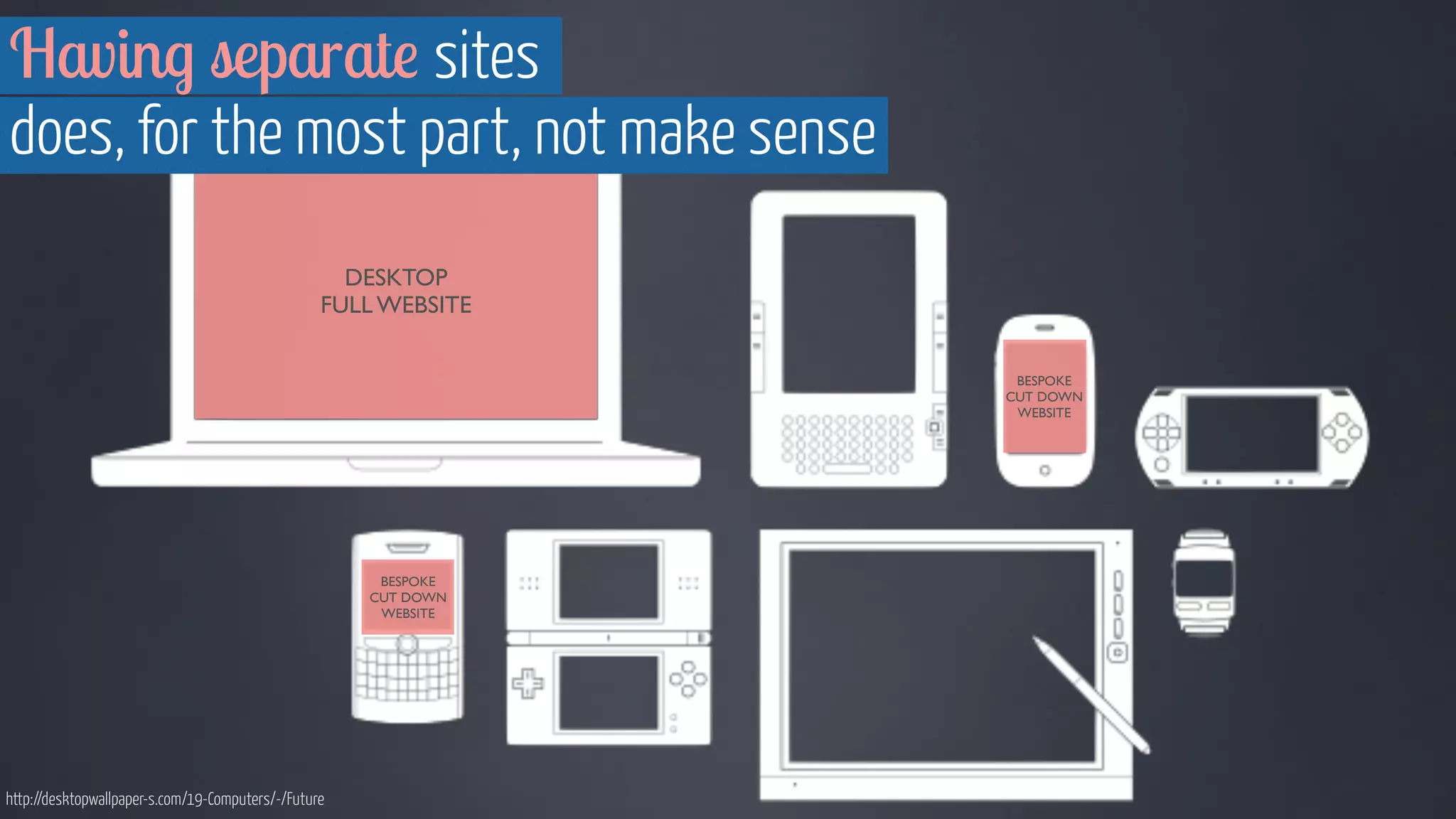
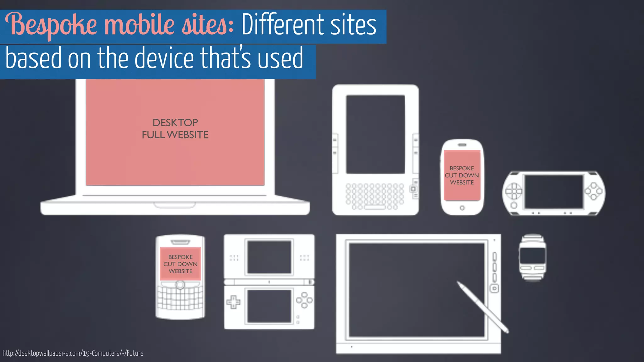
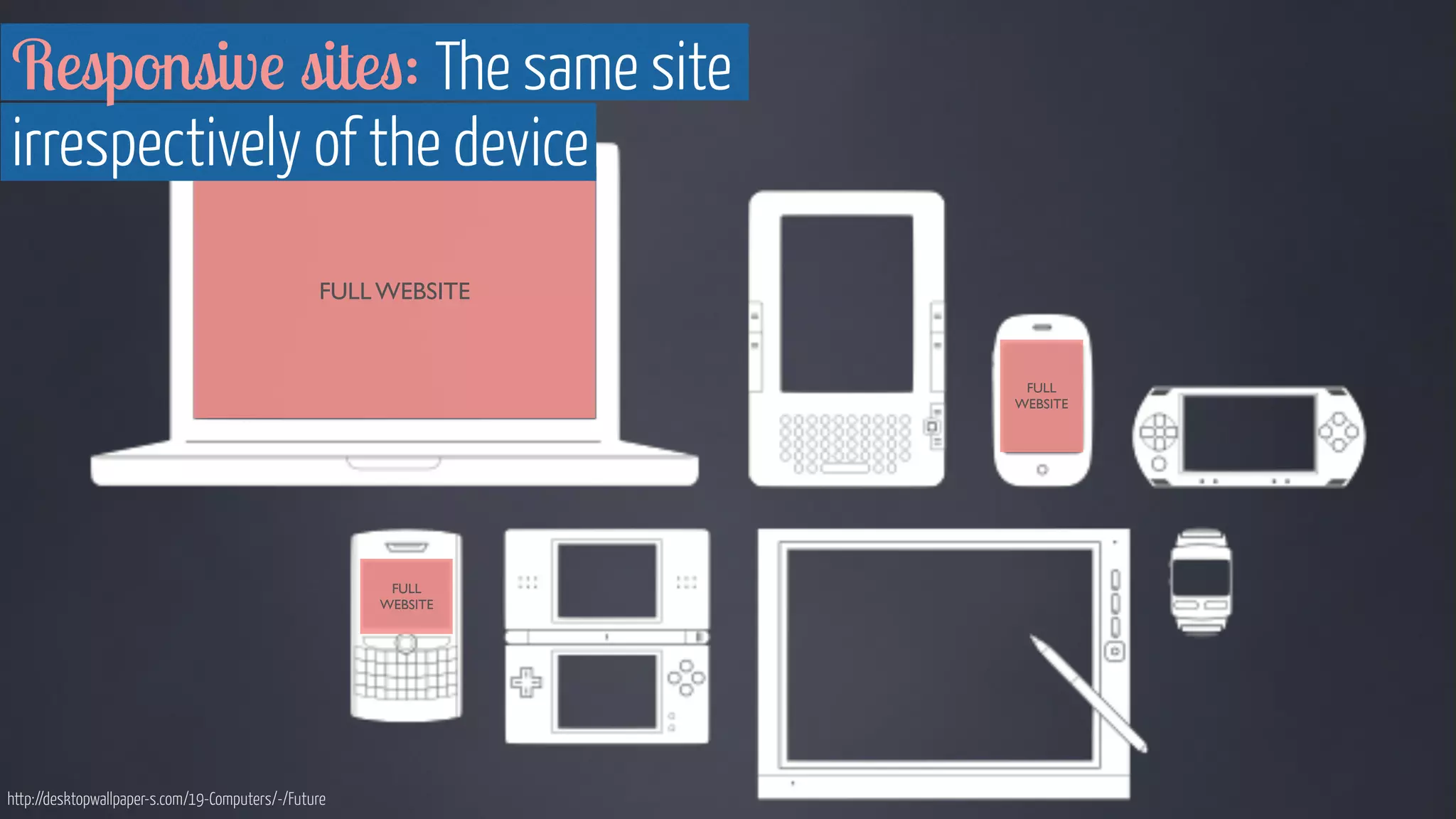
The document discusses device agnostic design, which aims to create content that can be accessed and displayed well on any device. It emphasizes building with reusable modular components rather than bespoke designs for each device. The key aspects are understanding content stacking strategies across screens, using content-based rather than device-based breakpoints, and designing interactive elements that work for both touch and non-touch interfaces. The goal is to provide users with a continuous experience regardless of the device they use.


![Responsive Design & Beyond [Code & Creativity Workshop]](https://cdn.slidesharecdn.com/ss_thumbnails/codecreativityworkshop1-140506164731-phpapp01-thumbnail.jpg?width=640&height=640&fit=bounds)


