Downloaded 170 times


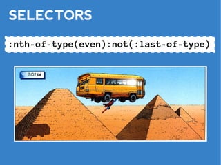


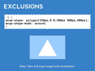

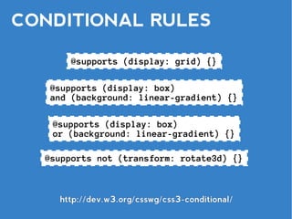
![CONDITIONAL RULES
@document url('http://w3.org/index.html') {}
@document url-prefix('http://w3.org/blog/') {}
@document domain('w3.org') {}
@document regexp('http://w3.org/[^/]*-d{8}/') {}](https://image.slidesharecdn.com/lws110627-110627174556-phpapp01/85/The-CSS3-of-Tomorrow-Version-2-52-320.jpg)


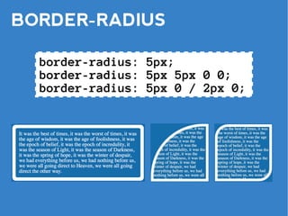
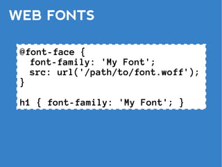
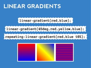
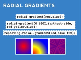
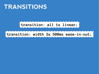
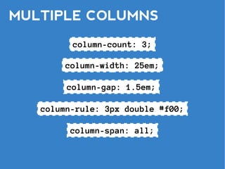
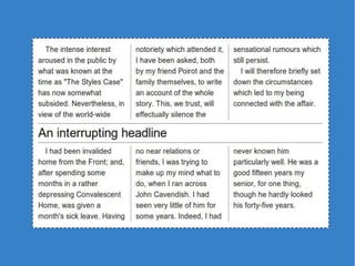
The document covers various advanced CSS3 features and techniques, such as border-radius, box shadows, gradients, transitions, and animations. It also touches on responsive design with media queries, flexible box layout, grid positioning, and conditional rules, along with variables and mixins in CSS. Additionally, it includes links to external resources and mentions copyright issues related to specific images used in the document.


![[Worskhop Summits] CSS3 Workshop](https://cdn.slidesharecdn.com/ss_thumbnails/schmitt-css3-v4-100114155033-phpapp02-thumbnail.jpg?width=640&height=640&fit=bounds)