Download as PDF, PPTX


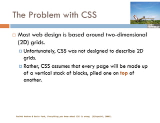
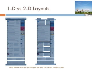
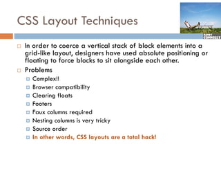

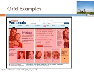
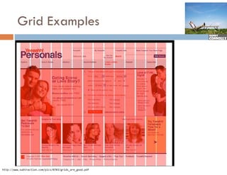
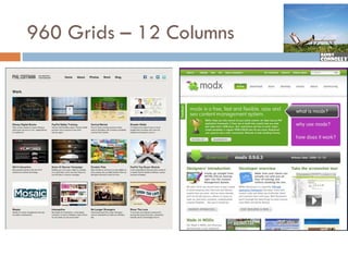
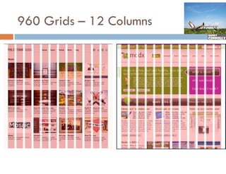
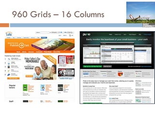
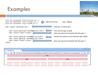
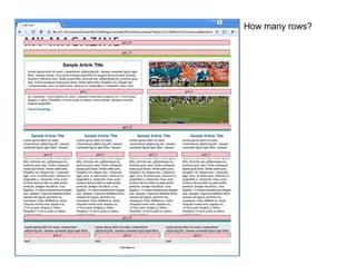
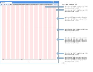
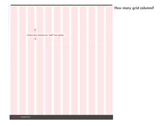
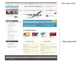
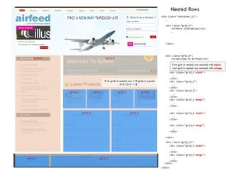
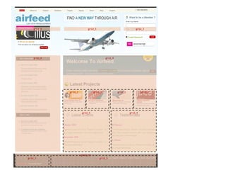

The document discusses challenges with CSS layout techniques, particularly the limitations of using CSS for two-dimensional grid designs that are common in web development. It introduces CSS table layout mode as a solution for achieving 2D layouts more effectively while mentioning the role of CSS frameworks in simplifying complex CSS layouts. Additionally, it touches on the potential of CSS3 grids for improved layout management and highlights common CSS frameworks like the 960 grid system.


