Downloaded 434 times


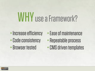
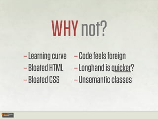
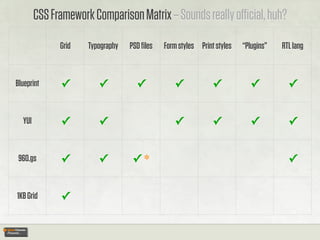
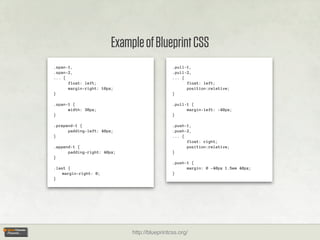
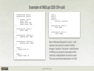
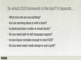
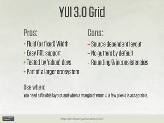
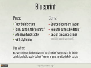
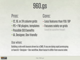
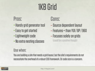
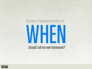
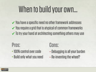


The document discusses the benefits and drawbacks of using CSS frameworks, such as increased efficiency and ease of maintenance, while also addressing concerns about learning curves and code bloat. It compares various frameworks, including Blueprint, YUI 3, 960.gs, and 1kb grid, highlighting their features and use cases to help developers choose the right one for their needs. The conclusion emphasizes the importance of understanding project requirements to decide whether to use a pre-existing framework or build a custom one.