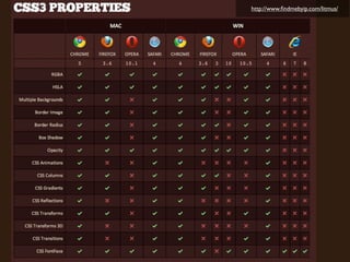
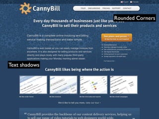
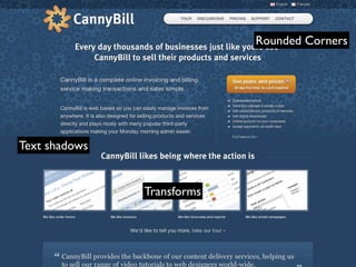
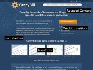
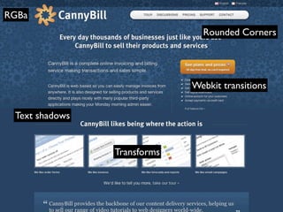
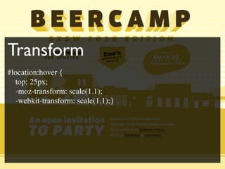
CSS3
Ready for Primetime?
Refresh Orlando β€’ April 27, 2010
Who am I?
Why is CSS3
so appealing?
Why is CSS3
  so appealing?
Simplified solutions
Less Markup
Zebra Striping a Table
 <table>
  <tr><td></td></tr>
  <tr class=β€œeven”><td></td></tr>
  <tr><td></td></tr>
  <tr class=β€œeven”><td></td></tr>
  <tr><td></td></tr>
  <tr class=β€œeven”><td></td></tr>
  <tr><td></td></tr>
  <tr class=β€œeven”><td></td></tr>
 </table>
Zebra Striping a Table

 .even{
   style declaration
 }
New Solution using
CSS3 advanced selector
New Solution using
CSS3 advanced selector
 tr:nth-child(even){
   style declaration
 }
Code solutions
   opposed to
image solutions
Rounded Corners
Rounded Corners
Rounded Corners


 <div class=β€œbox”>
  <div class=β€œbox-inner”>
    <img src=β€œboat.jpg” alt=β€œboat” />
  </div>
 </div>
Rounded Corners


 .box{
 width:226px;
 background:#e2e1d4 url(round-bottom.gif) no-
 repeat bottom left;}

 .box-inner{
 padding:15px;
 background: url(round-top.gif) no-repeat top left;}
Rounded Corners - Fluid


 <div class=β€œbox”>
  <div class=β€œbox-inner”>
    <div class=β€œbox-inner2”>
      <div class=β€œbox-inner3”>
    <img src=β€œboat.jpg” alt=β€œboat” />
  </div></div></div>
 </div>
Rounded Corners Γ‘ la CSS3
 <div class=β€œbox”>
    <img src=β€œboat.jpg” alt=β€œboat” />
 </div>
Rounded Corners Γ‘ la CSS3
 <div class=β€œbox”>
    <img src=β€œboat.jpg” alt=β€œboat” />
 </div>


 .box{
    padding:15px;
    background:#e2e1d4;
    border-radius:8px;
 }
The Problem with CSS3
Not all browsers support it (yet)
http://www.findmebyip.com/litmus/
Is CSS3 ready for
      primetime?
Yes?
Progressive
Enhancement
No?
It depends
β€œGood craftsmanship is about
understanding the various ways to
solve a particular problem, then
choosing the right task for the job.”

            Dan Cederholm, Handcrafted CSS
Things to consider
The Client
The Audience


               Photo by werkunz, http://www.flickr.com/photos/werkunz/
                               Used under Creative Commons License
The Design Problem


           Photo by Seth and Alexa, http://www.flickr.com/people/sethandalexa/
                                       Used under Creative Commons License
The Design Solution


                      http://theshipandthesea.com
The Designer
The Cost
My Challenge to you:

Try CSS3 where it is
appropriate
Pitching it
to a Client
Not all browsers see the
same design
HDTV
Video
                                                  Games
Wii   XBox 360


                                                                      Paul Stanton
       http://coffeepowered.co.uk/2010/02/an-analogy-for-progressive-enhancement/
Ramp Champ
Now for the fun
part of our show


                   Ramp Champ
Andy Clarke
http://www.cannybill.com
Rounded Corners
Rounded Corners


Text shadows
Rounded Corners


Text shadows


               Transforms
Rounded Corners


                            Webkit transitions


Text shadows


               Transforms
RGBa
                               Rounded Corners


                             Webkit transitions


 Text shadows


                Transforms
Rounded Corners
.borderradius header.branding nav ul {

 -moz-border-radius:20px 20px 20px 20px;

 -web-kit-border-radius: 20px 20px 20px 20px;
}
Text shadows and RGBa
.rgba body {

 color:rgba(255, 255, 255, 0.9);

 text-shadow:0 1px 1px rgba(0, 0, 0, 0.8);
}
Transforms
.csstransforms figure.video-tour:hover img {

 -moz-transform:scale(1.15);

 -web-kit-tranform:scale(1.15);
}
Transitions (web-kit)
.csstransforms figure.video-tour img {

 -webkit-transition-property : scale;

 -webkit-transition-duration : 0.2s;

 -webkit-transition-timing-function : ease-in-
out;
}
http://sxsw.beercamp.com/
Multiple Text shadows


      Transform
Multiple Text shadows


      Transform         border-radius
@font-face


Multiple Text shadows


      Transform         border-radius
Transform
Multiple Text Shadow
h1 .b {
  text-shadow: 1px 0px #FE8, 1px 2px #EB0, 3px 1px #FE8, 2px 3px #EB0, 4px 2px #FE8, 4px
4px #EB0, 5px 3px #FE8, 5px 5px #EB0, 7px 4px #FE8, 6px 6px #EB0, 8px 5px #FE8, 7px 7px
#EB0, 9px 6px #FE8, 9px 8px #EB0, 11px 7px #FE8, 10px 9px #EB0, 12px 8px #FE8, 11px
10px #EB0, 13px 9px #FE8, 12px 11px #EB0, 15px 10px #FE8, 13px 12px #EB0, 16px 11px
#FE8, 15px 13px #EB0, 17px 12px #FE8, 16px 14px #EB0, 19px 13px #FE8, 17px 15px #EB0,
19px 14px #FE8, 18px 16px #EB0, 21px 15px #FE8, 19.6px 17px #EB0, 22px 16px #FE8, 21px
18px #EB0, 24px 17px #FE8, 22px 19px #EB0, 25px 18px #FE8, 23px 20px #EB0, 26px 19px
#FE8, 24.5px 21px #EB0, 27.783px 20px #FE8, 26px 22px #EB0, 29px 21px #FE8, 27px 23px
#EB0, 30px 22px #FE8, 28px 24px #EB0, 32px 23px #FE8, 29.4px 25px #EB0, 33px 24px
#FE8, 31px 26px #EB0;
  z-index: 50;
}
Transform
Transform
#location:hover {
  top: 25px;
  -moz-transform: scale(1.1);
  -webkit-transform: scale(1.1);}
Transform
#location:hover {
  top: 25px;
  -moz-transform: scale(1.1);
  -webkit-transform: scale(1.1);}


#location h2 {
  -moz-transform: rotate(-7deg);
  -webkit-transform: rotate(-7deg);
}
Transform
Transform
#sponsors li a:hover {
  -moz-transform-origin: right bottom;
  -webkit-transform-origin: right bottom;
  -moz-transform: rotate(7deg) scale(1.2);
  -webkit-transform: rotate(7deg) scale(1.2);
}
#location .pointer {
    display: block;
    position: absolute;
    left: -20px;
    bottom: -55px;
    border-style: solid;

    border-width: 60px 90px 0;
    border-color: #EB0 transparent;

}
Elliot Jay Stocks
http://neutroncreations.com/blog/
Text
Text
Web-kit animation
div.neutron01 {
-webkit-animation-name:neutron01;
-webkit-animation-duration:10s;
-webkit-animation-iteration-count:infinite;
-webkit-animation-timing-function:linear }
                                           Text
@-webkit-keyframes neutron01 { from { -webkit-transform:rotate(0deg) } to { -webkit-
transform:rotate(360deg) }

}
div.neutron02 {
-webkit-animation-name:neutron02;
-webkit-animation-duration:4s;
-webkit-animation-iteration-count:infinite;
-webkit-animation-timing-function:linear }
@-webkit-keyframes neutron02 { from { -webkit-transform:rotate(360deg) } to { -webkit-
transform:rotate(0deg) }
}
Edge of My Seat
http://24ways.org
My Challenge to you:

Try CSS3 where it is
appropriate
Jeff Bridgforth
Jeff Bridgforth

http://www.slideshare.net/JBridg4th
Jeff Bridgforth

http://www.slideshare.net/JBridg4th

jeffbridgforth.com/refresh-talk
Jeff Bridgforth

http://www.slideshare.net/JBridg4th

jeffbridgforth.com/refresh-talk

Twitter: @webcraftsman

CSS3: Ready for Primetime?