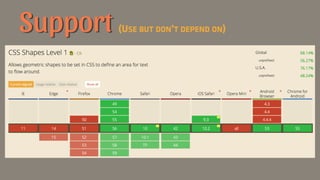
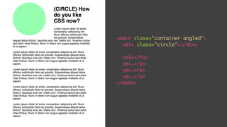
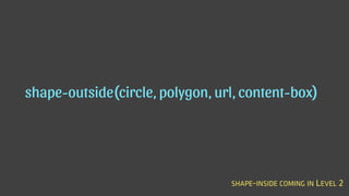
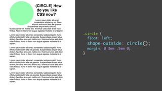
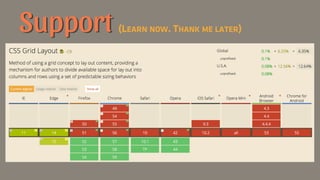
Downloaded 14 times


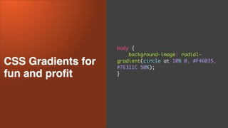
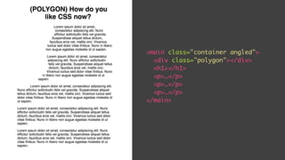
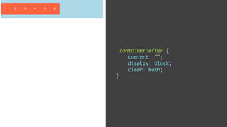
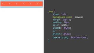
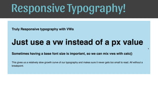
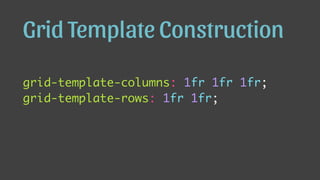
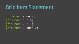
![repeating-linear-gradient(
[direction], [first color] #F46035,
[first color again to fight fade] #F46035 20px,
[second color] #7E311C 20px,
[second color again to fight fade] #7E311C 40px
);](https://image.slidesharecdn.com/post-modern-slides-170227153208/85/Post-Modern-CSS-Start-learning-CSS-Grid-Flexbox-and-other-new-properties-35-320.jpg)

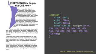


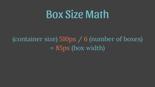


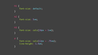
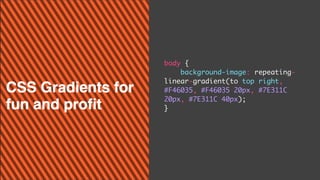
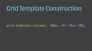
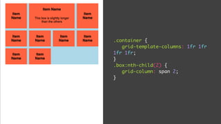
![calc(unit [+, -, ÷, x] unit)](https://image.slidesharecdn.com/post-modern-slides-170227153208/85/Post-Modern-CSS-Start-learning-CSS-Grid-Flexbox-and-other-new-properties-94-320.jpg)
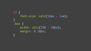


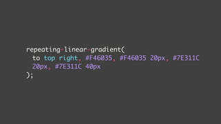
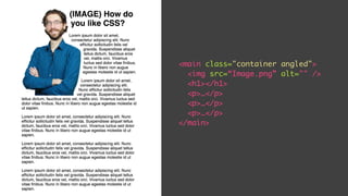
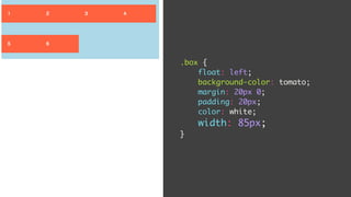
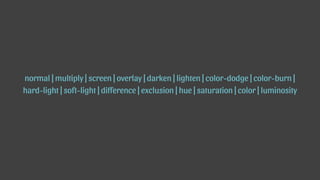
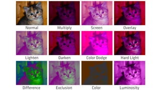
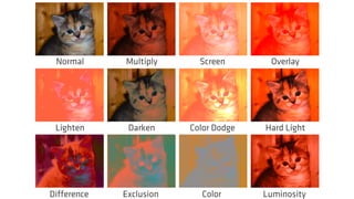
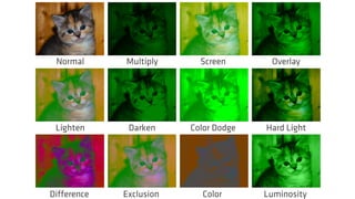
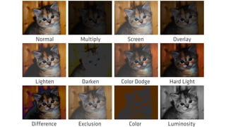
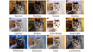
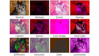
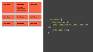
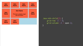
![.box {
height: 15vw;
margin-bottom: 50px;
width: calc(25% - 10px);
background-size: cover;
background-image: url(https://placekitten.com/1000/800);
background-color: purple;
background-blend-mode: [value];
}](https://image.slidesharecdn.com/post-modern-slides-170227153208/85/Post-Modern-CSS-Start-learning-CSS-Grid-Flexbox-and-other-new-properties-101-320.jpg)


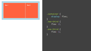
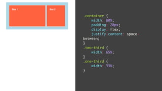
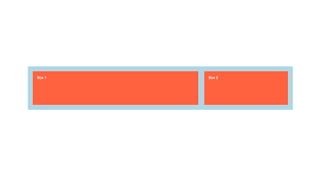
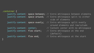
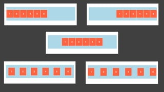
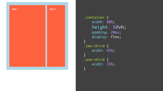
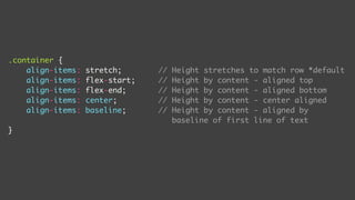
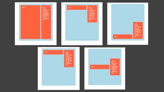
The document discusses post-modern CSS, exploring advanced layout techniques like grid layout and flexbox as a reaction to earlier web design eras. It details the evolution of CSS, highlights the advantages of CSS3 modules, and presents practical code examples for implementing modern properties. The content aims to illustrate the potential of post-modern design principles while providing guidance on responsive and visually compelling web layouts.