Downloaded 30 times


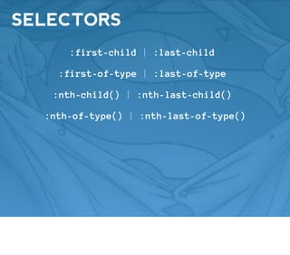
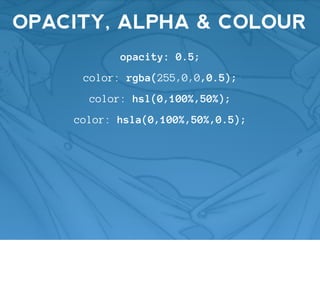
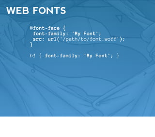


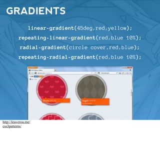

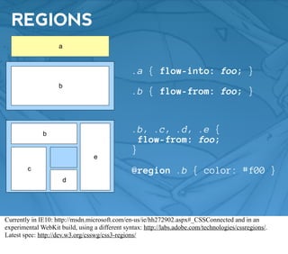


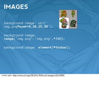
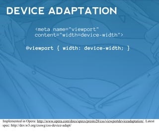
![CONDITIONAL RULES
@document url('http://w3.org/index.html') {}
@document url-prefix('http://w3.org/blog/') {}
@document domain('w3.org') {}
@document regexp('http://w3.org/[^/]*-d{8}/') {}
Implemented in Firefox: https://developer.mozilla.org/en/CSS/@-moz-document](https://image.slidesharecdn.com/fr111021-annotated-111021073134-phpapp02/85/The-CSS-of-Tomorrow-Front-Row-2011-41-320.jpg)


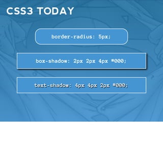
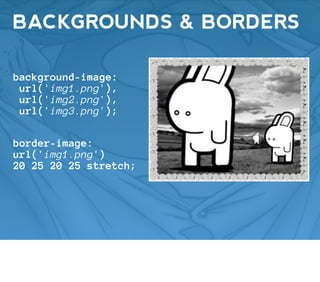
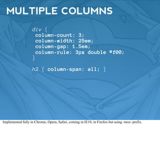
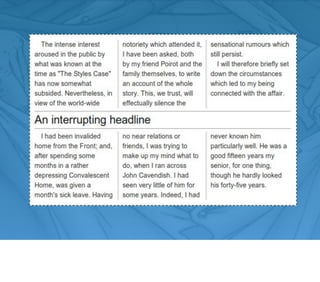
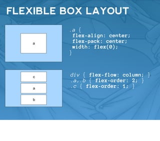
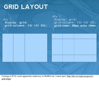
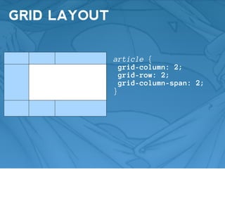
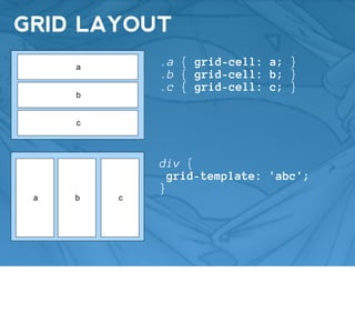
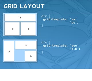
This document provides an extensive overview of CSS3, including various features such as selectors, media queries, gradients, transformations, transitions, animations, and layout techniques like Flexbox and Grid. It discusses the state of implementation in different browsers and provides links to further resources. Additionally, it touches on advanced concepts like variables, mixins, and conditional rules within CSS3.

![Learn to Love CSS3 [English]](https://cdn.slidesharecdn.com/ss_thumbnails/tpjab12css3-120521050202-phpapp01-thumbnail.jpg?width=640&height=640&fit=bounds)