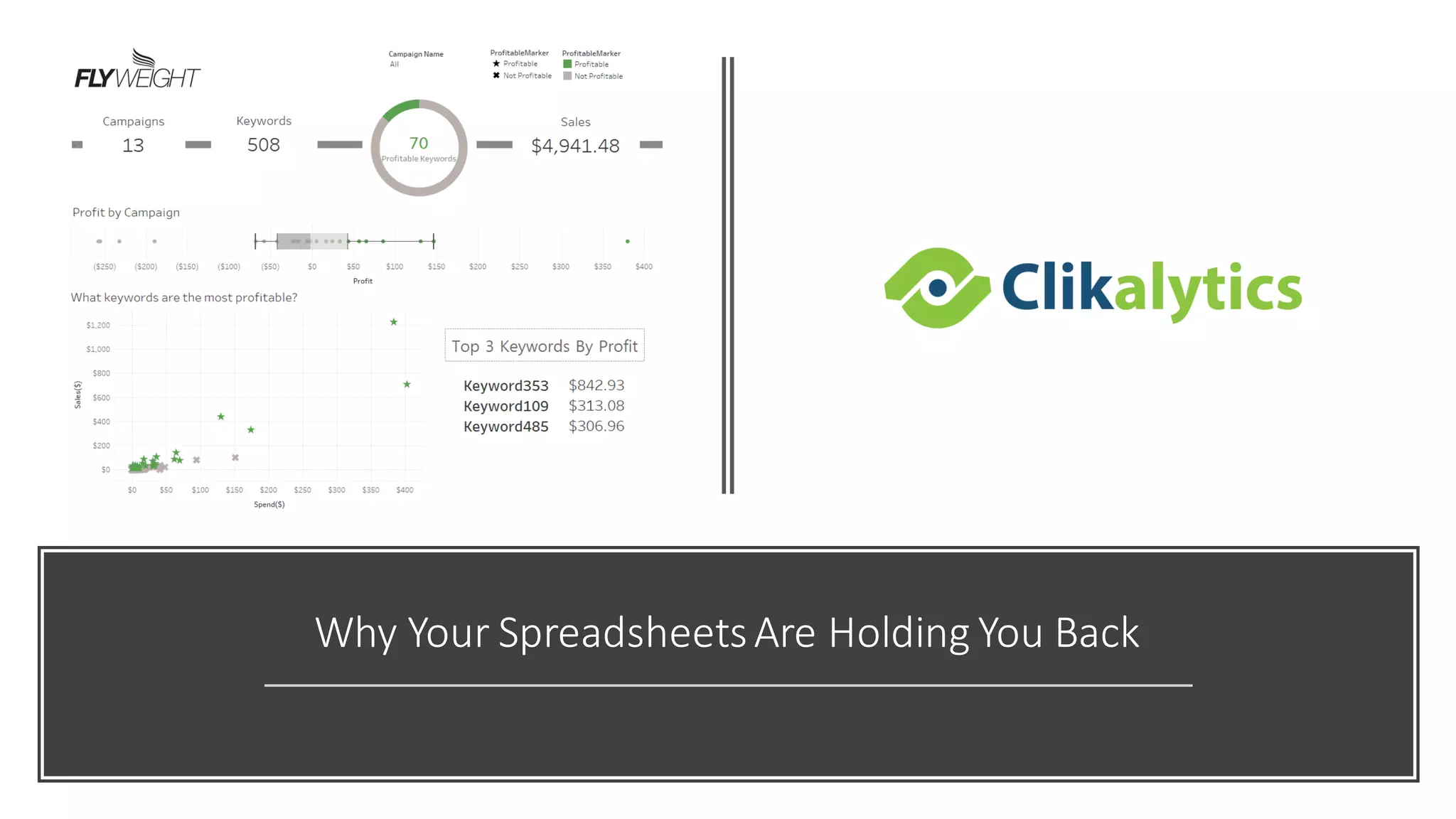
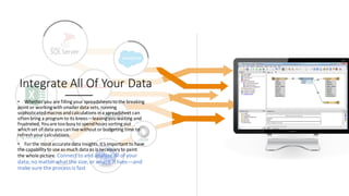
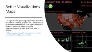
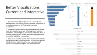
Why Your SpreadsheetsAre Holding You Back
Most Common,
Least Effective
• Data analysis is one of the most importantthings
to help maximize your businesses potential.For
many, Excel is the go-toanalysis tool of choice, but
as useful as it can be, it justcan’tdo it all. With
pressure mounting to glean more insightfrom your
ever growing data,spreadsheets don’t always have
the capabilities to deliver the insight you seek. The
good news? There are plenty more tools in the box.
Integrate All Of Your Data
• Regardlessof the size of yourorganization,
chances are, you’vegot dataeverywhere, and a lot
of it. It’snot just in spreadsheetsanymore,but it’s
also stored in the cloud,and in on-premisedata
warehouses.Socialmedia data,transactional data,
customer records, and web analyticsare just a few
examplesof informationthatcan’t be properly
analyzedin a spreadsheet.
• Excel and Google users often find themselves
forced to use subsets of datafor ad hoc analysis—
which will onlyyield a glimpse of the answersthey
seek. The realityis, with just a spreadsheet,at a
millionrows, you’re going to hit a brick wall.
Integrate All Of Your Data
• Whether you are fillingyour spreadsheets to the breaking
point or workingwithsmaller data sets, running
sophisticatedmacros andcalculations ina spreadsheet can
oftenbring a programto its knees—leavingyouwaiting and
frustrated. Youare toobusy to spendhours sorting out
whichset of data youcanlive without orbudgeting time to
refreshyour calculations.
• For the most accuratedata insights,it’s important to have
the capability to use as much data as is necessary to paint
the whole picture. Connect to and analyze all ofyour
data,no matter what the size, or where it lives—and
make sure the process is fast
Data Blending and Cleaning
• By joining different data sets ona commonfield,youcan
get a single, holistic view of things like performance and
track completionofgoals at every stepof yourprocess. With
the right tool,youcancreate links to eachof yourdata
sources,either live or as an extract,andeasily blend them.
• Regardless ofdata type, blendingyour data on
common field will elevate understandingand
decision-making.
Data Blending and Cleaning
• While you’reblending your data,it’s importantto
keep it clean too.For example, most spreadsheets
store datesin lines acrosscolumns. This makes
working with them painful and messy.
• Having the ability to remove unwanted rows,and
even the flexibility to rename dimensions and
measures, regardlessof original headings, is key.
Even better,none of these changeswill compromise
your dataupdates.
Better
Visualizations
• Data visualizationsare meant to
be easy and fastto read. Number-
based tables and spreadsheetsare
often the opposite. This is a use case
where a picture really is worth a
thousand words.
• Sure, spreadsheettools do let you
create some basic,built-in charts,
but in today’smarketplace,these
standard graphsare justtable
stakes, and the real data wins are
found in multiple types of advanced
visuals. Does this scenario sound
familiar?
Better Visualizations
• You finish youranalysis,confident
you know just the chart to showin
an upcomingpresentation.You take
the time and click through a whole
series of steps and make the chart.
You thinkit looks prettygood. All
the while you’re hopingnothing
changes before your meeting.
• You get to the meetingand there
are questions thatthe chart doesn’t
give answers right away.People ask
to see a different visualization to
answer their new questions.And
now you have to start over and
schedule another meeting.
• Say goodbye to this situation and
hello to better data visualizations.
Better Visualizations
Maps
• Geographicalmaps are a greatexample of a better
visualization—and no, maps are not a standardissue
on a spreadsheet’slineup of charttypes. Seeing your
data on a map brings a level of intuitive
understandingthatno pivot table could hope to
achieve.
• Mapping your data will reveal patternsto inform
your decisions and guide next steps.
Better Visualizations
Current and Interactive
• It’s never fun not to know the answer—especially in a
meeting where you’retrying to solve a problem. Set yourself up
to answer questions on the fly, by using interactive
visualizations.
• Interactivedashboards with a currentdata feed can enable
important analytical tasks, such as filtering views, adjusting
parameters, performing quick calculations, and drilling down to
examine underlying data. Answer the unanticipated questions
immediately with a few mouseclicks.
• Data can be fromthis quarter, this week, this hour, or thirty
seconds ago—there’s no doubt about it, a currentdata feed, or
a feed within the right timeline for your organization, will
elevate your problemsolving and your daily operations.
A Better Way
• You don’t have to ditch your
spreadsheets all together; but
integrating them into your
analysis with better data
visualization is easier than you
think.
• Clikalytics helps people see and
understand data no matter how
big, or where it is stored. Quickly
connect, blend, clean, visualize
and share your dashboards with
a seamless experience from the
PC to the iPad. Create and
publish dashboards with
automatic data updates, and
share them with colleagues,
partners or customers—no
programming skills required.

Spreadsheet problems

  • 1.
    Why Your SpreadsheetsAreHolding You Back
  • 2.
    Most Common, Least Effective •Data analysis is one of the most importantthings to help maximize your businesses potential.For many, Excel is the go-toanalysis tool of choice, but as useful as it can be, it justcan’tdo it all. With pressure mounting to glean more insightfrom your ever growing data,spreadsheets don’t always have the capabilities to deliver the insight you seek. The good news? There are plenty more tools in the box.
  • 3.
    Integrate All OfYour Data • Regardlessof the size of yourorganization, chances are, you’vegot dataeverywhere, and a lot of it. It’snot just in spreadsheetsanymore,but it’s also stored in the cloud,and in on-premisedata warehouses.Socialmedia data,transactional data, customer records, and web analyticsare just a few examplesof informationthatcan’t be properly analyzedin a spreadsheet. • Excel and Google users often find themselves forced to use subsets of datafor ad hoc analysis— which will onlyyield a glimpse of the answersthey seek. The realityis, with just a spreadsheet,at a millionrows, you’re going to hit a brick wall.
  • 4.
    Integrate All OfYour Data • Whether you are fillingyour spreadsheets to the breaking point or workingwithsmaller data sets, running sophisticatedmacros andcalculations ina spreadsheet can oftenbring a programto its knees—leavingyouwaiting and frustrated. Youare toobusy to spendhours sorting out whichset of data youcanlive without orbudgeting time to refreshyour calculations. • For the most accuratedata insights,it’s important to have the capability to use as much data as is necessary to paint the whole picture. Connect to and analyze all ofyour data,no matter what the size, or where it lives—and make sure the process is fast
  • 5.
    Data Blending andCleaning • By joining different data sets ona commonfield,youcan get a single, holistic view of things like performance and track completionofgoals at every stepof yourprocess. With the right tool,youcancreate links to eachof yourdata sources,either live or as an extract,andeasily blend them. • Regardless ofdata type, blendingyour data on common field will elevate understandingand decision-making.
  • 6.
    Data Blending andCleaning • While you’reblending your data,it’s importantto keep it clean too.For example, most spreadsheets store datesin lines acrosscolumns. This makes working with them painful and messy. • Having the ability to remove unwanted rows,and even the flexibility to rename dimensions and measures, regardlessof original headings, is key. Even better,none of these changeswill compromise your dataupdates.
  • 7.
    Better Visualizations • Data visualizationsaremeant to be easy and fastto read. Number- based tables and spreadsheetsare often the opposite. This is a use case where a picture really is worth a thousand words. • Sure, spreadsheettools do let you create some basic,built-in charts, but in today’smarketplace,these standard graphsare justtable stakes, and the real data wins are found in multiple types of advanced visuals. Does this scenario sound familiar?
  • 8.
    Better Visualizations • Youfinish youranalysis,confident you know just the chart to showin an upcomingpresentation.You take the time and click through a whole series of steps and make the chart. You thinkit looks prettygood. All the while you’re hopingnothing changes before your meeting. • You get to the meetingand there are questions thatthe chart doesn’t give answers right away.People ask to see a different visualization to answer their new questions.And now you have to start over and schedule another meeting. • Say goodbye to this situation and hello to better data visualizations.
  • 9.
    Better Visualizations Maps • Geographicalmapsare a greatexample of a better visualization—and no, maps are not a standardissue on a spreadsheet’slineup of charttypes. Seeing your data on a map brings a level of intuitive understandingthatno pivot table could hope to achieve. • Mapping your data will reveal patternsto inform your decisions and guide next steps.
  • 10.
    Better Visualizations Current andInteractive • It’s never fun not to know the answer—especially in a meeting where you’retrying to solve a problem. Set yourself up to answer questions on the fly, by using interactive visualizations. • Interactivedashboards with a currentdata feed can enable important analytical tasks, such as filtering views, adjusting parameters, performing quick calculations, and drilling down to examine underlying data. Answer the unanticipated questions immediately with a few mouseclicks. • Data can be fromthis quarter, this week, this hour, or thirty seconds ago—there’s no doubt about it, a currentdata feed, or a feed within the right timeline for your organization, will elevate your problemsolving and your daily operations.
  • 11.
    A Better Way •You don’t have to ditch your spreadsheets all together; but integrating them into your analysis with better data visualization is easier than you think. • Clikalytics helps people see and understand data no matter how big, or where it is stored. Quickly connect, blend, clean, visualize and share your dashboards with a seamless experience from the PC to the iPad. Create and publish dashboards with automatic data updates, and share them with colleagues, partners or customers—no programming skills required.