1. The document discusses 10 portrait photographs taken as part of a photography project focused on color. For each photo, the theme, focus, techniques used, and strengths and weaknesses are described. The theme for all photos was color, with the goal of exaggerating and highlighting color. Rule of thirds was used to frame each portrait shot. While colors and angles were strengths, weaknesses included backgrounds that were too distracting or colors that lacked blending or precision.
الأربعاء 17 ديسمبر 2014: أحداث منتظرة
9.00 اجتماع لجنة النظام الداخلي بمجلس نواب الشعب
مقر المجلس بباردو
10.00 وقفة احتجاجية للأساتذة الجامعيين المتعاقدين
أمام مقر وزارة التعليم العالي
10.00 الندوة المغاربية الثالثة حول الجوار الاجتماعي ببلدان المغرب العربي
مقر وزارة الشؤون الاجتماعية
10.00 ندوة صحفية لمنتدى الحقوق الاقتصادية والاجتماعية حول الهجرة
مقر المنتدى بالعاصمة
11.00 الندوة الختامية للمرحلة الثانية من مشروع التنمية الاجتماعية المحلية للمناطق الريفية
مقر اتحاد الفلاحة والصيد البحري بالعاصمة
11.00 ندوة صحفية لشبكة عهد للثقافة المدنية حول إصلاح المنظومة التربوية
مقر نقابة الصحافيين
12.00 توقيع اتفاقية تعاون بين وزارة الصناعة والوكالة الألمانية للتعاون الفني
مقر وزارة الصناعة
13.00 اجتماع شعبي لرئيس الاتحاد الوطني الحر سليم الرياحي
قاعة "الكنيسية" بباجة
14.00 تظاهرة لإحياء الذكرى الرابعة للثورة التونسية
أمام المسرح البلدي بالعاصمة
The Roman Empire A Historical Colossus.pdfkaushalkr1407
The Roman Empire, a vast and enduring power, stands as one of history's most remarkable civilizations, leaving an indelible imprint on the world. It emerged from the Roman Republic, transitioning into an imperial powerhouse under the leadership of Augustus Caesar in 27 BCE. This transformation marked the beginning of an era defined by unprecedented territorial expansion, architectural marvels, and profound cultural influence.
The empire's roots lie in the city of Rome, founded, according to legend, by Romulus in 753 BCE. Over centuries, Rome evolved from a small settlement to a formidable republic, characterized by a complex political system with elected officials and checks on power. However, internal strife, class conflicts, and military ambitions paved the way for the end of the Republic. Julius Caesar’s dictatorship and subsequent assassination in 44 BCE created a power vacuum, leading to a civil war. Octavian, later Augustus, emerged victorious, heralding the Roman Empire’s birth.
Under Augustus, the empire experienced the Pax Romana, a 200-year period of relative peace and stability. Augustus reformed the military, established efficient administrative systems, and initiated grand construction projects. The empire's borders expanded, encompassing territories from Britain to Egypt and from Spain to the Euphrates. Roman legions, renowned for their discipline and engineering prowess, secured and maintained these vast territories, building roads, fortifications, and cities that facilitated control and integration.
The Roman Empire’s society was hierarchical, with a rigid class system. At the top were the patricians, wealthy elites who held significant political power. Below them were the plebeians, free citizens with limited political influence, and the vast numbers of slaves who formed the backbone of the economy. The family unit was central, governed by the paterfamilias, the male head who held absolute authority.
Culturally, the Romans were eclectic, absorbing and adapting elements from the civilizations they encountered, particularly the Greeks. Roman art, literature, and philosophy reflected this synthesis, creating a rich cultural tapestry. Latin, the Roman language, became the lingua franca of the Western world, influencing numerous modern languages.
Roman architecture and engineering achievements were monumental. They perfected the arch, vault, and dome, constructing enduring structures like the Colosseum, Pantheon, and aqueducts. These engineering marvels not only showcased Roman ingenuity but also served practical purposes, from public entertainment to water supply.
2024.06.01 Introducing a competency framework for languag learning materials ...Sandy Millin
http://sandymillin.wordpress.com/iateflwebinar2024
Published classroom materials form the basis of syllabuses, drive teacher professional development, and have a potentially huge influence on learners, teachers and education systems. All teachers also create their own materials, whether a few sentences on a blackboard, a highly-structured fully-realised online course, or anything in between. Despite this, the knowledge and skills needed to create effective language learning materials are rarely part of teacher training, and are mostly learnt by trial and error.
Knowledge and skills frameworks, generally called competency frameworks, for ELT teachers, trainers and managers have existed for a few years now. However, until I created one for my MA dissertation, there wasn’t one drawing together what we need to know and do to be able to effectively produce language learning materials.
This webinar will introduce you to my framework, highlighting the key competencies I identified from my research. It will also show how anybody involved in language teaching (any language, not just English!), teacher training, managing schools or developing language learning materials can benefit from using the framework.
How to Make a Field invisible in Odoo 17Celine George
It is possible to hide or invisible some fields in odoo. Commonly using “invisible” attribute in the field definition to invisible the fields. This slide will show how to make a field invisible in odoo 17.
Unit 8 - Information and Communication Technology (Paper I).pdfThiyagu K
This slides describes the basic concepts of ICT, basics of Email, Emerging Technology and Digital Initiatives in Education. This presentations aligns with the UGC Paper I syllabus.
Synthetic Fiber Construction in lab .pptxPavel ( NSTU)
Synthetic fiber production is a fascinating and complex field that blends chemistry, engineering, and environmental science. By understanding these aspects, students can gain a comprehensive view of synthetic fiber production, its impact on society and the environment, and the potential for future innovations. Synthetic fibers play a crucial role in modern society, impacting various aspects of daily life, industry, and the environment. ynthetic fibers are integral to modern life, offering a range of benefits from cost-effectiveness and versatility to innovative applications and performance characteristics. While they pose environmental challenges, ongoing research and development aim to create more sustainable and eco-friendly alternatives. Understanding the importance of synthetic fibers helps in appreciating their role in the economy, industry, and daily life, while also emphasizing the need for sustainable practices and innovation.
Welcome to TechSoup New Member Orientation and Q&A (May 2024).pdfTechSoup
In this webinar you will learn how your organization can access TechSoup's wide variety of product discount and donation programs. From hardware to software, we'll give you a tour of the tools available to help your nonprofit with productivity, collaboration, financial management, donor tracking, security, and more.
Students, digital devices and success - Andreas Schleicher - 27 May 2024..pptxEduSkills OECD
Andreas Schleicher presents at the OECD webinar ‘Digital devices in schools: detrimental distraction or secret to success?’ on 27 May 2024. The presentation was based on findings from PISA 2022 results and the webinar helped launch the PISA in Focus ‘Managing screen time: How to protect and equip students against distraction’ https://www.oecd-ilibrary.org/education/managing-screen-time_7c225af4-en and the OECD Education Policy Perspective ‘Students, digital devices and success’ can be found here - https://oe.cd/il/5yV
8. 10.
Theme or focus of image & reasons for choice
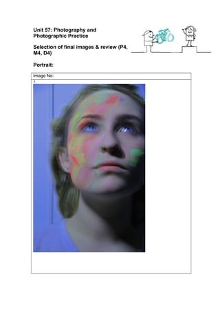
1. The theme of this image is colour I wanted to follow this throughout all my image the
focus in this image is the colour on the models (Emily) face I wanted to highlight the
colour and make it stand out more I wanted to make the image as unusual and
different to any other that I’d seen, the close up of her face was to show the colour
properly. Shining a light onto one side of her face was to bring out the colour this was
important. Having the double effect was part of my theme also making the colours a lot
more vibrant to make them stand out a lot more also slightly changing the colours from
the original image.
2. The theme for all my photos is colour and show it off in the image was important I
didn’t want them all to look the same so asking her to face different ways and look into
the camera was so each one was different the focus in this image is the small amount
of colour on the other side of the face as well as the full side of colour having just her
face in the image instead of shoulders makes you only look at the face. Having the
9. background changed to add colour was to add to my colour theme I didn’t want it to be
plain white also making it purple to match the colour on the face.
3. The theme for all my photos is colour and in this image I wanted the shoulders
upwards and I wanted to also include a lot more of the background to one side this was
purposely so I could frame it this also shows a lot of the colour on her face which the
choice for this image for to get as many different ‘poses’ as I could. The light shining
onto one side of her face was so I could get the shadowing around the edges. The
colours in this image are a lot brighter and extreme I liked the way the lighting on the
background comes out more the double effect was also another main focus.
4. The theme for all my images is colour, the focus in this image is the whole face I
wanted to get a front shot to get all the colour in on both sides of her face also
including her shoulders downwards it makes more of a profile shot and I wanted it to
be centred again its different from all the other images because it zoomed out unlike
most of the others also using the light on one side created a shadow around the top
edges and to the right side of her. Changing the background colour because I wanted
to avoid no colour also the double effect was part of my theme the colours are also
brought out a lot more.
5. The theme for all my images is colour, the focus in this image is her face and the
colour the most important thing and the reason I included it, zooming in and have a
plain background to the left makes you focus on her face also the light shining onto
one side of her face creates shadows. Having the background in black and white
makes the colour on the face stand out even more the only thing in this image that is in
colour is the face I wanted you to focus on her face to see the colour this is very
important because of my theme it almost looks like a mask.
6. The theme for all my images is colour, the focus in this image is her face having the
camera zoomed in gives you a better clear image of the colour I also wanted to get the
front shot and have it centred I wanted it to be ‘framed’ also the camera being focused
on her face and the surroundings slightly blurred makes you look at the main focus,
also having the light shining from the left of the image creates the shadowing behind
her and around the edges also it shines light on her face so you can see it a lot better.
The double effect in this image is very obvious because it’s on the colour it makes it
stand out and goes with my theme also adding colour to the background to take away
the white.
7. The theme for all my images is colour, the focus in this image is the shadowing one
face has the light on it the rest is shadowed I wanted the side of the face which had the
most colour on be lit up and be the main focus. I chose to have her centre and have
two sides of the background to help get the ‘two different sides effect’ with the
shadowing, also having some of her features be dark and shadowed makes the colour
stand out a lot more. Also having the two sides different colours, two colours which are
the same as the ones that are on her face they are all make more vibrant to make
them over exaggerated.
8. The theme for all my image is colour, the focus again in this image is the shadowing un
like the image before I wanted her to face the camera straight on instead on a side
shot of her face I wanted both sides to be seen but have one side more darker and
‘shadowed’ than the other, this is the only photo I have that is in full black and white I
thought I’d show colour in a different way because the colours on her face are now
greys and whites all in different shades.
9. The theme for all my images is colour, the focus in this image is the one side of her
face that has the most colour on it, it’s also a completely different shot from the others
having only half of her face in shot, I zoomed in with this also because I wanted the
detail of the colours to show more, I added colour to the background so it wasn’t plain
10. and take awake from the ‘colour’ also the slight doubled theme I have also is in this
image to frame the hair with a blue.
10. The theme for all my images is colour, the focus in this image is basically just her this
is the most zoomed out picture I have out of them all having the doubled effect makes
the colours on her face stand out, also I coloured the background to be a really bright
red I didn’t want to take away too much focus away from the model (Emily) but I didn’t
want the background to be a plain white. The double effect is the most obvious out of
them all in this image I wanted I to be different than the others.
Techniques used
1. I used rule of thirds because I wanted to frame the image with it being a portrait I think
its import to frame it to show of certain part, I also had lighting facing onto the ‘model’
so I had the same setting on most images.
2. I again used rule of thirds with this image because I wanted to frame it a certain way
using this helped me point the main parts I wanted to be the focus in the image.
3. I used the rule of thirds to frame my image and have certain points be made the main
focus. I wanted Emily (model) to be to one side to include some of the background I
didn’t want all the images to look the same.
4. I used the rule of thirds with this image because its portrait, I wanted to place Emily in
the middle of the image so using the 3x3 grid it helped find the main points in the
image.
5. I used the rule of thirds for this image so I could frame it because it was zoomed in I
wanted to have her face show as much colour as I could the 3x3 grid helped me with
the framing.
6. I used the rule of thirds with this image because I wanted it to be framed correctly I
wanted Emily (model) centred in the image also it helped me show what the main
points in the images were going to be.
7. I used the rule of thirds for this image because its close up I wanted to frame it and find
what the main points were going to be.
8. I used the rule of thirds with this image to frame it correctly I wanted to have Emily
centred as best as I could using the 3x3 grid helped me to place her.
9. I used the rule of thirds in this image because Emily (model) has only half her face in
so trying to get it lined up correctly to make have half of her face and half the wall in
the 3x3 grid helped.
10. I used rule of thirds with this image I wanted to make Emily (model) middle of the
image so using the 3x3 grid it helps me find where the middle is so then I could move
the camera to fit Emily into the middle.
Strengths & suggested improvements
1. The strengths in this image are the bright colours I like layered effect I have done it
makes the colours stand out and become a main focus in the image also I like the
angle of the image, I like the way its framed.
The weaknesses in this photo are the blending of the second layer of colour the edges
are slightly sharp and need to be blended in a bit more.
2. The strengths in this photo are the soft colours; the background colour matches some
11. of the colours on her face which brings out the purple a lot more.
The weakness in this photo is the way the model has her head turned having the side
of her face with the most colour away from the camera.
3. The strengths in this image is the angle I like the way she’s posed also the colours in
this image stand out which was Import part of my theme I wanted as much colour and
to over exaggerate it all
The weakness in his image is maybe the background colour takes away from the
colour on the face.
4. The strengths in this image is the angle how she’s centre of the image, I like how the
colours on her face stand out a lot and you can see it all on both sides as well.
The weakness is some of the edges need slightly touching up so the purple looks like it
was the original background.
5. The strengths in this image are the colours I like how detailed they are and how bold
and bright they are, I like how the colour is the main focus in the image.
The weakness is that I should have left her all in colour and just left the background
black and white.
6. The strengths in this image are the angle and framing of the image is centred and her
face is directly in the middle also the colours in the image stand out.
The weakness in this image is the background and the fact I have doubled the colour,
it takes away the original detail on her face also the colour in the background is over
powering.
7. The strengths in this image are the colour and the layered effect how I doubled the
image to create a border around the model to give is layers.
The weakness is the over powering background colours If I was to re do the editing I
would tone down on the colour to show more of the original colour and detail.
8. The strengths in this image is the angle I like how its framed it’s a good profile image
including her shoulders as well, also the shades on her face the mix of colours with the
white, greys and dark greys. Also the shadowing cast behind her and on her face.
The weakness in this image is how the right side of her face is completely dark and
you can’t see the detail.
9. The strengths in this are the bold colours I like how they are bright and stand out it also
shows off the detail of the powder on her face.
The weakness is this image is the background and how it doesn’t quite match up when
it meets her hair line.
10. The strengths in this image is the angle and the shadowing around the edges also it’s
a bright colour
The weakness in this photo is the editing style as taken away a lot of detail the original
image has a lot of shadowing and is very clear I feel as though the colour as taken this
away.
Editing details
1. I layered the image to get the colour to appear brighter and edited the background
colour to a slight tint of purple. Because I layered the image the colours doubled and
became almost 3d looking.
2. I have layered the image and added a purple tint to the background to make it
gradually fade as it gets to the model. I then blurred the image and edited the eye
colour to make it match some of the colours on the face.
12. 3. I layered the image to get a double/framed effect around the edges of the model I then
made the colours more vibrant to make them stand out, I then edited the background
the create a bold effect so it would add the ‘trippy’ look.
4. I layered the image and focused on the one layer to make the colours more vibrant and
to make them stand out, I then added a colour to the background editing it purple, and
also because I layered the image it doubled the edges.
5. I focused on the colour I wanted it to be the main focus so I decided to edit everything
else in black and white so the colour on the face would stand out I then edited the
colours to make them more vibrant.
6. I used the double effect on the colours in the face; I also changed the colours from the
original to make them appear more vibrant. I edited the colour of the background a
bright orange colour so it would match some of the colours in the face.
7. I edited the colour on the face to make it a lot more vibrant and bold so they stand out I
then also doubled the image to make it frame so it has a pink and green it also mixes
within the hair, I then added colour to the background I made the left side different to
the right both very bright colours.
8. I first added a black and white effect to the image; I messed around with the colour tool
which changed the tones on the face to a charcoal colour also made the shadowing a
lot darker so one side is in shadowing whilst the other is in light.
9. I made the colours on her face a lot more vibrant and to make it stand out it helps show
off the detail of the colours mixing, I then added a pink tint to the background so it
wouldn’t take away from the colours and look boring.
10. I doubled the image by layering the same image over the top I then moved it off to the
side to create a ‘ghost’ effect I edited the original layer by making the colours on the
face more vibrant, I then added a bold red colour to the background.
Capture Log
Setting Shutter Speed ISO Aperture
1. Manual
2. Manual
3. Manual
4. Manual
5. Manual
6. Manual
7. Manual
8. Manual
9. Manual
1. 1/15
2. 1/15
3. 1/15
4. 1/15
5. 1/15
6. 1/15
7. 1/15
8. 1/15
9. 1/15
1. 800
2. 800
3. 800
4. 800
5. 800
6. 800
7. 800
8. 800
9. 800
1. 5
2. 5
3. 5
4. 4.5
5. 5.6
6. 5
7. 5.6
8. 5
9. 5