10. Theme or focus of image & reasons for choice
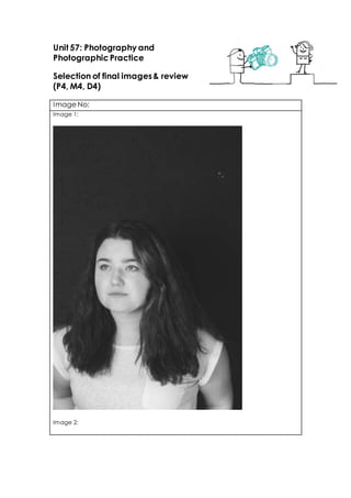
Image 1: The theme of my photo shoot is black and white and the focus was too
have good contrasted colours between the black and white. The shoot features a
friend doing different poses and showing different emotions. The reason for this is that
I wanted no colour and for it to be very monochrome.
Image 2: This image was more of a less serious photo to the other entire photos I shot
for my photo shoot; I used this because it shows a different side of the model and
allowed my images to be more varied. I did this to show that you don’t have to take
things seriously all the time and have a little fun.
Image 3: This is a lot more serious than the previous photo, the focus of this photo
shows that my model can also be versatile when it comes to showing different kinds
of emotion. I chose this photo because I thought it was very different to the other
photos.
Image 4: The focus of this photo was working on different poses and allowing to be
comfortable when modelling. When shooting I allowed my model to just relax and
pose however she wants so I can get real emotion with the photos.
Image 5: With this photo and the previous one I wanted to use some sort of prop to
make it more something to look at other than just a pretty face, I think using a prop
gave it more depth. The reason I choice this because again if was very different to
the other photos.
Image 6: The focus on each photo was to show a slightly different emotion so when
people look at the photo they feel what the model is feeling. I think them being in
black and white really sets the mood and I just love that effect. The reason I chose
11. this photo was because I just liked how the photo turned out.
Image 7: I think this is one of my favourite pictures from this shoot because its so
natural and works really well because it was taken out of context. The focus of this
image is like the others showing different emotions but with this one its completely not
set up and was basically just a test shot while the model prepares for the next photos
to be taken.
Image 8: This photo has got to be the least favourite of mine, don get me wrong I
love the way it came out I think it was just the angle of the shot and the way the
model was stood. The editing process was fine it was just the angles and positioning.
Image 9: This photo was a full face portrait looking right into the camera lens and I
think it works really well, the focus of the photo was once again to show different
emotions and I think this worked great. The reason I choose this photo was because It
was completely different to all the other photos I had taken in that shoot.
Image 10: This was one of the first ones I had taken and I told the model to just mess
around and get comfortable and start posing randomly and this is what the outcome
was. I like this photo because its vey different to the others and think it works realty
well, I chose this photo because of them reasons.
Techniques used
Image 1: One of the techniques I used and I thought it helped really well was the
white balance setting, I used this because the location was in a studio and the
lighting used was artificial.
Image 2: for this image I used auto focus as the artificial lighting was very bright and
in the right conditions to use it. I also used white balance setting again however I think
it bleached out the colour slightly.
Image 3: before taking this photo I decided to turn off one of the soft boxes so that
the light was more specifically focused on the model rather than the background as
well, I feel this gives a more crystal clear look to the photo and creates a darker look
to the back drop.
Image 4: for image four I decided to use manual focus on the lens to try and capture
the details myself, I feel doing this gives the photo a softer appearance, and the eyes
of the model appear brighter to the rest of the image which I am really keen on.
Image 5: I used the zoom on the camera to widen the shot and create more
negative space around the model, giving it something different to the rest of the
photos.
Image 6: I set the camera setting onto portraiture mode for this image and I think you
can tell, as the features of the model are more in focused and enhanced and the
eyes are brighter with the direct focus to the lens.
Image 7: I changed the aperture settings on the camera manually to accommodate
to the light, taking them slightly higher than necessary, however I feel this gives the
12. models skin a glowing quality.
Image 8: as the model was moving around in this photo I used a faster shutter speed
to capture her without blur, I think this gives a more relaxed look to the image.
Image 9: I used a 50mm lens to give the model more focus and a softer look to the
background, creating depth of field and giving a nice effect.
Image 10: I also used a 50mm lens here while switching the camera to landscape to
create diversity in the images. I feel landscape works well with the composition of the
model in the image.
Strengths & suggested improvements
Image 1: although I feel I captured the model well and the light gives her skin a soft
glow, I would improve this image by changing the way the model is holding her arms
as I feel it distracts from the rest of the image.
Image 2: this photograph is spontaneous and shows a playful and humorous side to
the model however I feel it is washed out, to improve I would change the aperture
settings to capture more detail.
Image 3: I like this image as it is dark and shows shadows and form better in the face,
to improve I would make sure the rest of the image is in focus, like the hair for
example, or change the composition so that she is more central in the frame.
Image 4: I do think this image is nice as it has soft qualities yet still holds detail in the
face however I feel that there is too much negative space above the model, to
improve I would lower the frame so that more of the model, like her arm, is shown.
Image 5: I prefer the composition of this image as the model is central and it feels
more satisfying to look at because of this, however the models mouth distracts from
the fragility of the image.
Image 6: I like this image for its dark colours, but I feel there is too much black which is
contrasted with the white of the models clothing, to improve I would either change
the models shirt to another colour or change the backdrop so that there is less black.
Image 7: I really enjoy the composition and pose from the model in this image
however again I feel the white shirt distracts from the soft balance of blacks and dark
shades in the image.
Image 8: I like the negative space contrasted betw een the models relaxed pose,
however I feel that the black back drop creates too much of a contrast and I feel it
would be more natural to have a different back drop
Image 9: although I like the detail in this image the photo was distorted so that the
facial features look rather odd, to improve I would change this
Image 10: I enjoy the pose in this image and also the dark shadows, however to
13. improve I would enlarge the frame by zooming out to capture more negative space
around the model and more of her arms.
Editing details
Instead of going into every detail of all 10 pictures that would just contain of a
repetition I’m just going to bulk it up into one big paragraph. When it came to the
editing process of these photo they were all done very much the same, first of all I
started to use the spot heal tool to clear any blemishes on the face. After doing this I
would then use the gradient map to then apply the black and w hite effect, which is
how I wanted my photos to turn out. Now onto the final part of my editing, to even
out the grey scale on the photo I would use the burn and dodge tool to apply lights
and darks to the photo.
Capture Log
Setting Shutter Speed ISO Aperture
Image 1:
Image 2:
Image 3:
Image 4:
Image 5:
Image 6:
Image 7:
Image 8:
Image 9:
Image 10:
1/50
1/50
1/50
1/50
1/50
1/50
1/50
1/50
1/50
1/50
800
800
800
800
800
800
800
800
800
800
f/4.5
f/4.5
f/4.5
f/4.5
f/5
f/5
f/4.5
f/4.5
f/4.5