12. Emma Upton
Theme or focus of image & reasons for choice
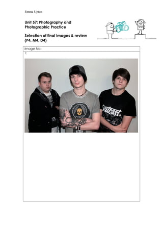
Image 1: In this image the main focus is the stance and whole look of the models,
however the lighting in this image draws attention to the model stood in the middle
as most of the light is on his face. I wanted the light to be mostly on the model in the
middle because his tattoos that are on clear view in this image perfectly represent a
rock band, which is what I was aiming for, as I think it fits perfectly for a rock music
magazine. The reason I chose this image is I think the stance of the models is definitely
a typical band stance, which is what I wanted to show through my images. I also
chose them to stand in front of a clear white background so that the models are the
entire main focus of the image.
Image 2: For this image again the main focus is the models and also the way their
stood. Each model has a different stance, which I think represents the personality
behind each of the models. The blank white canvas behind the models I think
definitely helps the models become the whole focus of the image. The reason I chose
this image is because it definitely looks like a typical rock band picture by the way
their stood, and the way they’re looking directly into the camera. I think this image is
perfect for a rock music magazine.
Image 3: With this image I wanted a different stance for the models so i had them sit
down on stairs so that each model was in shot. Again the focus of the image is the
models, however I think the positioning of the models is a bit more natural instead of
stood in front of a blank white canvas. However even with a different background I
think the focus is still fully on the models, which I think is because the models are
looking directly into the camera.
Image 4: This image is very similar to the last, being sat in the same place and again
looking directly into the camera. So to make this image different I took the image
closer to the models, so that the complete focus is the models faces. I think the look
on the models faces and the fact their all looking directly into the camera is also very
typical of a band picture.
Image 5: This image I chose to take outside against a brick wall. The focus is definitely
on the models again, with the models looking directly into the camera. I think this
definitely draws attention with the eye contact. The brick wall gives the image a more
urban look, and has more of a grunge effect. I think this is also a very typical rock
band image, due to the eye contact to the camera and the blank expression.
Image 6: This image is definitely the most natural image, as I captured the models
naturally laughing. I love this image, as I think it captured the happiness and emotions
naturally of the models. This image definitely stands out, and I think the black and
white effect definitely helps draw attention to this image. I think the colour effect
brings out the pure emotion within the image. The whole focus of this image is the
happiness and laughter showing through the image.
Image 7: I really like this image; I wanted to show the models outside but not against
the brick wall so I took the images in front of a dark fence to again show a more
grunge side rather than regular images inside.
Image 8: With this image I wanted the focus to again be on the whole band and
each of the models, which is why I chose to feature them all in the image and have
them look at the camera with a serious face. I think this is perfect, typical rock music
13. Emma Upton
band image, which is what I was aiming for.
Image 9: I really like this image and think it again looks like a typical band image,
however less serious than the previous images. They all have a slight grin and are all
looking directly into the camera, stood in a certain position. I really like the lighting in
this image as the light draws the attention and focus to the models, which is where
the most lighting falls.
Image 10: Again this is another image I really like; I think the lighting is perfect for an
outside image. I also like the fact that the models are not being serious, which is what
I was aiming for, because in rock music magazines (e.g. Kerrang!) there front cover
that includes bands, are never serious and have a humorous side too. The focus is
again the models and the way they are stood.
Techniques used
When taking all my images in manual I had full control of the shutter speed, f-stop
and ISO. I used an ISO of 300 when taking images inside because the room was very
well lit, however when taking them outside I took them at an ISO of 3200 in order to
get the right and enough lighting when outside.
I kept the f-stop around the same for each of the images of around f/3.5 to f/5 in
order to get as much lighting into each of the images as possible.
For the most posed pictures, I kept the shutter speed at about 1/60. However when I
wanted to take images that were more natural for example image 6; I had to use a
faster shutter speed to be able to capture the natural reactions.
Also I tried to include rule of thirds in each of the images, if I placed a grid over all the
images their faces, will fall on a joint where the lines of the grid meet.
Strengths & suggested improvements
Image 1: I think this image is quite strong for a typical band image that would fit in a
typical rock magazine. However if I were to take this image again, I would put the
model on the left more forward so he wasn’t so far behind everyone.
Image 2: I really like the overall theme of this image and I think it perfectly represents
a rock band, and I think it would look great in a rock music magazine. However if I
were to take this image again I think I would make the model on the far left look less
pale as I think he looks slightly too washed out or drained of colour.
Image 3: With this image I really like the whole theme of this image, and the way the
models are posed and their expressions. I think it’s a very typical band picture, with a
twist being sat down. However I think if I took this again I would stand a bit closer, to
capture more of their faces.
Image 4: I really like the theme of this image, and the look on the models faces.
However, I think a weakness to this image is the fact the model at the back is not
14. Emma Upton
really in focus compared to the other models in the image.
Image 5: I think this image definitely fits a rock band image, and I like the fact the
background is different and more urban looking, which again I think this fits for a rock
band image. However I think a weakness to this image could be a bit too bright and I
think there could be more colour on the models face.
Image 6: I really like this image and the natural emotion showing through the image.
However if I was to change anything I would change the model on the rights pose
with his hand and maybe looking away from the camera, so he was similar to the
other models.
Image 7: I really like this image and I think it definitely looks like a great typical rock
band image, with the way the models are standing. However if I took this image
again I would make sure no brick wall within the background of the images.
Image 8: I think this image is also quite a good typical rock band image; I really like
my use of lightings and the stance they are all in. I also like the fact the middle model
is stood to the back, however still catches attention. However I think a weakness
could be that the model in the middle is looking away from the camera which I think
would be better if he was looking directly into the camera like the other models.
Image 9: Again I think this image fits the stereotypical rock band image. I again really
like the lighting used in the image and think it draws attention to the models. However
I think a weakness could be that the model to the back is stood a bit further right
which I think would look better if the image was more symmetrical.
Image 10: With my final image I think one of the strengths of the image is that it is not
as serious as the previous images and I like the lighting used, I think it definitely grabs
the viewers’ attention and focus. However if I were to take this image again I would
take it horizontally instead of vertically to include more of the models.
Editing details
I didn’t really edit much on my images, i opened each of them individually in
Photoshop and adjusted the colour by changing the vibrancy, brightness and
contrast. Some of the images needed a bit more colour adjustment due to redness
on the models faces. The only other edit I made to the images was cropping some of
the image out, but besides that that’s the only thing I’ve edited on these images.
Capture Log
Setting Shutter Speed ISO Aperture
1.Manual
2. Manual
3. Manual
4.Manual
5.Manual
1/60
1/60
1/60
1/60
1/13
1/13
800
800
800
800
3200
3200
F/3.5
f/3.5
f/3.5
f/4.5