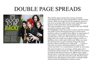
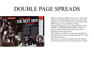
This double page magazine spread uses a typical rock layout with black, white, and pink colors. The large retro-style headline introduces an article that looks back on 1970s music. A pull quote in the headline attracts readers, while photos provide context without reading. Background information is included in a sidebar column. The overall retro design and references to drugs appeal to a young male audience interested in classic rock.
Tema: Five Senses / Relationship between human beings and their environment.
Objetivos:
To identify the five senses and their main organs.
To describe the main characteristics of each sense and compare them.
To identify the main function of each organ.
To explain the importance of how senses provide information about the environment.
Reinventing Home Telecare Services: Learning Lessons for Japan and Beyondjhalperin
This is the story of the initiative at Philips to bring the Lifeline personal emergency response service to Japan, with some lessons we learned along the way.
Everyone knows the power of stories, but when asked to come up with them, we struggle. Either we second guess ourselves as to the story's relevance, or we just come up blank and can't think of any. Unlocking Everyday Narratives: The Power of Storytelling in Marketing will teach you how to recognize stories in the moment and to recall forgotten moments that your audience needs to hear.
Key Takeaways:
Understand Why Personal Stories Connect Better
How To Remember Forgotten Stories
How To Use Customer Experiences As Stories For Your Brand
Short video marketing has sweeped the nation and is the fastest way to build an online brand on social media in 2024. In this session you will learn:- What is short video marketing- Which platforms work best for your business- Content strategies that are on brand for your business- How to sell organically without paying for ads.
The digital marketing industry is changing faster than ever and those who don’t adapt with the times are losing market share. Where should marketers be focusing their efforts? What strategies are the experts seeing get the best results? Get up-to-speed with the latest industry insights, trends and predictions for the future in this panel discussion with some leading digital marketing experts.
The session includes a brief history of the evolution of search before diving into the roles technology, content, and links play in developing a powerful SEO strategy in a world of Generative AI and social search. Discover how to optimize for TikTok searches, Google's Gemini, and Search Generative Experience while developing a powerful arsenal of tools and templates to help maximize the effectiveness of your SEO initiatives.
Key Takeaways:
Understand how search engines work
Be able to find out where your users search
Know what is required for each discipline of SEO
Feel confident creating an SEO Plan
Confidently measure SEO performance
First Things First: Building and Effective Marketing Strategy
Too many companies (and marketers) jump straight into activation planning without formalizing a marketing strategy. It may seem tedious, but analyzing the mindset of your targeted audiences and identifying the messaging points most likely to resonate with them is time well spent. That process is also a great opportunity for marketers to collaborate with sales leaders and account managers on a galvanized go-to-market approach. I’ll walk you through the methods and tools we use with our clients to ensure campaign success.
Key Takeaways:
-Recognize the critical role of strategy in marketing
-Learn our approach for building an actionable, effective marketing strategy
-Receive templates and guides for developing a marketing strategy
For too many years marketing and sales have operated in silos...while in some forward thinking companies, the two organizations work together to drive new opportunity development and revenue. This session will explore the lessons learned in that beautiful dance that can occur when marketing and sales work together...to drive new opportunity development, account expansion and customer satisfaction.
No, this is not a conversation about MQLs and SQLs. Instead we will focus on a framework that allows the two organizations to drive company success together.
Mastering Local SEO for Service Businesses in the AI Era is tailored specifically for local service providers like plumbers, dentists, and others seeking to dominate their local search landscape. This session delves into leveraging AI advancements to enhance your online visibility and search rankings through the Content Factory model, designed for creating high-impact, SEO-driven content. Discover the Dollar-a-Day advertising strategy, a cost-effective approach to boost your local SEO efforts and attract more customers with minimal investment. Gain practical insights on optimizing your online presence to meet the specific needs of local service seekers, ensuring your business not only appears but stands out in local searches. This concise, action-oriented workshop is your roadmap to navigating the complexities of digital marketing in the AI age, driving more leads, conversions, and ultimately, success for your local service business.
Key Takeaways:
Embrace AI for Local SEO: Learn to harness the power of AI technologies to optimize your website and content for local search. Understand the pivotal role AI plays in analyzing search trends and consumer behavior, enabling you to tailor your SEO strategies to meet the specific demands of your target local audience. Leverage the Content Factory Model: Discover the step-by-step process of creating SEO-optimized content at scale. This approach ensures a steady stream of high-quality content that engages local customers and boosts your search rankings. Get an action guide on implementing this model, complete with templates and scheduling strategies to maintain a consistent online presence. Maximize ROI with Dollar-a-Day Advertising: Dive into the cost-effective Dollar-a-Day advertising strategy that amplifies your visibility in local searches without breaking the bank. Learn how to strategically allocate your budget across platforms to target potential local customers effectively. The session includes an action guide on setting up, monitoring, and optimizing your ad campaigns to ensure maximum impact with minimal investment.
SMM Cheap - No. 1 SMM panel in the worldsmmpanel567
Boost your social media marketing with our SMM Panel services offering SMM Cheap services! Get cost-effective services for your business and increase followers, likes, and engagement across all social media platforms. Get affordable services perfect for businesses and influencers looking to increase their social proof. See how cheap SMM strategies can help improve your social media presence and be a pro at the social media game.
When most people in the industry talk about online or digital reputation management, what they're really saying is Google search and PPC. And it's usually reactive, left dealing with the aftermath of negative information published somewhere online. That's outdated. It leaves executives, organizations and other high-profile individuals at a high risk of a digital reputation attack that spans channels and tactics. But the tools needed to safeguard against an attack are more cybersecurity-oriented than most marketing and communications professionals can manage. Business leaders Leaders grasp the importance; 83% of executives place reputation in their top five areas of risk, yet only 23% are confident in their ability to address it. To succeed in 2024 and beyond, you need to turn online reputation on its axis and think like an attacker.\
Key Takeaways:
- New framework for examining and safeguarding an online reputation
- Tools and techniques to keep you a step ahead
- Practical examples that demonstrate when to act, how to act and how to recover
Mastering Multi-Touchpoint Content Strategy: Navigate Fragmented User JourneysSearch Engine Journal
Digital platforms are constantly multiplying, and with that, user engagement is becoming more intricate and fragmented.
So how do you effectively navigate distributing and tailoring your content across these various touchpoints?
Watch this webinar as we dive into the evolving landscape of content strategy tailored for today's fragmented user journeys. Understanding how to deliver your content to your users is more crucial than ever, and we’ll provide actionable tips for navigating these intricate challenges.
You’ll learn:
- How today’s users engage with content across various channels and devices.
- The latest methodologies for identifying and addressing content gaps to keep your content strategy proactive and relevant.
- What digital shelf space is and how your content strategy needs to pivot.
With Wayne Cichanski, we’ll explore innovative strategies to map out and meet the diverse needs of your audience, ensuring every piece of content resonates and connects, regardless of where or how it is consumed.
AI-Powered Personalization: Principles, Use Cases, and Its Impact on CROVWO
In today’s era of AI, personalization is more than just a trend—it’s a fundamental strategy that unlocks numerous opportunities.
When done effectively, personalization builds trust, loyalty, and satisfaction among your users—key factors for business success. However, relying solely on AI capabilities isn’t enough. You need to anchor your approach in solid principles, understand your users’ context, and master the art of persuasion.
Join us as Sarjak Patel and Naitry Saggu from 3rd Eye Consulting unveil a transformative framework. This approach seamlessly integrates your unique context, consumer insights, and conversion goals, paving the way for unparalleled success in personalization.
Videos are more engaging, more memorable, and more popular than any other type of content out there. That’s why it’s estimated that 82% of consumer traffic will come from videos by 2025.
And with videos evolving from landscape to portrait and experts promoting shorter clips, one thing remains constant – our brains LOVE videos.
So is there science behind what makes people absolutely irresistible on camera?
The answer: definitely yes.
In this jam-packed session with Stephanie Garcia, you’ll get your hands on a steal-worthy guide that uncovers the art and science to being irresistible on camera. From body language to words that convert, she’ll show you how to captivate on command so that viewers are excited and ready to take action.
5 big bets to drive growth in 2024 without one additional marketing dollar AND how to adapt to the biggest shifting eCommerce trend- AI.
1) Romance Your Customers - Retention
2) ‘Alternative’ Lead Gen - Advocacy
3) The Beautiful Basics - Conversion Rate Optimization
4) Land that Bottom Line - Profitability
5) Roll the Dice - New Business Models
The What, Why & How of 3D and AR in Digital CommercePushON Ltd
Vladimir Mulhem has over 20 years of experience in commercialising cutting edge creative technology across construction, marketing and retail.
Previously the founder and Tech and Innovation Director of Creative Content Works working with the likes of Next, John Lewis and JD Sport, he now helps retailers, brands and agencies solve challenges of applying the emerging technologies 3D, AR, VR and Gen AI to real-world problems.
In this webinar, Vladimir will be covering the following topics:
Applications of 3D and AR in Digital Commerce,
Benefits of 3D and AR,
Tools to create, manage and publish 3D and AR in Digital Commerce.
It's another new era of digital and marketers are faced with making big bets on their digital strategy. If you are looking at modernizing your tech stack to support your digital evolution, there are a few can't miss (often overlooked) areas that should be part of every conversation. We'll cover setting your vision, avoiding siloes, adding a democratized approach to data strategy, localization, creating critical governance requirements and more. Attendees will walk away with actions they can take into initiatives they are running today and consider for the future.
Come learn how YOU can Animate and Illuminate the World with Generative AI's Explosive Power. Come sit in the driver's seat and learn to harness this great technology.
2. CLASSIC ROCK
What characterizes the rock genre on this magazine front
cover is the dark background and text with a colour that
makes a strong contrast from dark to bright. Black and
red are also very typical when it comes to rock.
The picture of the man is placed in the middle and
because it is a medium longshot we can see his style and
how he is dressed and can easily recognize the rock
influence.
The fonts that is used is also very remarkable, especially
the main headline `Guns N` Roses` because of the small
details on each letter.
Each headline is written in a bigger size than the text
under. They give you the main info of what the articles in
the magazine are about and the text under makes you
very curious and makes you want to read about it. Small
buzz words such as “exclusive” is also used on the front
cover. This is to make the audience feel like it is
something special, something you don’t find in every
magazine and makes people feel more involved.
Up in the left corner you can see a note where it says
“FREE CD”. The note stands out cause of its yellow colour
and that its lapping the masthead. This is to attract
people to buy the magazine and is quite a good sales trick.
The sunglasses, the leather west, with his head tiltet to
the side and the chiarosairo lightning gives the man a
`bad boy` look.
3. CLASSIC ROCK
The main target for this magazine is clearly
people who likes rock, especially classic rock.
That you can tell both because of the Title of
the magazine and the text of what`s in it. The
layout is also important to show what the
magazine is about. Also here you have strong
contrasts between bright and dark colours.
Unlike maybe a pop magazine, rock
magazines often has very few colours, in this
case its only black, white and red that are
used. The black is often taken from the rock
image and
The black is often taken from the rock image and style
which a rockabilly person would wear. The red colour is
often used to attract the audiences attention.
These colours also makes the layout look very simple, but
at the same time a bit tough, stylish and cool.
The picture of Jimmy Page is centred in the middle of the
page and his head is placed over the masthead.
In addition to that it is placed a text what says “Led
Zeppelin” with big letters right over the picture of
Jimmy, in the middle of the magazine. This show that it is
two big articles in this issue of the magazine. One about
Jimmy and one about Led Zeppelin.
The picture of Jimmy is also edited in a certain way where
his face is half black and half white with a strong
contrast. This may be to represent his music, since rock
music is a mix between soft and rough.
The fonts are repeated and along with the font size it
creates a nice layout and it manages to drag the audiences
sight right where they want it to be. First the most
important and exciting stuff with a big font size and then
the rest written under each headline with a slightly
smaller size. The “FREE CD” note in the left top corner
attracts the audiences attention and is a good way to
make people buy the magazine.
4. MY ROCK
This magazines main target is first of all people that are into
rock music, maybe a bit rougher than normal. It is a clear
contrast between the colours but there are still a good match
and the green colour doesn`t stand out that much.
The picture is in a medium long shot and the person is placed
in the middle with many details such as insects around him.
Everything in the picture is kind of mysterious and the colour
are dark. Because of his long hair and a angry face expression
he gives a impression of darkness and rock. The masthead, title
of the magazine, is written in a big fat font in black with white
letters in the O. This doesn’t make it stand that much out and
the audience will give their attention to what the articles is
about instead.
The text doesn't really say much and the magazine seem to try
to catch the ones who already are interested in the different
bands they are writing about, rather then to write long and
interesting sentences to make other people read the magazine.
A bit down on the right side there is some text written in black
on a white background, that attracts more attention because of
the contrasts between the colours.
5. CONTENT PAGE
Again, the dominate colour are red, white and black.
The layout give us a retro feeling. This in most
because of the picture of Bruce Springsteen's back,
wearing jeans and a leather jacket and has a guitar
hanging on his back, that are chosen to be in black
and white. All this and because of that he has his
hands in his pockets and his legs from each other this
also represents Bruce Springsteen in a very cool,
slightly bad way.
6. CONTENT PAGE
Many content pages has many small different pictures and
numbers written different places all over the page.
This content page has a very tidy and nice layout. The text
colours are matching the background and the mans clothes.
Everything is black, white and red, and that is colours that are
very known in the rock world. The side numbers and the main
headline are written in red, the headlines are written in a bold
white font and the under text is written in a smaller and thinner
font size than the rest. This keep the layout organized and
makes it easy to read.
The picture is of a man standing bent towards the camera and
the shot is taken a bit above eye level so the person's face and
hand stands in focus. His clothes, the tattoos and the way he act
in front of the camera, with the face expression and the way he
stands, also represents the rock genre.
7. CONTENT PAGE
Even though this content page looks a bit messy you can see
a clear structure. The text is in the first column and in the
second and third there are pictures. The colours goes well
together, as in many other magazines the colours consists of
black, white and one specific colour that is often repeated in
both images and text. This makes the page look more tidy
and stylish.
There are three smaller pictures, two slightly bigger
pictures and one big picture. The size of the pictures is
based on how important the article is. The biggest picture is
placed in the middle of the page and has ` EXCLUSIVE`
written on it. This makes the readers think that this article
is special and are really worth to read.
The main headline in bold letters and in a big font size, so
its easy to see what magazine it is and what it is about.
Down to the left it is an orange rectangle with a green plus
sign on it. Because the background of the box is orange it
attracts the readers sight.
8. DOUBLE PAGE SPREADS
This double page attracts the viewers attention
immediately because of the big headline and the strong
colours. With the rough layout the magazine seems to
aim more at people who are into rock, especially men,
because of the masculine colours and shapes.
The main headline is in a very big font size and `BACK`
is written in green and is bold.
This highlights what the article is about and the readers
may find it more interesting because it seems more
exclusive when it is added extra effects on some parts of
the headline. Under the main headline you find the
introduction to the text. The band name is written in a
bigger font size at the top in green and are used as a
headline, but is still a part of the text. When you read
the introduction you get a feeling of what the main
article is about and because it ends with `…` it gives a
hint that it is more interesting stuff to read in the
article and that it is a continuation of what we just read.
The band members are covering a whole page and a
small piece of the second one. This could have been done
to make it look like its lesser text. Maybe their target
doesn’t like to read that much, and then a big picture is
a good way to make the text look small. The four band
members are also placed so they form a triangle shape
and are kind of including the audience more.
9. DOUBLE PAGE SPREADS
Typical rock layout. Black, white and a colour that
stands out. This double page also has a noticeable
sidebar to the right. There you can read about new
MCR tracks, a teaser of what's coming.
In the left upper corner it is placed a textbox with
`NEWS` and `WORLD EXCLUSIVE`. This is to
attract readers and let them know that this is
important and exciting news.
The headline is written in a big, more special font
and attracts the viewers attention quick. It is a pull
quote from the text
Also here it is used a lot of pictures of the band so
we know what the article is about without reading
10. DOUBLE PAGE SPREADS
This double page spread has a typical layout. Each
page has three columns and a sidebar with background
information.
The main headline is written in a big font size and in a
very retro font. The black background and the black
and white picture, the pink details and the word `
teenage head` makes references to drugs and this
appeal to a young male audience.
The introduction is written in yellow and with a bigger
font size than the actual article and introduces us to
what we are going to read about.
The whole layout is a very retro and old fashioned and
the text is about looking back to music in the 70`s.
In the middle of the two first columns on the second
page there is a picture of a poster of Jefferson Airplane
who was very big back in the old days.