Task 3 (1)
•Download as PPTX, PDF•
0 likes•168 views
The magazine aims to create a rebellious, punk, masculine and aggressive brand identity through various design elements. These include using bold sans-serif typography, masculine color schemes featuring red and black, and images depicting bands in aggressive poses. The language used also aims to portray a rebellious identity through words like "revolution". Together, these visual and linguistic elements target a younger, informal audience and establish a consistent brand across the front cover, context page, and double page spread.
Report
Share
Report
Share

Recommended
How effective is the combination of my main
The document discusses branding strategies for a band. It describes how the artist used consistent themes, styles, and color schemes across various media to create a cohesive brand image. Specific tactics mentioned include using vinyl disks and newspaper fonts to tie the print and video work together and reflect the band's genre. Font and imagery choices were meant to evoke a "ransom note" theme in line with the "Murder City" album title. Feedback praised the effective use of bright, abstract visuals and references across formats to engage audiences.
Presentation of fonts
The document discusses different fonts and their suitability for representing different music genres. It analyzes fonts for 80s rock, R&B, pop, and rap genres. For 80s rock, it notes a bold, blocky font that stands out. For R&B, it describes both bold blocky and more decorative, girly fonts using gold and silver. For pop, the fonts have flicks and curls with pinks and hearts, clearly representing the girly pop genre. For rap, it highlights basic, bold black fonts with blocks and spacing that are eye-catching while keeping the focus on the words, suitable for representing the rap genre.
How effective is the combination of my main
The document discusses the effectiveness of combining a band's main product with ancillary tasks like print work and music videos. It describes how the band used consistent themes, fonts, colors and imagery across their album cover, digipak, music video and poster to create a cohesive brand. Feedback indicated that the combination was effective, as viewers could easily link the different elements and understand the band's genre and themes.
Music Advert Analysis
The document analyzes a magazine advertisement for an artist's new album. It takes up two thirds of the page with a close-up shot of the artist making direct eye contact to draw attention. Her defiant expression and rebellious style with black and gold lipstick and accessories suggests the album will focus more on her personal attitudes. While black often has depressing connotations, the bright gold writing and accessories make the ad more appealing and catch the eye.
Main products and ancillary texts
The document discusses creating a cohesive brand image for an artist named Emerald across a digipak, magazine advert, and music video. It summarizes the consistent elements used across the three media, including Emerald's costume, makeup, and intense red dress/lipstick. The color schemes, fonts, and period details are also consistent to link the pieces together. The document provides details on design choices for the digipak and advert to guide the viewer's eyes along a reading path and emphasize different elements. It discusses how the pieces contribute to expanding Emerald's star qualities of glamour, dominance, and talent within a meta-narrative framework.
Initial Campaign design
The document outlines a marketing campaign design that incorporates the color red throughout to connote passion and sexuality. This includes using red lighting in photos and videos, displaying the artist's logo in red, and referencing Marilyn Monroe's iconic red lip. The campaign also aims to enhance the artist's Russian identity by using her Russian name "Sasha" and the Russian alphabet in the logo. Proposed designs for the digital album packaging and website involve sensual images that focus on the artist's appearance and emphasize the male gaze, such as reflecting the artist in a model's eyes.
Initial film poster and magazine covers
This document contains 3 posters and 3 magazine cover designs for an upcoming thriller film. The first poster uses a red streak and limited color palette to represent blood and the main character's scarf. It effectively includes all necessary media texts. The second poster experiments with splitting the key image into thirds to show the 3 main characters, but disconnects some elements. The third poster uses simple composition but establishes depth through character sizing and layering to show one character's control over the others. The magazine covers get progressively simpler, with the third using a promotional puff, skyline, and tagline to draw attention to the main image while including all necessary information.
Kristian Snow, Personal Branding Color & Fonts
The document discusses the branding choices for a website promoting a film producer working with Haitian culture. It explains that the font and color scheme choices were made to combine Haitian culture with film elegance. The triadic color scheme of red, blue, and beige was chosen because red and blue represent Haiti, and beige adds diversity while matching the designer's personality. Darker shades and black were selected for their power, elegance, and film connotations. References are provided discussing font meanings, color theory, and website design best practices.
Question 2
The document discusses a promotional campaign created for artist Caro Emerald that includes a music video, digipak, and magazine advertisement. It analyzes Emerald's typical "metanarrative" portrayal using red color, femme fatale style, and voyeuristic shots to appear sexually provocative and powerful. The campaign aims to develop this metanarrative through similar stylistic choices. Red lipstick, 1920s clothing, and shots that present the actress as glamorous yet unattainable are used across all three texts to signify sexuality, power and intrigue as in Emerald's work. Consistency of color palette, typography and visual motifs link the pieces to effectively promote Emerald's image and genre of electro-
Research for posters LO2
The document provides an analysis of several charity posters and leaflets that address homelessness. Key points made about each include:
- The Shelter England poster uses a dark color scheme and images of faces with text over the eyes to make people feel trapped and in need of donations.
- The Simon on the Streets poster features a photo of an alleyway and painted furniture to depict unsafe living conditions on the street.
- The Centre Point poster shows a smiling girl with toys to portray how the charity helps provide happy homes for young people.
- The Railway Children poster uses layered text and a gray color scheme with a partially invisible girl to symbolize the isolation of runaway children.
- The
Evaluation Task 2
The film includes a female character representing a middle-class English teenage girl studying in college, shown to be innocent and on her phone frequently like most teenage girls. It also includes a male stalker character dressed in all black to appear evil and scary without being too obvious initially to build suspense. Camerawork, lighting, editing and sound were used to manipulate audience perception of the characters, with dark lighting for the male and bright lighting for the female. While diverging somewhat from genre conventions by not using props for the male, the representations generally reinforce social stereotypes with the upbeat female and negatively portrayed stalker male.
Student ancillary analysis
The document provides an analysis of three student ancillary tasks evaluating digipaks from different bands. For the Arctic Monkeys digipak, the student likes the fonts and color scheme but finds the images hard to make out. For the mise-en-scene analysis, the student notes the casual costume fits the indie rock genre. The Sum 41 digipak fonts are hard to read and the band photo needs flipping. The Canopy Climbers digipak uses plain colors and fitting inside images, but the front fonts feel unprofessional.
Diary of make
The document discusses designing a logo for a magazine. The author experiments with graffiti fonts but finds the first one too animated and the second too urban and confusing. The third font is selected as it suits the magazine's ethos. The logo is done in capital black letters on the magazine cover to look urban and emphasize the title. A promotion sentence is added below along with a black, yellow and white color scheme to look smart and represent road colors.
Cd digipak analysis darius
Darius is posing on the front cover of his CD, casually dressed but appearing wealthy. Images throughout depict an American road trip, including motels, roads, and a bus ticket, creating a narrative that Darius is on a journey across the US. The beach and road settings depicted have different moods - beaches are happy while roads are more serious. Technical codes like lighting also vary, from relaxed high-key lighting to sadder blue hues, suggesting the journey did not end well for Darius.
Evaluation of fashion spreads
The document discusses four fashion spreads for a teenage lifestyle magazine. Each spread includes a photo of a model in edgy clothing against a gritty background, along with accompanying text. The intention is to portray a rebellious teenage aesthetic. The photos use lighting, sharpness and other edits to emphasize the models and backgrounds. The text is paired with the images in a way that does not distract from the models or clothing. The fonts, styles and positioning of the text also aim to convey a casual, rebellious tone appropriate for teenagers.
Presentation4
Semiotics is the study of signs and symbols. It examines how meaning is created and communicated through signs such as words, images, sounds, gestures and objects. There are three main types of signs: icons resemble what they signify, indexes are causally connected to what they signify, and symbols signify based on learned conventions. This article provides examples of different signs like traffic lights and discusses how semiotics can be used to analyze images and uncover deeper meanings and cultural codes.
Final products
The final logo incorporated a heart with two arrows crossing through it. The logo symbolized strength, love, and the ability to defend oneself and move forward after experiencing pain or a broken heart.
Posters featured stripped back images of models to show vulnerability. Images were in black and white to keep them raw and eye-catching while conveying innocence, purity, evil, and sadness. Catchy text stood out against the images and quotes provided context.
Bus advertisements kept a lighthearted tone for varied audiences. They featured the logo, bold fonts, and catchy motto while maintaining a bus theme. Merchandise like keychains, badges, and stickers featured minimal designs with just the logo to promote recognition without
Question 1 medi a
The document discusses conventions of comedy films and how the author's media product used and challenged some of those conventions. Some of the main conventions discussed include using bright, populated locations filmed during the day, locations like schools and bars, natural camera work and medium shots, funny dialogue and edited sounds, socially awkward or idiotic characters, subgenres like romance, exaggerated acting and props for humor. The author notes their film was set in a house and school, used theme music and portrayed an idiotic teacher character. They included credits in a creative way and did not follow conventions for titles or rely on dialogue for humor. The film included twists and used speech bubbles and facial expressions for comedy.
FMP Pre Production
This document provides information on using shapes and colors in character design. It discusses how different shapes like squares, circles, and triangles can be used to convey personality traits like strength, friendliness, and danger. It also explains how colors can immediately provide understanding of a character and how their saturation, size, and location can influence meaning. The document then shares examples of character designs and provides style sheets describing the creative choices and meanings behind each design's shapes, colors, and combinations. The style sheets give insights into how the designs represent the characters' backgrounds, personalities, and roles in stories.
FMP Pre Production Refined
This document provides information on using shapes and colors in character design. It discusses how different shapes like squares, circles, and triangles can be used to convey certain personality traits. Squares represent strength and reliability, circles represent friendliness and safety, and triangles represent danger and hostility. It also discusses how mixing shapes can create complex designs.
It then discusses using color in character design. Certain colors can immediately provide understanding of a character's personality, and color combinations, saturation, and placement can emphasize different traits.
The rest of the document includes style sheets and descriptions for several original character designs. It explains the creative choices behind each design and how the use of shape, color, clothing, and other visual elements represent aspects of
Changed Fmp pre production
This document discusses principles of character design using shapes and colors. Regarding shapes, squares convey strength and reliability, circles portray friendliness and safety, and triangles can represent danger but also cunningness. Combining shapes creates complex designs. Colors also convey meanings - red may indicate hostility, blues represent loyalty, and warm colors like yellow signal friendliness. Limited but expressive color palettes emphasize hues. Character designs are shown using shapes and colors to portray intended traits and backgrounds.
Changed Fmp pre production
This document discusses techniques for character design using shapes and colors. Regarding shapes, squares convey strength and reliability, circles portray friendliness and safety, and triangles can indicate danger but also cunning. Combining shapes creates complex representations. Colors also convey meanings immediately - red often signifies hostility, blues represent loyalty, and warm colors like yellow indicate friendliness. Limiting a character's color palette while using varied saturation focuses the design. The document provides examples of character designs incorporating these techniques and principles.
Textual analysis of real texts
This CD advertisement features bright colors and doodle-like designs that attract attention. Mika's name is written in large white capital letters against a blue outline, indicating his importance and masculine identity. The album title appears on an angle, suggesting he is alternative. A small black-and-white image of Mika represents his serious side, while the vibrant colors overall suggest multiple aspects to his personality. The use of contrasting colors makes the text stand out. Release date information allows viewers to know when the album will be available.
Question 1 evaluation
The document discusses conventions of comedy films and how the media product challenges or develops those conventions. Some key conventions included are bright locations filmed during the day, schools and homes as common settings, natural camera work and medium shots, funny dialogue and edited sounds, socially awkward or idiotic characters, and exaggerated acting. The media product sets most of its scenes in a house and high school to follow conventions. However, it uses social realism as its subgenre rather than the typical romance subgenre of comedies. It presents credits in a creative way within the film and uses a simple title rather than hinting at the plot.
Analysis Of Magazine Adverts
1) The magazine advert uses bright, girly imagery of a dollhouse and flowers to suggest pop music, but the lyrics are unconventional. This contrast was likely intentional to break conventions and make the artist more interesting.
2) The image takes up most of the advert and shows the artist looking at the camera, creating a direct address. This hints at deeper emotions but her defiant expression shows a focus on attitude and rebelliousness.
3) Black and gold colors catch the eye through their breaks from conventions, selling the artist's brand and love of "bling".
Presentation1 10 things i hate about you
This trailer summary analyzes key scenes from 10 Things I Hate About You. It discusses the mise-en-scene, editing, camerawork, and sound of several clips. The clips show two sisters with different personalities, one popular and one not. They also introduce two male characters, one who seems to like one of the sisters. Throughout, the analysis focuses on how these elements provide context and insight into the characters' relationships and personalities to help the audience understand the story.
Genre research
The group has chosen to create a thriller-romance genre for their teaser trailer to appeal to a wide audience. They will combine conventions from both genres, drawing inspiration from films like "Safe Haven" and "The Boy Next Door". The trailer will feature two main characters, a male protagonist who also portrays his alter ego antagonist due to an identity disorder, and a female protagonist. It will have settings from both genres, including a school/college campus, woodland, and homes. The narrative follows a boy and girl who meet in school, fall in love, but the boy begins to lose time due to his alter ego going on killing sprees without his knowledge.
SITWA Infrastructure Study
Preparation of an action plan for SITWA/ANBO support services
Christophe BRACHET, Hubert ONIBON
Media AS-LEVEL powerpoint on q magazine
Bauer Media Group publishes Q Magazine, a music magazine in the UK. Q targets all music lovers by featuring different genres and artists on its covers each month, such as Liam Gallagher and Lana Del Rey. This wide appeal has made Q the world's most successful music magazine. Q began publishing in 1986 and sometimes includes bonus CDs to promote sales.
IWRM Planning
This document summarizes a study on strengthening integrated water resources management (IWRM) planning in African lake and river basin organizations (L/RBOs). The study identified several gaps in IWRM planning processes, including a lack of cooperation and strategic planning. It also found needs such as improving stakeholder participation and developing water resources data systems. The study proposed priority actions that ANBO could take over five years, such as fostering regional policy frameworks, building capacity, and strengthening monitoring and evaluation of IWRM implementation. It concluded with recommendations for ANBO to take a flexible, demand-driven approach and ensure coordination across initiatives supporting African L/RBOs.
More Related Content
What's hot
Question 2
The document discusses a promotional campaign created for artist Caro Emerald that includes a music video, digipak, and magazine advertisement. It analyzes Emerald's typical "metanarrative" portrayal using red color, femme fatale style, and voyeuristic shots to appear sexually provocative and powerful. The campaign aims to develop this metanarrative through similar stylistic choices. Red lipstick, 1920s clothing, and shots that present the actress as glamorous yet unattainable are used across all three texts to signify sexuality, power and intrigue as in Emerald's work. Consistency of color palette, typography and visual motifs link the pieces to effectively promote Emerald's image and genre of electro-
Research for posters LO2
The document provides an analysis of several charity posters and leaflets that address homelessness. Key points made about each include:
- The Shelter England poster uses a dark color scheme and images of faces with text over the eyes to make people feel trapped and in need of donations.
- The Simon on the Streets poster features a photo of an alleyway and painted furniture to depict unsafe living conditions on the street.
- The Centre Point poster shows a smiling girl with toys to portray how the charity helps provide happy homes for young people.
- The Railway Children poster uses layered text and a gray color scheme with a partially invisible girl to symbolize the isolation of runaway children.
- The
Evaluation Task 2
The film includes a female character representing a middle-class English teenage girl studying in college, shown to be innocent and on her phone frequently like most teenage girls. It also includes a male stalker character dressed in all black to appear evil and scary without being too obvious initially to build suspense. Camerawork, lighting, editing and sound were used to manipulate audience perception of the characters, with dark lighting for the male and bright lighting for the female. While diverging somewhat from genre conventions by not using props for the male, the representations generally reinforce social stereotypes with the upbeat female and negatively portrayed stalker male.
Student ancillary analysis
The document provides an analysis of three student ancillary tasks evaluating digipaks from different bands. For the Arctic Monkeys digipak, the student likes the fonts and color scheme but finds the images hard to make out. For the mise-en-scene analysis, the student notes the casual costume fits the indie rock genre. The Sum 41 digipak fonts are hard to read and the band photo needs flipping. The Canopy Climbers digipak uses plain colors and fitting inside images, but the front fonts feel unprofessional.
Diary of make
The document discusses designing a logo for a magazine. The author experiments with graffiti fonts but finds the first one too animated and the second too urban and confusing. The third font is selected as it suits the magazine's ethos. The logo is done in capital black letters on the magazine cover to look urban and emphasize the title. A promotion sentence is added below along with a black, yellow and white color scheme to look smart and represent road colors.
Cd digipak analysis darius
Darius is posing on the front cover of his CD, casually dressed but appearing wealthy. Images throughout depict an American road trip, including motels, roads, and a bus ticket, creating a narrative that Darius is on a journey across the US. The beach and road settings depicted have different moods - beaches are happy while roads are more serious. Technical codes like lighting also vary, from relaxed high-key lighting to sadder blue hues, suggesting the journey did not end well for Darius.
Evaluation of fashion spreads
The document discusses four fashion spreads for a teenage lifestyle magazine. Each spread includes a photo of a model in edgy clothing against a gritty background, along with accompanying text. The intention is to portray a rebellious teenage aesthetic. The photos use lighting, sharpness and other edits to emphasize the models and backgrounds. The text is paired with the images in a way that does not distract from the models or clothing. The fonts, styles and positioning of the text also aim to convey a casual, rebellious tone appropriate for teenagers.
Presentation4
Semiotics is the study of signs and symbols. It examines how meaning is created and communicated through signs such as words, images, sounds, gestures and objects. There are three main types of signs: icons resemble what they signify, indexes are causally connected to what they signify, and symbols signify based on learned conventions. This article provides examples of different signs like traffic lights and discusses how semiotics can be used to analyze images and uncover deeper meanings and cultural codes.
Final products
The final logo incorporated a heart with two arrows crossing through it. The logo symbolized strength, love, and the ability to defend oneself and move forward after experiencing pain or a broken heart.
Posters featured stripped back images of models to show vulnerability. Images were in black and white to keep them raw and eye-catching while conveying innocence, purity, evil, and sadness. Catchy text stood out against the images and quotes provided context.
Bus advertisements kept a lighthearted tone for varied audiences. They featured the logo, bold fonts, and catchy motto while maintaining a bus theme. Merchandise like keychains, badges, and stickers featured minimal designs with just the logo to promote recognition without
Question 1 medi a
The document discusses conventions of comedy films and how the author's media product used and challenged some of those conventions. Some of the main conventions discussed include using bright, populated locations filmed during the day, locations like schools and bars, natural camera work and medium shots, funny dialogue and edited sounds, socially awkward or idiotic characters, subgenres like romance, exaggerated acting and props for humor. The author notes their film was set in a house and school, used theme music and portrayed an idiotic teacher character. They included credits in a creative way and did not follow conventions for titles or rely on dialogue for humor. The film included twists and used speech bubbles and facial expressions for comedy.
FMP Pre Production
This document provides information on using shapes and colors in character design. It discusses how different shapes like squares, circles, and triangles can be used to convey personality traits like strength, friendliness, and danger. It also explains how colors can immediately provide understanding of a character and how their saturation, size, and location can influence meaning. The document then shares examples of character designs and provides style sheets describing the creative choices and meanings behind each design's shapes, colors, and combinations. The style sheets give insights into how the designs represent the characters' backgrounds, personalities, and roles in stories.
FMP Pre Production Refined
This document provides information on using shapes and colors in character design. It discusses how different shapes like squares, circles, and triangles can be used to convey certain personality traits. Squares represent strength and reliability, circles represent friendliness and safety, and triangles represent danger and hostility. It also discusses how mixing shapes can create complex designs.
It then discusses using color in character design. Certain colors can immediately provide understanding of a character's personality, and color combinations, saturation, and placement can emphasize different traits.
The rest of the document includes style sheets and descriptions for several original character designs. It explains the creative choices behind each design and how the use of shape, color, clothing, and other visual elements represent aspects of
Changed Fmp pre production
This document discusses principles of character design using shapes and colors. Regarding shapes, squares convey strength and reliability, circles portray friendliness and safety, and triangles can represent danger but also cunningness. Combining shapes creates complex designs. Colors also convey meanings - red may indicate hostility, blues represent loyalty, and warm colors like yellow signal friendliness. Limited but expressive color palettes emphasize hues. Character designs are shown using shapes and colors to portray intended traits and backgrounds.
Changed Fmp pre production
This document discusses techniques for character design using shapes and colors. Regarding shapes, squares convey strength and reliability, circles portray friendliness and safety, and triangles can indicate danger but also cunning. Combining shapes creates complex representations. Colors also convey meanings immediately - red often signifies hostility, blues represent loyalty, and warm colors like yellow indicate friendliness. Limiting a character's color palette while using varied saturation focuses the design. The document provides examples of character designs incorporating these techniques and principles.
Textual analysis of real texts
This CD advertisement features bright colors and doodle-like designs that attract attention. Mika's name is written in large white capital letters against a blue outline, indicating his importance and masculine identity. The album title appears on an angle, suggesting he is alternative. A small black-and-white image of Mika represents his serious side, while the vibrant colors overall suggest multiple aspects to his personality. The use of contrasting colors makes the text stand out. Release date information allows viewers to know when the album will be available.
Question 1 evaluation
The document discusses conventions of comedy films and how the media product challenges or develops those conventions. Some key conventions included are bright locations filmed during the day, schools and homes as common settings, natural camera work and medium shots, funny dialogue and edited sounds, socially awkward or idiotic characters, and exaggerated acting. The media product sets most of its scenes in a house and high school to follow conventions. However, it uses social realism as its subgenre rather than the typical romance subgenre of comedies. It presents credits in a creative way within the film and uses a simple title rather than hinting at the plot.
Analysis Of Magazine Adverts
1) The magazine advert uses bright, girly imagery of a dollhouse and flowers to suggest pop music, but the lyrics are unconventional. This contrast was likely intentional to break conventions and make the artist more interesting.
2) The image takes up most of the advert and shows the artist looking at the camera, creating a direct address. This hints at deeper emotions but her defiant expression shows a focus on attitude and rebelliousness.
3) Black and gold colors catch the eye through their breaks from conventions, selling the artist's brand and love of "bling".
Presentation1 10 things i hate about you
This trailer summary analyzes key scenes from 10 Things I Hate About You. It discusses the mise-en-scene, editing, camerawork, and sound of several clips. The clips show two sisters with different personalities, one popular and one not. They also introduce two male characters, one who seems to like one of the sisters. Throughout, the analysis focuses on how these elements provide context and insight into the characters' relationships and personalities to help the audience understand the story.
Genre research
The group has chosen to create a thriller-romance genre for their teaser trailer to appeal to a wide audience. They will combine conventions from both genres, drawing inspiration from films like "Safe Haven" and "The Boy Next Door". The trailer will feature two main characters, a male protagonist who also portrays his alter ego antagonist due to an identity disorder, and a female protagonist. It will have settings from both genres, including a school/college campus, woodland, and homes. The narrative follows a boy and girl who meet in school, fall in love, but the boy begins to lose time due to his alter ego going on killing sprees without his knowledge.
What's hot (19)
Viewers also liked
SITWA Infrastructure Study
Preparation of an action plan for SITWA/ANBO support services
Christophe BRACHET, Hubert ONIBON
Media AS-LEVEL powerpoint on q magazine
Bauer Media Group publishes Q Magazine, a music magazine in the UK. Q targets all music lovers by featuring different genres and artists on its covers each month, such as Liam Gallagher and Lana Del Rey. This wide appeal has made Q the world's most successful music magazine. Q began publishing in 1986 and sometimes includes bonus CDs to promote sales.
IWRM Planning
This document summarizes a study on strengthening integrated water resources management (IWRM) planning in African lake and river basin organizations (L/RBOs). The study identified several gaps in IWRM planning processes, including a lack of cooperation and strategic planning. It also found needs such as improving stakeholder participation and developing water resources data systems. The study proposed priority actions that ANBO could take over five years, such as fostering regional policy frameworks, building capacity, and strengthening monitoring and evaluation of IWRM implementation. It concluded with recommendations for ANBO to take a flexible, demand-driven approach and ensure coordination across initiatives supporting African L/RBOs.
Task 4
- The document analyzes how various design elements of a magazine cover and articles target a young male audience aged 15-24.
- These elements include aggressive typography, dark color schemes involving black and red, images of bands portraying danger and violence, and simple informal language.
- All of these elements are used to portray a masculine, rebellious persona that would appeal to the target demographic.
Media powerpoint q magazine
Bauer Media Group publishes Q Magazine, a music magazine in the UK. Q targets all music lovers by featuring different genres and artists on its covers each month, such as Liam Gallagher and Lana Del Rey. This wide appeal has made Q the world's most successful music magazine. Q has been published since 1986 and sometimes includes bonus CDs to promote sales.
Pembuatan user di oracle
1. Dokumen tersebut membahas tentang pembuatan user baru, penggunaan privileges, dan login menggunakan user yang telah dibuat pada database Oracle. Langkah-langkah pembuatan user baru meliputi penggunaan perintah CREATE USER dan ALTER USER, sedangkan privileges dibagi menjadi system privileges dan object privileges.
Test shot homework
This document lists people and locations that will be used for test shots, as well as ideas for the types of images that will be taken including ideas for content pages, double page spreads, and a front cover. The test shots will feature Mitchell, Dewrey, Hannah, Bayes, Celine, Norgate, and the assistant in open areas surrounded by fields, by a sign, in an abandoned place, and at an old church and brick wall.
Iwrm planning ppp draft 2
This document summarizes a study on strengthening integrated water resources management (IWRM) planning in African river and lake basin organizations (L/RBOs). The study identified several gaps in current IWRM planning processes, including a lack of cooperation between countries, weak stakeholder participation, and limited data and capacity. To address these gaps, the study recommends priority actions such as fostering regional cooperation, improving data collection and information sharing, and building capacity through training. Based on the findings, the study proposes a 5-year program for the African Network of Basin Organizations to provide support to L/RBOs in developing and implementing IWRM plans. The program focuses on strengthening governance, increasing knowledge management and capacity building
Needs and gaps Climate Change Study for SITWA_niras
Needs and Gaps & Proposed Services
“Climate change vulnerability, adaptation and development agendas in the African RBOs”
by
NIRAS Natura AB International Consulting
Task 11 front cover
This document contains 3 draft front cover designs. Each draft includes an image proposed for the front cover. The document seeks to select one of the 3 draft designs to serve as the final front cover.
Task one.
Kerrang magazine covers rock, metal and pop-punk genres and features interviews with bands like Bring Me The Horizon and Foo Fighters. Its main audience is mostly male aged 15-24 from socioeconomic class ABC1. Mojo focuses on older artists like Pink Floyd and Grace Jones through interviews and news, targeting mainly males aged 45-54 from ABC1. Top of the Pops profiles chart-topping pop artists like One Direction and Nicki Minaj through gossip, fashion, and interviews, aiming for 85% female ABC1 readership aged 12.
Task 11 context page
This document contains draft content pages for an upcoming project. Draft one includes 4 images, draft two includes 6 images, and draft three includes 3 images laid out in different configurations across the pages.
Media AS-LEVEL powerpoint on inception
The document analyzes the 2010 film Inception from the perspectives of its institution, audience, genres, and production process. It discusses that the film was produced by Legendary Pictures and Syncopy Films. The target audience was teens and young adults interested in confusing sci-fi action movies. The genres included science fiction, heist film, and film noir. Principal photography took place in locations like Tokyo, London, Paris, and Canada. Christopher Nolan directed the film and aimed to keep effects realistic while using music to convey emotion.
Viewers also liked (14)
Needs and gaps Climate Change Study for SITWA_niras
Needs and gaps Climate Change Study for SITWA_niras
Similar to Task 3 (1)
Task 4
- The document analyzes how various design elements of a magazine cover and articles target a male-leaning audience ages 15-24. These include bold, masculine typography; dark color schemes representing death and darkness; and images of bands portraying aggression, tattoos, and messy hair.
- The language uses simple, informal words to appeal to younger readers. Positive words are used to portray bands favorably and attract the target audience.
- Photographs show bands engaging in violence or with unkempt appearances to relate to how the target audience sees themselves. Dark tones and colors like black and red create masculine, aggressive impressions.
Task 3
The document discusses how NME magazine uses stylistic elements like font, color, images and layout to create a masculine brand identity that appeals to their male audience. Specifically, it notes that NME consistently uses the same red color and sans-serif font in mastheads. Images are placed haphazardly to create a concert-like feel related to the music industry. Black backgrounds are used with white text titles and sections to give a chic yet masculine look. The informal language, images of drinking culture, and references to pubs and live performances further reinforce this masculine brand identity.
Music magazine Analysis
This document provides analysis of images and text from different music magazines. It discusses the main images of Katy Perry and Cheryl Cole, analyzing things like their facial expressions, positioning, use of lighting and how they are being used to attract both male and female audiences. It also summarizes the use of color, typography, layout, language and double page spreads in the magazines. Overall, it examines how symbolic and visual elements are strategically employed in the magazines to appeal to target demographics.
Brand identity and Mode of Address analysis
This document analyzes the language, typography, images, and layout used in Billboard magazine. It summarizes that the magazine uses a formal yet accessible tone and familiar music terminology to engage its target audience of young adults. Images of popular artists who appeal to both female and male readers are featured. A consistent sans-serif font and color scheme of red, blue, and yellow create a distinctive visual identity across issues. The organized layout emphasizes important articles and follows conventions expected by the audience. Overall, the magazine's design effectively communicates its brand as lively yet informative through consistent formal elements that relate to its readers' interests in music and celebrity culture.
Question 2 explanation
The document discusses how various visual elements in a magazine represent masculinity. It analyzes how the artist's body language, facial expression, clothing, and plain background connote anger, power, and popularity. The magazine's use of colors like black, red, and yellow are said to connote power, success, anger, and dominance. Additional masculine representations discussed include the artist's youth, masculine style of dress, and the magazine's use of sans-serif fonts and pull quotes depicting passion and ambition. Feminine representations, like a softer image of a smiling woman in a fluffy coat, are contrasted as well.
Evaluation – Question Two
This document discusses how the promotional package for a film establishes a consistent brand identity across different marketing platforms. It analyzes how the film "The Boy Next Door" created an effective brand identity through using a limited color palette, font style, and focusing on the main actress as the central marketing point. The document then describes how the student group created a brand identity for their hypothetical film "The Girl in Red" by focusing on the color red, a specific font, and the main character's red scarf. It explains how this brand identity was then consistently represented through the teaser, poster, and magazine cover to clearly communicate the thriller/romance genre.
Final why are fonts and colours important
The document discusses the importance of fonts and colors in magazines and how they convey messages about the target audience and genre. It states that rounded, smooth fonts portray a magazine as "pop" because they look fun, while bold, sharp fonts convey "rock" as they look more serious. Pastel colors suggest "pop" as they are playful, while black and red symbolize "rock" as they are darker and moodier. Colors also indicate the target gender audience. The document provides examples of appropriate and inappropriate font and color choices for conveying different magazine genres and audiences.
Evaluating Existing Products
The document analyzes magazine covers aimed at hip hop audiences. Some key techniques used across covers include prominent images of rappers in masculine poses to appeal to young male readers, bold colors and fonts that stand out and are easy to read, and minimal text focusing attention on the central image. Covers also portray rappers using stereotypical signifiers of wealth, style and risk-taking to present aspirational figures for the target demographic.
1.Research for print
The document provides an analysis of different magazine covers and pages, including their mastheads, fonts, images, and color schemes. Key points analyzed include how different design elements are used to convey the magazine's brand and values. Specific magazines summarized include Vogue, Empire, and Delicious magazine covers and pages. Font styles, placement of images and text, and color choices are examined for how they reflect the magazine's topic and target audience.
Signs And Signifiers - Music Magazines
The document discusses conventions used in rock music magazines. It analyzes front covers and contents pages of magazines like Kerrang and Rock Sound. Dark colors, gritty photos, and sans-serif fonts are used to represent rock's aggressive nature. Photos use close-ups and intimidating expressions to set a dark mood. Typography imitates band logos or uses bold colors to stand out. Contents pages clearly list sections and secondary images to inform readers while maintaining a rock style.
why are fonts and colours important
The document discusses how fonts and colors are important in conveying the intended message and target audience of magazines. Different fonts and colors portray different genres, ages, and genders. For example, rounded fonts with smooth edges portray pop magazines as less harsh and more fun, while bold, sharp fonts convey rock magazines as more serious and intimidating. Color choices also influence perceived genre, with pastels suggesting pop and darker hues like black and red symbolizing rock. Font size additionally indicates importance, with larger text used for mastheads and titles. The document provides examples of appropriate and inappropriate font and color combinations for conveying different magazine genres.
Molly baker 123
This document analyzes the language, representations, images, colors, layout, and fonts used in a music magazine contents page. It finds that the language uses colloquialisms and abbreviations to appeal to a young audience. The images of bands portray mystery and confidence through poses and rock/pop-style clothing. Red is the dominant color that ties to the magazine's logo. Cover stories are distinguished in a separate box without explicit labels. Font size and style are used strategically to guide the eye to important information.
Task 5
This document analyzes the representation techniques used across multiple pages of a magazine featuring artist Akon. It examines the images, fonts, colors, language and lighting employed on the front cover, content page, and double page spread. The analysis finds that masculine sans-serif fonts, low-key colors, relaxed poses in images of young adults, and informal language are used consistently to represent Akon and target a young male audience.
Question 5
This document discusses how the author appealed to their target audience in designing the front cover, contents page, and double page spread for a magazine.
For the design elements, the author used dark, masculine colors like red, black, and grey that are associated with indie/rock. Sans-serif fonts were used to appeal to the younger, male target audience. Images featured close-ups of artists with angry facial expressions and dark costumes.
The overall mode of address across the materials was aggressive but also conveyed passion through the body language and expressions in the images. Consistency was maintained through using the same design elements to create a recognizable house style.
Question 5
This document describes how the author appealed to their target audience in designing the front cover, contents page, and a double page spread for a magazine.
The author used colors like red, yellow, black, grey and white that are conventional for indie/rock genres. Images featured close-ups of artists with dark clothing and angry facial expressions. Sans-serif fonts were used to appeal to the target audience of younger males.
A consistent style was maintained across pages with the same colors, fonts and aggressive yet passionate modes of address. Images conveyed passion through body language while colors represented violence. The double page spread featured a black and white mid-shot that portrayed the artist as stylish and powerful.
Question 5
This document describes how the author appealed to their target audience in designing the front cover, contents page, and a double page spread for a magazine.
The author used colors like red, yellow, black, grey and white that are conventional for indie/rock genres. Images featured close-ups of artists with dark clothing and angry facial expressions. Sans-serif fonts were used as more masculine and appealing to younger males.
The same colors, fonts and styles were carried through each section for consistency. Images showed artists' body language and costumes to convey passion. The mode of address across sections was aggressive but passionate to match the target audience.
Magazine analysis
The document summarizes the design elements of several magazine covers and contents pages:
- Magazine covers use bold mastheads, colorful cover lines, central images of celebrities, and coordinated color schemes to attract attention and convey information about the publication and topics.
- Contents pages organize information through headings, images, logos and issue dates to inform readers about articles and establish a consistent brand identity.
- Design choices like fonts, layout, colors and photographs are used strategically to target intended audiences and portray particular tones or messages about the publications and their subjects.
Representations of people in rock magazines
The document discusses conventions used in rock/punk magazines and imagery to portray aggression and violence. Specifically, it mentions:
1) Bold, large fonts appeal to punk audiences and become a code for aggression in music magazines.
2) Font styles with cracked glass textures connote violence and aggression through references to shattered glass.
3) Dark colors, close-up shots, and horror masks in images create representations of the rock/punk genre being aggressive, dominant, and unapproachable.
4) Capital letters and phrases like "he could be your worst enemy" in pull quotes signify aggression through their boldness and threatening message.
Industry analysis
The contents page uses stylish typography and bold fonts to appeal to younger audiences. A large image of a woman is used to grab attention and represent the magazine's ideology. Key information like articles and sections are highlighted through spacing, fonts, and positioning to easily direct the reader.
Evaluation – Question Two
The promotional products for the film effectively establish the same genre across different platforms by creating a consistent brand identity. The brand identity uses the color red, a serif font, and the main character's red scarf. This identity is featured in the teaser trailer, promotional poster, and magazine cover, allowing each product to clearly suggest the thriller/romance genre. Specifically, the poster uses lighting and blood to convey the thriller element, while proxemics show the romance. The magazine cover focuses more on romance through its lighter tone and exclusive character interview.
Similar to Task 3 (1) (20)
More from JennaEngland89
Task 11 double page spread
This document contains 3 draft designs for a double page spread. Each draft is presented on its own page and is intended to showcase different visual concepts or layouts for the double page spread. The drafts provide options to choose from in developing the final design for the double page spread.
Task 9
The survey responses showed that 75% of respondents were between ages 15-17, females, listened to rock/metal music, and read magazines like Kerrang and Rock Sound. This matches the target audience for the magazine. Respondents also expressed interest in band interviews, photos of popular rock/metal bands like My Chemical Romance and Nirvana, and a dark color scheme. The survey provides useful guidance on what content and design elements will appeal most to the target readership and allows the creator to design a magazine that meets their preferences.
Task 9
The survey results will help the author design a magazine for their target audience. 75% of respondents were ages 15-17, which matches the target age range. 75% also listened to rock/metal music and read magazines like Kerrang and Rock Sound. Respondents wanted to see interviews with bands, photos of bands like My Chemical Romance and Nirvana, and a dark color scheme. The survey provides useful insights into what the target audience wants to see in a magazine about rock/metal music.
Task 3 (1)
The magazine aims to create a rebellious, punk, masculine and aggressive brand identity through various design elements. These include using bold sans-serif typography, masculine color schemes featuring red and black, and images depicting bands in aggressive poses. The language used also aims to portray a rebellious identity through words like "revolution". Together, these visual and linguistic elements target a younger, informal audience and establish a consistent brand across the front cover, context page, and double page spread.
Homework one
The Kerrang magazine contains several sections, including articles on various bands, information about upcoming concerts and events, album and concert reviews, and advertisements. The articles profile bands such as Black Veil Brides, Asking Alexandria, Architects, Rise to Remain, and Bury Tomorrow. The magazine also includes charts, letters from readers, and posters. Advertisements feature products like the new Wolfenstein video game, websites for supporting readers and football statistics, and shops selling band merchandise.
Task 3
The magazine aims to create a rebellious, punk, masculine and aggressive brand identity through various design elements. These include using bold sans-serif typography, masculine color schemes featuring red and black, and images depicting bands in aggressive poses. The language used also aims to portray a rebellious identity through words like "revolution". Together, these visual and linguistic elements target a younger, informal audience and establish a consistent brand across the front cover, context page, and double page spread.
Homework 1
The Kerrang magazine contains articles on various rock bands, interviews, information on upcoming concerts and events, album reviews, and advertisements. Key articles discuss the debate around Kurt Cobain's death, an exclusive interview with Bring Me The Horizon about their success over the years, an interview with Bayside about their dedicated fanbase, and a piece on Blitz Kids' upcoming largest headlining event. The magazine also includes information on bands like Metallica, Tonight Alive, Coldrain, Of Mice & Men, Neck Deep, and Five Finger Death Punch. Advertised products include other music magazines, special offers on Kerrang, Google Play, and rock-inspired clothing lines.
Task 2
The document analyzes the typography, layout, colors, images, language, and conventions used on the front cover, contents page, and a double page article spread of the magazine "Rock Sound".
The analysis finds that sans serif fonts are used throughout to appear masculine and appeal to the target younger male audience. Bold fonts are used for mastheads and band names to stand out. Dark colors like black and reds are used to connote aggression and relate to the genre of music covered. Images portray the dark style of bands to match the music. Language is simple and informal to be accessible to younger readers. The magazine follows conventions of metal magazines in its bold masculine design.
Task 1
Kerrang magazine covers rock, metal and pop-punk genres and features interviews with bands like Bring Me The Horizon and Foo Fighters. Its main audience is mostly male aged 15-24 from socioeconomic class ABC1. Mojo focuses on older artists like Pink Floyd and Grace Jones through interviews and news, targeting mainly male ABC1 readers aged 45-54. Top of the Pops profiles chart-topping pop artists like One Direction and Nicki Minaj through gossip, fashion and interviews, aiming for 85% female ABC1 readers aged 12.
More from JennaEngland89 (10)
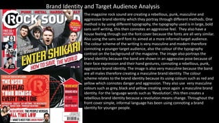
Task 3 (1)
- 1. Brand Identity and Target Audience Analysis The magazine rock sound are creating a rebellious, punk, masculine and aggressive brand identity which they portray through different methods. One method is by using different typography, the typography used is in large, bold sans serif writing, this then connotes an aggressive feel. They also have a house feeling through out the font cover because the fonts are all very similar. Also using the sans serif font its aimed at a more informal target audience. The colour scheme of the writing is very masculine and modern therefore connoting a younger target audience, also the colour of the typography contrast on the background of the magazine. The image also portrays the brand identity because the band are shown in an aggressive pose because of their face expression and their hand gestures, connoting a rebellious, punk, aggressive brand identity. The image is also very masculine because the band are all males therefore creating a masculine brand identity. The colour scheme relates to the brand identity because its using colours such as red and yellow which connotes danger and aggression. They also use very masculine colours such as grey, black and yellow creating once again a masculine brand identity. For the language words such as ‘Revolution’, this then creates a rebellious brand identity because a revolution means change. Throughout the front cover simple, informal language has been using connoting a brand identity for younger people.
- 2. The context page is creating a dark, demonic, rebellious/ playful brand identity. They do this through the different types of typography they use. For example the typography is very large and makes a statement making it stand out and seem very aggressive. It is also in sans serif making a younger brand identity. The typography colour scheme is also important because the colours white and red are creating a demonic brand identity because red is associated with the devil. The Image also creates a playful brand identity because the male is shown to be making a stupid face making him look childish and playful. He is shown to be wearing a shirt and tie which is given him a punk persona or even a childish high school look. The colour scheme creates the brand identity because its very dark and twisted especially the background because its in block black colour and black connotes death and darkness. The colours on the context page also create a house feeling with the front page. The language on the content page creates the aggressive demonic brand identity because it says things like ‘they kill you’ and ‘I’m actually quite terrified’. This is very straight forward at what its trying to say and it uses words such as ‘kill’ and ‘terrible’ which are strong, dark words. The language is also simple creating a younger brand identity because the language is more informal portraying a younger audience.
- 3. The double page spread creates a disturbing, Sinster brand identity, the magazine first does this through the typography. This is done by having the mast head looking like its written in blood, this then gives the typography a satanic look, also the red writing backs up the satanic look because red connotes blood and death therefore it can be related to Sinster/ satanic life. The image also creates an even more disturbing brand identity because the male is shown to be wearing dark, smudged make up, making him look aggressive and that he is like a ‘follow of the devil’. His facial expression is also aggressive, even though he has his tongue out it is not taken in fun silly way, but in a dark/ death like way. The man is also shown to be eating a persons brains which automatically gives him a zombie persona, this then portrays the brand identity to be very dark and twisted. The background creates a dark brand identity because its of a brick wall which is shown as dirty and reminds you of a prison wall which then connotes misery and crime, relating to the brand identity. The colour scheme is very important on creating the disturbing brand identity because the page is made to look like it’s slightly dirty and the red writing connotes on this making it seem more masculine. The red writing and the dirty walls all connote a deathlike feel creating the right brand identity for this magazine. The language also creates a perfect brand identity for the magazine because the fist words you're drawn to is ‘darkly’ and ‘devious’. These words are clearly dark and aggressive words, suiting the brand identity because these word s are connoting death and despair. The other words are very simple on the page making it more informal creating a younger target audience.