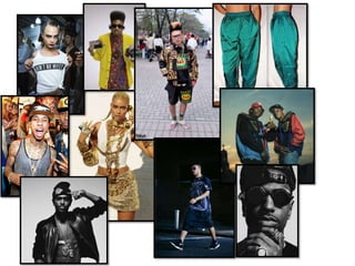
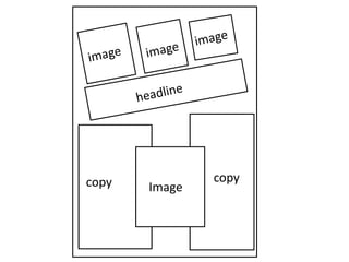
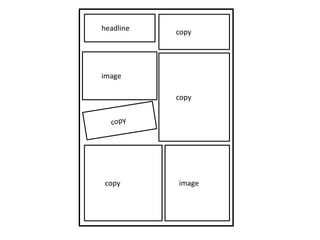
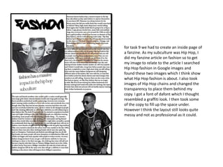
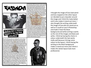
Imagecopy copy
image
imagecopy
copy
copyheadline
for task 9 we had to create an inside page of
a fanzine. As my subculture was Hip Hop, I
did my fanzine article on fashion so to get
my image to relate to the article I searched
Hip Hop fashion in Google images and
found these two images which I think show
what Hip Hop fashion is about. I also took
images of Hip Hop chains and changed the
transparency to place them behind my
copy. I got a font of dafont which I thought
resembled a graffiti look. I then took some
of the copy to fill up the space under.
However I think the layout still looks quite
messy and not as professional as it could.
I thought the image of Cara look weird
and too cropped on the other layout
so I decided to put a boarder around
the image and I think this looks better
and it also makes it stand out more. I
also thought the writing underneath
the image of Cara did not stand out as
well as it could so I put it Photoshop
and made it have the black
background and white writing is works
as the rest of the images and black and
white. I think by having the chains in
colour underneath the text works
really well because it brings some
colour to the layout. I think having the
writing on the black background
makes it stand out more and I think it
makes the whole layout look more
professional.

Task 9

  • 4.
  • 5.
  • 6.
    for task 9we had to create an inside page of a fanzine. As my subculture was Hip Hop, I did my fanzine article on fashion so to get my image to relate to the article I searched Hip Hop fashion in Google images and found these two images which I think show what Hip Hop fashion is about. I also took images of Hip Hop chains and changed the transparency to place them behind my copy. I got a font of dafont which I thought resembled a graffiti look. I then took some of the copy to fill up the space under. However I think the layout still looks quite messy and not as professional as it could.
  • 7.
    I thought theimage of Cara look weird and too cropped on the other layout so I decided to put a boarder around the image and I think this looks better and it also makes it stand out more. I also thought the writing underneath the image of Cara did not stand out as well as it could so I put it Photoshop and made it have the black background and white writing is works as the rest of the images and black and white. I think by having the chains in colour underneath the text works really well because it brings some colour to the layout. I think having the writing on the black background makes it stand out more and I think it makes the whole layout look more professional.