Download to read offline
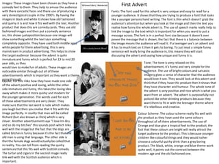
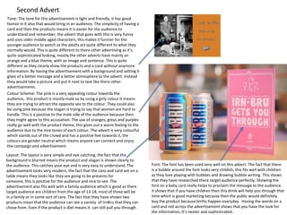
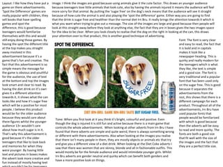

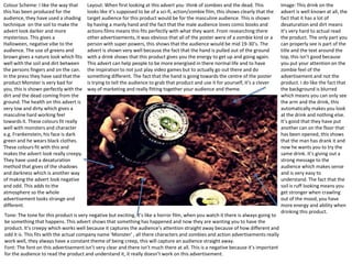
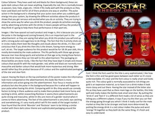

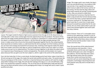

The document analyzes several Irn Bru advertisements. It discusses the images, fonts, colors, layouts, and tones used in the ads. The images are meant to be humorous and appeal to teenagers. Black and white images portray an old-fashioned style while bright colors like orange and blue are used to attract a younger audience. Fonts are casual and easy to read. Layouts keep the messages concise using different shapes and positioning of text. The tones across all ads are meant to be positive, quirky and humorous in order to appeal to teenagers.


![5G Explained! A High Level Overview [Introduction]](https://cdn.slidesharecdn.com/ss_thumbnails/5gexplainedahighleveloverview-260119165306-cc137a3e-thumbnail.jpg?width=640&height=640&fit=bounds)


