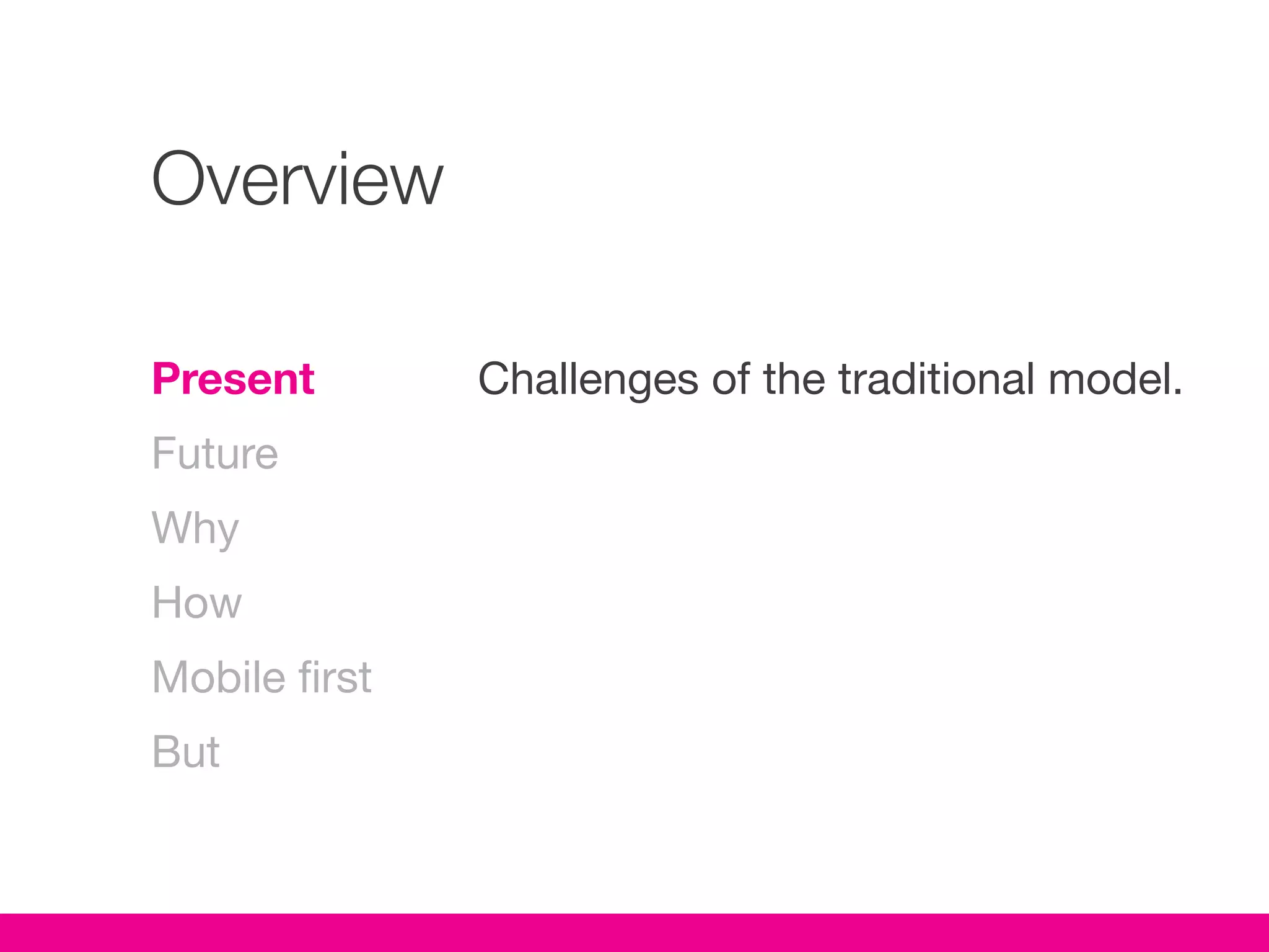
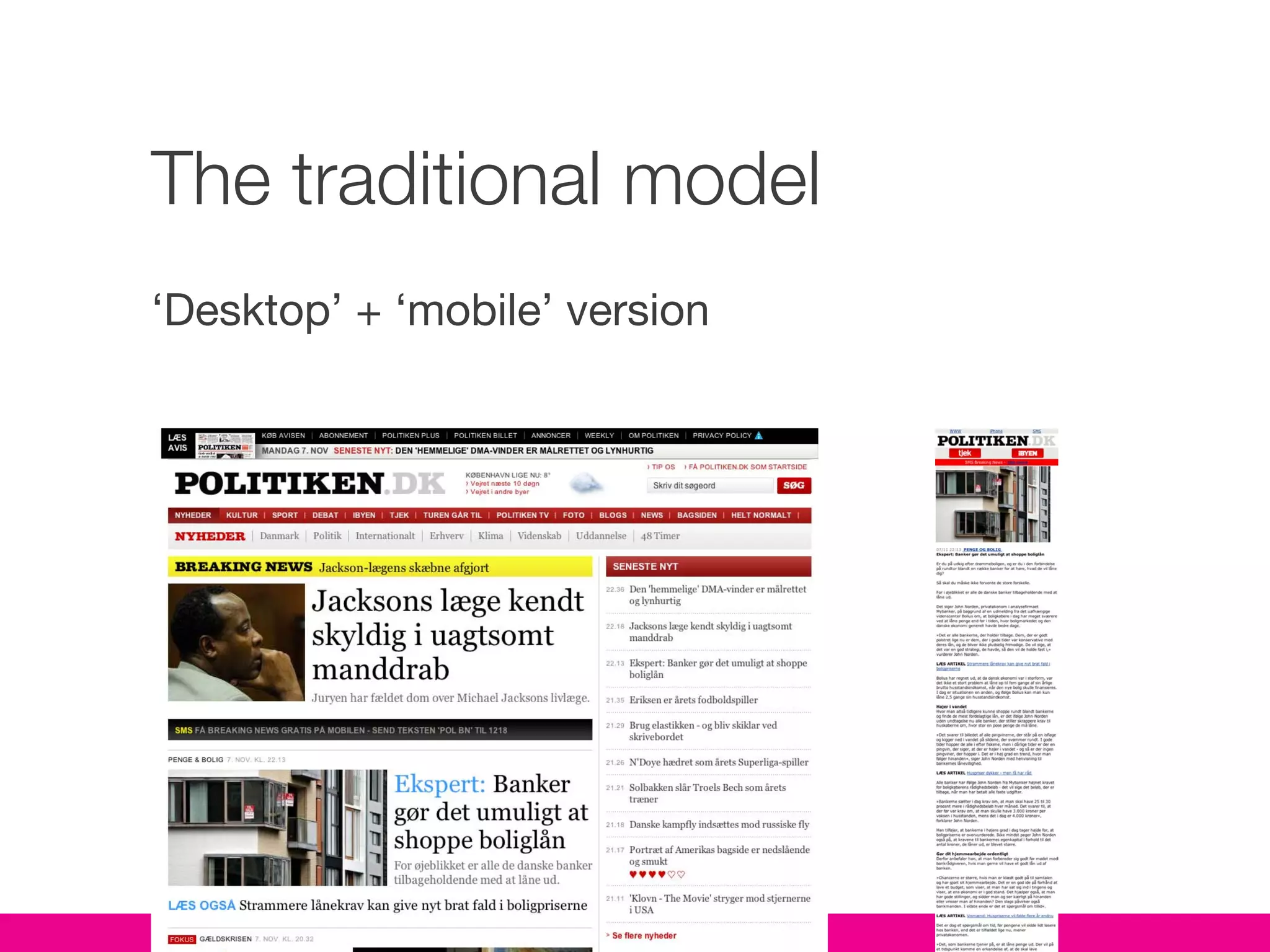
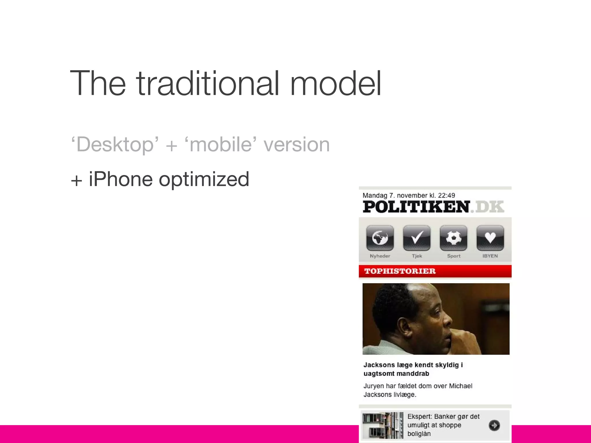
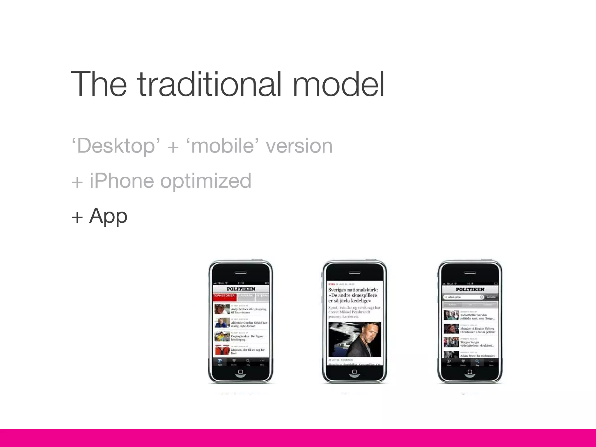
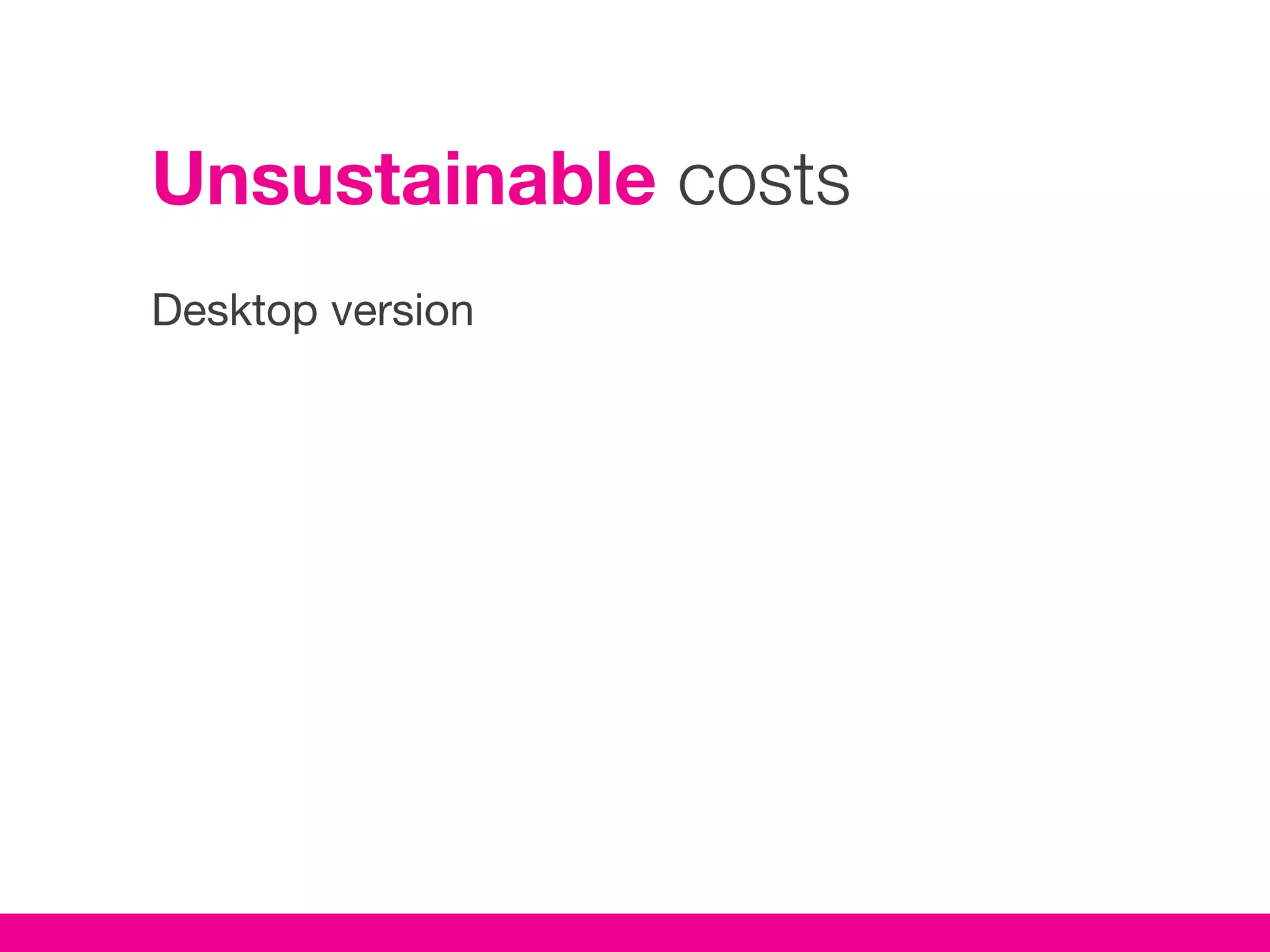
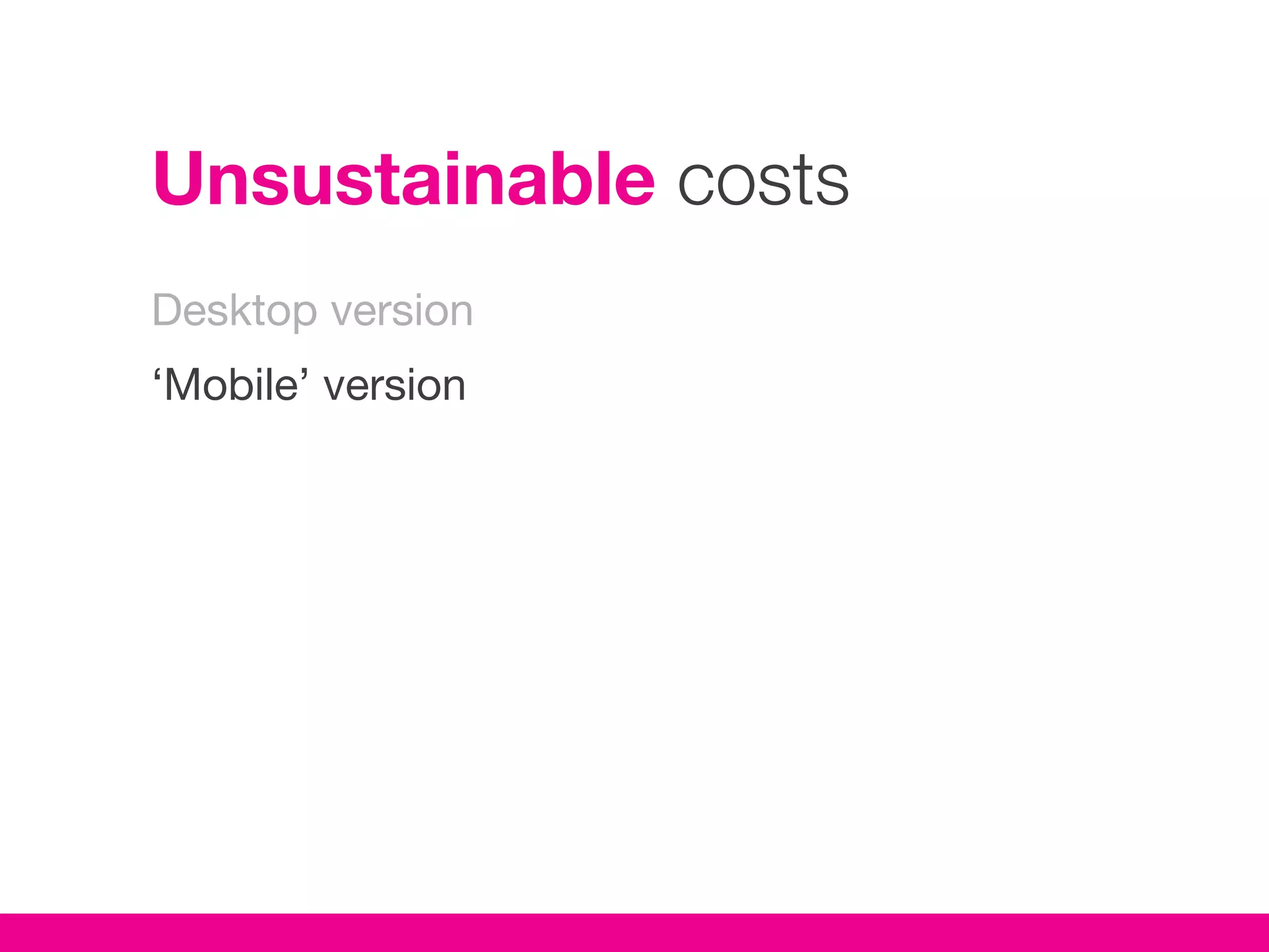
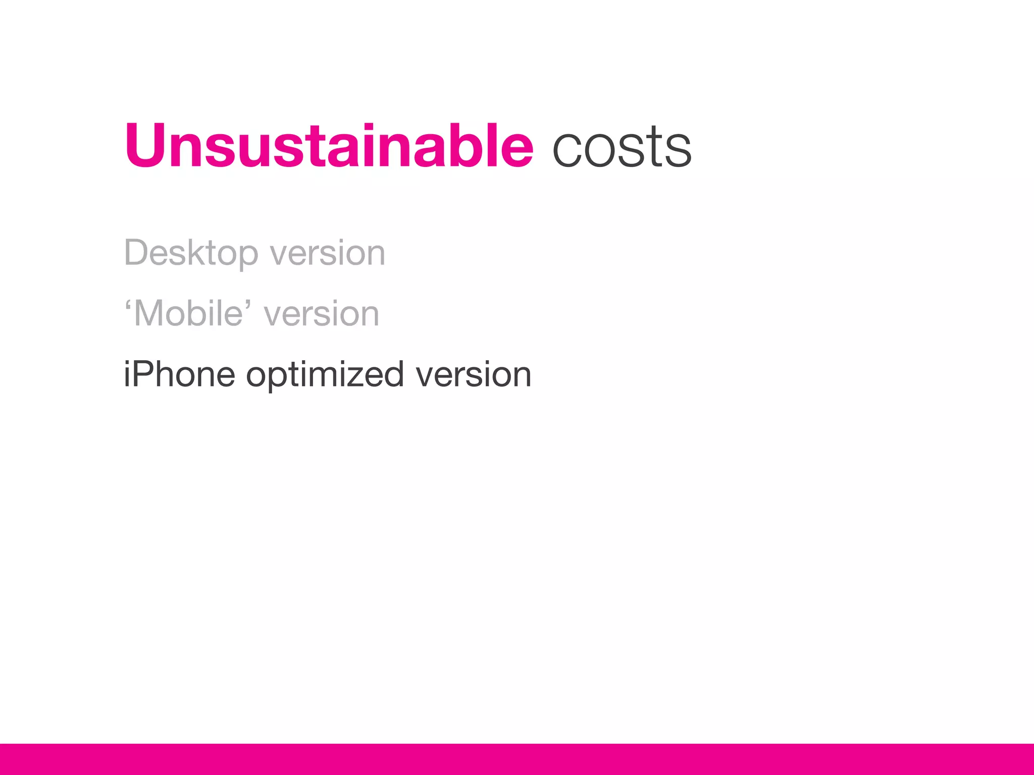
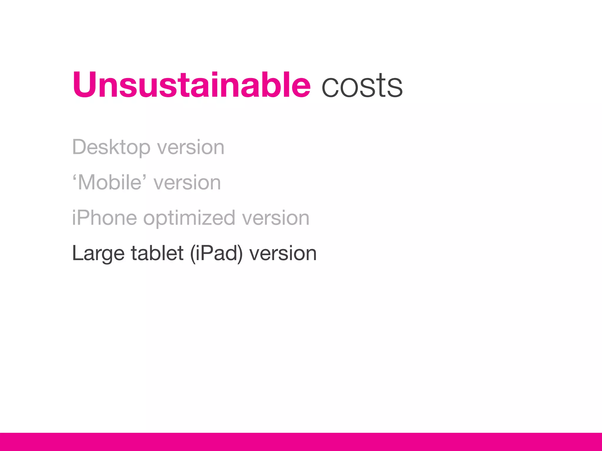
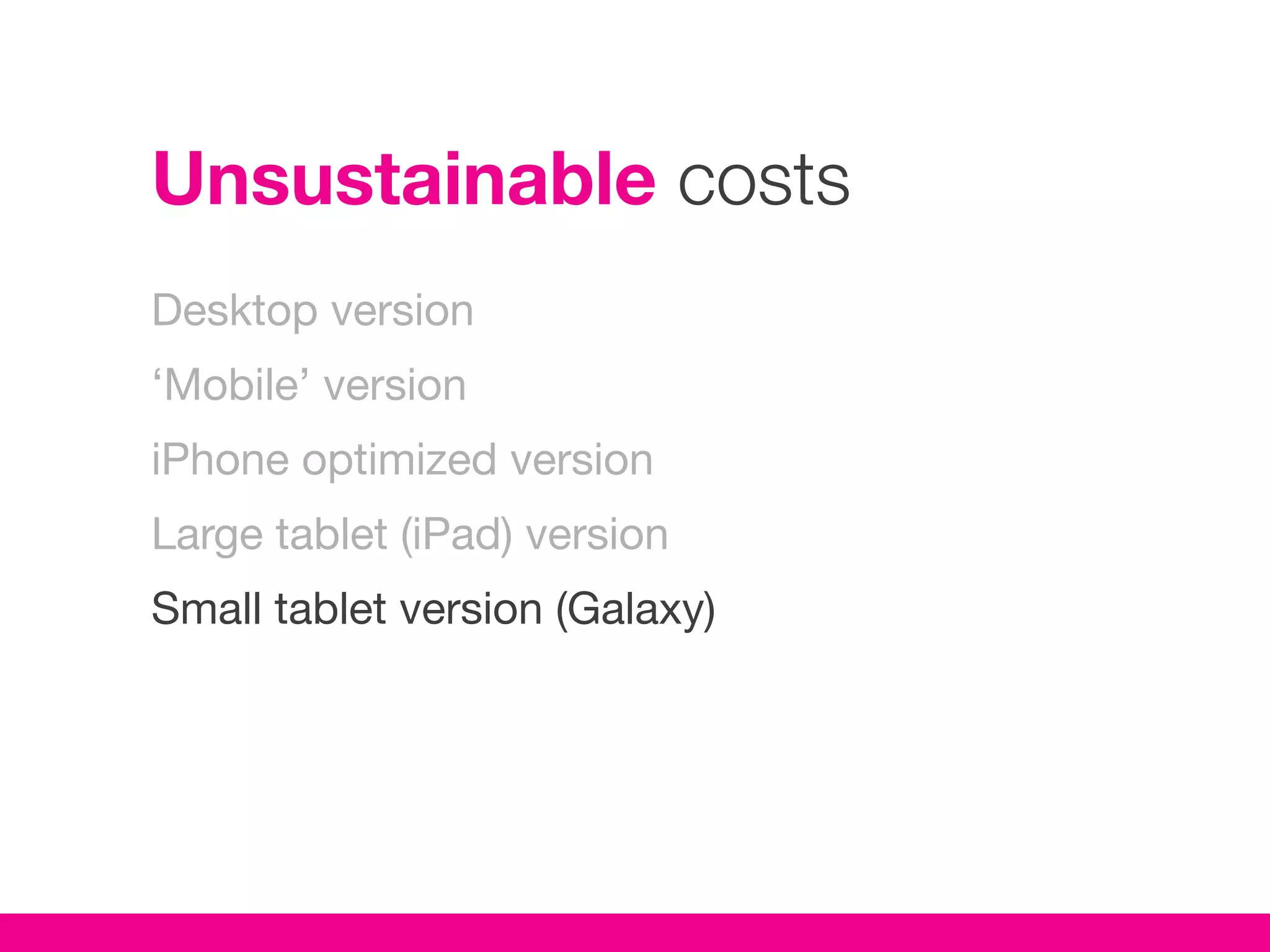
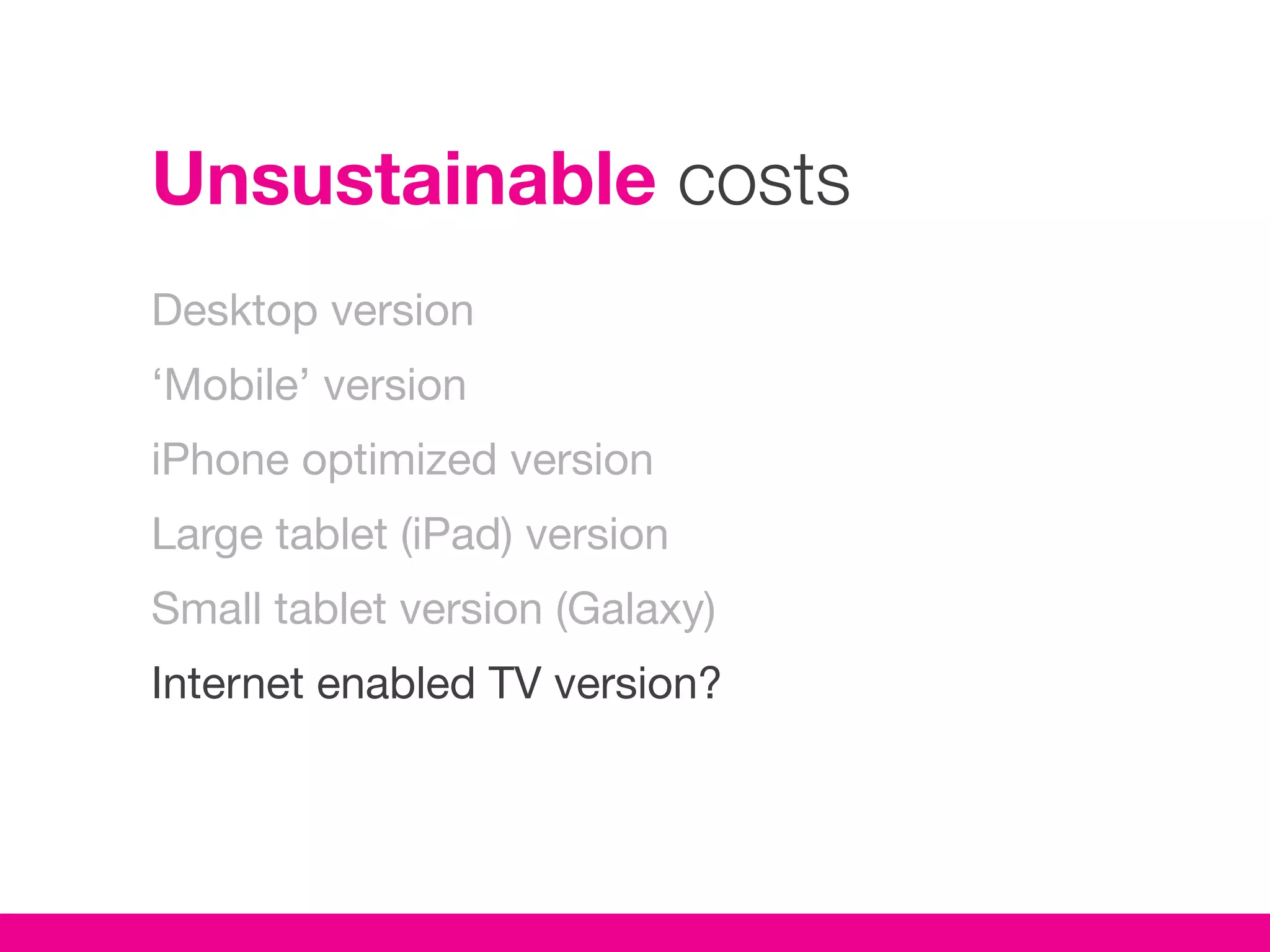
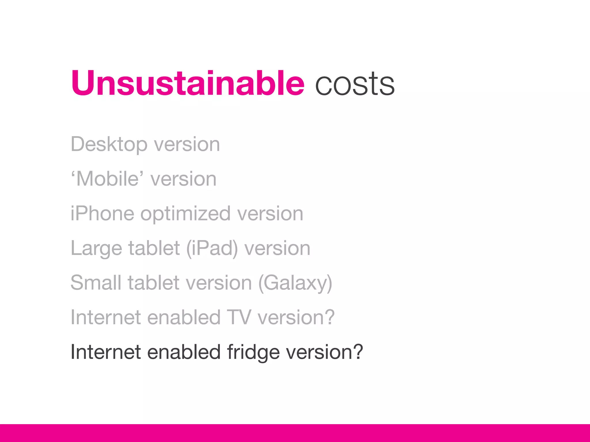
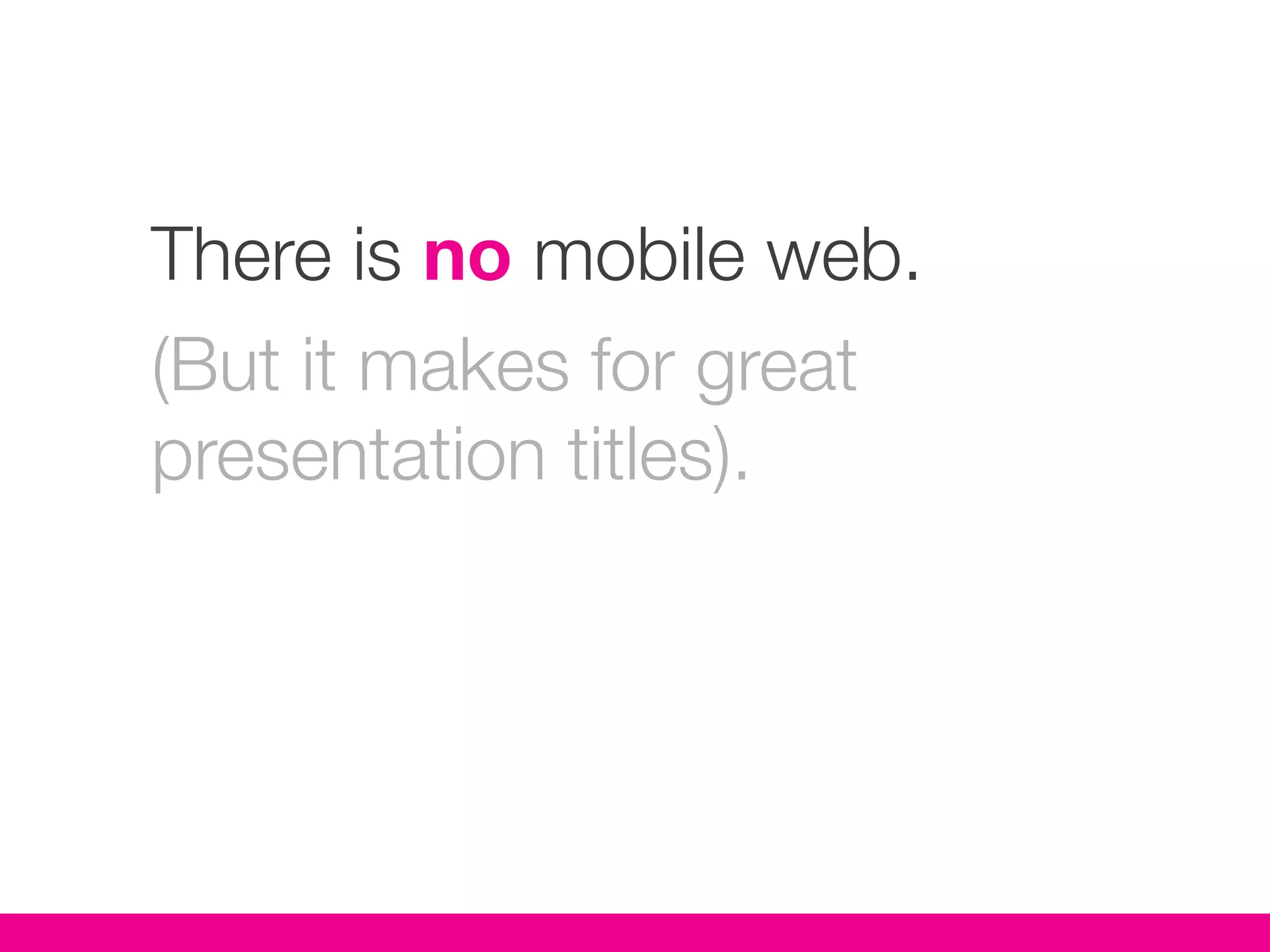
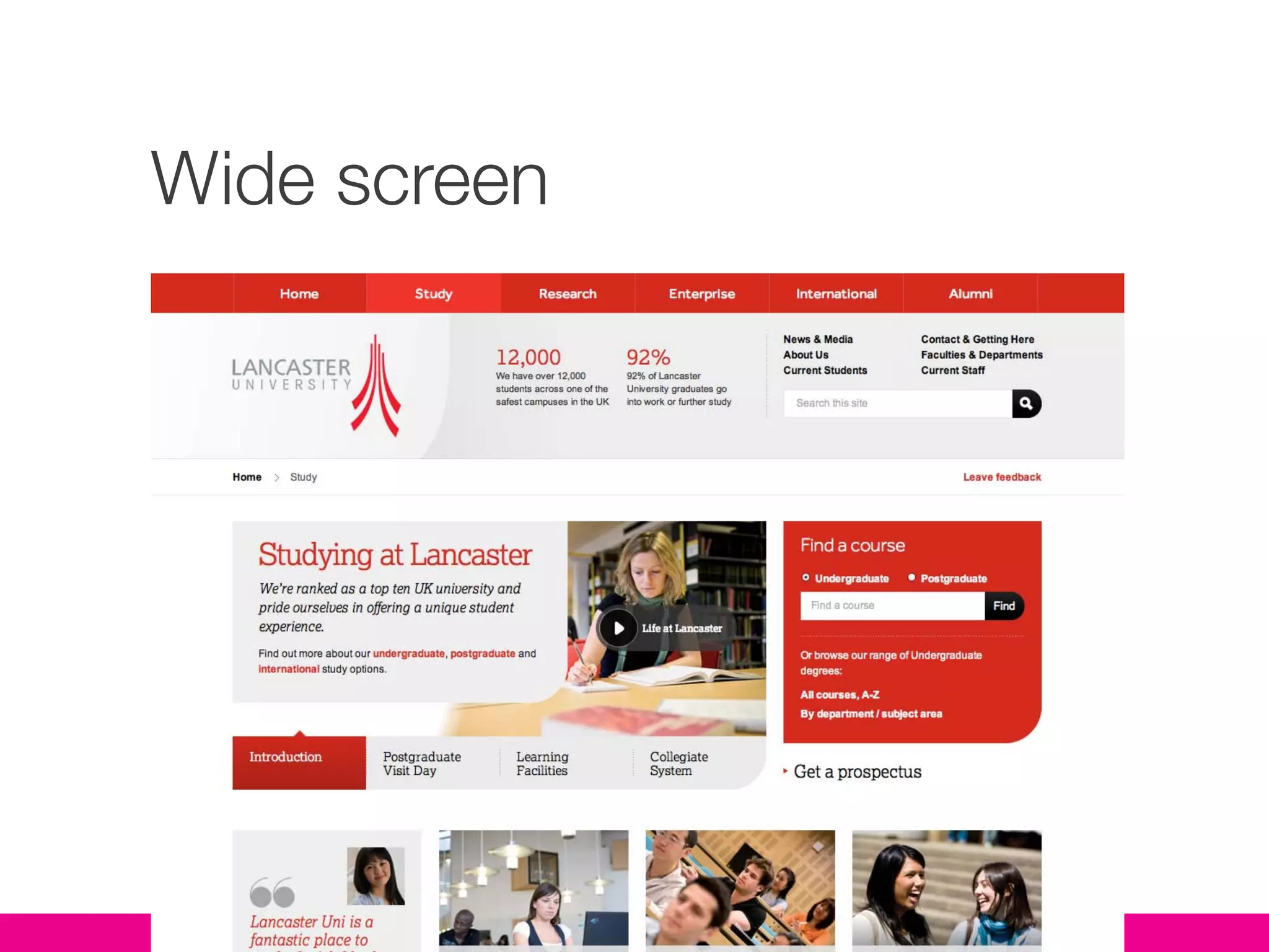
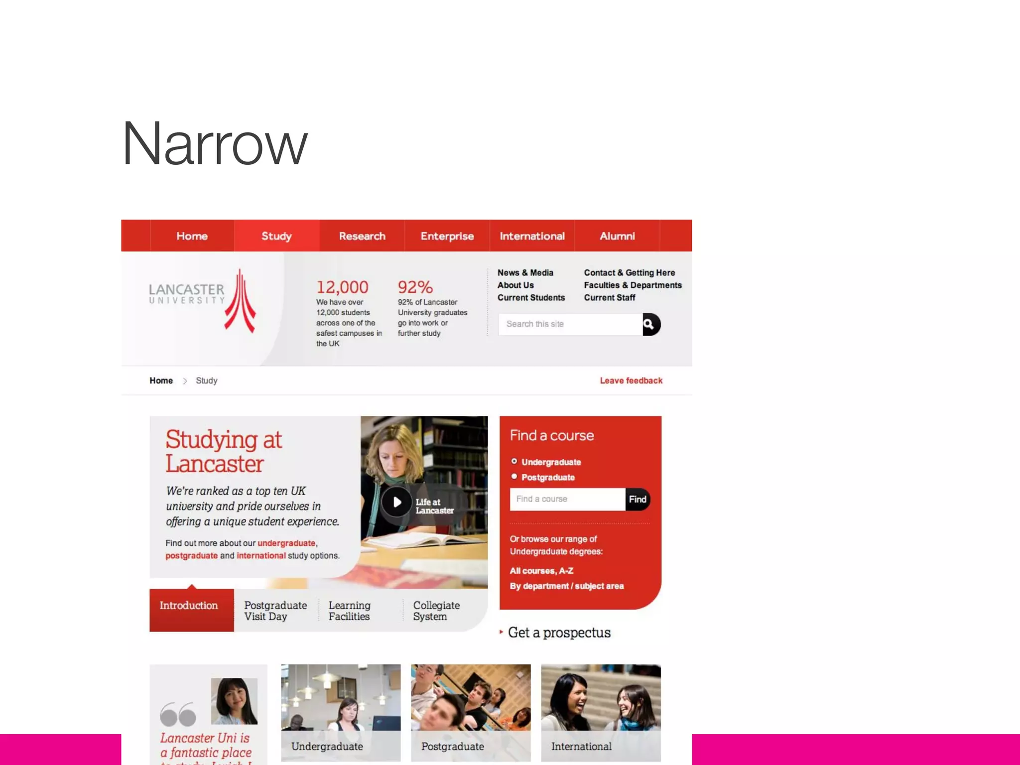
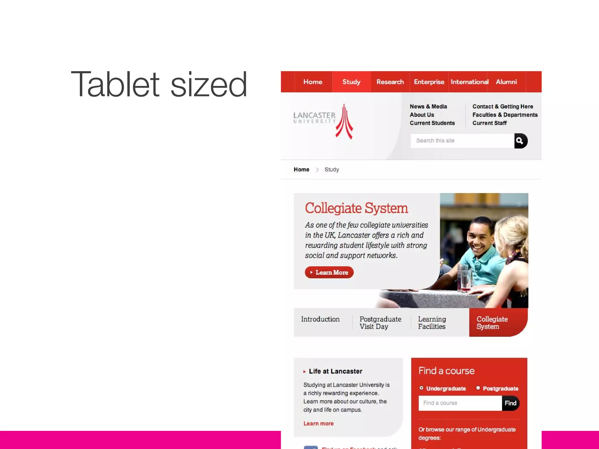
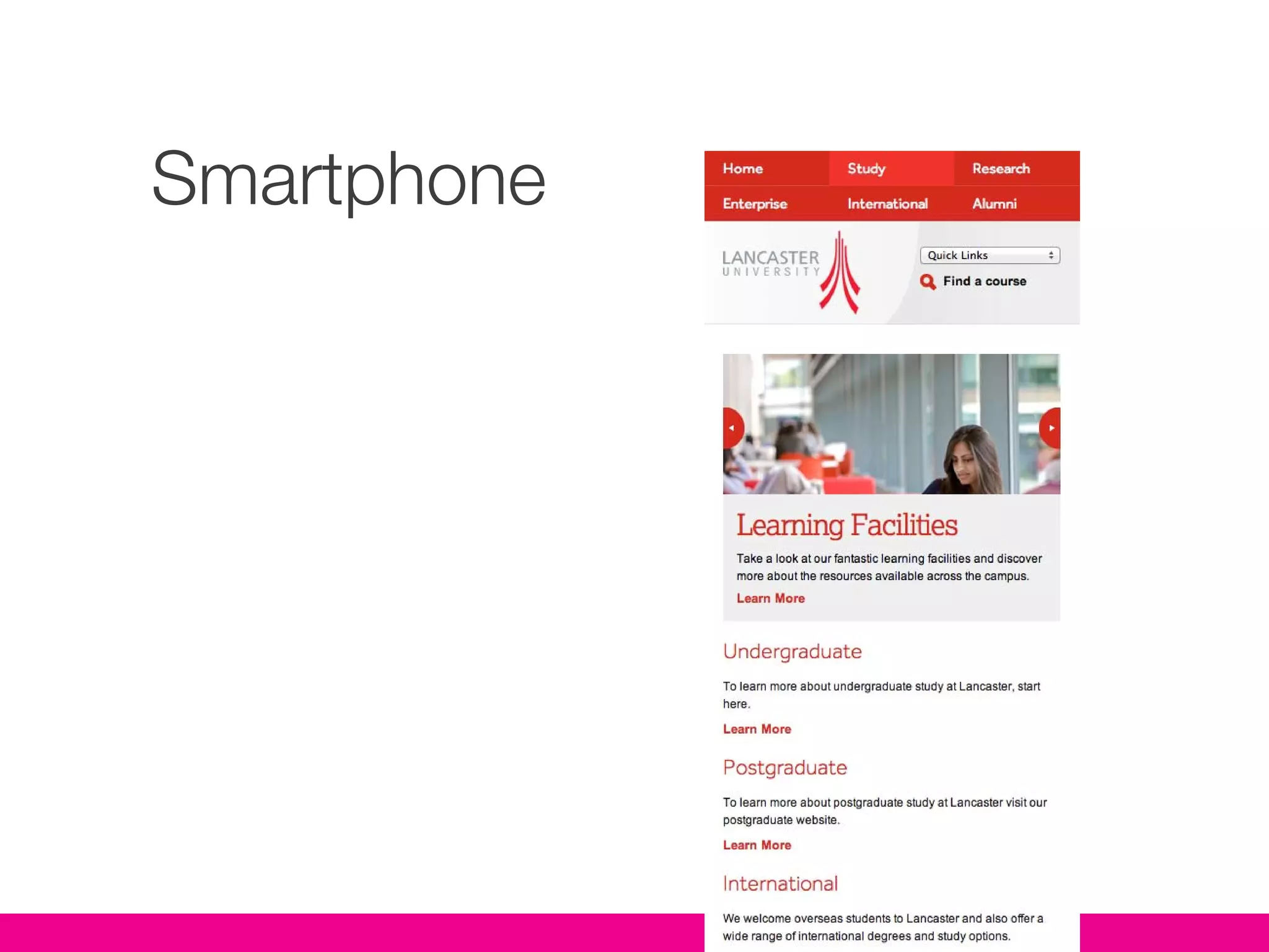
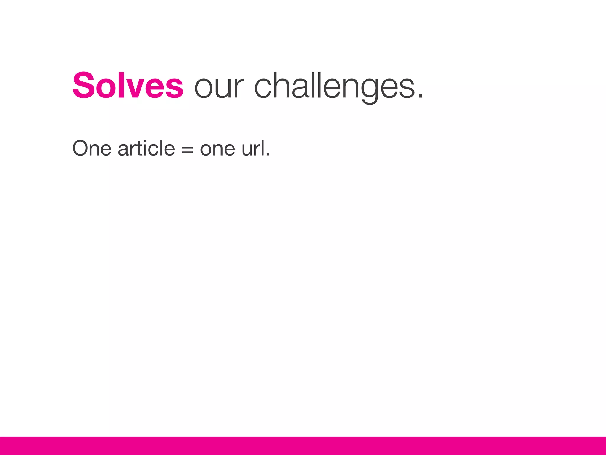
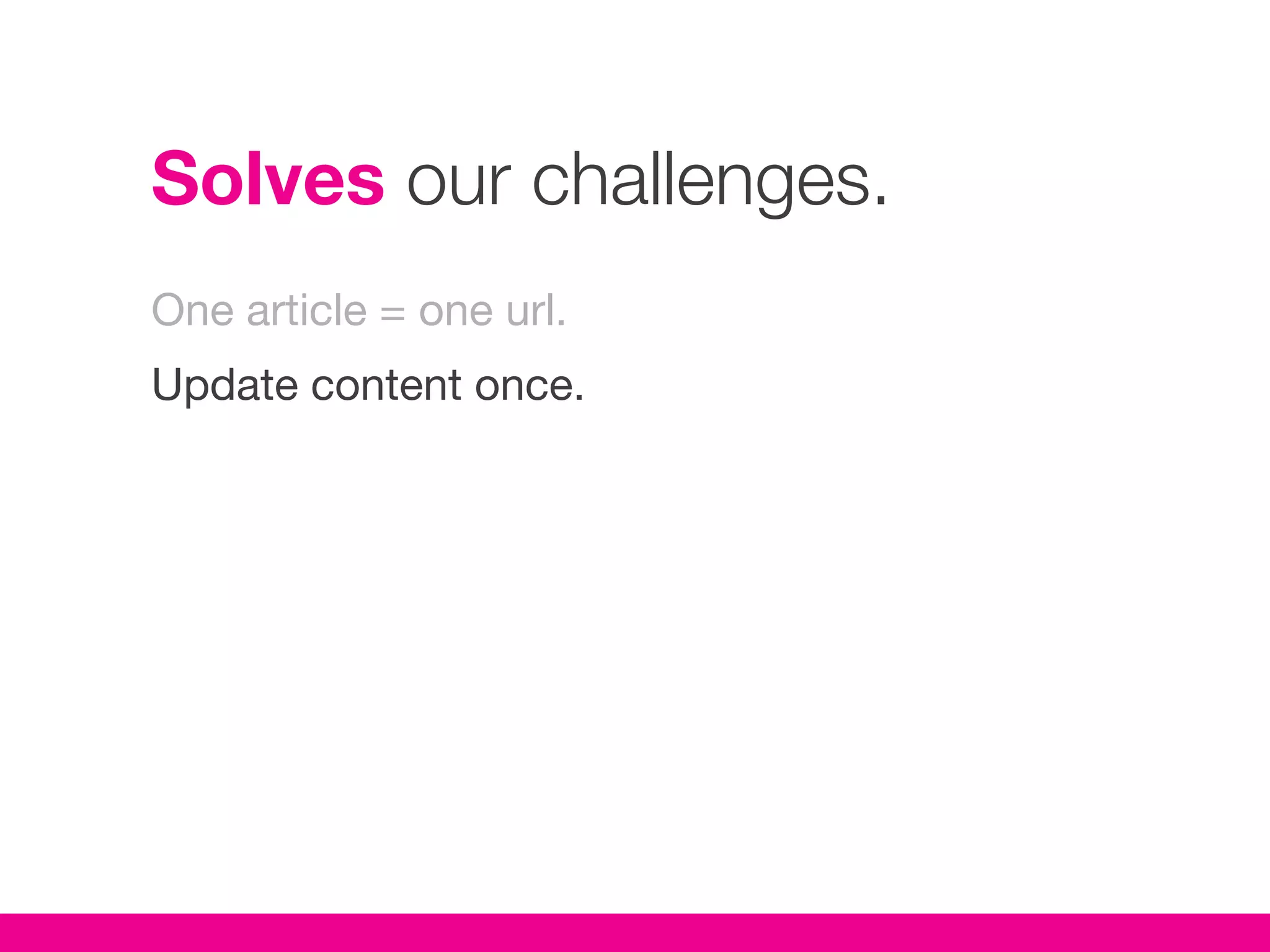
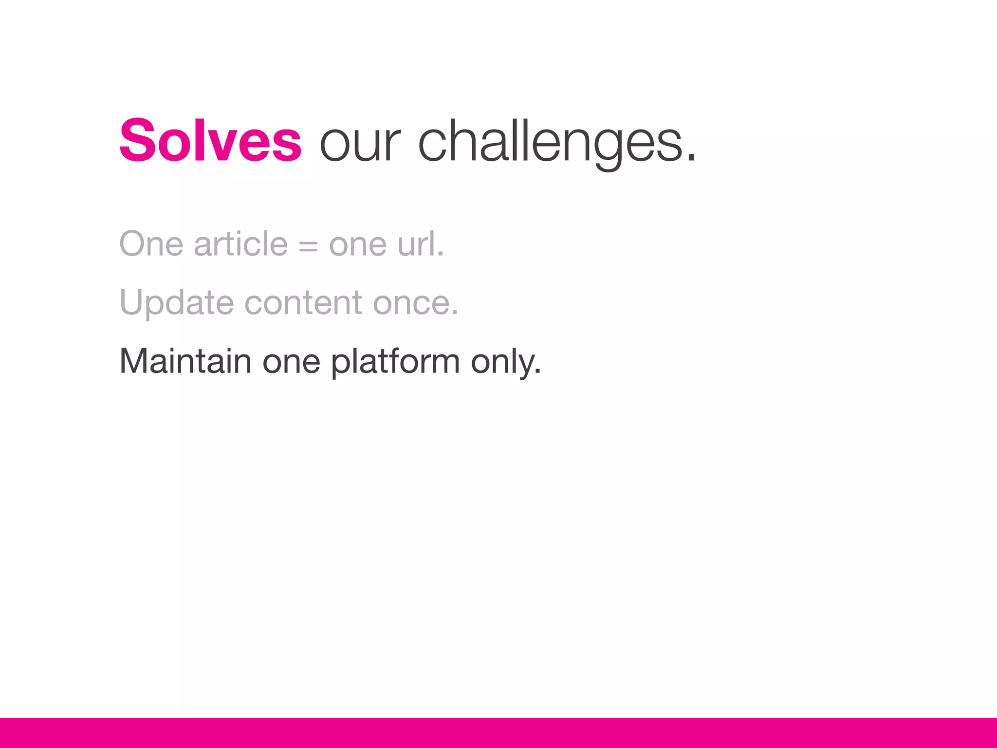
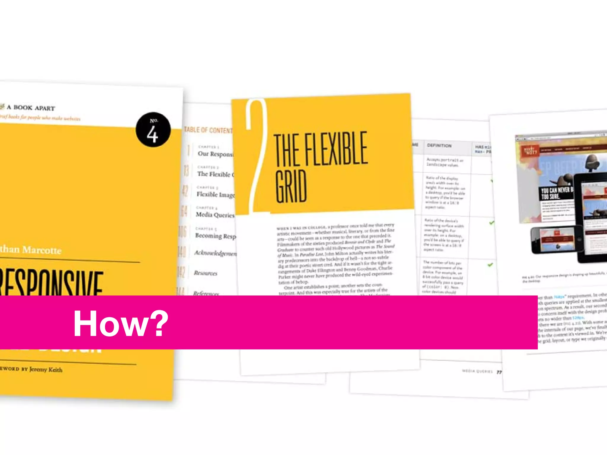
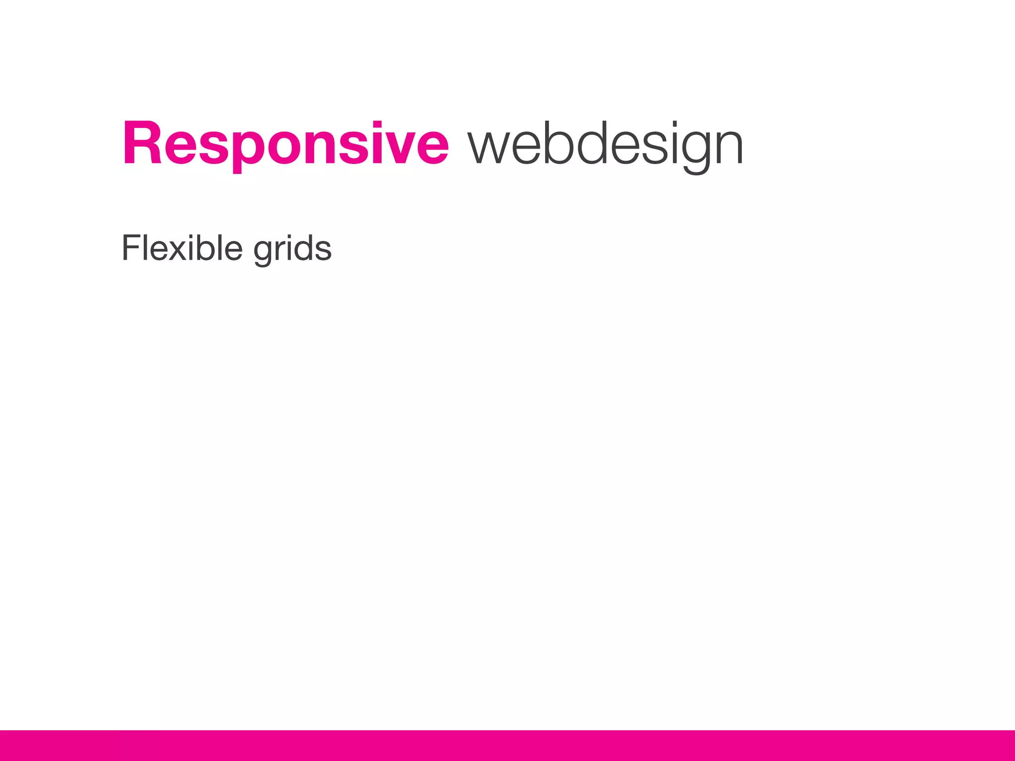
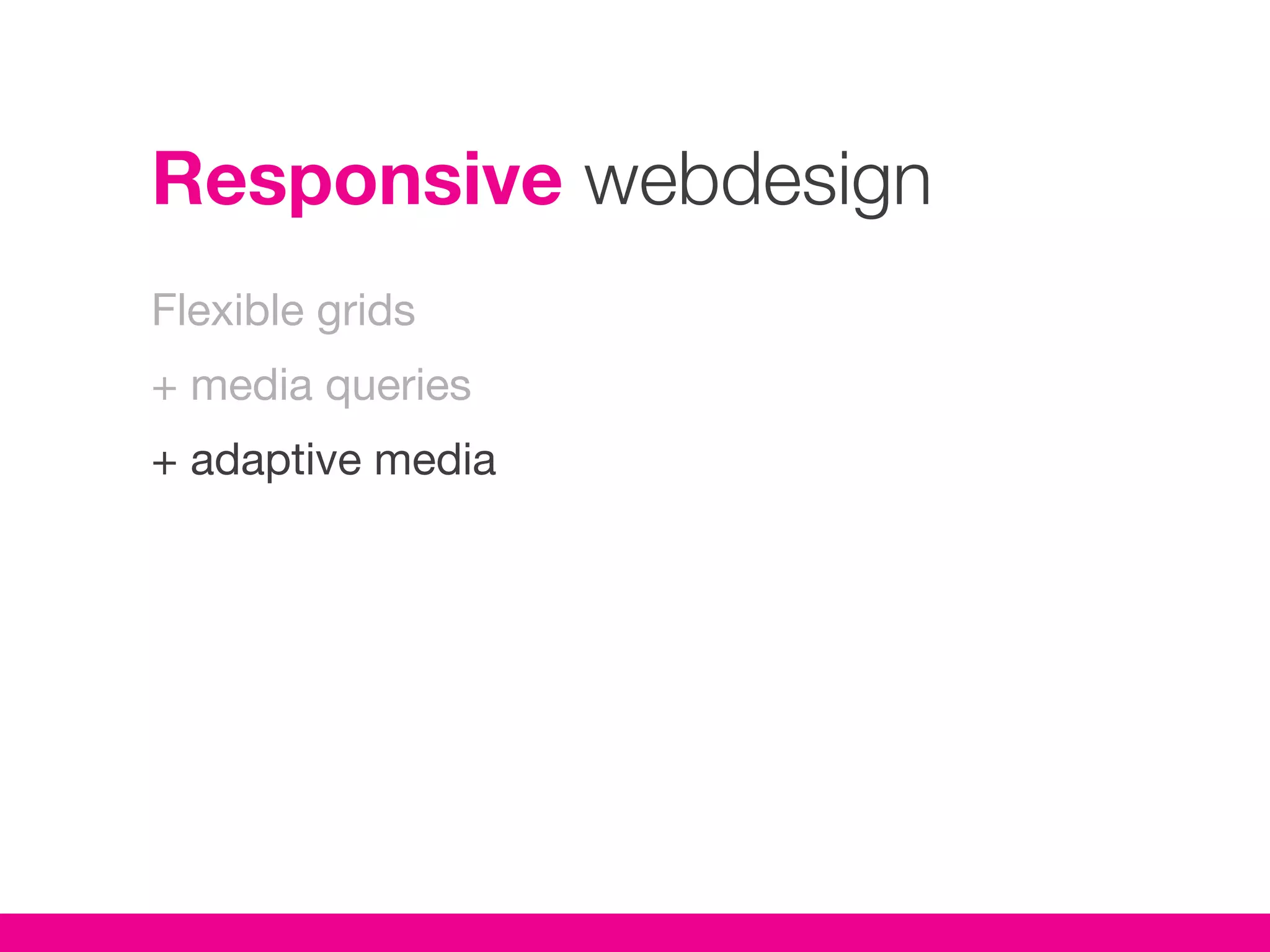
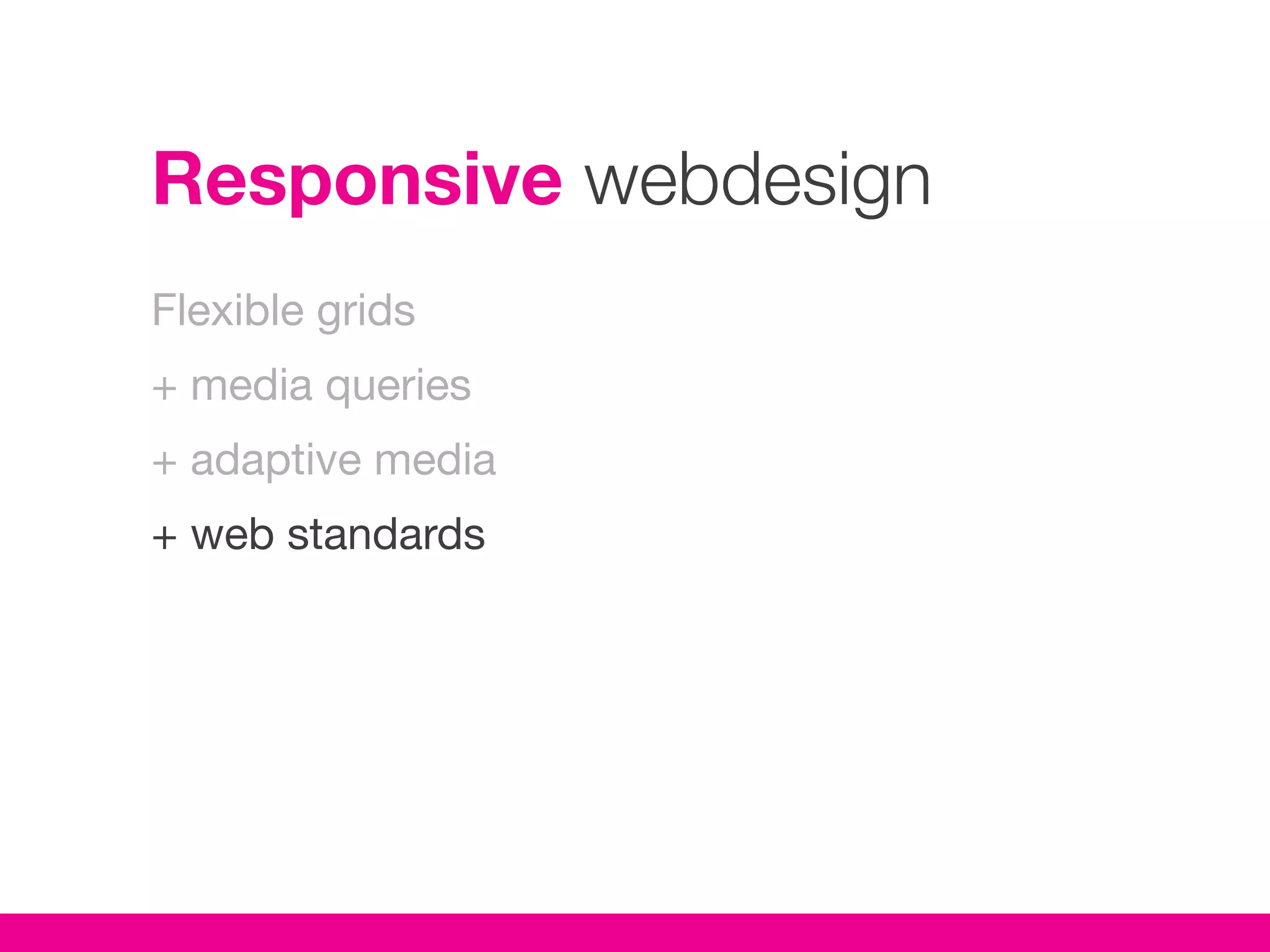
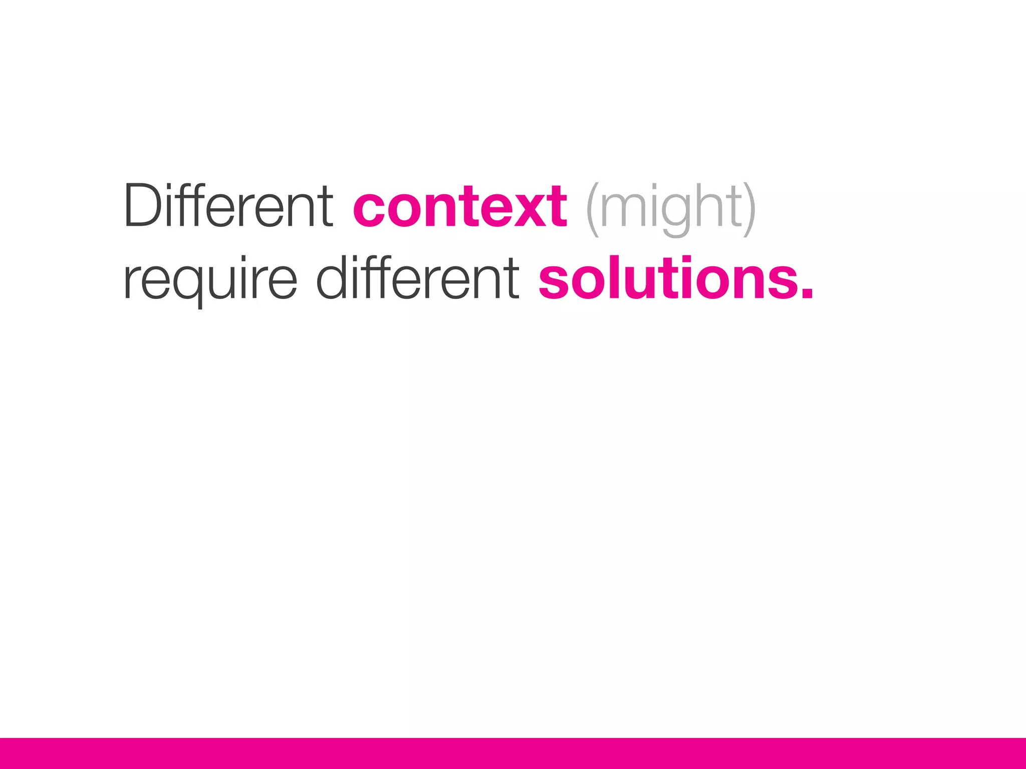
Sustainable
strategies for the
mobile web
This session
Strategy,
not <code />.
Designers &
developers beware.
Internets, not intranets.
Slides available online.
About me


Jesper Wøldiche Rahkonen
Municipality of Aarhus

designer /
markup marine /
project lead /

woeldiche on twitter / quora / linkedin / etc.
Overview

Present        Challenges of the traditional model.
Future
Why
How
Mobile first
But
Overview

Present
Future         A responsive alternative.
Why
How
Mobile first
But
Overview

Present
Future
Why            The benefits of a universal web.
How
Mobile first
But
Overview

Present
Future
Why
How            A look at the techniques.
Mobile first
But
Overview

Present
Future
Why
How
Mobile first   Why you should design mobile first.
But
Overview

Present
Future
Why
How
Mobile first
But            Really? I’m Cinderella too?
The traditional model
‘Desktop’ + ‘mobile’ version
The traditional model
‘Desktop’ + ‘mobile’ version
+ iPhone optimized
The traditional model
‘Desktop’ + ‘mobile’ version
+ iPhone optimized
+ App
Challenges
Content duplication
Challenges
Content duplication
Version specific links
Challenges
Content duplication
Version specific links
SEO issues
Unsustainable costs
Unsustainable costs
Desktop version
Unsustainable costs
Desktop version
‘Mobile’ version
Unsustainable costs
Desktop version
‘Mobile’ version
iPhone optimized version
Unsustainable costs
Desktop version
‘Mobile’ version
iPhone optimized version
Large tablet (iPad) version
Unsustainable costs
Desktop version
‘Mobile’ version
iPhone optimized version
Large tablet (iPad) version
Small tablet version (Galaxy)
Unsustainable costs
Desktop version
‘Mobile’ version
iPhone optimized version
Large tablet (iPad) version
Small tablet version (Galaxy)
Internet enabled TV version?
Unsustainable costs
Desktop version
‘Mobile’ version
iPhone optimized version
Large tablet (iPad) version
Small tablet version (Galaxy)
Internet enabled TV version?
Internet enabled fridge version?
You want updates with that?
(I know, you get the point).
Don’t assume context
from device.
There is no mobile web.
(But it makes for great
presentation titles).
@stephenhay
“There is no Mobile Web. There is only The Web,
which we view in different ways. There is also no
Desktop Web. Or Tablet Web. Thank you.”
The words we use
influence our thinking.
The alternative approach
Aim for universal access.
Make no assumptions.
Or try not to.
That goes for accesibility too.
Design and build for
everything in between.
Design and build for
everything in between.
Including the next device.
Lancaster University
Wide screen
Narrow
Tablet sized
Smartphone
Why?
Benefits
Reduced costs for multiple platforms.
Benefits
Reduced costs for multiple platforms.
Sustainable.
Benefits
Reduced costs for multiple platforms.
Sustainable.
Future proof.
Benefits
Reduced costs for multiple platforms.
Sustainable.
Future proof.
Works on iPhone 5.
Solves our challenges.
One article = one url.
Solves our challenges.
One article = one url.
Update content once.
Solves our challenges.
One article = one url.
Update content once.
Maintain one platform only.
34% more buzzwords per
project.
Nah, not really.
How?
A combination of techniques
and web standards
Responsive webdesign
Flexible grids
Responsive webdesign
Flexible grids
+ media queries
Responsive webdesign
Flexible grids
+ media queries
+ adaptive media
Responsive webdesign
Flexible grids
+ media queries
+ adaptive media
+ web standards
Adaptive webdesign?
A design approach
Design for mobile first.
Mobile extends your
capabilities.
Mobile is exploding.
Mobile first provides focus.
Expand from that focus.
I’m Cindarella too, really?
Different context (might)
require different solutions.
An example: The event site
One shoe never fits all.
But try it on first.
You might be Cindarella too.
More sources
‘Responsive Webdesign’, Ethan Marcotte.
‘Mobile First’, Luke Wroblewski.
‘A New Canon’, Mark Boulton.


Links online.
Thank you.

slideshare.net/woeldiche
Photos
Stone tablet: http://www.flickr.com/photos/mendhak/2181341370/
1984: http://www.flickr.com/photos/colindunn/4229983412/
Superheroes: http://www.flickr.com/photos/ari/2567524938/
Why: http://www.flickr.com/photos/tonikaarttinen/5687056556/
Cindarella: http://www.flickr.com/photos/tonyj1961/6047893889/
Nightclub: http://www.flickr.com/photos/30691679@N07/4423432834/
Another Cindarella: http://www.flickr.com/photos/tonyj1961/6036010920/
Responsive web design
Links
http://www.abookapart.com/products/responsive-web-design
http://www.alistapart.com/articles/responsive-web-design/
http://www.zeldman.com/2011/07/06/responsive-design-i-dont-think-
that-word-means-what-you-think-it-means/
Mobile first
Links
http://www.lukew.com/ff/entry.asp?933
http://www.lukew.com/ff/entry.asp?1137
http://www.lukew.com/ff/entry.asp?1393
http://www.abookapart.com/products/mobile-first
A New Canon
Links
http://2011.newadventuresconf.com/audio/mark.html
http://vimeo.com/29991675
http://www.netmagazine.com/interviews/in-depth/mark-boulton-layouts-
and-grid-systems

Sustainable Strategies for The Mobile Web