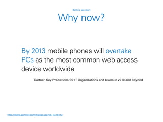
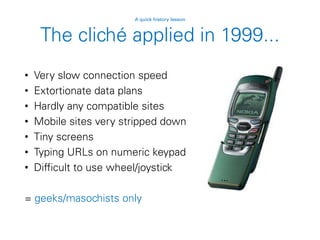
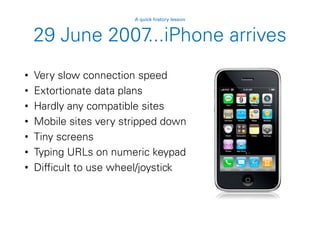
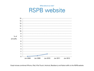
Responding to the challenge
of the mobile web
Graham Bird
Contents
• Before we start
• A quick history lesson
• Fast forward to today
• What about our site?
• Looking forwards
Before we start
Why mobile?
Engagement through mobile is one of
the guiding principles defined in
Operation Partridge (Online Capabilities)
Before we start
By 2013 mobile phones will overtake
PCs as the most common web access
device worldwide
Gartner, Key Predictions for IT Organizations and Users in 2010 and Beyond
http://www.gartner.com/it/page.jsp?id=1278413
Before we start
Why now?
A quick history lesson
The mobile cliché
• Poor connection speed
• Tiny audience
• Lots of distractions
• Tiny screen size
• Requires dedicated mobile site
• On the go (short attention span)
• One handed interaction
• Tedious to type on numeric
keypads
Photo by Oimax
A quick history lesson
The cliché applied in 1999...
• Very slow connection speed
• Extortionate data plans
• Hardly any compatible sites
• Mobile sites very stripped down
• Tiny screens
• Typing URLs on numeric keypad
• Difficult to use wheel/joystick
= geeks/masochists only
A quick history lesson
29 June 2007...iPhone arrives
• Very slow connection speed
• Extortionate data plans
• Hardly any compatible sites
• Mobile sites very stripped down
• Tiny screens
• Typing URLs on numeric keypad
• Difficult to use wheel/joystick
A quick history lesson
29 June 2007...iPhone arrives
• Very slow connection speed
• Extortionate data plans
• Hardly any compatible sites
• Mobile sites very stripped down
• Tiny screens
• Typing URLs on numeric keypad
• Difficult to use wheel/joystick
A quick history lesson
29 June 2007...iPhone arrives
• Very slow connection speed
• Extortionate data plans
• Hardly any compatible sites
• Mobile sites very stripped down
• Tiny screens
• Typing URLs on numeric keypad
• Difficult to use wheel/joystick
+ Apple marketing
+ widespread PR coverage
A quick history lesson
= overnight sensation
Fast forward to today
It’s not all Apple
Fast forward to today
Figures from statcounter.com for August 2011
Many screen sizes
Even the Kindle
has a browser
Fast forward to today
89% of smartphone owners use their
mobile device at home
Nielsen/Yahoo
http://advertising.yahoo.com/industry-knowledge/mobile-shopping-insight.html
Variable connection speed
Fast forward to today
Variable connection speed
Mobile devices
have overtaken
laptops for Wi-Fi
hotspot usage
GigaOM
http://gigaom.com/2011/06/21/mobile-devices-overtake-computers-on-wi-fi-networks/
0.00%
10.00%
20.00%
30.00%
40.00%
50.00%
60.00%
70.00%
80.00%
90.00%
100.00%
2010 2011
Fast forward to today
Portable, but not always moving
86% use their mobile device while at
home watching the TV
Nielsen/Yahoo
http://advertising.yahoo.com/industry-knowledge/mobile-shopping-insight.html
Fast forward to today
But most importantly...
People expect mobile support
Nearly half of mobile web users are
unlikely to return to a website that they
had trouble accessing from their phone,
and 57% are unlikely to recommend the
site
Compuware, New Study Reveals the Mobile Web Disappoints Global Consumers
http://investor.compuware.com/releasedetail.cfm?ReleaseID=592528
Fast forward to today
People expect mobile support
34% visit a site on their PC and then
follow up on mobile
Nielsen/Yahoo
http://advertising.yahoo.com/industry-knowledge/mobile-shopping-insight.html
Fast forward to today
People expect mobile support
70% of smartphone owners choose to
find information via the browser instead
of apps
Orange
http://www.unanimis.co.uk/orange-mobile-exposure-2010/
Fast forward to today
And they’re active users
People that use Facebook on their
mobile devices are twice as active on
Facebook than non-mobile users.
http://www.facebook.com/press/info.php?statistics
Fast forward to today
Mobile web design today
• Don’t assume bandwidth
Fast forward to today
Mobile web design today
• Don’t assume bandwidth
• Don’t assume user intent
Fast forward to today
Mobile web design today
• Don’t assume bandwidth
• Don’t assume user intent
• Don’t design for specific screen sizes
Fast forward to today
Mobile web design today
• Don’t assume bandwidth
• Don’t assume user intent
• Don’t design for specific screen sizes
• Do provide large touch targets
Fast forward to today
Mobile web design today
• Don’t assume bandwidth
• Don’t assume user intent
• Don’t design for specific screen sizes
• Do provide large touch targets
• Do take advantage of new capabilities
Fast forward to today
Mobile web design today
• Don’t assume bandwidth
• Don’t assume user intent
• Don’t design for specific screen sizes
• Do provide large touch targets
• Do take advantage of new capabilities
• Don’t use Flash (or other plugins)
Fast forward to today
What about our site?
The 1% rule
The Big Garden Birdwatch survey form
(and by implication, the rest of the website)
should support any browser that
exceeds 1% of traffic to our website
What about our site?
0
1
2
3
4
5
6
7
8
9
10
11
12
13
14
15
Jan 2008 Jan 2009 Jan 2010 Jan 2011 Jan 2012
Graph shows combined iPhone, iPad, iPod Touch, Android, Blackberry and Nokia traffic to the RSPB website
RSPB website
% of
all traffic
What about our site?
0
1
2
3
4
5
6
7
8
9
10
11
12
13
14
15
Jan 2008 Jan 2009 Jan 2010 Jan 2011 Jan 2012
Graph shows combined iPhone, iPad, iPod Touch, Android, Blackberry and Nokia traffic to the RSPB website
RSPB website
% of
all traffic
What about our site?
0
1
2
3
4
5
6
7
8
9
10
11
12
13
14
15
Jan 2008 Jan 2009 Jan 2010 Jan 2011 Dec 2011
Graph shows combined iPhone, iPad, iPod Touch, Android, Blackberry and Nokia traffic to the RSPB website
RSPB website
% of
all traffic
What about our site?
What’s popular on mobile?
• 11% of Bird identifier traffic
• 11% of Bird guide traffic
• 9% of Community traffic
• 9% of Feed the Birds day traffic
• 6.5% of Join traffic
• 6% of Reserves traffic (8.5% on find page)
• 0.3% of landing page traffic (2,500 people)
What about our site?
Figures from October 2011
Looking forwards
To provide the complete RSPB website
to the widest range of mobile devices with
little or no additional maintenance effort
What is our ambition?
Looking forwards
Help us achieve it
Looking forwards
• Bring mobile into the web strategy
• Support standardisation of the website
• Give us time to redesign the site
• Give us devices to test on
• A mobile-friendly site
Looking forwards
What are the benefits?
• A mobile-friendly site
• Better user experience
Looking forwards
What are the benefits?
• A mobile-friendly site
• Better user experience
• Better search rankings
Looking forwards
What are the benefits?
• A mobile-friendly site
• Better user experience
• Better search rankings
• Web Team more agile
Looking forwards
What are the benefits?
• A mobile-friendly site
• Better user experience
• Better search rankings
• Web Team more agile
• Increased robustness across desktop browsers as
well as mobile
Looking forwards
What are the benefits?
• A mobile-friendly site
• Better user experience
• Better search rankings
• Web Team more agile
• Increased robustness across desktop browsers as
well as mobile
• Continuous improvement across the site
Looking forwards
What are the benefits?
Including mobile in the strategy
Looking forwards
We need to recognise that mobile is here to
stay and ensure that the needs of the mobile
audience are part and parcel of our web
strategy
Standardising the site
Looking forwards
• Identify gaps in functionality
• Create a toolkit of reusable modular elements
• Tested on desktop and mobile
• Consistent behaviour across site
• Less code to maintain
• Quicker to build new sections
• Quicker to roll out updates
• No page left behind
Perceived downsides
of standardisation
Looking forwards
• Templates are seen as restrictive, limiting, dull
• Limited scope to reproduce print materials is
seen as a bad thing
• There is a desire from customers to make their
mark (“I want my thing to be different from
everything else”)
• Novelty is seen as inherently good (“change for
change’s sake”)
• Personal opinions are given too much weight
A brief interlude
Don’t fear the template
A brief interlude
• Templates can still be
beautiful & flexible
• We have one website, not
many
• Consistency is very
important
• If we weren’t doing bespoke
work all the time, we could
improve the core template
for everyone
Who else uses templates?
A brief interlude
BBC Online is heavily templated and strictly
controlled by visual guidelines
Let’s compare web budgets
A brief interlude
0
10,000,000
20,000,000
30,000,000
40,000,000
50,000,000
60,000,000
70,000,000
80,000,000
90,000,000
100,000,000
BBC RSPB
Optimistic
Let’s compare web budgets
A brief interlude
0
10,000,000
20,000,000
30,000,000
40,000,000
50,000,000
60,000,000
70,000,000
80,000,000
90,000,000
100,000,000
BBC RSPB
Using templates well Trying not to
Back to the point...
Standardisation is good
Looking forwards
• Consistency is a “first principle” of interaction
design – it breeds familiarity, confidence and
trust
• Feels professional and thought through
• User is more able to focus on task at hand
• Website is faster
• Reduced time to build and to maintain
• New functionality is created once and can be
used anywhere
Redesign
Looking forwards
• A new site that adapts to the device being used,
providing optimum design & usability for all
• Future-proof
• Best practice
• Optimised for poor connection speeds
• Consistent user experience
Redesign
Looking forwards
• A new site that adapts to the device being used,
providing optimum design & usability for all
• Future-proof Future-friendly
• Best practice
• Optimised for poor connection speeds
• Consistent user experience
Testing
Looking forwards
• Wi-Fi in the Web Team area
• Access to internal test servers and internet
• 1 x iPad 2
• 1 x iPhone 4
• 1 x Android phone
• 1 x Blackberry 6 phone
• 1 x Blackberry 5 phone
Thank you
Remember...not every mobile device will have an
RSPB app on it but every mobile device can access
the RSPB website

Responding to the challenge of the mobile web (2012)

  • 1.
    Responding to thechallenge of the mobile web Graham Bird
  • 2.
    Contents • Before westart • A quick history lesson • Fast forward to today • What about our site? • Looking forwards
  • 3.
  • 4.
    Why mobile? Engagement throughmobile is one of the guiding principles defined in Operation Partridge (Online Capabilities) Before we start
  • 5.
    By 2013 mobilephones will overtake PCs as the most common web access device worldwide Gartner, Key Predictions for IT Organizations and Users in 2010 and Beyond http://www.gartner.com/it/page.jsp?id=1278413 Before we start Why now?
  • 6.
  • 7.
    The mobile cliché •Poor connection speed • Tiny audience • Lots of distractions • Tiny screen size • Requires dedicated mobile site • On the go (short attention span) • One handed interaction • Tedious to type on numeric keypads Photo by Oimax A quick history lesson
  • 8.
    The cliché appliedin 1999... • Very slow connection speed • Extortionate data plans • Hardly any compatible sites • Mobile sites very stripped down • Tiny screens • Typing URLs on numeric keypad • Difficult to use wheel/joystick = geeks/masochists only A quick history lesson
  • 14.
    29 June 2007...iPhonearrives • Very slow connection speed • Extortionate data plans • Hardly any compatible sites • Mobile sites very stripped down • Tiny screens • Typing URLs on numeric keypad • Difficult to use wheel/joystick A quick history lesson
  • 15.
    29 June 2007...iPhonearrives • Very slow connection speed • Extortionate data plans • Hardly any compatible sites • Mobile sites very stripped down • Tiny screens • Typing URLs on numeric keypad • Difficult to use wheel/joystick A quick history lesson
  • 16.
    29 June 2007...iPhonearrives • Very slow connection speed • Extortionate data plans • Hardly any compatible sites • Mobile sites very stripped down • Tiny screens • Typing URLs on numeric keypad • Difficult to use wheel/joystick + Apple marketing + widespread PR coverage A quick history lesson
  • 17.
  • 18.
  • 19.
    It’s not allApple Fast forward to today Figures from statcounter.com for August 2011
  • 20.
    Many screen sizes Eventhe Kindle has a browser Fast forward to today
  • 21.
    89% of smartphoneowners use their mobile device at home Nielsen/Yahoo http://advertising.yahoo.com/industry-knowledge/mobile-shopping-insight.html Variable connection speed Fast forward to today
  • 22.
    Variable connection speed Mobiledevices have overtaken laptops for Wi-Fi hotspot usage GigaOM http://gigaom.com/2011/06/21/mobile-devices-overtake-computers-on-wi-fi-networks/ 0.00% 10.00% 20.00% 30.00% 40.00% 50.00% 60.00% 70.00% 80.00% 90.00% 100.00% 2010 2011 Fast forward to today
  • 23.
    Portable, but notalways moving 86% use their mobile device while at home watching the TV Nielsen/Yahoo http://advertising.yahoo.com/industry-knowledge/mobile-shopping-insight.html Fast forward to today
  • 24.
  • 25.
    People expect mobilesupport Nearly half of mobile web users are unlikely to return to a website that they had trouble accessing from their phone, and 57% are unlikely to recommend the site Compuware, New Study Reveals the Mobile Web Disappoints Global Consumers http://investor.compuware.com/releasedetail.cfm?ReleaseID=592528 Fast forward to today
  • 26.
    People expect mobilesupport 34% visit a site on their PC and then follow up on mobile Nielsen/Yahoo http://advertising.yahoo.com/industry-knowledge/mobile-shopping-insight.html Fast forward to today
  • 27.
    People expect mobilesupport 70% of smartphone owners choose to find information via the browser instead of apps Orange http://www.unanimis.co.uk/orange-mobile-exposure-2010/ Fast forward to today
  • 28.
    And they’re activeusers People that use Facebook on their mobile devices are twice as active on Facebook than non-mobile users. http://www.facebook.com/press/info.php?statistics Fast forward to today
  • 29.
    Mobile web designtoday • Don’t assume bandwidth Fast forward to today
  • 30.
    Mobile web designtoday • Don’t assume bandwidth • Don’t assume user intent Fast forward to today
  • 31.
    Mobile web designtoday • Don’t assume bandwidth • Don’t assume user intent • Don’t design for specific screen sizes Fast forward to today
  • 32.
    Mobile web designtoday • Don’t assume bandwidth • Don’t assume user intent • Don’t design for specific screen sizes • Do provide large touch targets Fast forward to today
  • 33.
    Mobile web designtoday • Don’t assume bandwidth • Don’t assume user intent • Don’t design for specific screen sizes • Do provide large touch targets • Do take advantage of new capabilities Fast forward to today
  • 34.
    Mobile web designtoday • Don’t assume bandwidth • Don’t assume user intent • Don’t design for specific screen sizes • Do provide large touch targets • Do take advantage of new capabilities • Don’t use Flash (or other plugins) Fast forward to today
  • 35.
  • 36.
    The 1% rule TheBig Garden Birdwatch survey form (and by implication, the rest of the website) should support any browser that exceeds 1% of traffic to our website What about our site?
  • 37.
    0 1 2 3 4 5 6 7 8 9 10 11 12 13 14 15 Jan 2008 Jan2009 Jan 2010 Jan 2011 Jan 2012 Graph shows combined iPhone, iPad, iPod Touch, Android, Blackberry and Nokia traffic to the RSPB website RSPB website % of all traffic What about our site?
  • 38.
    0 1 2 3 4 5 6 7 8 9 10 11 12 13 14 15 Jan 2008 Jan2009 Jan 2010 Jan 2011 Jan 2012 Graph shows combined iPhone, iPad, iPod Touch, Android, Blackberry and Nokia traffic to the RSPB website RSPB website % of all traffic What about our site?
  • 39.
    0 1 2 3 4 5 6 7 8 9 10 11 12 13 14 15 Jan 2008 Jan2009 Jan 2010 Jan 2011 Dec 2011 Graph shows combined iPhone, iPad, iPod Touch, Android, Blackberry and Nokia traffic to the RSPB website RSPB website % of all traffic What about our site?
  • 40.
    What’s popular onmobile? • 11% of Bird identifier traffic • 11% of Bird guide traffic • 9% of Community traffic • 9% of Feed the Birds day traffic • 6.5% of Join traffic • 6% of Reserves traffic (8.5% on find page) • 0.3% of landing page traffic (2,500 people) What about our site? Figures from October 2011
  • 41.
  • 42.
    To provide thecomplete RSPB website to the widest range of mobile devices with little or no additional maintenance effort What is our ambition? Looking forwards
  • 43.
    Help us achieveit Looking forwards • Bring mobile into the web strategy • Support standardisation of the website • Give us time to redesign the site • Give us devices to test on
  • 44.
    • A mobile-friendlysite Looking forwards What are the benefits?
  • 45.
    • A mobile-friendlysite • Better user experience Looking forwards What are the benefits?
  • 46.
    • A mobile-friendlysite • Better user experience • Better search rankings Looking forwards What are the benefits?
  • 47.
    • A mobile-friendlysite • Better user experience • Better search rankings • Web Team more agile Looking forwards What are the benefits?
  • 48.
    • A mobile-friendlysite • Better user experience • Better search rankings • Web Team more agile • Increased robustness across desktop browsers as well as mobile Looking forwards What are the benefits?
  • 49.
    • A mobile-friendlysite • Better user experience • Better search rankings • Web Team more agile • Increased robustness across desktop browsers as well as mobile • Continuous improvement across the site Looking forwards What are the benefits?
  • 50.
    Including mobile inthe strategy Looking forwards We need to recognise that mobile is here to stay and ensure that the needs of the mobile audience are part and parcel of our web strategy
  • 51.
    Standardising the site Lookingforwards • Identify gaps in functionality • Create a toolkit of reusable modular elements • Tested on desktop and mobile • Consistent behaviour across site • Less code to maintain • Quicker to build new sections • Quicker to roll out updates • No page left behind
  • 52.
    Perceived downsides of standardisation Lookingforwards • Templates are seen as restrictive, limiting, dull • Limited scope to reproduce print materials is seen as a bad thing • There is a desire from customers to make their mark (“I want my thing to be different from everything else”) • Novelty is seen as inherently good (“change for change’s sake”) • Personal opinions are given too much weight
  • 53.
  • 54.
    Don’t fear thetemplate A brief interlude • Templates can still be beautiful & flexible • We have one website, not many • Consistency is very important • If we weren’t doing bespoke work all the time, we could improve the core template for everyone
  • 55.
    Who else usestemplates? A brief interlude BBC Online is heavily templated and strictly controlled by visual guidelines
  • 63.
    Let’s compare webbudgets A brief interlude 0 10,000,000 20,000,000 30,000,000 40,000,000 50,000,000 60,000,000 70,000,000 80,000,000 90,000,000 100,000,000 BBC RSPB Optimistic
  • 64.
    Let’s compare webbudgets A brief interlude 0 10,000,000 20,000,000 30,000,000 40,000,000 50,000,000 60,000,000 70,000,000 80,000,000 90,000,000 100,000,000 BBC RSPB Using templates well Trying not to
  • 65.
    Back to thepoint...
  • 66.
    Standardisation is good Lookingforwards • Consistency is a “first principle” of interaction design – it breeds familiarity, confidence and trust • Feels professional and thought through • User is more able to focus on task at hand • Website is faster • Reduced time to build and to maintain • New functionality is created once and can be used anywhere
  • 67.
    Redesign Looking forwards • Anew site that adapts to the device being used, providing optimum design & usability for all • Future-proof • Best practice • Optimised for poor connection speeds • Consistent user experience
  • 68.
    Redesign Looking forwards • Anew site that adapts to the device being used, providing optimum design & usability for all • Future-proof Future-friendly • Best practice • Optimised for poor connection speeds • Consistent user experience
  • 69.
    Testing Looking forwards • Wi-Fiin the Web Team area • Access to internal test servers and internet • 1 x iPad 2 • 1 x iPhone 4 • 1 x Android phone • 1 x Blackberry 6 phone • 1 x Blackberry 5 phone
  • 70.
    Thank you Remember...not everymobile device will have an RSPB app on it but every mobile device can access the RSPB website