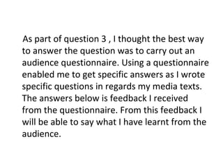
From feedback received on audience questionnaires about the ancillary texts for a music artist, the following was learned:
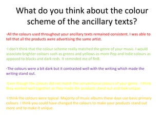
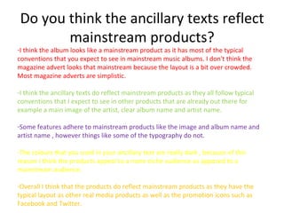
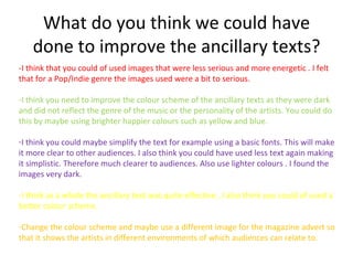
- The dark color scheme of the texts did not match the pop/indie genre and made the products seem more suited to genres like R&B. Brighter colors would have been more appropriate.
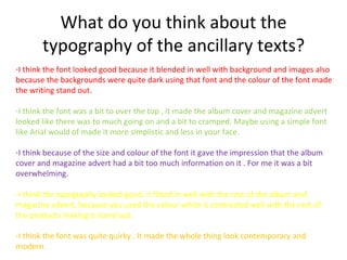
- The typography was generally effective but in some cases was too "over the top" or crowded, making the layout overwhelming. Simpler fonts would have helped.
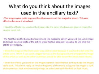
- The images used were generally clear and effective but could have been larger in some cases. Effects made some images too dark. Lighter, more energetic images may have better reflected the genre.
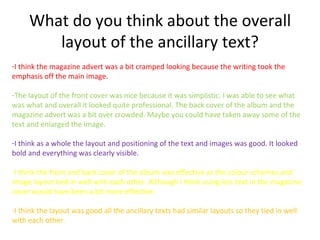
- The overall layout was
