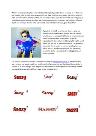
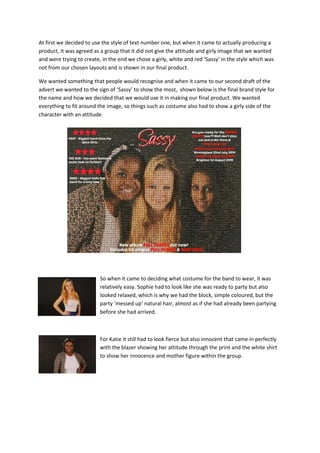
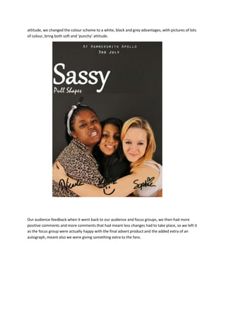
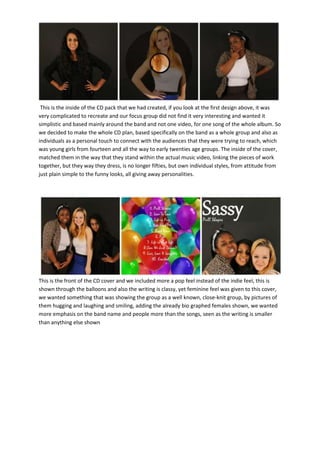
The document discusses the design process for ancillary materials for a girl band music project. It describes choosing a girly yet individual style with white, red, and black colors. Different text styles were prototyped before settling on a girly cursive style to match the desired image. Feedback led to changing the advertisement to be less girly with a modern white, black, and gray color scheme. The CD cover was also adjusted based on feedback to focus more on showcasing the band and individual band members rather than a single music video. The end result was meant to create a cohesive branding identity across all ancillary materials that would appeal to their target audience of young girls.