
More Related Content
What's hot
Viewers also liked
Similar to Sterling records
Similar to Sterling records (20)
More from RhysMJNelson
More from RhysMJNelson (20)
Recently uploaded
Recently uploaded (20)
Sterling records
- 2. Criteria for a successful/appealing draft. • Sophisticated • Sharp but bold • Modern/Silk • Appealing to target audience • Font reinforces the record name The above are all aspects we have taken in to consideration when analysing each draft and explaining why we haven't chosen it and for the final design why we have chosen it and how we see it meeting our criteria.
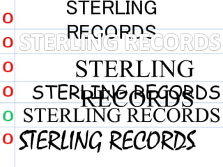
- 3. STERLING RECORDSAfter analysing this particular draft of our record label name we came to a conclusion that this particular type of font does not reinforce the sophistication that we are trying to project within our target audience. This is because the font we have used does not link in to the actual name ‘Sterling Records’ as it sounds like a wealthy company it should contain more sharp writing rather than really bold. For this particular reason we have chosen not to proceed with using this draft. This particular draft was not used for the final design as it contained a few elements which did not match our criteria for the final design. The main element that was not appropriate is that the internal part of the font is empty and does not reinforce the name ‘Sterling’ the record name is a very dominant and sophisticated name which should contain bold and sharp aspects within the font. For this particular reason we have chosen not to proceed with using this draft. STERLING RECORDSThis draft gave us an immediate indication that this font type would be totally against our criteria as it doesn’t meet it at all. This font clearly connotes a rock type genre, this is something apposite our genre of music as our genre is Rnb/Pop. In addition this font is not sophisticated in any way shape or form. For this particular reason we have chosen not to proceed with using this draft. Below we have taken group discussions and verbal opinions in to account in relation to the rejection of drafts we have created and why. In addition, the draft we have chosen and why. Lastly the final draft of the record label .
- 4. STERLING RECORDS This draft was appealing to us at first and we were considering using this as out final design due to the fact that it contains bold and traditional sophisticated sharp edges at the each of every letter which clearly links in with our record labels name. The reason why we rejected this particular draft was because after verbally analysing the text within our group we realised that the text was stretched out vertically which would connote other things rather than our criteria. For this particular reason we have chosen not to proceed with using this draft. STERLING RECORDSThis particular draft had us thinking in terms of should we or shouldn’t we use this. We finalised it and came to a decision that we wouldn’t be using this font type for our record label. This is because the font is writing in a sort of italic style which would be appealing for a record label name which is more to involve the youths due to the fast hand written font. Our record label font should reinforces strong aspects of sophistication. For this particular reason we have chosen not to proceed with using this draft. STERLING RECORDSFinally, a draft we were all confident that it ticked all boxes in our criteria list. This draft is very silk, sophisticated and projective due to the fact that it reinforces the traditional aspects of how established the word sterling is in terms of the currency. Moreover it is highly appealing to our target audience as we aim to target young professionals and young adults. Furthermore, the font chosen has been edited to make it look silk but bold at the same time but not excessive amounts of bold otherwise it would be over the top. For these particular reasons and due to the discussions held within our group we all agreed to use this draft and expand on to create a final draft to use for our record labels logo.
- 5. As you can see we have now used our previous draft and have expanded on it in order to further meet our personal set criteria. We have used the well known software Photoshop CS6 to construct the final draft of the record label name. Starting of which the font, we have chosen to place an outer glow effect due to the fact that it reinforces the name sterling and its value. The colour silver was used as a obvious connotation for the British currency as we are trying to project the traditional British aspects through out our ancillary tasks of CD cover and magazine cover. Linking back to the criteria of making the text modern, we chose to place a double ring around the ST from the sterling. This is because we didn’t want to express our record label as just wealth but aspects of sophistication and class as well as the double ring gives a clear indication of modernism and class. This again links back to our target audience of young professionals and young adults.