This double-page magazine spread features an interview-style article about pop star Justin Bieber. It targets teenage girls aged 16-19. The page uses Justin Bieber's large image on the cover and header to attract attention. The article has an unbalanced ratio of text to one large picture of Justin. It uses red lines and a mix of black, white, and red colors throughout to make it visually appealing while linking to themes of love that relate to Justin Bieber's image.
2137ad Merindol Colony Interiors where refugee try to build a seemengly norm...luforfor
This are the interiors of the Merindol Colony in 2137ad after the Climate Change Collapse and the Apocalipse Wars. Merindol is a small Colony in the Italian Alps where there are around 4000 humans. The Colony values mainly around meritocracy and selection by effort.
Explore the multifaceted world of Muntadher Saleh, an Iraqi polymath renowned for his expertise in visual art, writing, design, and pharmacy. This SlideShare delves into his innovative contributions across various disciplines, showcasing his unique ability to blend traditional themes with modern aesthetics. Learn about his impactful artworks, thought-provoking literary pieces, and his vision as a Neo-Pop artist dedicated to raising awareness about Iraq's cultural heritage. Discover why Muntadher Saleh is celebrated as "The Last Polymath" and how his multidisciplinary talents continue to inspire and influence.
Hadj Ounis's most notable work is his sculpture titled "Metamorphosis." This piece showcases Ounis's mastery of form and texture, as he seamlessly combines metal and wood to create a dynamic and visually striking composition. The juxtaposition of the two materials creates a sense of tension and harmony, inviting viewers to contemplate the relationship between nature and industry.
2137ad - Characters that live in Merindol and are at the center of main storiesluforfor
Kurgan is a russian expatriate that is secretly in love with Sonia Contado. Henry is a british soldier that took refuge in Merindol Colony in 2137ad. He is the lover of Sonia Contado.
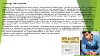
1. Analysing a Feature Article
The magazine has chosen to focus the feature article on this particular artist (Drake) as he is extremely successful and current. The magazine
targets 16-19 year olds that are interested in the artist and getting to know more about him. The page attracts the audience visibly with a
large picture of the artist himself and a large headline in capital letters. The article uses both formal and informal lexis, with a bit of humour.
This engages the audience. The article praises Drake from start to finish, including his obsessive female fans, intense life and the most
successful moments in his career. The article uses quotes from Drake and other well recognised artists to further engage and entertain the
reader, making them feel like they are understanding Drake personally. The article uses some slang; ‘hanging out’ ‘smash’. This targeting the
audience specifically with language relevant to the age group.
There are 3 columns, this makes the article more visibly attractive and seemingly less to read. The ratio of text to pictures is unbalanced.
There is only one image of drake on a large scale, and text which takes up ¾ of an a4 page. The quote “I cant paint a façade, look at the
Rolex. Its not all happy” is enlarged (pull quotes). This part of the article will attract the reader and potentially persuade them to read the
whole article.
The cover model is Drake. He is looking directly into the camera with a serious but emotional expression. Drake appeals to the younger
generation as he is very current and modern artist, relevant to the teens themselves. The body language and attitude of the model is very
casual, mysterious and laid back. The jewellery worn suggests wealth and is also attractive to the target audience as it is likely to be something
they aspire to have themselves. This is significant and relevant to the audience and the
magazine as a music magazine. The casual denim clothing suggests that drake is similar
to his fans despite his fame and wealth.
2. Analysing a Feature Article
The magazine ‘Q’ has chosen to focus this particular feature article on Lady Gaga. The article specifically targets 16-19 year olds that have a
wide interest in Lady Gaga. The page attracts the audience visibly with a large picture of Lady Gaga (cover model) on the left hand side of
the article, a larger header stating the article is directly about Lady Gaga, and a large ‘L’ which covers the majority of the double page
spread article that further highlights the article is about Lady Gaga. The colour of the L anchors the logo of Q magazine.
There are 3 columns, this makes the article more visibly attractive and seemingly less to read. The ratio of text to pictures is unbalanced.
There is only one image of Lady Gaga on a large scale, and text which takes up a whole a4 page. The large ‘S’ at the start of one of the
paragraphs suggests that this is the start of the main part of this article.
The cover model is Lady Gaga. The image takes up a whole page, indicating she is of high significance. Lady Gaga is a internationally famous
artist, this meaning her face is recognised every and anywhere. This immediately draws attention to the article. She is looking directly into
the camera in a provocative manner. In this sense, Gaga may appeal more to men in this article. Lady Gaga has no clothes on and is covering
herself with her hands. This suggests a very garnish and sexy attitude, which is what the artist is well known for. The picture has been further
edited into greyscale to create a more artistic and classic affect to both the magazine and Lady Gaga herself.
At the bottom right hand corner of the page, the logo of the magazine is just visible
highlighting what magazine this is.
3. Analysing a Feature Article
This double-page spread is from Top of the Pops magazine, and features pop star Justin Bieber. The magazine is targeted to young teenage
girls, specifically 16-19 year olds. . The page attracts the audience visibly with a large picture of Justin Bieber (cover model) on the right
hand side of the article, which just spans the centre line. A larger header is also included stating the article is about Justin and more
specifically, his interest in girls. Unlike the rest of the articles I've looked at, this double-page spread consists of an interview-style article,
unlike a heavy text-based article.
There are 3 columns, this makes the article more visibly attractive and seemingly less to read. The use of different coloured text throughout
the article makes reading also more convenient. The ratio of text to pictures is unbalanced. There is only one image of Justin on a large
scale, and text which takes up a whole a4 page.
There are red lines in the background of the article, which make it less formal and uniform. The title of the article is a quote from the text,
which is quite unusual, and there is also a smaller image on the left-hand page. The colour scheme consists of the colours black, white and
red. Black and white are conventional, and red is used a lot in music magazines. Red connotes love and passion, which links to Justin Bieber
being a heart-throb to the girls.
The cover model is Justin Bieber. The image takes up a whole page, indicating he
is of high significance. Justin Bieber is a internationally famous artist, this
meaning his face is recognised every and anywhere. This immediately draws
attention to the article. He is looking directly into the camera in a provocative
manner. This specifically targets his female fans. The colour of his clothing is
Black and red, fitting directly with the colour scheme.