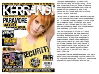
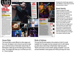
This document analyzes various elements of Kerrang! magazine issues, including covers, contents pages, and double page spreads. It discusses typical features like certain color schemes, styles of writing, and stereotypical representations of genres. The analyses note how elements are both consistent with and different from Kerrang!'s usual house style. Images are frequently used to draw in readers through appealing to bands and stereotypes while also providing information.
The document discusses various music magazines including Kerrang!, Vibe, and Top of the Pops. Details provided on Kerrang! include that it covers rock, punk, and heavy metal genres and targets goth, emo, and heavy metal fans. Analysis is also provided of Kerrang! magazine covers and articles, discussing typical styles, layouts, and how they represent bands and genres. The document also includes a questionnaire responses about music magazine preferences, with most responses focused on rock magazines.
The document provides an analysis of the Kerrang! magazine cover. It summarizes the different elements of the cover including the title, masthead, strapline, main image of Gerard Way, additional band images, cover lines, and colors/graphics used. The language and design elements are described as being aggressive and loud to match the rock music genre targeted at readers aged 16-25. Overall the analysis finds the cover achieves a unified house style through its use of bold capitalized text, bright colors, and crackled graphics to appeal to its target audience of rock music fans.
The document analyzes the layout, design elements, images and text used across multiple pages of a magazine to determine the target audience. Key points include:
- Bold text, bright colors and cluttered layout with small band images indicate a target of teenage males.
- A front cover with Frank Iero in the center using direct address alongside competitions and poster collectors items also aims at teenagers.
- In contrast, a mature layout with large celebrity images, minimal text and neutral colors presents an older, more sophisticated audience.
- Placement of mastheads, page numbers, titles and other elements follow conventions to effectively guide the eye across the page.
This document analyzes and compares the covers of multiple music magazines. It notes similarities and differences between the covers in terms of color schemes, target audiences, and layouts. The magazines share a common use of black, white, and red colors. Their target audiences vary from dance to rock music fans. The covers differ in their positioning of text, amount of text used, and level of clutter. The document also analyzes individual magazine covers like Mix Mag, Q, and Billboard in more detail, noting design elements, models, and how they appeal to intended readers.
The document analyzes and compares the covers of multiple music magazines. It notes that most covers use black, white and red as core colors. It also discusses similarities in photo angles and studio shots. The target audiences vary by genre but include dance, rock, and indie music fans. Layouts and amount of text differ by magazine as well. "Mix Mag" is described as more sophisticated than others that appear more cluttered.
This document analyzes a double page spread from a rock magazine. The spread uses typical conventions like columns of text and a large central image. The image shows a female model with a serious expression, dark makeup, and revealing clothing to portray a "rock chick" image and appeal to both male and female readers. The layout, colors, and fonts are also analyzed in terms of their symbolic meanings and how they represent the band and target demographics.
This 3 paragraph summary provides the key details from the multi-page magazine article about Lady Gaga:
Lady Gaga has become one of the biggest pop stars in the world with over 8 million album sales. The article profiles her unconventional style and provocative performances that push boundaries and comment on issues like sexuality. This has led to both immense popularity and controversy, with some criticizing her as an "attention whore." The profile describes her journey from singing in clubs as a teenager to breaking through with hits like "Poker Face" and "Bad Romance." It analyzes how she draws influence from diverse figures like David Bowie and uses shock value to spark important discussions.
This document contains analyses of magazine covers and contents pages from various rock music magazines such as Kerrang, NME, and Q Magazine. The analyses describe visual elements that would attract readers' attention, including prominent images of bands and their members, eye-catching fonts and colors, and previews of featured articles. The target audiences of the magazines are identified as generally male, ranging from teenagers to older generations, depending on the styles of music featured.
The magazine covers the new Blade Runner 2049 film. On the front cover, the dominant image is of Deckard and K from the film. It also advertises exclusive access and quotes from Harrison Ford to generate hype. The target audience is fans of cinema ages 15-35, specifically those interested in Blade Runner and similar films. It will be distributed both digitally and in print.
The document analyzes the design elements of magazine covers for NME, Kerrang!, and Q magazines. It discusses how each magazine's masthead, images, sell lines, colors, and other features are deliberately designed to represent the magazines' brands and target audiences. The mastheads and colors aim to convey rebellion for NME or loudness for Kerrang!, while Q uses simplicity. Images of bands are prominently displayed and positioned to highlight popular members. Sell lines advertise additional content to draw readers. Colors and freebies are used to attract attention and interest readers in the magazines' music content.
The document analyzes the front covers of several music magazines, examining elements like cover images, mastheads, fonts, colors, lists of artists, freebies, and other stylistic choices. It finds that all the magazines follow conventions like placing the masthead, barcodes, and issue info in consistent locations. The cover designs aim to attract target audiences by featuring popular artists in poses and styles relating to the relevant genres. Text elements like quotes, lists of artists, and headlines work to draw readers in and give them a sense of what's inside. Color palettes, graphics, and language are tailored per magazine to match expected audience demographics.
The document analyzes the front covers of several music magazines, examining elements like cover images, mastheads, fonts, colors, lists of artists, freebies, and other stylistic elements. It finds that all the magazines follow typical conventions like placing the masthead, barcodes, and issue info in consistent locations. The covers are also designed to appeal to the magazines' target audiences through the choice of artists featured and stylistic cues related to different music genres.
This document analyzes magazine covers from Kerrang!, Rock Sound, and Alternative Press magazines. It discusses various design elements of the covers including images, layouts, fonts, and color schemes. The target audience for these magazines is identified as teenagers and young adults aged 15-21 interested in rock and alternative music genres. Specific bands and artists featured on the covers are examined in terms of attracting readers and representing the styles of music covered in each magazine.
This double-page magazine spread features an interview-style article about pop star Justin Bieber. It targets teenage girls aged 16-19. The page uses Justin Bieber's large image on the cover and header to attract attention. The article has an unbalanced ratio of text to one large picture of Justin. It uses red lines and a mix of black, white, and red colors throughout to make it visually appealing while linking to themes of love that relate to Justin Bieber's image.
This document provides an analysis of the cover and contents pages of the Hip-Hop Weekly magazine. On the cover, there are many images of famous rappers which would attract fans. However, the design is described as "hectic" and not very mature. The contents pages layout is praised for clearly showing the stories and sections in an organized manner. The double page spread about Eazy-E is analyzed positively for using iconic black-and-white images of Eazy-E and his son that would appeal to fans, along with a well-organized text layout of the interview.
This document provides an analysis of a 2013 issue of the magazine Rock Sound featuring the band Paramore. It summarizes the magazine's target audience as people aged 15-24 interested in rock music. It notes the magazine connects with readers by giving away free CDs and discussing issues like bullying. The summary describes common design elements across the magazine like consistent colors and use of capital letters. It provides a brief history of Rock Sound, noting it began in 1999 and gains exposure for bands by including free CDs. Finally, it analyzes features of the Paramore-focused cover like images and text used to attract readers.
RESEARCH AND PLANNING - Music magazine analysisSydneyIsittAger
Both Q magazine and We Love Pop magazine target different audiences through their design choices. Q magazine uses a more mature red color scheme and formal text to appeal to older readers, while We Love Pop uses bright colors and informal, multi-colored text to seem fun and attract younger audiences. The magazines also differ in the types of stories covered, with Q focusing on music backgrounds and We Love Pop emphasizing gossip, as well as the images used on covers and inside pages.
The document analyzes several magazine covers and contents pages. It examines design elements like images, fonts, colors and layouts and how they target specific audiences. Key points analyzed include using popular bands and celebrities to attract readers, highlighting freebies and prices to increase sales, and employing rebellious imagery and informal language to appeal to teenage audiences. Color schemes and mastheads are also designed to stand out and engage readers.
This document provides information about two rock music magazines: Kerrang! and Metal Hammer.
Kerrang! has a circulation of 40,203 and readership of 387,000. Its mission is to take readers into the lives of rock musicians. The typical reader is a 25-year-old male who is passionate about rock music. Metal Hammer has a circulation of 35,259 and readership of 337,000. Its mission is to cover established and new metal bands. The typical reader is a 22-year-old male metal fan.
Both magazines use color schemes and layouts that match the genres they cover. Images of musicians are featured prominently. Articles aim to excite readers about new music and bands
This document analyzes six front covers of the pop music magazine "We Love Pop" to identify shared features and patterns. It finds that the covers consistently feature: the artist prominently on the right side; additional feature photos of both male and female artists; bright colors associated with pop music. Costume choices aim to keep young readers up-to-date on fashion trends. The signature masthead, pug logo, and use of photos also remain consistent across issues. These repetitive elements help maintain the magazine's brand identity and attract its target audience.
This double page spread from Vibe magazine features a full body shot of a female artist in a bright red dress as the main image. There are several smaller images of the artist in the same outfit in different poses in the background. The page lacks a title, has no bold text or subheadings, and the genre of music is unclear. The greyscale color scheme and modern clothing suggests the magazine covers popular culture beyond just music. The artist's poses are analyzed through the lens of Laura Mulvey's Male Gaze theory, implying the images are intended to please the male audience.
The document analyzes conventions used in modern rock magazines like Rocksound and Kerrang!, such as informal layouts with darker colors and serious facial expressions on covers. It discusses common elements like free music offers, a focus on music over celebrity gossip, and targeting teenagers/young adults. The analysis gives examples from magazine spreads, noting uses of colors, fonts, and intense imagery that attract readers while representing the rock genre.
The document provides an analysis of the design elements of the front cover and contents page of an indie music magazine. On the front cover, sans-serif fonts in varied sizes are used to draw attention to key information. Red, black, and white are used to create a contemporary style aligned with the genre. The cover image depicts the band in stereotypical rock poses. On the contents page, a mix of serif and sans-serif fonts and bold/plain text are used, along with images of famous artists, to attract readers' attention. The double page spread employs serif fonts, columns, and images of the artist to present information in a conventional magazine format.
The document summarizes and analyzes two double-page spreads (DPS) from music magazine NME. The first DPS features British musician Liam Gallagher and uses his image and interview to promote the magazine's brand and appeal to its target male audience. The second DPS features Florence Welch from Florence and the Machine and oversexualizes her image to also target young heterosexual men, though in a more conventional feminine style for articles about female artists. Both DPS employ consistent layouts and color schemes with the magazine's branding to engage readers through prominent images and interviews of famous indie artists.
The document provides an analysis of the design elements of various magazine covers, including:
1) Mastheads are prominently displayed using bold colors and styles to draw attention. Subheadings are also analyzed for how they intrigue readers about article contents.
2) Main images usually feature artists and are chosen to represent the magazine's brand and themes. Colors are also selectively used to focus attention or reference musical eras.
3) Layouts aim to attract readers through uncluttered spaces around main images and strategic positioning of additional text elements like contents. Language is also informal to build rapport with readers.
4) Additional features like band indexes and subscription details are included to enrich the reading experience and cultivate
The main image takes up one full page, maintaining the band's brand identity across issues. It features Kings of Leon looking directly at the camera to create a personal connection with readers. The large, eye-catching image of the well-known band is intended to draw readers in. The dark, indie-rock styled image portrays the band's genre through icons like leather jackets and conveyed attitude. The interview article aims to promote and inform readers about the band through a mostly formal tone with some humor.
The document analyzes the codes and conventions used on magazine front covers through examples. It summarizes the key design elements of four music magazine covers, including their color schemes, fonts, images, headers, and cover lines. Common techniques identified are using bold colors and large prominent images to attract attention, varying font sizes to add depth, and strategically placing cover lines to highlight featured artists and stories.
This document analyzes and compares the covers of multiple music magazines. It notes similarities and differences between the covers in terms of color schemes, target audiences, and layouts. The magazines share some common colors like black, white, and red. They also take splash photos in a studio at a medium-long shot angle. The target audiences vary between genres like dance, rock, and indie. Differences include the amount of text, positioning of elements, and level of clutter. The document examines individual magazine covers in more depth, analyzing aspects like colors, images, fonts, and how well the covers appeal to their intended readerships.
The document provides an analysis of the front cover and contents page layout of two magazines - Kerrang! and We Love Pop.
For the Kerrang! cover, the key signifier is Gerard Way of My Chemical Romance in a red outfit. Colors and fonts are chosen to appear alternative and rebellious. The contents page features Metallica in black and white to represent nostalgia, with a competition to attract readers.
The We Love Pop cover's key signifier is Olly Murs in a bright jumper. Pink is used to appeal to the target audience of young females. The contents page again features Olly Murs with articles about romance and bromances between boy band members.
Overall
The fonts used in Kerrang! magazine are chosen to appeal to its target audience of 16-23 year olds interested in rock music. Bold, sans-serif fonts are used that have a ragged, distressed look meant to seem rebellious and rock-inspired. The title font is cracked to give a hard rock feel and show the genre. Captions and headlines use large, clear fonts so readers can easily find information. Photos show bands in a natural, intimate style relating to fans and the lively target demographic. Strong contrasts between black and white create emphasis. Overall the magazine strives to have an edgy yet accessible design that readers can easily identify with the rock genre.
The document provides details about various music magazines, including their target audiences, cover designs, and content layouts. NME targets 15-24 year old males but includes various artists to attract a wider audience. Top of the Pops targets 11-16 year old girls with bright colors, jokes, and prizes. Kerrang uses dark colors and images of rock bands to appeal to fans of rock music. The magazines employ various design techniques tailored to their target demographics.
The dominant image on the front cover of the magazine is the band All Time Low. The writing and images are designed to attract a teenage/young adult audience with short, bold text and a prominent image of the band. The magazine uses bright colors like red to stand out and features the band prominently to draw attention.
The contents page also features a dominant image of Fall Out Boy reading a Kerrang! magazine. Images of bands and section titles are in bold, bright colors to attract readers' eyes. A small image of another band is included without drawing too much attention away from the main image.
This magazine cover targets teenage girls and young women. The main image features two smiling members of the boy band Union J, appealing to fans of mainstream pop music. Smaller images promote celebrities like Rita Ora and One Direction that would be attractive to the target audience. Sell lines advertise content on fashion, beauty, and celebrities. A quiz and posters of One Direction aim to engage readers and encourage purchases. The masthead, price, and bubbly font create an upbeat, feminine style appropriate for the young female target market.
The document provides details about various magazine covers, including their layout, color schemes, featured artists, and target audiences. Key elements that are highlighted include the use of prominent images and text to attract readers' attention, consistency in branding and house styles, and inclusion of previews of article topics to entice reading. The magazines profile various music genres including rock, indie, and pop artists in order to appeal to a range of teenage listeners.
This document analyzes magazine covers and articles from Kerrang! magazine and Scoot-Mag. For the Kerrang! magazine cover, the summary notes the bright colors and use of words like "awesome" suggest a younger target audience of 13+. A double page article is also described as using an untidy font and focusing more on images than text. For the Scoot-Mag cover, the summary explains the main rider featured does an insane trick to attract younger readers, and the colors match his favorite color. A double page article about a new sponsored rider keeps the writing brief and features varied images of the rider.
This document analyzes magazine covers and contents pages from different magazines. It discusses design elements like mastheads, photos, fonts and color schemes. Across the various magazine examples, common techniques are used to draw attention to the main story and artist while integrating other stories and information. Photos primarily feature the lead artist prominently in the center to attract readers. Fonts, colors and layouts are coordinated across pages to maintain a consistent brand and appeal to the intended music genre audience.
This document analyzes magazine covers and contents pages from different magazines. It examines elements like mastheads, photos, fonts, colors and layouts. The analyses suggest these elements are deliberately chosen to represent the genre of music featured, attract target audiences, and highlight the most important stories. Photos in particular are used to showcase lead artists and intrigue readers into learning more. Color schemes and fonts aim to fit the aesthetic of the music while carefully structuring information across the page.
This document provides annotations and analyses of the covers of several magazines across different genres:
1) The first magazine analyzed is a pop music magazine, with its central image being Brandon Flowers. Its target audience is females ages 14-20 and uses conventions like bright colors and Flowers' pose to appeal to this group.
2) The second is a rock magazine called NME, featuring the band Biffy Clyro. Its dark color scheme and bold font are typical of rock magazines and it aims to attract young male students ages 14-19.
3) The third magazine analyzed is about hip hop and its cover features icons of the genre holding gold weapons. It uses wealth and power as conventions to engage its target of
The double page spread in NME focuses on the band The Vaccines. A large photo shows the band members making eye contact with the camera, holding their guitars to emphasize they are "the biggest guitar band of 2011." The photo runs across the fold and uses a simple color scheme of black, light blue and white to reflect the band's simple musical style. Short quotes and facts about the band's success entice readers to learn more in the full article.
The target audience of the Kerrang! magazine is young people aged 14+ due to its focus on modern music genres like rock. It uses stylistic elements like a smashed masthead, loud font, and red color scheme to signify genres like rock and metal. The Uncut magazine seems aimed at an older audience (25+) as it features older, classic rock bands that younger people may not recognize. Both magazines follow consistent house styles in their layouts, color palettes, and fonts to maintain their brand identities and associate with rock music.
The Vibe magazine targets teenagers and young adults aged 15-25 with its typography and focus on rap/hip-hop artists. It uses a central image of the artist Dead
The document compares and contrasts the covers of two music magazines: Kerrang! and Top of the Pops (TOTP). Some key differences noted are that Kerrang! targets an older male audience with darker imagery and simpler layout, while TOTP targets younger females with brighter imagery, more organized layout, and sneak previews of articles. Both magazines use conventions of their respective genres (rock for Kerrang! and pop for TOTP) and feature artists that appeal to their target audiences.
This double page spread from NME magazine features an article about the indie rock band White Lies. The layout follows NME conventions with a large image of the band on the right page and text on the left. This maintains the magazine's brand identity. The main image depicts the band in a dark room lit by spotlights, reflecting their dark indie rock image. The article is both a description of the band's pre-show rituals and an interview about their upcoming gig. Additional elements like the headline, standfirst, and color scheme are designed to draw in readers who are fans of both White Lies and the rock genre.
This magazine is aimed at teenagers who enjoy rock music. The front cover features a close-up photo of the rock singer Olly Sykes and promotes an article about getting inside his mind. Other modern rock bands advertised will appeal to younger readers. Bold colors and text are used to attract attention. The contents page lists rock-focused articles next to photos of bands. A double-page spread promotes the annual rock festival Slam Dunk and photos of rock performers to interest readers.
This document summarizes the key elements of a Kerrang magazine cover. The target audience is males aged 15-34 interested in rock and heavy metal music. The main image features the band Black Veil Brides to appeal to fans and draw readers in. Intriguing cover lines about the band and other artists like Asking Alexandria aim to provoke curiosity and encourage people to purchase the magazine to learn more. Bold colors, fonts and graphics are used consistently across issues to reinforce the magazine's brand identity within the rock/metal genre.
This document analyzes the front cover and contents page of a music magazine. Key details analyzed include the use of colors, fonts, and images to appeal to target audiences and convey the magazine's genre. Celebrities featured and layouts are examined to understand how conventions are used or subverted. The target audience seems to be teenagers interested in rock, rap, or pop music from America. Exclusive content and free offers are called out as marketing tactics to encourage purchases.
Strategies for Effective Upskilling is a presentation by Chinwendu Peace in a Your Skill Boost Masterclass organisation by the Excellence Foundation for South Sudan on 08th and 09th June 2024 from 1 PM to 3 PM on each day.
How to Setup Warehouse & Location in Odoo 17 InventoryCeline George
In this slide, we'll explore how to set up warehouses and locations in Odoo 17 Inventory. This will help us manage our stock effectively, track inventory levels, and streamline warehouse operations.
Main Java[All of the Base Concepts}.docxadhitya5119
This is part 1 of my Java Learning Journey. This Contains Custom methods, classes, constructors, packages, multithreading , try- catch block, finally block and more.
Reimagining Your Library Space: How to Increase the Vibes in Your Library No ...Diana Rendina
Librarians are leading the way in creating future-ready citizens – now we need to update our spaces to match. In this session, attendees will get inspiration for transforming their library spaces. You’ll learn how to survey students and patrons, create a focus group, and use design thinking to brainstorm ideas for your space. We’ll discuss budget friendly ways to change your space as well as how to find funding. No matter where you’re at, you’ll find ideas for reimagining your space in this session.
How to Manage Your Lost Opportunities in Odoo 17 CRMCeline George
Odoo 17 CRM allows us to track why we lose sales opportunities with "Lost Reasons." This helps analyze our sales process and identify areas for improvement. Here's how to configure lost reasons in Odoo 17 CRM
Chapter wise All Notes of First year Basic Civil Engineering.pptxDenish Jangid
Chapter wise All Notes of First year Basic Civil Engineering
Syllabus
Chapter-1
Introduction to objective, scope and outcome the subject
Chapter 2
Introduction: Scope and Specialization of Civil Engineering, Role of civil Engineer in Society, Impact of infrastructural development on economy of country.
Chapter 3
Surveying: Object Principles & Types of Surveying; Site Plans, Plans & Maps; Scales & Unit of different Measurements.
Linear Measurements: Instruments used. Linear Measurement by Tape, Ranging out Survey Lines and overcoming Obstructions; Measurements on sloping ground; Tape corrections, conventional symbols. Angular Measurements: Instruments used; Introduction to Compass Surveying, Bearings and Longitude & Latitude of a Line, Introduction to total station.
Levelling: Instrument used Object of levelling, Methods of levelling in brief, and Contour maps.
Chapter 4
Buildings: Selection of site for Buildings, Layout of Building Plan, Types of buildings, Plinth area, carpet area, floor space index, Introduction to building byelaws, concept of sun light & ventilation. Components of Buildings & their functions, Basic concept of R.C.C., Introduction to types of foundation
Chapter 5
Transportation: Introduction to Transportation Engineering; Traffic and Road Safety: Types and Characteristics of Various Modes of Transportation; Various Road Traffic Signs, Causes of Accidents and Road Safety Measures.
Chapter 6
Environmental Engineering: Environmental Pollution, Environmental Acts and Regulations, Functional Concepts of Ecology, Basics of Species, Biodiversity, Ecosystem, Hydrological Cycle; Chemical Cycles: Carbon, Nitrogen & Phosphorus; Energy Flow in Ecosystems.
Water Pollution: Water Quality standards, Introduction to Treatment & Disposal of Waste Water. Reuse and Saving of Water, Rain Water Harvesting. Solid Waste Management: Classification of Solid Waste, Collection, Transportation and Disposal of Solid. Recycling of Solid Waste: Energy Recovery, Sanitary Landfill, On-Site Sanitation. Air & Noise Pollution: Primary and Secondary air pollutants, Harmful effects of Air Pollution, Control of Air Pollution. . Noise Pollution Harmful Effects of noise pollution, control of noise pollution, Global warming & Climate Change, Ozone depletion, Greenhouse effect
Text Books:
1. Palancharmy, Basic Civil Engineering, McGraw Hill publishers.
2. Satheesh Gopi, Basic Civil Engineering, Pearson Publishers.
3. Ketki Rangwala Dalal, Essentials of Civil Engineering, Charotar Publishing House.
4. BCP, Surveying volume 1
A review of the growth of the Israel Genealogy Research Association Database Collection for the last 12 months. Our collection is now passed the 3 million mark and still growing. See which archives have contributed the most. See the different types of records we have, and which years have had records added. You can also see what we have for the future.
How to Build a Module in Odoo 17 Using the Scaffold MethodCeline George
Odoo provides an option for creating a module by using a single line command. By using this command the user can make a whole structure of a module. It is very easy for a beginner to make a module. There is no need to make each file manually. This slide will show how to create a module using the scaffold method.
বাংলাদেশের অর্থনৈতিক সমীক্ষা ২০২৪ [Bangladesh Economic Review 2024 Bangla.pdf] কম্পিউটার , ট্যাব ও স্মার্ট ফোন ভার্সন সহ সম্পূর্ণ বাংলা ই-বুক বা pdf বই " সুচিপত্র ...বুকমার্ক মেনু 🔖 ও হাইপার লিংক মেনু 📝👆 যুক্ত ..
আমাদের সবার জন্য খুব খুব গুরুত্বপূর্ণ একটি বই ..বিসিএস, ব্যাংক, ইউনিভার্সিটি ভর্তি ও যে কোন প্রতিযোগিতা মূলক পরীক্ষার জন্য এর খুব ইম্পরট্যান্ট একটি বিষয় ...তাছাড়া বাংলাদেশের সাম্প্রতিক যে কোন ডাটা বা তথ্য এই বইতে পাবেন ...
তাই একজন নাগরিক হিসাবে এই তথ্য গুলো আপনার জানা প্রয়োজন ...।
বিসিএস ও ব্যাংক এর লিখিত পরীক্ষা ...+এছাড়া মাধ্যমিক ও উচ্চমাধ্যমিকের স্টুডেন্টদের জন্য অনেক কাজে আসবে ...
Pengantar Penggunaan Flutter - Dart programming language1.pptx
Media Coursework
1.
2.
3. Kerrang! magazine
Genre – Rock/Punk/Heavy Metal
Target Audience – Goth/Emo/Heavy
metal fans
Content – All about the different musical
people out there under the genre
“Rock”, “Punk” or “Metal” etc. (EG:
Green Day; Paramore; Bullet For My
Valentine; Foo Fighters etc.)
Publishers – Bauer Media Group
I intend to produce a
music magazine much
like Kerrang!
4. Vibe magazine
Genre – Pop
Content – All about the relevant music and
artists coming under the pop category (EG:
Nicki Minaj; Drake; Kanye; Beyoncé etc.)
Target Audience – Teen/Chav/Gangster
Publishers – Quincy Jones
5. Top Of The Pops
Genre – Teen/Pop/R&B
Content – Full of information about people
and their life – much like US Weekly or OK!
but about musical people instead.
Target Audience – Teen
Publishers – Immediate Media Company
6.
7. The majority of the typography is in “Franklin Gothic
Heavy” because it is big, bold and eye catching. The bold
text in the title draws you in to look at what the magazine
is about. As your eyes flicker over the cover, you see that
there are bold band names such as “Bullet For My
Valentine” and “Foo Fighters” which draws you in further
if you are a big fan of those bands.
The main colours are black and white; the colours usually used
for a dark, miserable gothic scene in a movie. However there is
also a lot of yellow in this issue’s cover and it connotes danger
with the black as in many of the “DANGER” signs around,
there are the colours black and yellow. The colours black,
yellow and white are more likely to attract the target audience
of the metal-heads; the Goths and the emos.
There aren’t many images on the cover as it is mainly
of one girl (Hayley Williams; lead singer of Paramore)
and how she answers your questions. This appeals to
the target audience by giving off the same yellow and
black colours again in the top that she is wearing and
showing her hair colour to be a similar colour. There is
also an image of the band “Bullet For My Valentine” to
attract the audience again to show what they look like.
There is again, more images of people from different
bands as you look to the bottom left corner; there are
posters of them now.
The language of the cover is very acceptable and formal due to
wanting to attract more older people to read the magazine. The
only slang people of language is “ON YER BIKE!”. It then clarifies
underneath it by saying “Foo Fighters Taylor rides solo…”
8. The typography of the contents is in “Franklin Gothic Heavy” to
attract the target audience. The normal typography is quite small so
you would need the big bold writing in capitals to see what the
articles are about.
The layout is very cluttered as there are a lot of pages to go through
and in this particular issue; there is a competition on so they would
want to make that bigger than the rest of the adverts or the letter
from the editor. The letter from the editor is quite small compared to
what it would usually be because of the competition.
The colours are quite dark and dangerous again, just like the cover.
It has yellow, black, white and this time; some red. The red is to
attract the Metallica fans as it is a Metallica competition. Each
subheading is in yellow with black surrounding it, again giving off
the danger tape effect. There is a patch of slightly different colours
in the bottom right hand corner of the page advertising a
subscription to Kerrang! for £15. The colours are blue, yellow and a
small amount of black.
There is only 5 images on this page due to it being the contents: the
vans on the competition part (both pairs); the picture of Metallica;
the picture of the magazines in the advert and the messed up image
of the editor. The images of the vans shoes are only there to show
people what they would want.
The language is quite brief and like taking notes with a small
explanation underneath. However it is formal with there being no
slang and “teenage talk”.
9. The typography is quite small for an interview on a
double page spread. However the title is very big to
attract the audience and draw them into reading the
article.
The layout is not like you would expect as it has 2
columns of writing and over one page is a picture or
Taylor Momsen. It has a insert over the image of
something she said.
The colours aren’t as dangerous looking as before.
These colours are black, grey and purple. The give
the effect of looking funky and “cool” to attract the
audience to the page.
The only image on the double page spread is of the
lead singer of the band “The Pretty Reckless”. It is a
big one, again to attract the audience and people
just randomly flicking through the page. It is bigger
than you would expect as if you are going to have a
picture over a page it would not overlap unless it is a
poster.
You can’t really tell what the language is as the
writing is very small. However there is a rhetorical
question “Is The Pretty Reckless 17-year-old
frontwoman as crazy as she seems?” in the
description under the title “wild child”.
10.
11. Analysing the latest issue of Kerrang! magazine the cover is completely different. It has more variety of colours and fonts; it isn’t all
in capital letters.
Brand Identity
It has more colour: black; blue; grey; yellow; red and orange. Kerrang! obviously wants the image on each issue to cover half
of the title. This issue has got the someone from the band “Weezer” and his head covers the letters “rra” from Kerrang!. It also
has red eyes signalling that the man is evil and dangerous. Kerrang! clearly wants the non readers to think that it is a
dangerous and scary magazine.
House Style
Kerrang!’s preferred way of presenting their written material is to practically
shout it at people by putting it all in capital letters. However this issue is
different by having less capitals. Kerrang! prefers to have their issue covers
cluttered with writing and images; all to attract the target audience.
Mode of Address
The way that this text speaks to the audience is that it is often eye
catching with the capital letters and colours. The language is very abrupt
but formal as if you were briefing a search and rescue team. The
rhetorical questions keep you thinking so on this issue the question is “A
Day To Remember; Will you forgive them?” and it makes you think ‘Why,
what have they done wrong?’.
12. Analysing the contents of an issue of Kerrang! magazine. This issue is quite different as it is mainly images and the letter from the
editor is at the side of the page and not at the bottom.
Brand Identity
It has more colour and Kerrang! magazine wants people to think that
there are a lot of bands that they cover and they show this by giving
us lots of images to look at of these bands. In this issue it shows us
Blink 182 and Paramore.
House Style
Kerrang!’s way of presenting this written material is to have it in
capital letters and in colours. It can be shouted at you in capitals
like the cover or it can be written nicely AND shouted at you like it
is here.
Mode of Address
The way that this text speaks to the audience is that it is quite big
and colourful so that the reader can see what they want to see or
read the letter from the editor.
13. Analysing this double page spread is
quite different in some ways to the first
one and similar in others.
Brand Identity
These two pages are hugely
different with there being way less
written text than the previous
double page spread. This one has
a small interview, 2 reviews of
different bands and a “what did you
think?” box with 3 peoples different
opinions of the bands. In a way,
there is more written text than
before. Also there are images and I
mean that there are loads! There
are 8 photos of the bands whilst
performing in Cardiff. Kerrang! is
probably trying to clutter the page
with more information to try and get
more people reading the page.
House Style
The house style is quite different to other pages and
the cover. Its design is not to shout at you but to draw
you in with the tonnes of information about A Day To
Remember’s latest gig and the latest gig from Emily’s
Army. The images also draw you in as there are not 5,
6, 7, 8 but 9 photos!
Mode of Address
The way that this text speaks to the audience is that it is small,
readable from the paper (not the computer) and it is still making
you think about what A Day To Remember might have done
“ADTR come back to torch Cardiff, apology accepted!” if you are
not that interested in band gossip and mainly just enjoy the music.
14.
15. The language of these 3
images are all different.
This appeals the target
audience by having the
name of the band in big
red letters and the
caption underneath
saying “ADTR COME
BACK TO TORCH CARDIFF,
APOLOGY ACCEPTED!”.
This banner has alliteration of the words “Pop-Punk
Picnic” and then draws the audience in by saying that
our invite to the picnic is inside the issue.
This piece has a rhetorical
question on it making the
reader want to know more
about her and if the
prediction about Taylor
Momsen is true or false.
16. This image appeals to the
specific audience by
having the red eyes so it
says to any non-readers
that it is dangerous and
scary yet those who read
it know it is just
something to do with the
band and will draw the
reader in.
This image draws the audience in by showing you what
Metallica look like and then causing them to look
over the page as there isn’t usually a band picture on
the contents unless there is a competition.
This image doesn’t
really do so much for
drawing the reader in;
it only really shows
you what the lead
singer looks like.
17. The colours are very different to
other issues and are more to do
with the band this time; none of the
usual colours of yellow, black and
red but mainly green. This draws
the reader in by it showing that
the magazine is taking an interest in
this band and what colours
represent them.
The colours of this cover are much like the usual
covers with there being colours of yellow and
black, representing danger to other non-readers
but normal readers know that this is normal and is
just a way of showing that Hayley Williams is
wearing a yellow t-shirt so they should have
yellow to translate that. Also it has that sense
of safety coming from the magazine and Hayley’s
top saying “security”.
This issue is yet again different. There
is lots of blue and red this time because
Hayley’s hair is red and blue. There is
the main colour of yellow again and again
to any non-readers this connotes danger
and to stay away from the magazine but
to those readers; there is that image of
those people you love and listen to on
the top so it means safety to them.
18.
19. The magazine has represented Taylor Momsen as dark and mysterious.
Her dark eyes connote danger and connect to the rock genre. Her hair
related to the title “wild child” with the fact that it is messy and looks
like she has been head-banging to some rock music. It represents the
stereotype of Goth and Emo with what she is wearing and what she is
part of. The stereotype is that most Goths and Emos wear black and
dark clothing and they listen to heavy metal music.
This cover of Green Day has represented them as crazy and psychotic with their poses
but with Billy-Joe Armstrong’s make-up (the middle one), it makes him look even
more crazy than he would have looked without. Mike Dirnt’s (the one on the right)
pose makes him look deranged yet Billy-Joe and Tre Cool (the one with the hat) look
bored in this shot. The dark colours of their clothing suggest that they are gothic and
scary. This all connects to the rock and metal genre that they come from with the dark
colours and gothic style. However the colour green throws us off but if you are a reader
you would know what it is just a pun for their name “Green Day”. This also represents
the stereotype of Goth, Emo and Metalhead. Male Goths, Emos and Metalheads often
wear similar things to what Billie-Joe is wearing and what he does with his make-up. It
shows that most people that do things like this will most likely be in a rock band or
listen to music like Green Day.
20.
21. Front Cover
On the front cover of a Kerrang! magazine, it is typical to have colours of
yellow, black and red; sometimes with blue on it. It is also typical to
stereotype the different “categories” for people (Goth, Emo, Metalhead
etc). The writing is all in capitals and the title is often half covered by an
image of a band member. It often has one main image and then some
advert on there with a competition. Most of the writing is on the left
hand side of the cover and the band name is nearly always next to the
picture wit Double Pha tghee eSxpcerpetaiodn of this issue… The band name is in the middle.
On a double page spread in Kerrang! there will be at least one
image and a lot of writing because the magazine will need to get
across what the people are really like if it is an interview or if it is
a review, they will need to get across what the reviewer thought
of the band. The stereotyping is kept to a minimum, even though
the images look like they are trying to get people to look like
Goths, Emos or Metalheads. They aren’t. Kerrang! is trying to get
people to like the magazine and by putting up stereotypical photos,
it gets the people to wonder if that is really what they are like.
22. Contents Pages
The contents will nearly always have an image on there of the editor and it will
have a couple of photos of a band too. Depending on the issue will depend on
whether the contents bit is down the bottom of the page or at the side or even
smack-bang in the middle. There is always a letter from the editor and an advert
for a subscription of Kerrang!
Sometimes there is a competition on the contents but sometimes it is on a
different page so the contents has a different layout. There is a different
layout every issue.