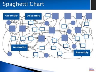
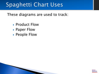
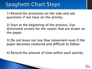
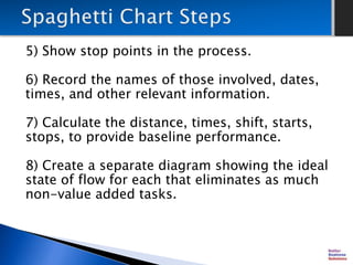
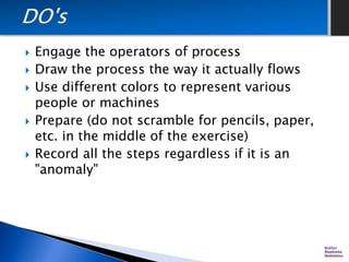
A spaghetti chart is a data visualization method that represents flows through systems resembling noodles, aimed at reducing inefficiencies. It involves tracking various flows, drawing scaled diagrams, and recording detailed information about the processes. The document outlines steps for creating these diagrams, including documenting all activities, calculating performance metrics, and engaging operators to accurately represent the actual flow.