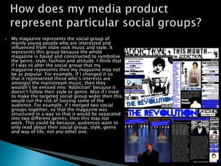
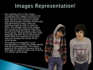
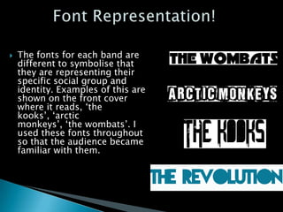
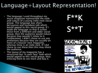
   My magazine represents the social group of
    mainly young people who are interested and
    influenced from indie rock music and style. It
    represents this group because the whole
    magazine is based and constructed to symbolise
    the genre, style, fashion and attitude. I think that
    if I was to alter the social group that my
    magazine represents then my magazine may not
    be as popular. For example, if I changed it so
    that it represented those who’s interests are
    amongst the mainstream music, then they
    wouldn’t be enticed into ‘Addiction’ because it
    doesn’t follow their style or genre. Also if I tried
    to make the targeted social group wider then this
    would run the risk of loosing some of the
    audience. For example, if I merged two social
    groups together, so that the magazine was
    structured in a way so that it would be separated
    into two different genres, then this may not
    work. This could be because, audiences want to
    only read about their social group, style, genre
    and way of life, not any other one.
   The clothing worn in the images
    throughout the magazine connote the
    style and fashion of the social group.
    Also, because the clothing is mainly
    what you’d expect someone of that style
    and generation to wear, then the
    audience might be able to relate to
    them. The people used in the images
    also convey to the audience that they
    are representing the young, indie/rock
    social group. They do this by their body
    language and their facial expressions.
    These allow the audience to see that
    they are amongst the trends of the
    social group.
   Throughout my magazine I used
    demographics, so that the images would
    only be of young people. This would
    appeal to the audience because they’re
    then able to relate to them, due to being
    in a similar social group.
   The fonts for each band are
    different to symbolise that
    they are representing their
    specific social group and
    identity. Examples of this are
    shown on the front cover
    where it reads, ‘the
    kooks’, ‘arctic
    monkeys’, ‘the wombats’. I
    used these fonts throughout
    so that the audience became
    familiar with them.
   The language I used throughout my
    music magazine represented the style
    and culture of a young indie/rock social
    group. The language was short,
    persuasive and mundane talk which
    would appeal to this social group. If I
    made the language so that it suited
    those from a different and older social
    group, then the audience would reduce
    because they wouldn’t relate to it.
    Furthermore, I didn’t chose to use any
    profanities because they are usually on
    more of a heavier rock magazine,
    whereas mine is an indie rock. If I did
    chose to use these then this may shock
    the audience.
   The layout of my magazine has a
    structured but ‘in your face’ look which
    would appeal to this social group, thus
    enticing them to see more and buy it.

Social groups evaluation

  • 2.
    My magazine represents the social group of mainly young people who are interested and influenced from indie rock music and style. It represents this group because the whole magazine is based and constructed to symbolise the genre, style, fashion and attitude. I think that if I was to alter the social group that my magazine represents then my magazine may not be as popular. For example, if I changed it so that it represented those who’s interests are amongst the mainstream music, then they wouldn’t be enticed into ‘Addiction’ because it doesn’t follow their style or genre. Also if I tried to make the targeted social group wider then this would run the risk of loosing some of the audience. For example, if I merged two social groups together, so that the magazine was structured in a way so that it would be separated into two different genres, then this may not work. This could be because, audiences want to only read about their social group, style, genre and way of life, not any other one.
  • 3.
    The clothing worn in the images throughout the magazine connote the style and fashion of the social group. Also, because the clothing is mainly what you’d expect someone of that style and generation to wear, then the audience might be able to relate to them. The people used in the images also convey to the audience that they are representing the young, indie/rock social group. They do this by their body language and their facial expressions. These allow the audience to see that they are amongst the trends of the social group.  Throughout my magazine I used demographics, so that the images would only be of young people. This would appeal to the audience because they’re then able to relate to them, due to being in a similar social group.
  • 4.
    The fonts for each band are different to symbolise that they are representing their specific social group and identity. Examples of this are shown on the front cover where it reads, ‘the kooks’, ‘arctic monkeys’, ‘the wombats’. I used these fonts throughout so that the audience became familiar with them.
  • 5.
    The language I used throughout my music magazine represented the style and culture of a young indie/rock social group. The language was short, persuasive and mundane talk which would appeal to this social group. If I made the language so that it suited those from a different and older social group, then the audience would reduce because they wouldn’t relate to it. Furthermore, I didn’t chose to use any profanities because they are usually on more of a heavier rock magazine, whereas mine is an indie rock. If I did chose to use these then this may shock the audience.  The layout of my magazine has a structured but ‘in your face’ look which would appeal to this social group, thus enticing them to see more and buy it.