Smb vs smw
•
1 like•344 views

The document compares the user interfaces of Super Mario Bros from 1985 and Super Mario World. It describes each of the key elements that make up the UI such as the coin, character, level, time, and score indicators. In Super Mario Bros, all UI elements used the same simple white font style. However, in Super Mario World each element had its own graphical style to make them more easily distinguishable like the gold coin counter. The positioning of the UI also changed from being lined at the top to positioned in the screen corners for better visibility.

More Related Content
Similar to Smb vs smw
Similar to Smb vs smw (20)
More from Ryan Worcester
More from Ryan Worcester (20)
Smb vs smw
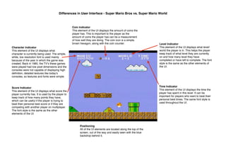
- 1. Differences in User Interface - Super Mario Bros vs. Super Mario World Coin Indicator This element of the UI displays the amount of coins the player has. This is important to the player as the amount of coins the player has can be a measurement of how well they are doing. The coin icon is a simple, brown hexagon, along with the coin counter. Character Indicator This element of the UI displays what character is currently being used. The simple, white, low resolution font is used mainly because of the year in which the game was created. Back in 1985, the TVʼs these games were played had low pixel dimensions and the consoles were not capable of displaying high definition, detailed textures like todayʼs consoles, so textures and fonts were simple. Level Indicator This element of the UI displays what level/ world the player is in. This helps the player keep track of what level they are currently on and how many level they have completed or have left to complete. The font style is the same as the other elements of the UI. Time Indicator This element of the UI displays the time the player has spent in this level. It can be important for players who want to beat their personal best times. The same font style is used throughout the UI. Score Indicator This element of the UI displays what score the player currently has. It is used by the player to keep track of how many points they have, which can be useful if the player is trying to beat their personal best score or if they are competing with another player on multiplayer. The font style is the same as the other elements of the UI. Positioning All of the UI elements are located along the top of the screen, out of the way and easily seen with the blue backdrop behind it.
- 2. Differences in User Interface - Super Mario Bros vs. Super Mario World Coin Counter This element of the UI displays the amount of coins a player has. This element is vastly different from the 1985 Super Mario Bros. The coin counter has itʼs own style from the other elements of the UI, gold/yellow font fits well with the coin icon next to it. The size is large enough for the player to quickly glance to see how many coins they have. The font matches with the time indicator and the score counter. Player Indicator This element of the UI displays the characters currently playing. This element is a lot different from the 1985 Super Mario Bros (SMB). In SMB, the character is displayed by the name, however in Super Mario Worlds (SMW) the characters are displayed by an icon of their face. Time Indicator This element of the UI displays the time spent on the level. It is different from the 1985 SMB as the counter sits next to a clock icon in SMW and is a grey colour now. The font matches the coin counter and the score counter. Score Counter The score counter displays the playerʼs current score. It is located under the time indicator in the same colour and font. Star Counter The star counter displays how many stars the player currently has. The dotted outline of the star represent the stars left to find. There were no stars in the 1985 SMB so there is nothing to compare, however if there was a star counter in SMB, it would most probably fit the same style as the other element of the UI as they all look the same. Positioning The positioning has changed, All the UI elements are now aligned in the top corners of the screen, not at the top. This is due to the with the fact that in the 1985 SMB, the top of the screen would always stay blue due to the Y axis being fixed, meaning the white coloured UI elements will always be seen, however in SMW, the game is 3 dimensional, meaning the X, Y and Z axises are always changing and so lining all the elements at the top of the screen could cause some of the screen to be obstructed. For example, if all of the elements were lined up the top in the screenshot above, princess peachʼs face would be covered, obstructing the important parts of the game. Graphical Styles All of the UI elements in the 1985 SMB were identical in graphical style, they were all white and used the same font. However, in SMW, each element has a unique style to differentiate from one another. This helps make glancing at certain parts of the UI easier to understand, meaning if I wanted to check how many coins I had, I would look over and clearly see what element indicates how many coins I have due to the graphical style.