Download as PDF, PPTX
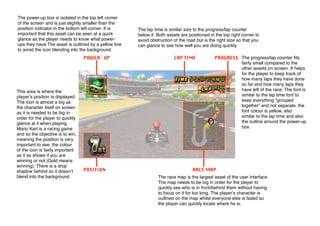

The power-up box is located in the top left corner and is slightly smaller than the position indicator in the bottom left. It must be visible at a glance so the player knows their power-ups. It has a yellow outline to prevent blending into the background.


