Call Girls In Dwarka ⏩7838079806 ⏩Escort Service In Patel Nagar Delhi
Mock Up Cover Analysis
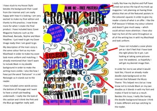
1. In order for me to see what it would
look like, I found an already made
doodle style background on the
internet that followed the Music
Theme. This helped me a lot as I now
know not to include Black on my own
doodles as it blends in with my font and
makes it hard to read as a result.
Besides this issue, I really like having
the doodle background because I think
it looks different and eye catching to
the reader.
I really like how my Skyline and Puff have
turned out across the top of my mock up
magazine. I am planning on having three
photos that are of the featured posters in
the coloured squares in order to give my
reader a taste of what is on offer. I like the
Puff because it follows my colour scheme
and doesn’t give much away – which
could attract more attention. I have also
kept my font all the same throughout so
all of the writing ties in with my Masthead
and look uniform.
I have not included a cover photo
yet as I don’t feel that I have took
the right photo for it yet. I am
looking at taking some pictures
over the weekend, so hopefully I
will get my desired image then.
My description of the main story is
the same colour font as my main
Masthead in order to make my cover
look more uniform and matching. I
already mentioned that I don’t want
to include Black in my doodle
background in order to make the
writing more visible. I also like how I
have put the word ‘Exclusive!’ in a red
Rectangle so it stands out to the
reader.
I have stuck to my House Style
besides the background that I used
from the internet and I am really
happy with how it is looking. I am very
excited to make my final edition and
thanks to this practice, I now know
more for when I create the final
product. I have included basic Cover
Magazine Features such as the
Masthead, Barcode, Skyline and Main
Headline. I just need to get my Cover
Image ready then I am good to go.
I have included some words across
the bottom of the page and I want
to have a small sub-heading
underneath. I really like the look of
this section and I think the Pink and
the Blue go together really well.