Python Notes for mca i year students osmania university.docx
Production diary
1. PRODUCTION DIARY – ALICJA MORAWSKA
When production started, I hadn’t been able to collect any photography to begin work on
the articles, so I started trying out different ideas for the CD cover I had planned to make. I
knew what the general layout was meant to be like so I began with adding the list of songs
and artists to the back half of the cover.
This was quite easy to do as it was simply
creating a list of fake music. I looked at
pre-existing products to help me
understand what the standard layout of
the text should look like, making a clear
difference between artist and song, as the
CD would feature a collection of different
bands that had been picked out by the
magazine for a free copy to its listeners.
I knew that eventually I would have to
come up with a name for the magazine
anyway, as it would have to go on the front
cover and be mentioned in articles, so the
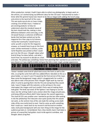
name Royalties was picked so that I could
put it on the CD case. I thought about what
kind of thing I’ve done before, and what I
learnt from my research to decide on a font
and style. The yellow was something I knew from planning that I wanted to use and the font
was chosen as it was slightly eroded and gave the title a more rough, grunge appearance.
I knew I needed some kind of splash text across the front as well as the
title, so using the same font with less added effects I decided on this as a
place holder, as I wasn’t sure if it would be the final version of the layer.
Now came the background image, which I struggled with for a while. I
was able to take a few pictures that I thought might work by now but
when it came to pasting them into the file and seeing how they would
look, I wasn’t happy with the outcome as the writing on the cover
interrupted the images and I just couldn’t find a way of making them
look good. The birds eye views of the lighters I was hoping to use the
most, but the writing made it very unclear what the image actually was,
and trying different affects didn’t help improve the overall apperence.
The stack of CD’s was another area I wanted to go into but after putting
it into the photoshop file it became clear quite quickly that this would
not work, as the verticle lines of the cds made the writing across both
sides of the case really hard to read. I had to come up with something
that I could use. I went back to my research and focused on another
style, really plain background with one main thing on the image for the
audience go look at. I remembered that a few months back I had taken a
picture of a wasp that had gotten stuck inside against a window, and
thought about using that.
2. PRODUCTION DIARY – ALICJA MORAWSKA
The image I chose was a detailed image of a wasp
against a blue background, meaning that I was able
to fit the entire focus of the picture between the title
and the slash writing at the bottom.
I then brought my attention over to the back of the
case, starting to add the aspects to make it look more
realistic such as adding a few record company logos
to give clear indication to who released the product,
as well as adding text stating that the cd is not for
resale purposes.
With the CD case finished, I started to move onto the articles. I brought two friends into the
studio for a photoshoot, as this would allow me to collect images for two double page
spreads at once, meaning that later I wouldn’t have to worry about not having the images
ready, something that I know I made a mistake with during the print rotation earlier in the
year. During the photoshoot, I experimented with different light settings and wanted to
make sure that I was going to get a range of images, to be able to have options when
choosing the tone of the pages later on. I decided to continue with the model I originally
picked for the mental health article and would later decide what the other models photos
would be used for. I felt confident in being able to use the studio as I had taken time during
research to get used to how the room works.
The first thing I did after choosing my images was free transform it into the correct size for
the double page spread, and after experimenting, decided to use the gradient tool to make
the image come together into the same shade of black where the text would be. I spent
some time trying to figure out how to fix some of the imperfections on the models face and
came across the spot healing tool which allowed me to use the surrounding pixels to correct
some of the minor details. I thought about how I was going to lay out the rest of the page
that surrounded the model and where the text was going to be placed. I decided that I was
going to set up a new guide along the page, equal distance from the top and bottom that I
could use to add in details such as page titles and page numbers across the top, and things
such as photographer credit and a few lines of text along the bottom.
3. PRODUCTION DIARY – ALICJA MORAWSKA
I wanted to add more to the left-hand side of the
page as I felt it looked too empty so I re-read the
article I had written for this spread and picked
out a pull quote that I placed over the model,
using quotes on separate layers to be able to
control them better.
I came back to my mental health double page
spread at the start of this week and found that a lot of the layers had flattened down,
meaning that I wasn’t able to edit them. Luckily I’d done most of what I wanted from
Photoshop on this save, only having to place a rectangle box over some text that wasn’t the
right size, allowing me to move on to putting in the article using InDesign without it causing
too much of a problem.
Once I had the finished image in InDesign I could start adding the copy of the article I had
written for this page. I’d tried working out how many words it would take to fill in a piece of
A4 in two columns ahead of writing it so I wouldn’t have to worry about it being the wrong
length, but when it came to placing it in the two columns that I’d made it was quite a bit too
short so I had to add additional text to the artist’s answers to make sure that it looked good
and I wasn’t left with a lot of empty space.
4. PRODUCTION DIARY – ALICJA MORAWSKA
I started work on my second double page spread that was focused around tattoos, as I was
able to get the photoshoot done at the models house, using natural lighting outside to make
sure that the tattoos wear easily visible. I knew that the person I’d picked has experience in
being used as a photography model so the directing went smoothly. I wasn’t able to get
hold of a camera so I borrowed a phone that was able to control shutter speed which I felt
was important because of the brightness that day. All of the photos looked good on screen
but when I brought them over to my mac, I found that some of them came out very dark,
the background had pixelated and it was hard to work with.
Luckily some of the images came
out correctly and I decided to spend the day trying out different photos and seeing if any of
them would work or if I would have to go back for a second photoshoot. the most important
thing for me to decide if I would need to reshoot the images was the lighting and the
colours, so I started trying out different light and saturation levels, using filters and
experimenting with colourizing the image. I focused on one image that I was favouring to
work with.
Here is the original image,
that I thought was too bright
and needing to be toned
down. The second is through
a sepia style filter, which I felt
I would work with if nothing
else could work. The last
image I went around the
model and put her on a
separate layer from the
background, to experiment with
lowering the intensity and brightness of
the environment and adding different
hues and RGB curves to the model.
I finally decided on the levels that I wanted the image to be and thought it
to be the final, but after discussing with my tutor about any additional
effects I could add to it, I went about creating a sort of shadow that is on a
separate layer, coming out separately from the main photograph. I did this
by outlining the model using the elliptical marquee tool to create a blank
space around her so that the layer underneath could come through. I then
added another layer of the same image underneath and moved to the left
of the top layer so that you could see and imprint of her that was less
visible to the side, slightly like a red and blue 3D style image.
5. PRODUCTION DIARY – ALICJA MORAWSKA
The blank space allows the under layer to
be seen in a lower opacity and although
the design wasn’t planned I really like the
affect that it has given the image. Once I
got the right half of the page done I
needed to work out how I was going to
create an area for the article to go where
the writing would be easily visible.
Currently the left half of the page is a very
dark brick wall and I’m considering using
another gradient like I did in the previous
double page spread. But as I got into trying out different colours and lengths of the gradient
I found that it wasn’t giving me the appearance I wanted. Looking at it I think that it wasn’t
looking as smooth as I would want, having the bright colour
flow into the middle of the page but then being blocked off
again by the edge of the brick wall. After trying out several
different shades and colours, I ended up deciding on having
the entire left half of the page being a solid colour. I wanted
the left side colour to be linked to the main image
somehow so I went to Adobe Colour where I pulled the
main image in, and it extracted a colour wheel for me
based off of the shades that it found in the photo.
After finally having the basis of the page realised, I thought about what I could do to make
the page look more interesting. Personally, I really like the tattoos the model has around her
shoulders and I wanted to try and frame her and the page using them. It took a little while
to work out how to do this, but once I got the process down on the first layer the rest were
easy to follow. I did this by looking over the photographs from the photoshoot and finding
the ones where one specific part of the tattoo was facing the camera so that I
could get the design from the best angle. I pasted the entire image into the
document and delete everything around it that I didn’t want so that it was
easier to work with when I enlarged it. Once that was done I would use the
magic wand tool to delete anything that wasn’t the same colour as the ink. I
found I had to change the tolerance on the tool as in some of the images the
skin tone was too close to the tattoo due to the intense lighting. When I was
left with nothing but the tattoo on the layer, I went into image adjustments
and changed the contrast to be the highest it could be with the darkness at
the lowest setting, making the image entirely a black outline. When finished
creating all the layers I worked out where I wanted the placement to be so that it would
frame the model. I also went through the same process with the only tattoo that the model
had that isn’t visible in the main image, a bison on the inside of the left arm, as it gave me
the opportunity to include the part of the article that refers to it, even though it wasn’t
visible on the model.
6. PRODUCTION DIARY – ALICJA MORAWSKA
I needed to continue the house style that I began in the first double page spread, using the
same font for the article title in the top left corner. The title for this part of the project is Ink
Review and in the article, it begins by saying that this is a monthly review of different artist’s
tattoos, giving a better idea of what a reader could expect from the magazine in another
issue. i went through the same process, but realised that the left half of the page was still
very blank and I felt it would look too bland if I added
the article now. To fix this I got the idea to use some
of the leaf deasigns around the title, making it seem
as though they’re coming out of box.
I also wanted to add a box to hold the photography
credits, to make the page seem more realistic. The
last thing I wanted to add in photoshop was a pull
quote from the article. I chose something that gave the
readers a general idea about what kind of direction the story
went. I really like how this double page spread came out,
even though I wasn’t able to have the layout I planned out in
pre-production, I did try to hold onto as
much of the planning as I could. I saved the
file as a JPEG and moved it to Indesign where
I had to figure out how to make the article fit
in around the pull quote. I wanted to
continue using columns as I did in the
previous double page spread, as it would
enforce a house style, but this meant having
the pull quote interrupt the columns. It was
easy enough to do with some moving around
and making sure that the gaps between the
top of each line were the same length, as I
wanted to make sure that it didn’t look
unproffesional. The blocks of text at the top
are equally spaced, as I had to make sure the
entire article fit onto the page but wanted to
avoid the large amount of blank space on the
right of the page. The botttom half of the
writing starts equally but was adapted to fit
the bison tattoo. The last thing that I did with
this piece was changing the questions to
italics, as they weren’t very clear in the
regular text and I didn’t want to use a
different colour as after trying out some
options I found that having the entire page
be two toned worked the best.
7. PRODUCTION DIARY – ALICJA MORAWSKA
Once the ink review was done I started work on the
second photograph that I took during the studio session
with the model for the mental health page. It took a
little while to pick which out image I wanted as some of
them came out blurry due to having the wrong setting
on the camera which I know I will really need to pay
more attention to when I next work in a studio. In the
end I decided on this image as I felt it was a very
different pose to the other two, the lighting is really
good on it and I had idea about how to work with it.
Another reason I wanted to use this image was because
there was very little editing to it that I actually had to
do apart from some light heal spotting around the face
to reduce any blemishes. Because the image I chose
actually cuts off at the edge of the screenshot, meaning
that the hand and knee aren’t visible I knew I would
have to do the second half of the page as a solid colour,
so to do that I actually used the eyedropper tool and
found a shade of green that I liked from the models
hair, ensuring that it was a good enough contrast for
the white text of the article to be visible. Now that was the general layout of the page done,
I didn’t want the entire right side to only be article, as I thought it would be too dull
compared to the other two spreads I had done. I thought about the other images
from the photoshoot that I didn’t chose as the main image because I didn’t feel they
looked that good when made A4. I went over them again and picked out four that
looked good in their own smaller sizes and made a border on the right side of the
spread, as it gives the reader a better understanding of the personality of the artist,
as well as giving them more to look at rather than just a big block of writing, which I
really wanted to avoid. I gave each photo the same white stroke around the outside
as well as a drop shadow, to give them all a kind of boarder, as I didn’t want them to
look like they had just been dropped in. I also wanted to make sure that they fit
inside the guides I had for the page, so that they didn’t interrupt the rest of the file
The next thing to do was continuing the house style by adding the rectangle
containing the title of the page, using the same font and size as before. I also wanted
to make sure that I continued to credit photographers as I had done, because it
makes the page look more realistic as a part of magazine.
At this point I was a little stuck on what to add to the page because I still felt it
looked too bland but I didn’t know what else to incorperate. After playing around
with some of the options for a while, I found something in the shape tool. It looks
kind of like a water mark left by a cup but I thought it was worth trying out so I went
around the model to place her on a layer on her own separate from the original, so
that I could slide the shape in between her and the background. The colour I used I
8. PRODUCTION DIARY – ALICJA MORAWSKA
thought worked quite well with the green as it was the
same tone but complimented each other quite well still.
This made the image look a bit more interesting and gave
the page something more unique. Due to the border of
pictures taking away from some of the space that was
designated to the article, the spacement of the pull quote
was quite obvious to me as there was quite a bit of blank
space above the model. I went through the article and
found something that would seem eye catching to a
reader that also related to the title of the article.
The finishing touches on this piece were adding the page number to
contine the house style, as well as experimenting with placement of
another one of the water ring shapes that I found. I felt it a bit odd to only
have the one splash of orange across the entire page so I found another
simliar shape, add the same effects to it and tried out different placed I
could put it, where it wouldn’t disturb a lot of the white article. This ended
up being the bottom right corner of the page below one of the images. It’s
not a lot of additional colour but I felt it balanced the pages out a bit
more. Adding the text was the final step, which I found an issue with as I
had written too much to fit into the already limited space. I went around
this by moving the text up to eliminate as much blank space as possible,
and playing around with different spacing between the letters.
9. PRODUCTION DIARY – ALICJA MORAWSKA
The next thing I focused on getting started was the festival poster. After spending some
time thinking about how to use the flat plan I had made in pre-production I realised I wasn’t
going to be able to do it on A4 like I had planned. This meant having to come up with a new
layout quickly. The idea that I got was to made the colour scheme and background quite
simple but clear as to what the poster is advertising and focusing more of the text. What I
wanted to do was use images of crowds from the internet, editing them in a way that makes
them practically unrecogizable and layering these images on top of one another in various
shades of the same colour.
This was the first stage that I went throught with trying out
different styles of editing in the images of the crowd. Using the
filter gallery I found a style that outlines the colours and shapes
of the image in a more simplistic way. Whilst I do enjoy the
style of this and feel as if I may try to use it in another project, I
didn’t feel it was exactly what I wante this poster to look like.
That’s how I came to the conclusion of using a colour overlay
on each layer of to leave me with the shape that is still obvious
as to what it is whilst making it much simpler as a background.