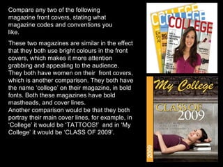
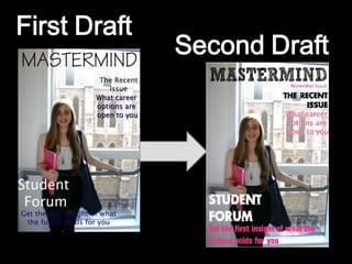
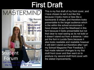
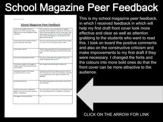
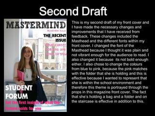
The document discusses and compares two magazine front covers, noting similarities in their use of bright colors, inclusion of women, and inclusion of the word "college" in bold fonts. It then provides feedback on the author's first draft of a school magazine cover, suggesting changes to the masthead font and colors to make it more attention-grabbing. The author's second draft incorporates this feedback, changing the masthead font and colors to pink to better represent the school environment theme.