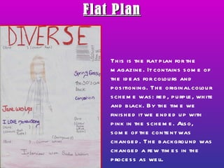
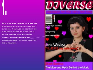
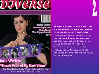
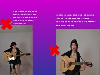
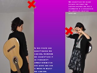
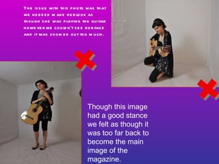
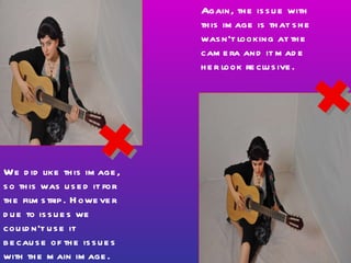
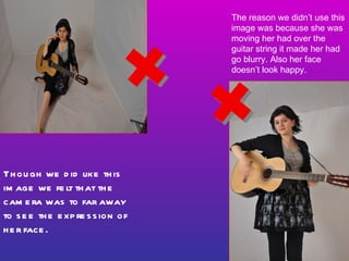
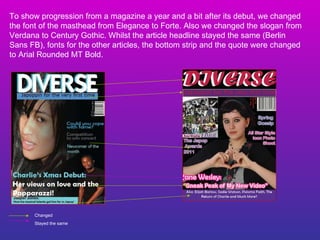
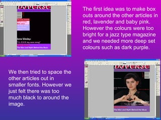
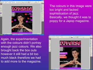
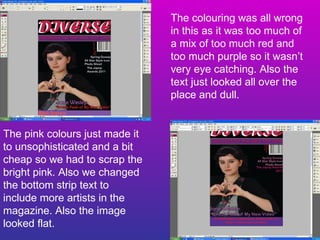
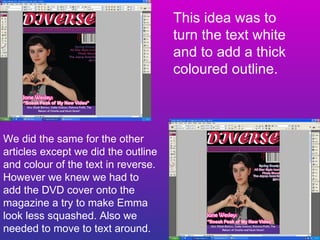
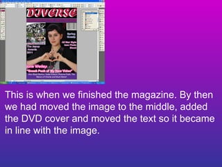
This document evaluates different design ideas for the layout of a music magazine. It discusses changes made to the color scheme, backgrounds, fonts, and positioning of images and text over multiple iterations. Various photos were considered but not used for reasons such as eyes being closed, unfavorable angles, or hands blocking the face. The final design placed the main image in the center, included a DVD cover, and aligned the text with the image.