
Recommended
More Related Content
What's hot
What's hot (18)
Viewers also liked
Viewers also liked (20)
Similar to Analysis of Magazine Preliminary Work - Front Cover and Contents Styling
Similar to Analysis of Magazine Preliminary Work - Front Cover and Contents Styling (20)
More from jessspardoe
More from jessspardoe (20)
Analysis of Magazine Preliminary Work - Front Cover and Contents Styling
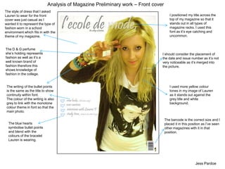
- 1. Analysis of Magazine Preliminary work – Front cover The style of dress that I asked Lauren to wear for the front cover was just casual as I wanted it to represent the type of fashion worn in a school environment which fits in with the theme of my magazine. I positioned my title across the top of my magazine so that it stands out in all types of magazine racks. I used this font as it’s eye catching and uncommon. The D & G perfume she’s holding represents fashion as well as it’s a well known brand of fashion therefore this shows knowledge of fashion in the college. I should consider the placement of the date and issue number as it’s not very noticeable as it’s merged into the picture. I used more yellow colour tones in my image of Lauren as it stands out against the grey title and white background. The writing of the bullet points is the same as the title to show continuity within font. The colour of the writing is also grey to link with the monotone colour theme in font so that the main photo. The barcode is the correct size and I placed it in this position as I’ve seen other magazines with it in that position. The blue hearts symbolise bullet points and blend with the colours of the bracelet Lauren is wearing. Jess Pardoe
- 2. Analysis of Magazine Preliminary work - Contents I chose to use the same font throughout my front cover and contents pages, this shows continuity of a theme, the colours also all blend as a theme of grey as well. My writing on the pages is also in lower case as it’s individual and eye catching for an audience of teenagers at college (as my magazine is about fashion in college.) I have used the title of my magazine in the top left hand corner, partly as an advertisement, I will use this on my final piece as well. I liked the idea of having two outfits in the photo shoot for this preliminary magazine as it’s supposed to be showing different styles of fashion within a college, I think that the choice of clothing shows this well. It was hard to select around the shoes she’s holding as they have an intricate shape and blend into the background easily. The idea of having a creative photo of Lauren balancing on a letter of the title of the page was to show the skills I have learnt through Photoshop and a higher level of editing. I also used the idea of Lauren holding up a sign about an interview to include another editing skill. I asked her to hold a blank sheet of white paper and then edited it using Photoshop to make it look like a blackboard style of writing. The ideas of pages on this contents page were inspired by what has happened recently within Lutterworth College, such as the new canteen and the new year tens. I used pale blue hearts as bullet points as the colour blends with the blue denim in the photos and the grey front used throughout. Jess Pardoe