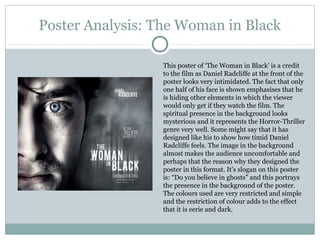
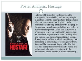
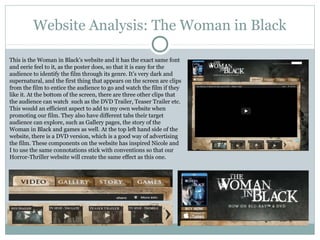
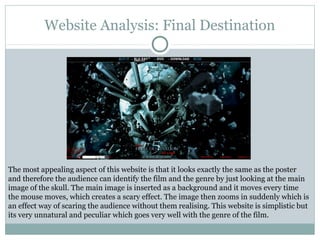
Poster Research

   BY SABA KEBEDE
Poster Research
Poster Research

These posters all represent the Horror-Thriller genre and this
will help Nicole and I in the making of our very own poster of
the same genre. All these posters are effective and similar in
the effect that they all have the main characters as the main
feature, dominating the poster. The facial expressions of the
protagonists portray the state of their situation to be
unwelcoming and eerie as they look very unsettled. In
particular the ‘Gone’ and ‘Woman in Black’ posters portray the
protagonist to be right at the heart of the posters with hints,
like the antagonists such as Woman in Black hovering in the
background to illustrate a sinister effect.
Poster Analysis: The Woman in Black

                 This poster of ‘The Woman in Black’ is a credit
                 to the film as Daniel Radcliffe at the front of the
                 poster looks very intimidated. The fact that only
                 one half of his face is shown emphasises that he
                 is hiding other elements in which the viewer
                 would only get if they watch the film. The
                 spiritual presence in the background looks
                 mysterious and it represents the Horror-Thriller
                 genre very well. Some might say that it has
                 designed like his to show how timid Daniel
                 Radcliffe feels. The image in the background
                 almost makes the audience uncomfortable and
                 perhaps that the reason why they designed the
                 poster in this format. It’s slogan on this poster
                 is: “Do you believe in ghosts” and this portrays
                 the presence in the background of the poster.
                 The colours used are very restricted and simple
                 and the restriction of colour adds to the effect
                 that it is eerie and dark.
Poster Analysis: Hostage

        In terms of this poster, the focus is on the
        protagonist (Bruce Willis) and it’s very simple
        in contrast with the other posters. This poster is
        effective in the sense that it gives out the
        connotations of being a thriller with the prop of
        the gun and the colours symbolises and reflect a
        horror-thriller poster. Given that our poster is
        of the same genre, we can identify aspects that
        we could use to portray the same thrilling effect.
        You can see that the protagonist is not looking
        directly at the audience, which could imply that
        he looking at something, or looking away from
        focus as if he has something to hide. The fact
        that he’s doing this is effective and I would like
        to interpret a lack of eye contact with the
        audience to create a sense of a hidden identity.
Website Analysis: The Woman in Black

This is the Woman in Black’s website and it has the exact same font
and eerie feel to it, as the poster does, so that it is easy for the
audience to identify the film through its genre. It’s very dark and
supernatural, and the first thing that appears on the screen are clips
from the film to entice the audience to go and watch the film if they
like it. At the bottom of the screen, there are three other clips that
the audience can watch such as the DVD Trailer, Teaser Trailer etc.
This would an efficient aspect to add to my own website when
promoting our film. They also have different tabs their target
audience can explore, such as Gallery pages, the story of the
Woman in Black and games as well. At the top left hand side of the
website, there is a DVD version, which is a good way of advertising
the film. These components on the website has inspired Nicole and
I to use the same connotations stick with conventions so that our
Horror-Thriller website will create the same effect as this one.
Website Analysis: Final Destination


The most appealing aspect of this website is that it looks exactly the same as the poster
and therefore the audience can identify the film and the genre by just looking at the main
image of the skull. The main image is inserted as a background and it moves every time
the mouse moves, which creates a scary effect. The image then zooms in suddenly which is
an effect way of scaring the audience without them realising. This website is simplistic but
its very unnatural and peculiar which goes very well with the genre of the film.

Poster Research

  • 1.
    Poster Research BY SABA KEBEDE
  • 2.
  • 3.
    Poster Research These postersall represent the Horror-Thriller genre and this will help Nicole and I in the making of our very own poster of the same genre. All these posters are effective and similar in the effect that they all have the main characters as the main feature, dominating the poster. The facial expressions of the protagonists portray the state of their situation to be unwelcoming and eerie as they look very unsettled. In particular the ‘Gone’ and ‘Woman in Black’ posters portray the protagonist to be right at the heart of the posters with hints, like the antagonists such as Woman in Black hovering in the background to illustrate a sinister effect.
  • 4.
    Poster Analysis: TheWoman in Black This poster of ‘The Woman in Black’ is a credit to the film as Daniel Radcliffe at the front of the poster looks very intimidated. The fact that only one half of his face is shown emphasises that he is hiding other elements in which the viewer would only get if they watch the film. The spiritual presence in the background looks mysterious and it represents the Horror-Thriller genre very well. Some might say that it has designed like his to show how timid Daniel Radcliffe feels. The image in the background almost makes the audience uncomfortable and perhaps that the reason why they designed the poster in this format. It’s slogan on this poster is: “Do you believe in ghosts” and this portrays the presence in the background of the poster. The colours used are very restricted and simple and the restriction of colour adds to the effect that it is eerie and dark.
  • 5.
    Poster Analysis: Hostage In terms of this poster, the focus is on the protagonist (Bruce Willis) and it’s very simple in contrast with the other posters. This poster is effective in the sense that it gives out the connotations of being a thriller with the prop of the gun and the colours symbolises and reflect a horror-thriller poster. Given that our poster is of the same genre, we can identify aspects that we could use to portray the same thrilling effect. You can see that the protagonist is not looking directly at the audience, which could imply that he looking at something, or looking away from focus as if he has something to hide. The fact that he’s doing this is effective and I would like to interpret a lack of eye contact with the audience to create a sense of a hidden identity.
  • 6.
    Website Analysis: TheWoman in Black This is the Woman in Black’s website and it has the exact same font and eerie feel to it, as the poster does, so that it is easy for the audience to identify the film through its genre. It’s very dark and supernatural, and the first thing that appears on the screen are clips from the film to entice the audience to go and watch the film if they like it. At the bottom of the screen, there are three other clips that the audience can watch such as the DVD Trailer, Teaser Trailer etc. This would an efficient aspect to add to my own website when promoting our film. They also have different tabs their target audience can explore, such as Gallery pages, the story of the Woman in Black and games as well. At the top left hand side of the website, there is a DVD version, which is a good way of advertising the film. These components on the website has inspired Nicole and I to use the same connotations stick with conventions so that our Horror-Thriller website will create the same effect as this one.
  • 7.
    Website Analysis: FinalDestination The most appealing aspect of this website is that it looks exactly the same as the poster and therefore the audience can identify the film and the genre by just looking at the main image of the skull. The main image is inserted as a background and it moves every time the mouse moves, which creates a scary effect. The image then zooms in suddenly which is an effect way of scaring the audience without them realising. This website is simplistic but its very unnatural and peculiar which goes very well with the genre of the film.