Download as PDF, PPTX


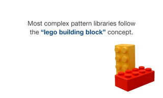


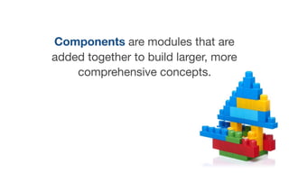
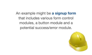
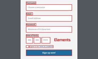
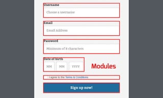

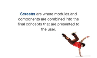
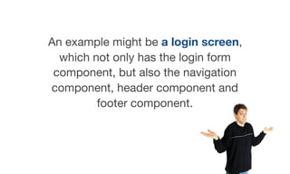


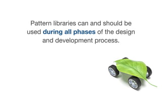
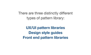


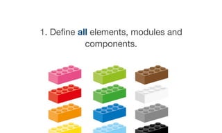
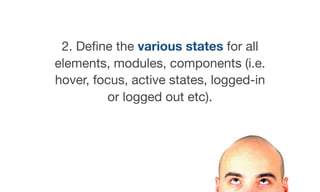
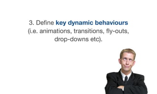


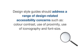


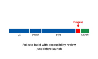

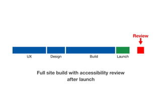


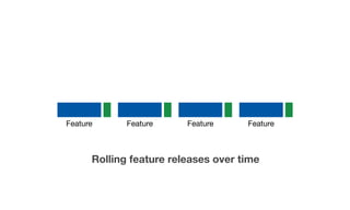


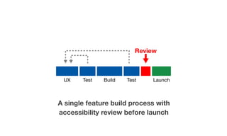


The document discusses the evolution of web design from full pages to re-usable components through the use of pattern libraries, which enhance efficiency, consistency, and quality in design. It outlines different types of pattern libraries, including UX/UI pattern libraries, design style guides, and front-end pattern libraries, emphasizing the importance of incorporating accessibility considerations throughout all phases of development. The author highlights the need to 'bake in' accessibility from the start and suggests careful testing of modules and components to ensure compliance and usability.