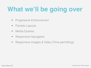
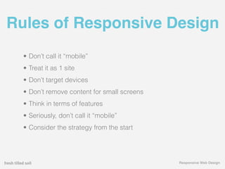
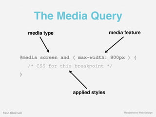
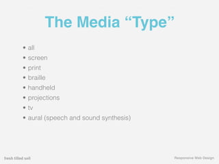
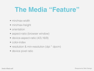
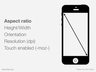
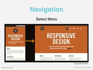
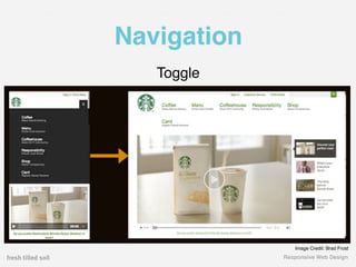
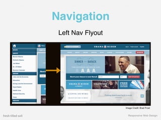
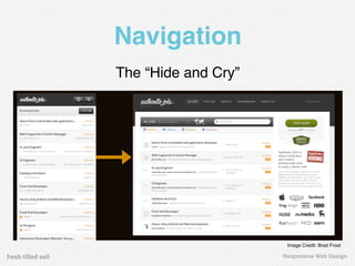
Keys to Responsive Design
        Presented by
I’m Tim.
Presented by
Files

 ftsdesign.com/labs/rwd/assets.zip


RWD = Responsive Web Design


                                Responsive Web Design
What we’ll be going over
 • Progressive Enhancement
 • Flexible Layouts
 • Media Queries
 • Responsive Navigation
 • Responsive Images & Video (Time permitting)


                                             Responsive Web Design
01 The Basics
   Getting on the same page & responsive design basics


                                                   Responsive Web Design
Progressive Enhancement


                   Responsive Web Design
Progressive Enhancement


                   Responsive Web Design
Why & When of RWD
• +1 for Progressive Enhancement
• Single codebase
• Scales to multi-sites
• Less staff
• Less server overhead
• Better SEO


                                   Responsive Web Design
Why & When of RWD
• What is “mobile” about this site?
• Do NOT do it just because it’s cool


                                        Responsive Web Design
Responsive Sites


                   Responsive Web Design
Rules of Responsive Design
  • Don’t call it “mobile”
  • Treat it as 1 site
  • Don’t target devices
  • Don’t remove content for small screens
  • Think in terms of features
  • Seriously, don’t call it “mobile”
  • Consider the strategy from the start


                                             Responsive Web Design
Flexible Layouts


    %
                   Responsive Web Design
Creating a Flexible Layout


      Exercise


                     Responsive Web Design
The Media Query


                  Responsive Web Design
The Media Query
    media type                      media feature


@media screen and ( max-width: 800px ) {
    /* CSS for this breakpoint */
}


                   applied styles


                                          Responsive Web Design
The Media “Type”
• all
• screen
• print
• braille
• handheld
• projections
• tv
• aural (speech and sound synthesis)


                                       Responsive Web Design
The Media “Feature”
• min/max-width
• min/max-height
• orientation
• aspect-ratio (browser window)
• device-aspect-ratio (4/3,16/9)
• color-index
• resolution & min-resolution (dpi * dpcm)
• device pixel ratio


                                             Responsive Web Design
Aspect ratio
Height/Width
Orientation
Resolution (dpi)
Touch enabled (-moz-)


                        Responsive Web Design
Aspect ratio
Height/Width
Orientation
Resolution (dpi)
Touch enabled (-moz-)


                        Responsive Web Design
Aspect ratio
Height/Width
Orientation
Resolution (dpi)
Touch enabled


                   Responsive Web Design
Aspect ratio
Height/Width
Orientation
Resolution (dpi)
Touch enabled (-moz-)


                        Responsive Web Design
Aspect ratio
Height/Width
Orientation
Resolution (dpi)
Touch enabled (-moz-)


                        Responsive Web Design
Responsive Sites


                   Responsive Web Design
Setting Breakpoints


                 Responsive Web Design
Adding a Media Query


    Exercise


                 Responsive Web Design
Making it work on everywhere


                       Responsive Web Design
Viewport tag content
width=device-width // define the viewport size
initial-scale=1.0 // starting zoom level
maximum-scale=1.0 // control zooming (0-10)
user-scalable=0 // prevent zooming / input:focus scrolling


                                                   Responsive Web Design
Recommended Tag


<meta name=”viewport” content=”width=device-width, initial-scale=1.0”>


                                                          Responsive Web Design
Adding the Viewport Tag


     Exercise


                   Responsive Web Design
Navigation
•   The “Do nothing” approach

•   Stacked navigation method

•   Footer anchor

•   Select menu

•   Toggle

•   Left nav flyout (we’ll go through this later)

•   The “Hide and Cry”

                                                   Responsive Web Design
Navigation
The “Do Nothing” Approach


                            Image Credit: Brad Frost


                              Responsive Web Design
Navigation
The “Stacked Navigation” method


                             Image Credit: Brad Frost


                               Responsive Web Design
Navigation
 Footer Anchor


                 Image Credit: Brad Frost


                   Responsive Web Design
Navigation
 Select Menu


               Image Credit: Brad Frost


               Responsive Web Design
Navigation
   Toggle


                Image Credit: Brad Frost
             Responsive Web Design
Navigation
 Left Nav Flyout


                   Image Credit: Brad Frost


                     Responsive Web Design
Navigation
The “Hide and Cry”


                      Image Credit: Brad Frost

                     Responsive Web Design
Navigation


Exercise


             Responsive Web Design
Browser Support


                          caniuse.com


                  Responsive Web Design
03 Dealing with media
   Images and Video


                        Responsive Web Design
Media (Images & Video)


                 Image Credit: TeamTreehouse.com


                       Responsive Web Design
Responsive Images
• Max-width method
• Picturefill method
• Dealing with Retina displays
• Using SVG and Icon fonts


                                 Responsive Web Design
Install Picturefill


  Exercise


                     Responsive Web Design
Responsive Video
• FitVid, jQuery plugin
• Creating intrinsic ratios in CSS


                                     Responsive Web Design
FitVid


https://vimeo.com/28523422

                             Responsive Web Design
Intrinsic Ratios

.video {                      .video iframe,
    position: relative;       .video object,
    padding-bottom: 56.25%;   .video embed {
    padding-top: 25px;            position: absolute;
    height: 0;                    top: 0;
    overflow: hidden;             left: 0;
    margin-bottom: 20px;          width: 100%;
}                                 height: 100%;
                              }


                                             Responsive Web Design
Responsive Video


  Exercise


               Responsive Web Design
Responsive Sites


                   Responsive Web Design
04 Resources
   Continuing your education


                               Responsive Web Design
Books
Responsive Web Design
by Ethan Marcotte


                            Responsive Web Design
Articles
• Responsive Web Design
  http://www.alistapart.com/articles/responsive-web-design/


• Guidelines for Responsive Design
  http://coding.smashingmagazine.com/2011/01/12/guidelines-for-responsive-web-design/


• Design Process in a Responsive Age
  http://uxdesign.smashingmagazine.com/2012/05/30/design-process-responsive-age/


• Adaptive vs. Responsive Design
  http://uxdesign.smashingmagazine.com/2012/11/08/ux-design-qa-with-christian-holst/


• Responsive Design is more than breakpoints
  http://inspectelement.com/articles/responsive-web-design-is-so-more-than-just-a-few-
  breakpoints/


                                                                                   Responsive Web Design
Tools & Plugins
•   Picturefill
    https://github.com/scottjehl/picturefill


•   FitVids
    http://fitvidsjs.com/


•   RespondJS
    https://github.com/scottjehl/Respond


•   Testing a Responsive Site
    http://mattkersley.com/responsive/


•   Multi-device layout patterns
    http://www.lukew.com/ff/entry.asp?1514


                                              Responsive Web Design
Folks on Twitter
• Responsive Design, @rwd
• Mat Marquis, @wilto
• Chris Coyier, @chriscoyier
• Brad Frost, @brad_frost
• Luke Wroblewski, @lukew


                               Responsive Web Design
What we went over
• What?
• When?
• Why?
• How?


                  Responsive Web Design
Slides
ftsdesign.com/labs/rwd/slides.pdf


                               Responsive Web Design
05 Questions & Comments?
   ...and maybe answers


                           Responsive Web Design
Contact Information
E-mail: tim.wright@freshtilledsoil.com
Twitter: @csskarma
Fresh Tilled Labs: freshtilledsoil.com/habitat/labs


                                                      Responsive Web Design

Keys to Responsive Design