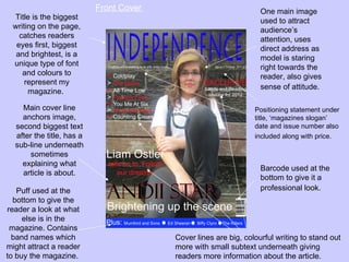
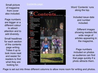
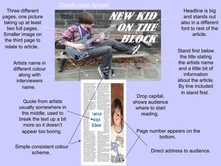
In what ways does your media
product use, develop or challenge
   forms and conventions of real
         media products?
Front Cover                             One main image
 Title is the biggest                                              used to attract
 writing on the page,                                              audience’s
   catches readers                                                 attention, uses
  eyes first, biggest                                              direct address as
  and brightest, is a                                              model is staring
 unique type of font                                               right towards the
    and colours to                                                 reader, also gives
     represent my
                                                                   sense of attitude.
      magazine.

    Main cover line                                              Positioning statement under
    anchors image,                                               title, ‘magazines slogan’
  second biggest text                                            date and issue number also
  after the title, has a                                         included along with price.
  sub-line underneath
      sometimes
    explaining what
                                                                   Barcode used at the
    article is about.
                                                                   bottom to give it a
   Puff used at the                                                professional look.
  bottom to give the
reader a look at what
     else is in the
 magazine. Contains
  band names which                       Cover lines are big, colourful writing to stand out
might attract a reader                   more with small subtext underneath giving
to buy the magazine.                     readers more information about the article.
Small picture       Contents page
   of magazine                                                 Word ‘Contents’ runs
    front cover                                                  along the top.
  also included.
                                                                  Included issue date
 Page numbers                                                         and number
 are bigger or a                                                       included.
 different colour
     to attract                                                      Different images
 attention and to                                                  showing readers the
  add diversity.                                                       wide range of
 Small headlines                                                   articles appearing in
 for each section                                                      the magazine.
  of the contents
    page writing.
    Tidies it up to                                                 Page numbers
  look more neat                                                  included on photos
   and easier for                                                so audience can find
   readers to find                                               that page quickly if a
    what they are                                                photo attracts them.
     looking for.
Page is set out into three different columns to allow more room for writing and photos.
Double page spread
   Three different                                                   Headline is big
pages, one picture                                                   and stands out
 taking up at least                                                 also in a different
   two full pages.                                                  font to rest of the
Smaller image on                                                          article.
  the third page to
  relate to article.
                                                                   Stand first below
                                                                    the title stating
     Artists name in                                               the artists name
     different colour                                              and a little bit of
        along with                                                     information
      interviewers                                                 about the article.
          name.                                                    By line included
                                                                     in stand first.
                                                  Drop capital,
          Quote from artists                    shows audience
        usually somewhere in                     where to start
         the middle, used to                       reading.
        break the text up a bit
          more so it doesn’t
         appear too boring.                      Page number appears on the
                                                         bottom.
      Simple consistent colour
             scheme.                                   Direct address to audience.

Question 1

  • 1.
    In what waysdoes your media product use, develop or challenge forms and conventions of real media products?
  • 2.
    Front Cover One main image Title is the biggest used to attract writing on the page, audience’s catches readers attention, uses eyes first, biggest direct address as and brightest, is a model is staring unique type of font right towards the and colours to reader, also gives represent my sense of attitude. magazine. Main cover line Positioning statement under anchors image, title, ‘magazines slogan’ second biggest text date and issue number also after the title, has a included along with price. sub-line underneath sometimes explaining what Barcode used at the article is about. bottom to give it a Puff used at the professional look. bottom to give the reader a look at what else is in the magazine. Contains band names which Cover lines are big, colourful writing to stand out might attract a reader more with small subtext underneath giving to buy the magazine. readers more information about the article.
  • 3.
    Small picture Contents page of magazine Word ‘Contents’ runs front cover along the top. also included. Included issue date Page numbers and number are bigger or a included. different colour to attract Different images attention and to showing readers the add diversity. wide range of Small headlines articles appearing in for each section the magazine. of the contents page writing. Tidies it up to Page numbers look more neat included on photos and easier for so audience can find readers to find that page quickly if a what they are photo attracts them. looking for. Page is set out into three different columns to allow more room for writing and photos.
  • 4.
    Double page spread Three different Headline is big pages, one picture and stands out taking up at least also in a different two full pages. font to rest of the Smaller image on article. the third page to relate to article. Stand first below the title stating Artists name in the artists name different colour and a little bit of along with information interviewers about the article. name. By line included in stand first. Drop capital, Quote from artists shows audience usually somewhere in where to start the middle, used to reading. break the text up a bit more so it doesn’t appear too boring. Page number appears on the bottom. Simple consistent colour scheme. Direct address to audience.