
Recommended
More Related Content
What's hot
What's hot (17)
Similar to Research
Similar to Research (20)
Research
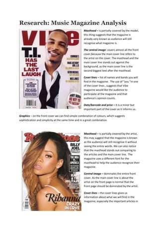
- 1. Research: Music Magazine Analysis Masthead – is partially covered by the model, this thing suggests that the magazine is already very known as audience will still recognise what magazine is. The central image- covers almost all the front cover,because the main cover line refers to the artist on the cover. The masthead and the main cover line stands out against the background, as the main cover line is the second biggest text after the masthead. Cover lines – list of names and bands you will find in the magazine. The use of “you “in one of the cover lines , suggests that Vibe magazine would like the audience to participate at the magazine and that audience’s opinion counts. Date/barcode and price – it is a minor but important part of the cover as it informs us. Graphics – on the front cover we can find simple combination of colours, which suggests sophistication and simplicity at the same time and in a great combination. Masthead – is partially covered by the artist, this may suggest that the magazine is known as the audience will still recognise it without seeing the entire words. We can also notice that the masthead stands out comparing to the articles and the main cover line. The magazine uses a different font for the masthead to help the audience recognize their magazine. Central image – dominates the entire front cover. As the main cover line is about the artist on the front page is normal that the front page should be dominated by the artist. Cover lines – the cover lines gives us information about what we will find in the magazine, especially the important articles in
- 2. the magazine are presented on the front cover. Date/barcode and price- helps the audience know how much they may spend on the magazine, plus some information about the magazine,which you can find in the barcode and date. Graphics- on the front cover we can find simple combination of black/white articles in different fonts. The masthead is different in colour and it uses a totally different font, to make it stand out and catch the buyer’s eye. Masthead –is situated over the artist’s head, in my opinion this thing suggests that the masthead for this magazine is much more important as it has the colours inside the letters. As we can notice the masthead is using black for the letters but also red, blue, yellow and green to stand out comparing to the cover lines. Central image- the picture of the artist on the front cover is black and white, because I think the designer of the magazine thought that the masthead should be the only one using colours as we want to see the brand of the magazine instead of the artist. Cover lines- the cover lines gives us information about what important articles we can find in the magazine. Date/barcode and price - you can notice that these elements are not on the front cover. This may mean that this magazine consider all these elements not that important to be on the front cover but also they consider that the audience should be attracted by the articles first and then by price. Graphics - the cover lines are written using red and black and appropriate fonts. The main cover line is written in white and the artist’s quote in black.
- 3. Masthead – is partially covered by the artist. We can notice that the colour of the masthead is not so different comparing to the artist’s hair,this thing may suggest that the magazine thinks the artist on the cover is much more important than the actual masthead. Central image – the artist on the cover is situated in the middle. The mise en scene connotes rock music. As we can notice, Revolver, combines the beauty of the artist with the dark and unpleasant side of hard rock. The blood from the artist’s hand connotes death, which is associated with hard rock. Cover lines – gives us information about the important articles we can find in the magazine. Date/barcode and price - helps the audience know how much they may spend on the magazine, plus some information about the magazine,which you can find in the barcode and date. Buzz word – the buss word used to catch audience’s eye is ‘’ free ‘’ this is used to inform the buyer that he can get extra special content. Graphics – on the front cover we can notice a good combination of red, black and white for the cover lines. The font for the main cover line is different than the other fonts used for the smallest cover lines , just to catch our eye on what’s the most important article in this magazine. Masthead – is partially covered by the artist. The magazine masthead and the main cover line are the one that catches the buyer’s eye. The white and red colours contrasts each other, which makes the magazine recognisable. Central image - The magazine used an extreme close up for the front cover. We can notice that the artist on the cover is the typical example of a rapper. He is wearing golden grills on his teeth, this suggest power and money. Cover lines - the cover lines are written in white on black which makes a nice effect. The main cover line is obvious bigger than the others, because that’s most important article in the magazine. Date/barcode and price – we can also notice that the barcode is written using the same effect as the cover lines.
- 4. Graphics – on the front cover we can notice a good combination of red, black and white for the cover lines .