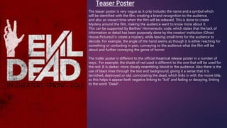
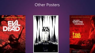
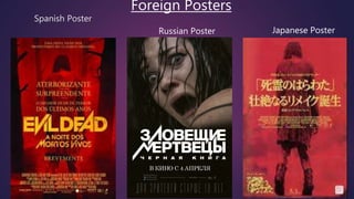
Print
Teaser Poster 
The teaser poster is very vague as it only includes the name and a symbol which 
will be identified with the film, creating a brand recognition to the audience, 
and also an inexact time when the film will be released. This is done to create 
Mystery around the film, making the audience want to know more about it. 
This can be supported by Barthes’ Hermeneutic code, which states that the lack of 
information or detail has been purposely done by the creator/ institution (Ghost 
House Pictures)To create a mystery, while leaving small hints for the audience to 
decode. For example, the angle of the hand seems as though it is either reaching for 
something or contorting in pain, conveying to the audience what the film will be 
about and further conveying the genre of horror. 
The trailer poster is different to the official theatrical release poster in a number of 
ways. For example, the shade of red used is different to the one that will be used for 
the rest. It is darker, more closely resembling blood to the audience. Also there is the 
use of black lines through the text and background, giving it a sense that it is 
tarnished, destroyed or old, connotating the dead, which links in with the movie title, 
as this helps it appear both negative linking to “Evil” and fading or decaying, linking 
to the word “Dead”.
Original Release Poster (November 20th 2012) 
Second Version (February 22nd 2013)
 Both poster denote a girl looking injured, walking somewhere. However there are connotations of the poster. For example, the girl looks 
as though she is trying to get away from something, perhaps a threat as she is covered in blood and her clothes look dirty. Although, 
from her body language, it is evident that the girl has given up, as her knees are slightly bent and her head is down low, conveying that 
she doesn’t have strength or energy, as opposed to a something such as a wide shot of the girl running. This creates an enigma to the 
audience, as they will wonder what has happened to her, as it is capturing the film in Todorov’s narrative theory of de-equilibrium, but 
also make them wonder what will happen next. 
 The same tagline is used throughout the posters, “A new vision from the makers of the original classic”, which would encourage the 
target audience of fans of the original movie to see the film, also as it is a “new” vision, it may attract a younger audience. Also the 
taglines: “ The most terrifying film you will ever experience”, takes up half of the poster and cover the image of the character, showing 
and reinforcing to the audience the seriousness behind the words, and making them take notice of it. The text almost appears as if its 
covering the girl, hiding her from the audience, which further creates an enigma, as they will want to find out what she looks like and 
what has happened to her in the film, therefore being encouraged by the taglines to watch it, to have the “experience”. 
 However there are some slight differences to the posters. The first uses a greyscale tone to the image, conveying to the audience that the 
girl is now perhaps unemotional and dethatched after what could have been a traumatic experience, but also that her surrounding are 
very dramatic and draining on the character. The second poster uses what later becomes an identifiable red tone through the image. This 
conveys to the audience that the film entails violence, blood and gore, and a threat. The second poster also uses yellow for the text, 
which connotates a hazard or emergency as it is bright and eye catching, but also cowardice or betrayal through the colloquial term 
“yellow- belly”, therefore hinting what the film plot may entail, to the audience. 
 The posters also encourage the audience to interact with the film on other platforms through the use of the social media icons at the 
bottom, which include Facebook, and Twitter. This would encourage the audience to use these other platforms, as a way of solving the 
mystery which the poster presents, through any information it may provide and also make them want to watch the film. 
 The second poster also uses the icon of the hand, which shows how after the release of the teaser trailer and the first theatrical trailer, the 
institution became concerned with creating brand recognition. This would then make it easy for the audience to identify with the film, 
through the meaning which has been created, that the symbol of the hand should be associated with Evil Dead. It also includes a specific 
month in which the film will be released, creating a build up for the audience till the time comes. There is also a certificate rating at the 
bottom, informing people that the movie is rated “R”, for a restricted audience, usually 18. This then informs the audience whether it is 
age appropriate or available to those who are underage to see it.
Other Posters
 This poster was created for promotion 2 weeks before 
the films release. This is particularly highlighted on the 
poster itself to create anticipation within the audience
Spanish Poster 
Foreign Posters 
Russian Poster Japanese Poster
 Posters were recreated to be shown in other countries, therefore reaching 
a audience on a wider, global scope. 
 However, there may have been issues with its reception in other countries. 
For example, the red tones would be used in western society to convey 
danger and violence. However in Japan, they perceive the colour to 
represent new life and female fertility.
Other forms of print 
Magazine coverage. This was 
used to reach audiences who 
were fans of horror movies 
and read horror movie 
magazines. 
Billboards. These were created to 
attract audiences as they commuted 
from home/ school/ work, and would 
be sure to see it as it was in a busy 
commercialised city.

Promotion evil dead print

  • 1.
  • 2.
    Teaser Poster Theteaser poster is very vague as it only includes the name and a symbol which will be identified with the film, creating a brand recognition to the audience, and also an inexact time when the film will be released. This is done to create Mystery around the film, making the audience want to know more about it. This can be supported by Barthes’ Hermeneutic code, which states that the lack of information or detail has been purposely done by the creator/ institution (Ghost House Pictures)To create a mystery, while leaving small hints for the audience to decode. For example, the angle of the hand seems as though it is either reaching for something or contorting in pain, conveying to the audience what the film will be about and further conveying the genre of horror. The trailer poster is different to the official theatrical release poster in a number of ways. For example, the shade of red used is different to the one that will be used for the rest. It is darker, more closely resembling blood to the audience. Also there is the use of black lines through the text and background, giving it a sense that it is tarnished, destroyed or old, connotating the dead, which links in with the movie title, as this helps it appear both negative linking to “Evil” and fading or decaying, linking to the word “Dead”.
  • 3.
    Original Release Poster(November 20th 2012) Second Version (February 22nd 2013)
  • 4.
     Both posterdenote a girl looking injured, walking somewhere. However there are connotations of the poster. For example, the girl looks as though she is trying to get away from something, perhaps a threat as she is covered in blood and her clothes look dirty. Although, from her body language, it is evident that the girl has given up, as her knees are slightly bent and her head is down low, conveying that she doesn’t have strength or energy, as opposed to a something such as a wide shot of the girl running. This creates an enigma to the audience, as they will wonder what has happened to her, as it is capturing the film in Todorov’s narrative theory of de-equilibrium, but also make them wonder what will happen next.  The same tagline is used throughout the posters, “A new vision from the makers of the original classic”, which would encourage the target audience of fans of the original movie to see the film, also as it is a “new” vision, it may attract a younger audience. Also the taglines: “ The most terrifying film you will ever experience”, takes up half of the poster and cover the image of the character, showing and reinforcing to the audience the seriousness behind the words, and making them take notice of it. The text almost appears as if its covering the girl, hiding her from the audience, which further creates an enigma, as they will want to find out what she looks like and what has happened to her in the film, therefore being encouraged by the taglines to watch it, to have the “experience”.  However there are some slight differences to the posters. The first uses a greyscale tone to the image, conveying to the audience that the girl is now perhaps unemotional and dethatched after what could have been a traumatic experience, but also that her surrounding are very dramatic and draining on the character. The second poster uses what later becomes an identifiable red tone through the image. This conveys to the audience that the film entails violence, blood and gore, and a threat. The second poster also uses yellow for the text, which connotates a hazard or emergency as it is bright and eye catching, but also cowardice or betrayal through the colloquial term “yellow- belly”, therefore hinting what the film plot may entail, to the audience.  The posters also encourage the audience to interact with the film on other platforms through the use of the social media icons at the bottom, which include Facebook, and Twitter. This would encourage the audience to use these other platforms, as a way of solving the mystery which the poster presents, through any information it may provide and also make them want to watch the film.  The second poster also uses the icon of the hand, which shows how after the release of the teaser trailer and the first theatrical trailer, the institution became concerned with creating brand recognition. This would then make it easy for the audience to identify with the film, through the meaning which has been created, that the symbol of the hand should be associated with Evil Dead. It also includes a specific month in which the film will be released, creating a build up for the audience till the time comes. There is also a certificate rating at the bottom, informing people that the movie is rated “R”, for a restricted audience, usually 18. This then informs the audience whether it is age appropriate or available to those who are underage to see it.
  • 5.
  • 6.
     This posterwas created for promotion 2 weeks before the films release. This is particularly highlighted on the poster itself to create anticipation within the audience
  • 7.
    Spanish Poster ForeignPosters Russian Poster Japanese Poster
  • 8.
     Posters wererecreated to be shown in other countries, therefore reaching a audience on a wider, global scope.  However, there may have been issues with its reception in other countries. For example, the red tones would be used in western society to convey danger and violence. However in Japan, they perceive the colour to represent new life and female fertility.
  • 9.
    Other forms ofprint Magazine coverage. This was used to reach audiences who were fans of horror movies and read horror movie magazines. Billboards. These were created to attract audiences as they commuted from home/ school/ work, and would be sure to see it as it was in a busy commercialised city.