1. Representations of People in my Magazine
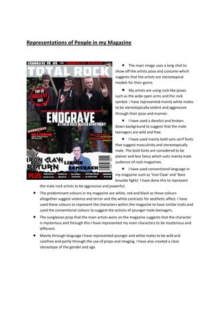
The main image uses a long shot to
show off the artists pose and costume which
suggests that the artists are stereotypical
models for their genre.
My artists are using rock like poses
such as the wide open arms and the rock
symbol. I have represented mainly white males
to be stereotypically violent and aggressive
through their pose and manner.
I have used a derelict and broken
down background to suggest that the male
teenagers are wild and free.
I have used mainly bold sans serif fonts
that suggest masculinity and stereotypically
male. The bold fonts are considered to be
plainer and less fancy which suits mainly male
audience of rock magazines.
I have used conventional language in
my magazine such as ‘Iron Claw’ and ‘Bare
knuckle fights’ I have done this to represent
the male rock artists to be aggressive and powerful.
The predominant colours in my magazine are white, red and black as these colours
altogether suggest violence and terror and the white contrasts for aesthetic affect. I have
used these colours to represent the characters within the magazine to have similar traits and
used the conventional colours to suggest the actions of younger male teenagers.
The sunglasses prop that the main artists wore on the magazine suggests that the character
is mysterious and through this I have represented my main characters to be mysterious and
different.
Mainly through language I have represented younger and white males to be wild and
carefree and partly through the use of props and imaging. I have also created a clear
stereotype of the gender and age.
2. A close up of Titus in the top half
shows his plain facial expression which
suggests a mysterious character. Also the use
of a bandana costume and sunglasses suggests
the artist’s different clothing style and
represents younger males to be different and
eccentric with their clothing.
The colour scheme of red, white and
black signifies darkness which represents the
character on the page to have similar features.
This is stereotypical for the age and male
gender.
The pose of looking away from the
reader on the image at the top suggests a lack
of interest of people and a carefree character.
The image is a long shot where the
artists are standing in violent and aggressive
stances for example the guitar prop about to
hit on Jack represents the younger male
characters as aggressive and violent.
I used red, black and white in my
contents page as these are colours that
connote violence and anger which helps me
to represent my characters to be similar to
this.
Also the language I have used like in
the pull quote it says ‘I just can’t stop
rocking’ which would suit the younger male gender because of its aggressive tone and anger.
The use of the mainly black and maybe cheap costumes connote that the readers or
characters are of middle class which could also suggest the readers are also of ABC1 class.