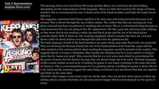
1. This Kerrang front cover has Danny Worsnop and Ben Bruce on it and these the band Asking
Alexandria are the main features of this magazine. There is a mid-shot used for the image of Danny
and Ben, this is conventional because it shows most of the band members and helps the reader know
who it is.
The magazine represents both Danny and Ben to be stern men who look powerful and scary to be
around. This is shown through the use of their clothes. The clothes that they are wearing are very
plain coloured and have no patterns or anything else on them. This is a conventional thing because as
rock musicians they are not going to live the ‘glamourous’ life like a pop star and wear pink clothing,
so they show this by just wearing a white top and black jacket and the use of the black jacket
connotes death. Both of them are also wearing sunglasses which connotes that they are cool and
know a little bit about fashion even though they don’t live the glamorous life.
The body language of both of the band members are quite strong and make them look very powerful.
They are showing this because Danny has one of his hands pointed at his head like a gun and the
other pointed at the camera (which when reading the magazine would be pointed at the reader). This
suggests that he is trying to intimidate other people into thinking that he is scary and he is trying to
show that he ‘wants you dead’. This connotes that he is a very scary man which is conventional for
the genre of music that the band is because they are always made out to be scary. The body language
of Ben is quite similar as well as he is holding his guitar in one hand a pointing in the same direction
as Danny is. This is conventional because he is a guitarist and he is holding his guitar to show who he
is the band and the pointing suggest the same things as Danny’s was and shows that they are together
and think on the same lines.
All of the other images on the front cover are all the same, they are all mid-shots and no of them are
smiling which connotes that they are all scary and not happy which is stereotypical for the genre of
music.
Task 5-Representation
Analysis-Front cover.
2. On the content page there is 3 main images of what is inside the magazine. The first image is the
lead singer from Slipknot, this image is a mid-shot which shows half of the singer which is
conventional.
The mis-en-scene used is a grey overall and a mask which doesn’t show his face. This is
conventional because it makes the person look like something from a horror film which
connotes death and horror. Also the use of the mask connotes a sense of hidden identity. This is
conventional because all of the people in slipknot wear the same type of clothing and masks and
that is what makes the band stand out to other people and this is stereotypical as the social
groups of rock music are not meant to be like everyone else and are meant to be different and
dress different to everyone else. The body language of the singer is just causal and doesn’t really
mean anything by it unlike the front cover. This is still stereotypical though because he is at a
concert and he is looking at his fans.
The next image is of two men near a rollercoaster, being near a roller coaster connotes the fact
that they like danger and live off it. Also the man on the right is holding his left hand up, this
connotes that he is very powerful and has a lot of strength. All of the other images on the front
cover are all the same, they are all mid-shots and no of them are smiling which connotes that
they are all scary and not happy which is stereotypical for the genre of music.
Task 5-Representation
Analysis-Content page.
3. Task 5-Representation
Analysis-Content page. On the content page there is 4 main images of what is inside the magazine. The first
image is the lead singer from My Chemical Romance, this image is a mid-shot which
shows half of the singer which is conventional. The rest of the images are kind of close-up,
this is conventional because it emphasis his face and shows his emotion more as it is
up close. All of the images are in black and white this shows that all of the artists are
moody and don’t really show any emotion. This is conventional because stereotypically
the audience of the music are seen to be like this as well
The colour used for the fonts is white and red. These are conventional colours because
red connotes danger/aggression, and danger connotes death which links in to the mis-en-
scene.
The mis-en-scene used is a all black clothing, this is conventional for the genre of
magazine because black connotes death and aggression and this fits in with the genre of
music.
Black and white-moody
Live performances-showing what they do best
Emotion-close ups