1. Representation
on my front
cover…
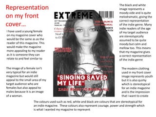
I have used a young female
on my magazine cover who
would be the same as as the
reader of this magazine. This
would make the magazine
more appealing to my reader
as it is someone they can
relate to and feel similar to
The image of a female isn’t
very typical for an indie
magazine but would still
appeal to the small area of my
target audience who are
females but also appeal to
males because it is an image
of a woman.
The black and white
image represents a
moody vide and is quite
melodramatic, giving the
correct representation
of the indie genre. Many
indie readers of the age
of my target audience
are stereotypically
assumed to be quite
moody but calm and
mellow too. This means
that my magazine gives
a correct representation
of the indie genre
The modern clothing
used in my front cover
image represents youth
but it is also quirky
which is stereotypical
for an indie magazine
and is the impression
that I want to create
The colours used such as red, white and black are colours that are stereotypical for
an indie magazine. These colours also represent courage, power and strength which
is what I wanted my magazine to represent
2. Representation on my
double page spread…
The young artists in the
image represent youth
which is stereotypical
for indie artists. Their
poses show strength
which is associated with
indie and is how I want
my magazine to be
represented. This
means my magazine
will be associated with
strong, powerful
images
The artists in my image are wearing
fashionable and modern clothing which
represents the age that they are. Indie
artists stereotypically wear modern.
Interesting clothing and this is what I want
my magazine to be associated with.
The colours used such as red, white and black are colours that are stereotypical for
an indie magazine. These colours also represent courage, power and strength which
is what I wanted my magazine to represent
The
context of
my article
and the
language
used
represents
the age of
the artists
featured.
This will
appeal to
my target
audience
and also
represent
the age
and
characteris
tics of indie
artists
3. Representation
on my contents
page…
The artists in my image are
seen to be wearing
fashionable and modern
clothing which represents the
fact that they are young. Indie
artists stereotypically wear
modern and interesting
clothing and this is what I want
my magazine to be associated
with.
My text has been
written in modern font
styles which is
stereotypical for an
indie magazine. The
fonts used are also
always bold and this is
how I want my
magazine to be
represented too.
I have used the colours red, white and black because
they are stereotypical for an indie magazine. These
colours represent courage, power and strength which is
what I wanted my magazine to represent and be
associated with
The young artists in the
images represent youth
which is stereotypical
for indie artists. One
image is a stronger
image which show
strength which is
something that is
associated with indie
and is how I want my
magazine to be
represented. The other
image is more relaxed
and shows the artist
having fun, this shows
that although they are
serious they’re also
young and like to have a
good time, which is
represented in indie
magazines too. This
means my magazine will
be associated with
strong, powerful images
but also not come
across as too serious