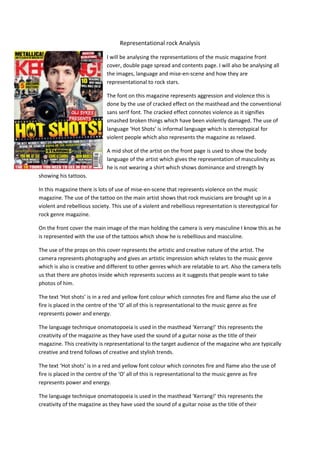
1. Representational rock Analysis
I will be analysing the representations of the music magazine front
cover, double page spread and contents page. I will also be analysing all
the images, language and mise-en-scene and how they are
representational to rock stars.
The font on this magazine represents aggression and violence this is
done by the use of cracked effect on the masthead and the conventional
sans serif font. The cracked effect connotes violence as it signifies
smashed broken things which have been violently damaged. The use of
language ‘Hot Shots’ is informal language which is stereotypical for
violent people which also represents the magazine as relaxed.
A mid shot of the artist on the front page is used to show the body
language of the artist which gives the representation of masculinity as
he is not wearing a shirt which shows dominance and strength by
showing his tattoos.
In this magazine there is lots of use of mise-en-scene that represents violence on the music
magazine. The use of the tattoo on the main artist shows that rock musicians are brought up in a
violent and rebellious society. This use of a violent and rebellious representation is stereotypical for
rock genre magazine.
On the front cover the main image of the man holding the camera is very masculine I know this as he
is represented with the use of the tattoos which show he is rebellious and masculine.
The use of the props on this cover represents the artistic and creative nature of the artist. The
camera represents photography and gives an artistic impression which relates to the music genre
which is also is creative and different to other genres which are relatable to art. Also the camera tells
us that there are photos inside which represents success as it suggests that people want to take
photos of him.
The text ‘Hot shots’ is in a red and yellow font colour which connotes fire and flame also the use of
fire is placed in the centre of the ‘O’ all of this is representational to the music genre as fire
represents power and energy.
The language technique onomatopoeia is used in the masthead ‘Kerrang!’ this represents the
creativity of the magazine as they have used the sound of a guitar noise as the title of their
magazine. This creativity is representational to the target audience of the magazine who are typically
creative and trend follows of creative and stylish trends.
The text ‘Hot shots’ is in a red and yellow font colour which connotes fire and flame also the use of
fire is placed in the centre of the ‘O’ all of this is representational to the music genre as fire
represents power and energy.
The language technique onomatopoeia is used in the masthead ‘Kerrang!’ this represents the
creativity of the magazine as they have used the sound of a guitar noise as the title of their
2. magazine. This creativity is representational to the target audience of the magazine who are typically
creative and trend follows of creative and stylish trends.
The smaller images on the magazine are very representational to the magazine. The smaller image of
‘reasons why rock will rule 2013’ uses images of men looking angry and shouting on the Image this
represents the magazine as aggressive
The font used on this double page spread represents violent behaviour and harsh mode of address.
The sans serif font used in the large headline makes it stand out also the use of a low key light
background used on the main image makes the ‘child’ headline stand out even more this represents
the magazine more aggressively by standing out it also represents the female artists as a more
aggressive and wild child. This is stereotypical as rock artists are conventionally aggressive this also
helps with the mode of address of the magazine.
The stereotypical artist on the left of the double page spread is represented as an attractive but
unruly woman. The mise-en-scene on the image is representation of the artists being antistereotypical feminine as she is wearing dark leather clothes and a black collar which also represents
the rock gene as a gloomy and rebellious. The use of black on the image connotes death and evil,
however it also connotes elegance and formality which is a conventional portrayal of the rock artist.
The artist is a young female which represented as attractive, this targets the stereotypical target
audience of male rock music listeners. The use of the mid shot of the artists represents the artist as
being more attractive.