
Recommended
More Related Content
What's hot
What's hot (20)
Viewers also liked
Viewers also liked (15)
Similar to Representing Teenage Rock Fans
Similar to Representing Teenage Rock Fans (20)
Representing Teenage Rock Fans
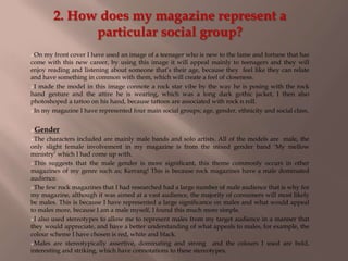
- 1. 2. How does my magazine represent a particular social group? On my front cover I have used an image of a teenager who is new to the fame and fortune that has come with this new career, by using this image it will appeal mainly to teenagers and they will enjoy reading and listening about someone that‟s their age, because they feel like they can relate and have something in common with them, which will create a feel of closeness. I made the model in this image connote a rock star vibe by the way he is posing with the rock hand gesture and the attire he is wearing, which was a long dark gothic jacket, I then also photoshoped a tattoo on his hand, because tattoos are associated with rock n roll. In my magazine I have represented four main social groups; age, gender, ethnicity and social class. Gender The characters included are mainly male bands and solo artists. All of the models are male, the only slight female involvement in my magazine is from the mixed gender band „My mellow ministry‟ which I had come up with. This suggests that the male gender is more significant, this theme commonly occurs in other magazines of my genre such as; Kerrang! This is because rock magazines have a male dominated audience. The few rock magazines that I had researched had a large number of male audience that is why for my magazine, although it was aimed at a vast audience, the majority of consumers will most likely be males. This is because I have represented a large significance on males and what would appeal to males more, because I am a male myself, I found this much more simple. I also used stereotypes to allow me to represent males from my target audience in a manner that they would appreciate, and have a better understanding of what appeals to males, for example, the colour scheme I have chosen is red, white and black. Males are stereotypically assertive, dominating and strong and the colours I used are bold, interesting and striking, which have connotations to these stereotypes.
- 2. Social class For this social group, my target audience would preferably be for the working class. This goes well to suit the main character, because of his fairly recent rise to fame and fortune as opposed to when he was too, from a working class background. As well as representing working class through characters, I have also represented working class through photography (image manipulation), costume, writing style and also the actual content that is written, a perfect example of this would be in the article on the double page spread, the interviewer does not speak in a formal and posh way, this is also to give a sense of trust to the interviewee so that they may give more open and honest answers. I used simple fonts and an informal writing style throughout as a stereotype of the working class is that they are less educated. I have used images which connote rebellion such as untidy hair and facial hair that has not been trimmed neatly, serious facial expressions, and confident open body language and passionate hand gestures. I also emphasised the sense of rebellion by using Photoshop to put a tattoo on the back of my models hand which says „Freedom‟ and an image of the outline of a bird. Also some of the content can connote rebellion for example; on the front cover it says “is this article about me on drugs again?” which foreshadows that he has went through some sort of downfall recently which any audience would be interested in.
- 3. Age The average age of the characters feature in my magazine is from 16 to around 23 which I found, is increasing in existing artists, so because this magazine contains artists who are of the younger generation, it will appeal more towards the younger generation. I have done this so that the audience that is of that age gains more hope in what the can achieve and also so that they can be looked up to and seen as role models in some aspects of their lives, because teenagers are looking up to celebrities at a younger age and at a considerable rate. A younger audience is stereotypically less educated and more informal, so I adapted to this by using simple sentences and some appropriate „slang‟ when necessary such as „Hmm‟. Stereotypically teenagers are more attracted by images and things they do not have to focus much on, but I challenged this convention because my magazine is for the reader who is devoted to what they believe in and like, so although the language was kept simple, the text was increased for maximum information on what the audience wants to know. Increased Text
- 4. Ethnicity My main images are taken of a non white male, the main reason I chose to this is because some of the most successful rock stars where not from all white countries such as Aerosmith who was originally from Argentina. Another reason I chose to do this is because a stereotype of teenagers is that they are narrow minded, and a stereotype for rock music is that rock stars are commonly white. I wanted to break both of these stereotypes by using the same method (2 birds with one stone). So by doing this my magazine will appeal to a wider and diverse audience. My magazine is not monocultural because it is aimed at a diverse audience and welcomes every different ethnicity, culture and religion to have something in common and share their appreciation for this genre of music. Like class, I have presented this through elements that have connotations of confidence and therefore independence such as the colour scheme, facial and body language and mise en scene of photography. None Are White