Download to read offline

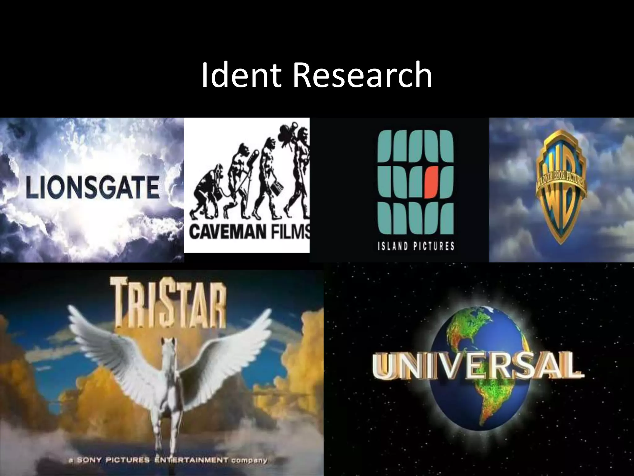
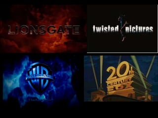

This document discusses company idents used in film trailers and provides recommendations for creating an ident for a horror genre teaser trailer. It notes that company idents normally include a logo built up in frames with graphics and text, and have a black background to make the logo stand out brightly. For horror teaser trailers specifically, the document observes that most only show a 1-3 second flash of the logo due to the short length of teasers. It recommends creating a dark, dull ident to fit the horror genre, and including an ident in their own teaser to make it look more professional.


