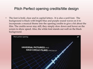
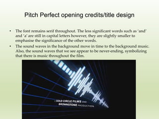
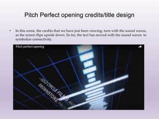
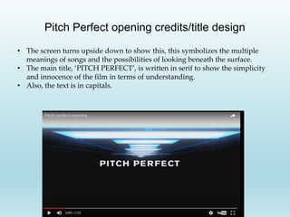
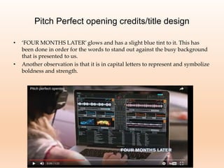
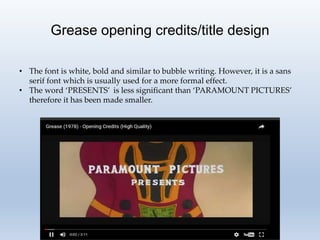
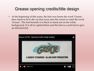
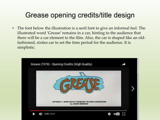
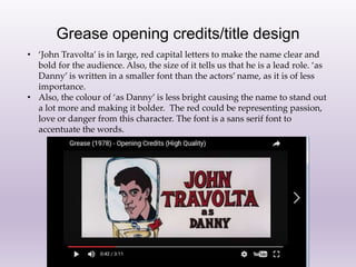
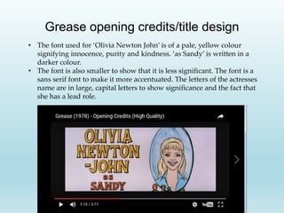
The document summarizes and analyzes the opening title designs of the films Pitch Perfect and Grease. For Pitch Perfect, the titles are in bold capital letters on a black background with moving blue and purple sound waves, representing the musical theme. The credits slow and hover to emphasize speed. For Grease, the title is presented in a white, bold sans-serif font resembling bubble writing against a car racing onto the screen. Actor names are in large colored capital letters to highlight their significance, while roles are in smaller darker fonts. Both films use stylistic fonts and animation to set the tone and provide context clues about the films for viewers.


![[Pro forma] - mographics - case study](https://cdn.slidesharecdn.com/ss_thumbnails/pro-forma-mographics-casestudy-171008214351-thumbnail.jpg?width=640&height=640&fit=bounds)


