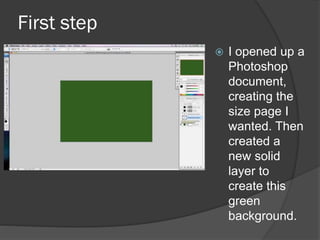
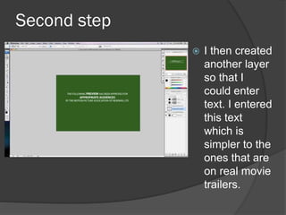
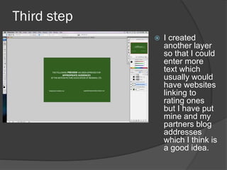
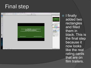
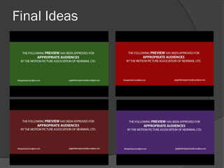
BY KIERA GARRISON
Introduction
 Here I have created my own rating card
to put at the beginning of my trailer so
that it is known that appropriate
audiences can watch my film.
 I have included the way I created these
rating cards, step by step, and some of
the outcomes I created.
First step
 I opened up a
Photoshop
document,
creating the
size page I
wanted. Then
created a
new solid
layer to
create this
green
background.
Second step
 I then created
another layer
so that I
could enter
text. I entered
this text
which is
simpler to the
ones that are
on real movie
trailers.
Third step
 I created
another layer
so that I could
enter more
text which
usually would
have websites
linking to
rating ones
but I have put
mine and my
partners blog
addresses
which I think is
a good idea.
Final step
 I finally
added two
rectangles
and filled
them in
black. This is
the final step
because it
now looks
like the real
rating cards
that are on
film trailers.
Final Ideas
Final Ideas Analysis
 I think that these all look like the real film rating cards
except the purple one which would be effective
because it shows that it is different and my own
creation. The two red ones also look effective because
there is a real rating card that is red, so by making my
trailer look more professional the red may look better. I
am not too sure which one I like better but because
the name of my film is going to be red, I don’t know
whether the beginning of my trailer will have too much
red in. I think that the green might be the best thing to
choose because it is one of the colours that are used
in the real ones so that would give my trailer a
professional start. I think I will work on my trailer
versions by adding some of these in so I can get more
of a visual look on which one will look better at the
beginning and the one that gives it a professional look.

Rating Cards

  • 1.
  • 2.
    Introduction  Here Ihave created my own rating card to put at the beginning of my trailer so that it is known that appropriate audiences can watch my film.  I have included the way I created these rating cards, step by step, and some of the outcomes I created.
  • 3.
    First step  Iopened up a Photoshop document, creating the size page I wanted. Then created a new solid layer to create this green background.
  • 4.
    Second step  Ithen created another layer so that I could enter text. I entered this text which is simpler to the ones that are on real movie trailers.
  • 5.
    Third step  Icreated another layer so that I could enter more text which usually would have websites linking to rating ones but I have put mine and my partners blog addresses which I think is a good idea.
  • 6.
    Final step  Ifinally added two rectangles and filled them in black. This is the final step because it now looks like the real rating cards that are on film trailers.
  • 7.
  • 8.
    Final Ideas Analysis I think that these all look like the real film rating cards except the purple one which would be effective because it shows that it is different and my own creation. The two red ones also look effective because there is a real rating card that is red, so by making my trailer look more professional the red may look better. I am not too sure which one I like better but because the name of my film is going to be red, I don’t know whether the beginning of my trailer will have too much red in. I think that the green might be the best thing to choose because it is one of the colours that are used in the real ones so that would give my trailer a professional start. I think I will work on my trailer versions by adding some of these in so I can get more of a visual look on which one will look better at the beginning and the one that gives it a professional look.