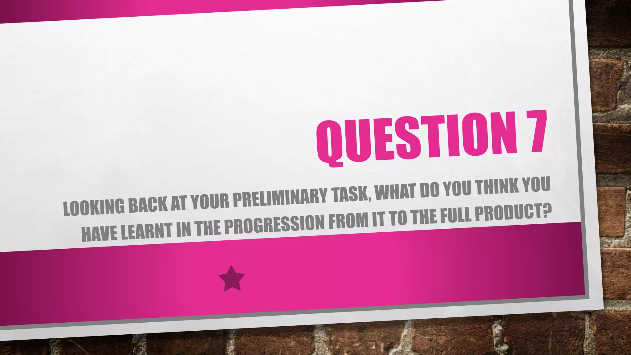
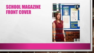
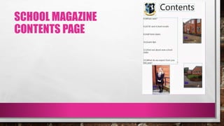
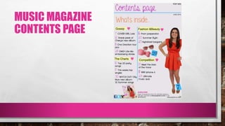
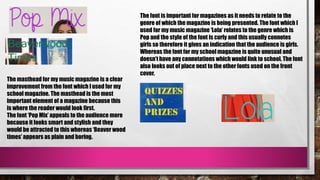
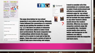
SCHOOL MAGAZINE
FRONT COVER
SCHOOL MAGAZINE
CONTENTS PAGE
MUSIC MAGAZINE
FRONT COVER
MUSIC MAGAZINE
CONTENTS PAGE
As you could hopefully tell there is a vivid improvement from
my school magazine to my music magazine. There are clear
elements in which my music magazine looks better and
elements which I have improved on.
These have consisted from:
- Font
- Layout
- Colour
- Images
- Style
The masthead for my music magazine is a clear
improvement from the font which I used for my
school magazine. The masthead is the most
important element of a magazine because this
is where the reader would look first.
The font ‘Pop Mix’ appeals to the audience more
because it looks smart and stylish and they
would be attracted to this whereas ‘Beaver wood
times’ appears as plain and boring.
The font is important for magazines as it needs to relate to the
genre of which the magazine is being presented. The font which I
used for my music magazine ‘Lola’ relates to the genre which is
Pop and the style of the font is curly and this usually connotes
girls so therefore it gives an indication that the audience is girls.
Whereas the font for my school magazine is quite unusual and
doesn’t have any connotations which would link to school. The font
also looks out of place next to the other fonts used on the front
cover.
?
The page description for my school
magazine is very plain and boring. Although,
I have followed the convention of a contents
page by not putting the numbers in order
e.g. 1,2,3. But there are plenty of elements
which I could have added to make it look
more professional. My music magazine has
4 subheadings which breaks the pages
apart so it is easier to read and to find the
pages. I have also used a variety of fonts to
make it look more interesting and unique.
I need to consider all of the
conventions of a contents page
to make it look professional and
efficient as possible but my
contents page for my school
magazine did not achieve this. I
did not include the page number
or any other features which
would attract the readers
attention. Whereas my music
magazine contents page did
accomplish this. I included
social media sites such as
twitter and Instagram so the
audience are able to
communicate with the magazine
and learn more.
COLOUR
The choice of colour is important for magazines as we
are able to recognize what genre it is and also allows us
to know who the magazine is aimed at e.g. male/female. I
have come to understand that you need to use colours
which would best suit your product and make sure that
the colours work well together. I believe that the choice
of colours for my school magazine did not link together
and the front cover and contents page appeared as two
different magazines. So knowing this I was able to adapt
this information for my music magazine and I think it
worked well.
I have also learned how a magazine should be laid out in
order for it to follow the right conventions. After researching
pop music magazines I automatically knew what I thought
looked right whilst creating my product. So I knew what
features to include such as a variety of puffs and unique
fonts. This also helped me when I needed to construct my
two page spread. I hadn’t created this for my school
magazine, yet I knew how I wanted it to be presented.
I also believe that I have
become a lot more confident
whilst on the computer and I
am willing to try new media
sites to improve my work. I also
feel like I have become a more
creative person this is shown
from my final product from the
school magazine to the music
magazine. I am not afraid to
experiment with different
colours and fonts and I will
spend a long time trying to
make sure it looks right.
From making my magazine I feel as if I have better knowledge
and understanding of magazines as a whole. For example the
different media institutions and which institution distributes
all of the magazines e.g. IPC media and Egmont.
CONCLUSION
In conclusion I feel like I did better in my music magazine than in my
school magazine. I have learnt from the mistakes which I made and I
was able to improve this when creating my music magazine. I fully
understand why I should have done a preliminary task (school
magazine) as I was firstly able to get a clear idea of how to use
Photoshop and InDesign and secondly it allowed me to learn from my
mistakes to make my final product better.

Question 7

  • 2.
  • 3.
  • 4.
  • 5.
  • 6.
    As you couldhopefully tell there is a vivid improvement from my school magazine to my music magazine. There are clear elements in which my music magazine looks better and elements which I have improved on. These have consisted from: - Font - Layout - Colour - Images - Style
  • 7.
    The masthead formy music magazine is a clear improvement from the font which I used for my school magazine. The masthead is the most important element of a magazine because this is where the reader would look first. The font ‘Pop Mix’ appeals to the audience more because it looks smart and stylish and they would be attracted to this whereas ‘Beaver wood times’ appears as plain and boring. The font is important for magazines as it needs to relate to the genre of which the magazine is being presented. The font which I used for my music magazine ‘Lola’ relates to the genre which is Pop and the style of the font is curly and this usually connotes girls so therefore it gives an indication that the audience is girls. Whereas the font for my school magazine is quite unusual and doesn’t have any connotations which would link to school. The font also looks out of place next to the other fonts used on the front cover.
  • 8.
    ? The page descriptionfor my school magazine is very plain and boring. Although, I have followed the convention of a contents page by not putting the numbers in order e.g. 1,2,3. But there are plenty of elements which I could have added to make it look more professional. My music magazine has 4 subheadings which breaks the pages apart so it is easier to read and to find the pages. I have also used a variety of fonts to make it look more interesting and unique. I need to consider all of the conventions of a contents page to make it look professional and efficient as possible but my contents page for my school magazine did not achieve this. I did not include the page number or any other features which would attract the readers attention. Whereas my music magazine contents page did accomplish this. I included social media sites such as twitter and Instagram so the audience are able to communicate with the magazine and learn more.
  • 9.
    COLOUR The choice ofcolour is important for magazines as we are able to recognize what genre it is and also allows us to know who the magazine is aimed at e.g. male/female. I have come to understand that you need to use colours which would best suit your product and make sure that the colours work well together. I believe that the choice of colours for my school magazine did not link together and the front cover and contents page appeared as two different magazines. So knowing this I was able to adapt this information for my music magazine and I think it worked well.
  • 10.
    I have alsolearned how a magazine should be laid out in order for it to follow the right conventions. After researching pop music magazines I automatically knew what I thought looked right whilst creating my product. So I knew what features to include such as a variety of puffs and unique fonts. This also helped me when I needed to construct my two page spread. I hadn’t created this for my school magazine, yet I knew how I wanted it to be presented. I also believe that I have become a lot more confident whilst on the computer and I am willing to try new media sites to improve my work. I also feel like I have become a more creative person this is shown from my final product from the school magazine to the music magazine. I am not afraid to experiment with different colours and fonts and I will spend a long time trying to make sure it looks right. From making my magazine I feel as if I have better knowledge and understanding of magazines as a whole. For example the different media institutions and which institution distributes all of the magazines e.g. IPC media and Egmont.
  • 11.
    CONCLUSION In conclusion Ifeel like I did better in my music magazine than in my school magazine. I have learnt from the mistakes which I made and I was able to improve this when creating my music magazine. I fully understand why I should have done a preliminary task (school magazine) as I was firstly able to get a clear idea of how to use Photoshop and InDesign and secondly it allowed me to learn from my mistakes to make my final product better.