Evaluation 7
•Download as PPTX, PDF•
0 likes•256 views
The document summarizes the key things the author learned in creating magazine front covers for a school magazine and music magazine. For the music magazine, the author used feedback from multiple drafts to improve the design. Some lessons learned were to make the masthead eye-catching, use color to draw attention to important text, stick to a limited color scheme, and include relevant content for the target audience. The author changed conventions like using a livelier font and darker, less conventional image for the music magazine that better suited the indie rock genre and younger audience.
Report
Share
Report
Share

Recommended
Question 7
The document discusses the key things the author learned in progressing from a preliminary task to the full product of a music magazine. Specifically:
1) The author learned how to edit backgrounds and add design elements like issue numbers, dates, prices and social media links to make the magazine more like a real published product.
2) For the contents page, the author added introductions, text boxes around cover lines, and more images to make it more appealing and easier to read compared to the preliminary college magazine.
3) For the double page interview spread, the author included an introduction, question and answer format, an image of the interviewee, and pull quotes to provide more context and make the interview easier for
Question 7
The document compares the student's school magazine to their music magazine, highlighting improvements made. For the music magazine, the student used a more appealing font for the masthead that matched the target audience. Fonts were also chosen that related better to the genre and conveyed the appropriate tone. The layout of the contents page was improved with subheadings, varied fonts, and inclusion of social media to engage readers. Color selection for the music magazine was better coordinated to represent the genre and audience. Through the process, the student gained confidence with design software and a better understanding of magazine conventions and production.
Question 7
The document compares a student's school magazine to their music magazine, noting improvements made in several areas for the music magazine. These include using more appealing fonts, breaking up the contents page with subheadings and including social media links, choosing colors that better suit the genre and work together across pages, and gaining confidence to experiment with layouts, fonts, and designs. The student concludes they did better on the music magazine having learned from the mistakes and strengths of designing the initial school magazine.
Evaluation 7 f
The document summarizes what the author learned from creating a preliminary magazine that could be improved for their final pop music magazine product. Specifically, the author learned that for a pop music magazine to appeal to its target teenage audience it needs bright colors, original fonts, a cluttered but content-rich format, informal language, prominent images on the cover and throughout, and elements like banners and frames that relate to web/social media and retro styles enjoyed by teenagers. The author analyzed their preliminary draft and made changes like adding more colorful and varied photos, torn paper elements, and filling empty spaces to create a final magazine that better matches the conventions and interests of their target market.
Presentation1
The document discusses the key differences learned between creating a school magazine and a music magazine. For the school magazine, a single consistent font was used to maintain a formal tone, while the music magazine varied fonts to appear more appealing. Images in the school magazine were similar, while the music magazine included different models and shot variations. The tone of the school magazine had to remain formal and sophisticated, while the music magazine could incorporate humor and a more casual voice. The document contrasts the simplistic design of the school magazine with the visually cluttered and vibrant design of the music magazine.
Magazine design evaluationnn
Music magazines are the most popular among the author's age group. The author compared magazine covers and contents pages from pop and rock magazines. They found pop magazines use bolder colors and fonts while rock magazines use red, black, and white. The author created a logo for their magazine using a bold, simple font to catch the eye. They edited two images for the cover, adjusting brightness, contrast, and orientation to make them vibrant and fit well together. Feedback from classmates on the author's magazine was positive.
Media evaluation question 7
Looking back at their preliminary school magazine project, the author feels their final music magazine shows significant improvement. They learned how to make the design and layout more appealing to the target audience. Specifically, the front cover was improved by making the title bold and stand out, organizing the coverlines, and using an eye-catching background image. The contents page was also improved by including multiple images, better organizing the content, and filling up white space without looking cramped. Overall, the author is pleased with how their final music magazine better represents and appeals to the target rock music audience.
Media evaluation question 7
The document provides an evaluation of improvements made from a preliminary school magazine project to a final music magazine project. The student felt their final products showed significant improvement in appearance and audience appeal. Issues identified with the preliminary magazine's front cover included a lack of background, simple text, inconsistent coloring, dull title, and uneye-catching coverlines. The student addressed these issues by making the title bolder, organizing bold coverlines, using an eye-catching main image and background. Similar issues with the contents page were also improved upon, such as adding more images and sub-headings to guide the audience.
Looking back at your preliminary task, what
Meg Allard reflects on improvements made from her preliminary magazine to her music magazine. She believes the music magazine looks more professional with a sophisticated masthead font using effects like embossing. The central image is more stylized and interestingly angled. Layout and design refer back to magazines reviewed for better structure. Colors suit the target audience of girls. The contents page uses thinner, varied fonts allowing more space. Images stand out against a white background. Vibrant purple with black and white provides good contrast and visibility. Doing the preliminary task helped identify strengths and weaknesses to incorporate into the stronger music magazine.
Laguage features in magazines
The document discusses language features used in the magazine "Rock Sound" to appeal to its target teenage audience. On the cover, informal language like "Ruled" is used to relate to teens. Alliteration ("Pop-Punk Posters") is used to grab attention. While there are no puns on the cover, magazines often use them to draw interest and humor. The cover contains more images than words to engage young people visually in bands and artists. Bright colors and large pictures and text are used to attract readers' attention. Inside pages also use informal language ("Hitchin' A Ride") and focus more on visuals than words to appeal to and engage the teenage audience.
Possible names for my music magazine
This document outlines the planning process for a music magazine project. Key steps included creating a calendar to schedule photo shoots and deadlines, contacting a band to photograph at a gig, researching costumes and props, designing mock front covers, and selecting fonts and colors for the masthead to suit an indie/rock genre. Reflection on the planning process revealed a clear perspective on the music magazine and attention to genre-specific details to guide future design work.
Pitch
The document provides details on the proposed "POP" music magazine, including:
- The name "POP" was chosen as it represents the genre instantly and is short like other popular music magazines.
- The mission is to give readers first-hand information on their favorite artists with no gimmicks, allowing readers to feel connected to pop stars.
- Interviews were found to be the most wanted feature. The magazine will focus on the pop/chart music genre and target older teenagers.
- It will be published monthly at £3.99 generally or £2.99 for students, released on the 1st of each month.
- The magazine aims to have a sophisticated style while still
My proposal 332
- The proposed magazine is called "Tour Magazine" and will focus on club/dance music genre.
- The magazine aims to provide accurate updates to fans of dance/club music and represent this "fun loving and free spirited music."
- Key features will include a weekly magazine, female cover stars, Q&As with music stars, competitions through social media, and fashion/advice pages.
- The magazine will have a colorful, girly theme shown through imagery and language to create a bond with the target readers.
Evaluation q1
In what ways does your media product use, develop or challenge forms and conventions of real media products?
Task 9
The document discusses initial ideas for a magazine focused on electronic club music. It will target males and females ages 16-25. The front cover will use bright blues and oranges with bold fonts to grab attention. It will feature top artists, clubs, and reviews. The contents page will list articles and some may include images. The double page spread will interview the artist on the cover and include short lists. Photographs will use medium shots that clearly show faces of artists featured.
Question 7
The document discusses the progression made in magazine cover and contents page design between a preliminary task and finished product. For the cover, improvements included using brighter colors that fit the target audience and genre, adding more graphics and photos to make the text stand out, and simplifying the language. For the contents page, key progressions involved adding structure with columns, including more detailed descriptions, using easier to read font colors and sizes, and incorporating more varied photos. The finished pieces employed consistent color schemes and magazine design elements like multiple photos to engage readers.
Looking back at your preliminary task (the school magazine), what do you feel...
The student summarizes their learning progress from an initial school magazine project to a final music magazine project. They gained more confidence and skills using Photoshop and developed better ideas for cover designs. Their photography skills also improved from simple photos taken at school to a planned shoot with consideration of lighting, outfits, and backgrounds. Overall, the student experimented more with design elements and felt their work progressed significantly from the initial task to the final product.
Contnets page analysis
This magazine targets younger children who regularly listen to pop music. The layout uses bright pink and white colors with easy to read fonts. Pictures and varied page numbers break up the text and make the articles easier to find. The informal colors, fonts, and images connote fun and appeal to the target audience. The language is informal with slang to seem relaxed. The brand identity is instantly recognizable through the consistent use of girly pink and yellow colors, informal fonts, and child-friendly language throughout the magazine.
Music Magazine Survey: Analysis of results
- The majority of respondents to the music magazine survey were teenagers aged 13-18, showing this is the target audience.
- Most respondents listened to rock, alternative, and heavy metal music and did not prefer classical or jazz.
- Females responded to the survey more than males, indicating the magazine should focus more on genres and artists appealing to females.
- Respondents listened to music frequently, for 3+ hours per day, showing they are passionate about music and will be interested in a music magazine.
Question 5 - media evluation
This document discusses how the target audience of young people was addressed in a music magazine. To attract this audience, the magazine featured "90 biggest singles of 2013" on the front cover to draw interest in new music. A low price of £2 was chosen to appeal to students and unemployed youth. Inside features like interviews and articles about popular artists would also engage the target audience. A color scheme of blue, grey, and white was selected to attract both male and female readers without being too masculine or feminine. Throughout the magazine, varied fonts, prominent logos, and models/quotes from featured artists were used to maintain reader interest while keeping designs simple and focused.
Question 1
The document discusses the design choices made for a pop music magazine project. It describes using a bold font and merging layout styles from other pop magazines to make the masthead unique. High key lighting and photo editing tools were used to make the model look attractive and professional. Bright clothes and accessories were chosen for the photoshoot to match the pop genre. Elements like the contents page, barcode, and issue number were included to mimic real pop magazines. The double page spread layout drew inspiration from other music magazines. Color schemes aimed to attract a young audience while differentiating from directly copying other publications.
Evaluation 5
By comparing his preliminary school magazine to his final music magazine, the author learned:
1) He gained more confidence in experimenting with design elements, making his final magazine more unique.
2) He better understood industry codes and conventions in targeting his audience.
3) He engaged in more planning and preparation, such as conducting a survey and writing an article, to create a higher quality product tailored to his music audience.
As media studies
The student created a magazine spread for a coursework evaluation. Their magazine uses a familiar layout found in many existing music magazines, with a large featured photo and tidy columns. While others used obvious props like guitars in their photos, the student found that celebrity photoshoots rarely include props, so they followed that approach. The magazine aims to represent youths, women, and culture. It focuses on a fictional female DJ artist named Sophie Wood to appeal to women and attract attention from both genders. The student believes IPC Media, the parent company of NME magazine, would be a good fit to represent their magazine. Through this project, the student learned more about the music industry, media, and how to make a magazine
Evaluation
The student created a magazine spread about a fictional female DJ named Sophie Wood. The spread uses a conventional magazine layout with a large background photo, tidy columns, and unique artist photos that do not feature obvious musical instruments. The magazine aims to represent youths, women, and culture. It has a fashion-oriented style that may inspire the audience and attract more women readers. Through this project, the student learned more about the music industry, magazine genres, and how to make a magazine look more professional.
Question 7
The student learned several skills in progressing from a preliminary school magazine task to developing a full music magazine product. For the music magazine, the student learned to add more effects and styles to the masthead to make it more unique, add shadows to give it depth, and include a strapline. The student also learned the importance of using bold fonts to draw attention to key elements and varying font sizes and styles to make the contents page more interesting. Through refining images and fixing details, the student learned that small adjustments can improve the overall quality and professionalism of the magazine.
Power point 5 media
The author attracted their audience by representing their magazine towards teenage girls from working class backgrounds who had little money. They chose this audience because it was large and popular enough to buy the magazine, which specialized in pop music and discussed artists who performed these songs. Although other magazines had similar audiences, the author's magazine stood out by being brightly colored and more eye-catching than magazines like Q, which did not have many colors and did not stand out as well.
Evaluation – question_1
The document discusses how the media product uses, develops, and challenges conventions of real music magazines. It summarizes that the front cover and double page spread use typical conventions like the masthead, color scheme, standfirst, drop cap, and pull quote to look realistic. However, the contents page challenges conventions by having an atypical layout with a large main image and non-column listings to portray a fresh, distinctive magazine for its target indie music audience. In conclusion, most elements follow conventions for realism while the contents page challenges norms to suit the magazine's genre and prevent boredom for its target readers.
Magazine Analysis.
The document provides an analysis of the front cover, a double page spread, and contents page of a dance music magazine. Key points include:
- The front cover uses bright colors, alliteration in the title, and an image of a woman in a bikini to target young people interested in dance music and clubbing.
- The double page spread features large images of people clubbing to create a happy vibe, along with smaller photos and a pink and yellow color scheme to catch readers' attention.
- The contents page uses a bold font, white and yellow writing against a black background for readability, and splits the page with a track list and simple page numbers to make navigation easy.
Question 7
The author created two magazines - a school magazine and a music magazine - to improve their skills. They analyzed the differences between the two magazines. The music magazine had a clearer masthead font that would attract readers, used fonts related to the genre of music, incorporated more design elements like colors and images on the cover, and had a more professional looking contents page that included social media links. Creating the initial school magazine allowed the author to learn InDesign and Photoshop skills and identify design weaknesses to improve upon for the music magazine. The author felt they better understood magazine design conventions and grew more confident in their abilities after completing this project.
Evaluation
This is an evaluation of all of the construction work that had been done such as the school magazine and music magazine.
More Related Content
What's hot
Looking back at your preliminary task, what
Meg Allard reflects on improvements made from her preliminary magazine to her music magazine. She believes the music magazine looks more professional with a sophisticated masthead font using effects like embossing. The central image is more stylized and interestingly angled. Layout and design refer back to magazines reviewed for better structure. Colors suit the target audience of girls. The contents page uses thinner, varied fonts allowing more space. Images stand out against a white background. Vibrant purple with black and white provides good contrast and visibility. Doing the preliminary task helped identify strengths and weaknesses to incorporate into the stronger music magazine.
Laguage features in magazines
The document discusses language features used in the magazine "Rock Sound" to appeal to its target teenage audience. On the cover, informal language like "Ruled" is used to relate to teens. Alliteration ("Pop-Punk Posters") is used to grab attention. While there are no puns on the cover, magazines often use them to draw interest and humor. The cover contains more images than words to engage young people visually in bands and artists. Bright colors and large pictures and text are used to attract readers' attention. Inside pages also use informal language ("Hitchin' A Ride") and focus more on visuals than words to appeal to and engage the teenage audience.
Possible names for my music magazine
This document outlines the planning process for a music magazine project. Key steps included creating a calendar to schedule photo shoots and deadlines, contacting a band to photograph at a gig, researching costumes and props, designing mock front covers, and selecting fonts and colors for the masthead to suit an indie/rock genre. Reflection on the planning process revealed a clear perspective on the music magazine and attention to genre-specific details to guide future design work.
Pitch
The document provides details on the proposed "POP" music magazine, including:
- The name "POP" was chosen as it represents the genre instantly and is short like other popular music magazines.
- The mission is to give readers first-hand information on their favorite artists with no gimmicks, allowing readers to feel connected to pop stars.
- Interviews were found to be the most wanted feature. The magazine will focus on the pop/chart music genre and target older teenagers.
- It will be published monthly at £3.99 generally or £2.99 for students, released on the 1st of each month.
- The magazine aims to have a sophisticated style while still
My proposal 332
- The proposed magazine is called "Tour Magazine" and will focus on club/dance music genre.
- The magazine aims to provide accurate updates to fans of dance/club music and represent this "fun loving and free spirited music."
- Key features will include a weekly magazine, female cover stars, Q&As with music stars, competitions through social media, and fashion/advice pages.
- The magazine will have a colorful, girly theme shown through imagery and language to create a bond with the target readers.
Evaluation q1
In what ways does your media product use, develop or challenge forms and conventions of real media products?
Task 9
The document discusses initial ideas for a magazine focused on electronic club music. It will target males and females ages 16-25. The front cover will use bright blues and oranges with bold fonts to grab attention. It will feature top artists, clubs, and reviews. The contents page will list articles and some may include images. The double page spread will interview the artist on the cover and include short lists. Photographs will use medium shots that clearly show faces of artists featured.
Question 7
The document discusses the progression made in magazine cover and contents page design between a preliminary task and finished product. For the cover, improvements included using brighter colors that fit the target audience and genre, adding more graphics and photos to make the text stand out, and simplifying the language. For the contents page, key progressions involved adding structure with columns, including more detailed descriptions, using easier to read font colors and sizes, and incorporating more varied photos. The finished pieces employed consistent color schemes and magazine design elements like multiple photos to engage readers.
Looking back at your preliminary task (the school magazine), what do you feel...
The student summarizes their learning progress from an initial school magazine project to a final music magazine project. They gained more confidence and skills using Photoshop and developed better ideas for cover designs. Their photography skills also improved from simple photos taken at school to a planned shoot with consideration of lighting, outfits, and backgrounds. Overall, the student experimented more with design elements and felt their work progressed significantly from the initial task to the final product.
Contnets page analysis
This magazine targets younger children who regularly listen to pop music. The layout uses bright pink and white colors with easy to read fonts. Pictures and varied page numbers break up the text and make the articles easier to find. The informal colors, fonts, and images connote fun and appeal to the target audience. The language is informal with slang to seem relaxed. The brand identity is instantly recognizable through the consistent use of girly pink and yellow colors, informal fonts, and child-friendly language throughout the magazine.
Music Magazine Survey: Analysis of results
- The majority of respondents to the music magazine survey were teenagers aged 13-18, showing this is the target audience.
- Most respondents listened to rock, alternative, and heavy metal music and did not prefer classical or jazz.
- Females responded to the survey more than males, indicating the magazine should focus more on genres and artists appealing to females.
- Respondents listened to music frequently, for 3+ hours per day, showing they are passionate about music and will be interested in a music magazine.
Question 5 - media evluation
This document discusses how the target audience of young people was addressed in a music magazine. To attract this audience, the magazine featured "90 biggest singles of 2013" on the front cover to draw interest in new music. A low price of £2 was chosen to appeal to students and unemployed youth. Inside features like interviews and articles about popular artists would also engage the target audience. A color scheme of blue, grey, and white was selected to attract both male and female readers without being too masculine or feminine. Throughout the magazine, varied fonts, prominent logos, and models/quotes from featured artists were used to maintain reader interest while keeping designs simple and focused.
Question 1
The document discusses the design choices made for a pop music magazine project. It describes using a bold font and merging layout styles from other pop magazines to make the masthead unique. High key lighting and photo editing tools were used to make the model look attractive and professional. Bright clothes and accessories were chosen for the photoshoot to match the pop genre. Elements like the contents page, barcode, and issue number were included to mimic real pop magazines. The double page spread layout drew inspiration from other music magazines. Color schemes aimed to attract a young audience while differentiating from directly copying other publications.
Evaluation 5
By comparing his preliminary school magazine to his final music magazine, the author learned:
1) He gained more confidence in experimenting with design elements, making his final magazine more unique.
2) He better understood industry codes and conventions in targeting his audience.
3) He engaged in more planning and preparation, such as conducting a survey and writing an article, to create a higher quality product tailored to his music audience.
As media studies
The student created a magazine spread for a coursework evaluation. Their magazine uses a familiar layout found in many existing music magazines, with a large featured photo and tidy columns. While others used obvious props like guitars in their photos, the student found that celebrity photoshoots rarely include props, so they followed that approach. The magazine aims to represent youths, women, and culture. It focuses on a fictional female DJ artist named Sophie Wood to appeal to women and attract attention from both genders. The student believes IPC Media, the parent company of NME magazine, would be a good fit to represent their magazine. Through this project, the student learned more about the music industry, media, and how to make a magazine
Evaluation
The student created a magazine spread about a fictional female DJ named Sophie Wood. The spread uses a conventional magazine layout with a large background photo, tidy columns, and unique artist photos that do not feature obvious musical instruments. The magazine aims to represent youths, women, and culture. It has a fashion-oriented style that may inspire the audience and attract more women readers. Through this project, the student learned more about the music industry, magazine genres, and how to make a magazine look more professional.
Question 7
The student learned several skills in progressing from a preliminary school magazine task to developing a full music magazine product. For the music magazine, the student learned to add more effects and styles to the masthead to make it more unique, add shadows to give it depth, and include a strapline. The student also learned the importance of using bold fonts to draw attention to key elements and varying font sizes and styles to make the contents page more interesting. Through refining images and fixing details, the student learned that small adjustments can improve the overall quality and professionalism of the magazine.
Power point 5 media
The author attracted their audience by representing their magazine towards teenage girls from working class backgrounds who had little money. They chose this audience because it was large and popular enough to buy the magazine, which specialized in pop music and discussed artists who performed these songs. Although other magazines had similar audiences, the author's magazine stood out by being brightly colored and more eye-catching than magazines like Q, which did not have many colors and did not stand out as well.
Evaluation – question_1
The document discusses how the media product uses, develops, and challenges conventions of real music magazines. It summarizes that the front cover and double page spread use typical conventions like the masthead, color scheme, standfirst, drop cap, and pull quote to look realistic. However, the contents page challenges conventions by having an atypical layout with a large main image and non-column listings to portray a fresh, distinctive magazine for its target indie music audience. In conclusion, most elements follow conventions for realism while the contents page challenges norms to suit the magazine's genre and prevent boredom for its target readers.
Magazine Analysis.
The document provides an analysis of the front cover, a double page spread, and contents page of a dance music magazine. Key points include:
- The front cover uses bright colors, alliteration in the title, and an image of a woman in a bikini to target young people interested in dance music and clubbing.
- The double page spread features large images of people clubbing to create a happy vibe, along with smaller photos and a pink and yellow color scheme to catch readers' attention.
- The contents page uses a bold font, white and yellow writing against a black background for readability, and splits the page with a track list and simple page numbers to make navigation easy.
What's hot (20)
Looking back at your preliminary task (the school magazine), what do you feel...
Looking back at your preliminary task (the school magazine), what do you feel...
Similar to Evaluation 7
Question 7
The author created two magazines - a school magazine and a music magazine - to improve their skills. They analyzed the differences between the two magazines. The music magazine had a clearer masthead font that would attract readers, used fonts related to the genre of music, incorporated more design elements like colors and images on the cover, and had a more professional looking contents page that included social media links. Creating the initial school magazine allowed the author to learn InDesign and Photoshop skills and identify design weaknesses to improve upon for the music magazine. The author felt they better understood magazine design conventions and grew more confident in their abilities after completing this project.
Evaluation
This is an evaluation of all of the construction work that had been done such as the school magazine and music magazine.
Presentation
The document summarizes a student's media project creating a pop music magazine for girls aged 8-14. The student aimed to represent teenagers positively and challenge stereotypes. Through the process, the student learned how to use design software like InDesign and Photoshop more effectively. Feedback showed the magazine was successful at attracting its target audience and addressing them in an age-appropriate manner. The student was proud of the progression from their initial idea to the final product.
presentation
The document summarizes a student's media project creating a pop music magazine for girls aged 8-14. The student aimed to represent teenagers positively and challenge stereotypes. Through the process, the student learned how to use design software like InDesign and Photoshop more effectively. Feedback showed the magazine was successful at attracting its target audience and addressing them in an age-appropriate manner. The student was proud of the progression from their initial idea to the final product.
Evaluation
The document discusses the process of creating a magazine cover and layout. It describes how the author was inspired by a Vogue magazine cover in designing their own music magazine cover. Key aspects they replicated included the bold masthead, sophisticated main image, and column layout of the contents page. The author explains how they aimed to create a sophisticated, neutral design with a black and white color scheme. Feedback noted the contents page could be improved, so the author made changes like adding more color and spacing out the text. Overall, working on this preliminary project helped the author learn Photoshop skills to produce a higher quality final magazine cover.
Question 7
The author learned several skills in progressing from their preliminary school magazine to their final music magazine. For the music magazine, they gained more experience using InDesign and Photoshop and learned to edit images to make them look more professional. They also conducted more research on their target audience's preferences. As a result, their music magazine front cover had a cleaner background, more appealing layout, and higher quality images compared to the school magazine. The author felt they were more creative and produced a magazine that looked more like professional music publications.
Evaluation
The document describes the process of creating a music magazine cover and layout. The creator was inspired by a Vogue magazine cover they saw, particularly liking how it was set out like a poster and had bold writing for stories. For their music magazine, they aimed for a sophisticated look with neutral colors and a serious model on the cover. Feedback noted the contents page could be improved, so the creator added more color and spacing to make it look more professional while keeping the overall style. Through this process, the creator learned Photoshop skills that improved their work.
Evaluation q7
The document discusses how completing a preliminary college magazine task helped the author learn important conventions for their final music magazine product. For the college magazine, the author experimented with layout, photography, and Photoshop skills. This allowed them to identify weaknesses in their first attempt, such as a cluttered layout with many small stories, poorly edited images, and an unclear masthead. For their music magazine, the author applied what they learned to improve the layout, feature large prominent images, and use clear fonts and colors consistent with industry standards. Completing the preliminary college magazine was beneficial as it provided an opportunity to develop skills and understand conventions needed to create a professional final magazine.
Evaluation presentation
The document discusses the process of creating a music magazine called "Vibe" as a class project. Key points include:
- The magazine was inspired by Spin magazine and uses similar conventions like images of artists, headlines, and stories about music.
- Photoshop skills like airbrushing, adding text, and adjusting layers were used to design the magazine cover and layout.
- Research of existing magazines helped determine design elements and the target audience of teenagers aged 13-19.
- Artists like Miley Cyrus and Pixie Lott were featured to appeal to this young demographic.
Evaluation
The document discusses how the author created a music magazine to target a specific audience based on research. Through surveys on Survey Monkey, the author found that most respondents were ages 17-25 and enjoyed a variety of music genres. This informed the content and design of the magazine to attract this demographic. Inspired by Billboard and NME magazines, the author chose a simple title and masthead design without bright colors that would distract from the content. The front cover features an attractive female model to attract both male and female readers through techniques like the male gaze. Overall, the magazine aims to attract its target audience through clean, easy-to-read design and content tailored to music-loving youth.
Evaluation
My media product uses conventions of real magazines such as dates, mastheads, images, and prices to provide information to readers and attract their attention. The layout and color scheme are somewhat conventional but the front cover image is less bright than typical music magazines to give the product a more elegant feel. The contents page follows conventions like listing contents and including the front cover image but also includes advertisements and notes to engage readers. The double page spread uses a conventional interview format to interest readers in the featured person.
Evaluation 2
The document discusses the process of designing magazines for a college course. It describes creating a music magazine aimed at teenagers to fill a gap in magazines catering to chart/pop music. It also created a college magazine appealing to prospective college students. Key learnings included using simple backgrounds and colors that complemented images to direct attention. Formats from other magazines like NME and New were inspirations. The final magazines featured informal language and bold colors to attract teenage audiences.
Evaluation
The document discusses the inspiration and design choices for a music magazine front cover, contents page, and double page spread created by the author. The author was inspired by a Vogue magazine cover that used neutral colors and featured a sophisticated model. They aimed to create a magazine that was also sophisticated and aimed at young adults. Throughout the magazine, the author kept a consistent black and white color scheme and style to make it stand out from other colorful magazines. Feedback from test audiences validated that the model and image stood out as intended. The author acknowledged areas for potential improvement based on the feedback.
Evau
The document evaluates a media product created by the student. It discusses how the student's magazine uses conventions of real music magazines in its layout, design elements, and photos. The student aims their magazine at young teenage girls interested in pop music. Major music publisher Baur Media Group would be suited to distribute the magazine to shops and teenagers. The front cover represents summer and the social group of young, trendy teenage girls. The intended audience is also young, hip teenagers who believe the magazine features undiscovered and unique music. The student learned skills in research, photography, photo editing in Photoshop, and magazine design through creating their media product.
Evaluation
The document discusses the process of designing magazines for a college course. It describes creating a music magazine aimed at teenagers to fill a gap in magazines catering to chart/pop music. It also created a college magazine appealing to prospective college students. The document reflects on lessons learned, such as using bold colors and simple layouts to attract younger audiences, and editing images for professional-looking magazines.
Evaluation
The document describes the process of creating a music magazine focused on the rap genre. It discusses following conventions of real music magazines, such as using a large main image on the cover featuring the artist of a double page spread. It also challenges some conventions, like blending text and images on double page spreads. The target audience is described as mainly males aged 16-25 who enjoy rap music. Feedback from surveys of other rap fans provided suggestions to improve the layout, entertainment features, and quality of the main cover image.
Evaluation
The magazine challenges conventions by not following typical music magazine formats. Photos were taken in natural environments rather than professional studio shoots due to timing. The target audience may not be instantly clear as it does not look like a typical music magazine. Photos were edited in Photoshop to look brighter and more vibrant. The main article focuses on a 17-20 year old Italian American girl on holiday to appeal to a similar demographic. Simplistic fonts avoid clutter. The magazine mixes music, fashion, world events and movies like Time magazine to reach a broader 14+ audience. Overall, it diverges from conventions to intrigue readers into exploring its diverse content beyond just music.
Recovered file 1
The student learned many new skills in progressing from their preliminary task to creating a full music magazine. For the preliminary front page, the text overlapped the main image and the artist was not properly cut out from lack of Photoshop skills. The full magazine featured the text flowing around the main image and a cleaner cut-out. Additional improvements included more organized additional lines, varied typography sizes and colors, and inclusion of typical magazine elements like barcodes, dates, and websites. Overall the preliminary work lacked experience, but researching real magazines helped the student create a more professional and authentic final product.
Evaulation
This document contains an evaluation of a student's media magazine project. It includes sections that discuss how the magazine uses conventions of real music magazines, what type of media institution might distribute the magazine, how it represents a social group of young teenage girls, who the target audience is, and what technologies were used and learned in the process of creating the magazine. The student refined their magazine over multiple versions, improving layouts, photos, and fixing errors based on feedback.
One.
The document discusses various design elements of a magazine front cover and contents page for a pop music magazine, analyzing how they conform to stereotypical conventions of the pop genre. These include using bright colors, catchy titles, airbrushed celebrity images, and columns of easy-to-read text with pull quotes. The target audience is described as young females, so the designs aim to attract this demographic with extravagant fonts, fashionable costumes, and an emphasis on female idols.
Similar to Evaluation 7 (20)
Recently uploaded
clinical examination of hip joint (1).pdf
described clinical examination all orthopeadic conditions .
Hindi varnamala | hindi alphabet PPT.pdf
हिंदी वर्णमाला पीपीटी, hindi alphabet PPT presentation, hindi varnamala PPT, Hindi Varnamala pdf, हिंदी स्वर, हिंदी व्यंजन, sikhiye hindi varnmala, dr. mulla adam ali, hindi language and literature, hindi alphabet with drawing, hindi alphabet pdf, hindi varnamala for childrens, hindi language, hindi varnamala practice for kids, https://www.drmullaadamali.com
Your Skill Boost Masterclass: Strategies for Effective Upskilling
Your Skill Boost Masterclass: Strategies for Effective UpskillingExcellence Foundation for South Sudan
Strategies for Effective Upskilling is a presentation by Chinwendu Peace in a Your Skill Boost Masterclass organisation by the Excellence Foundation for South Sudan on 08th and 09th June 2024 from 1 PM to 3 PM on each day.The Diamonds of 2023-2024 in the IGRA collection
A review of the growth of the Israel Genealogy Research Association Database Collection for the last 12 months. Our collection is now passed the 3 million mark and still growing. See which archives have contributed the most. See the different types of records we have, and which years have had records added. You can also see what we have for the future.
How to Create a More Engaging and Human Online Learning Experience
How to Create a More Engaging and Human Online Learning Experience Wahiba Chair Training & Consulting
Wahiba Chair's Talk at the 2024 Learning Ideas Conference. How to Manage Your Lost Opportunities in Odoo 17 CRM
Odoo 17 CRM allows us to track why we lose sales opportunities with "Lost Reasons." This helps analyze our sales process and identify areas for improvement. Here's how to configure lost reasons in Odoo 17 CRM
Beyond Degrees - Empowering the Workforce in the Context of Skills-First.pptx
Iván Bornacelly, Policy Analyst at the OECD Centre for Skills, OECD, presents at the webinar 'Tackling job market gaps with a skills-first approach' on 12 June 2024
Pollock and Snow "DEIA in the Scholarly Landscape, Session One: Setting Expec...
Pollock and Snow "DEIA in the Scholarly Landscape, Session One: Setting Expec...National Information Standards Organization (NISO)
This presentation was provided by Steph Pollock of The American Psychological Association’s Journals Program, and Damita Snow, of The American Society of Civil Engineers (ASCE), for the initial session of NISO's 2024 Training Series "DEIA in the Scholarly Landscape." Session One: 'Setting Expectations: a DEIA Primer,' was held June 6, 2024.How to Setup Warehouse & Location in Odoo 17 Inventory
In this slide, we'll explore how to set up warehouses and locations in Odoo 17 Inventory. This will help us manage our stock effectively, track inventory levels, and streamline warehouse operations.
BÀI TẬP BỔ TRỢ TIẾNG ANH LỚP 9 CẢ NĂM - GLOBAL SUCCESS - NĂM HỌC 2024-2025 - ...
BÀI TẬP BỔ TRỢ TIẾNG ANH LỚP 9 CẢ NĂM - GLOBAL SUCCESS - NĂM HỌC 2024-2025 - ...Nguyen Thanh Tu Collection
https://app.box.com/s/tacvl9ekroe9hqupdnjruiypvm9rdaneTraditional Musical Instruments of Arunachal Pradesh and Uttar Pradesh - RAYH...
Traditional Musical Instruments of Arunachal Pradesh and Uttar Pradesh
বাংলাদেশ অর্থনৈতিক সমীক্ষা (Economic Review) ২০২৪ UJS App.pdf
বাংলাদেশের অর্থনৈতিক সমীক্ষা ২০২৪ [Bangladesh Economic Review 2024 Bangla.pdf] কম্পিউটার , ট্যাব ও স্মার্ট ফোন ভার্সন সহ সম্পূর্ণ বাংলা ই-বুক বা pdf বই " সুচিপত্র ...বুকমার্ক মেনু 🔖 ও হাইপার লিংক মেনু 📝👆 যুক্ত ..
আমাদের সবার জন্য খুব খুব গুরুত্বপূর্ণ একটি বই ..বিসিএস, ব্যাংক, ইউনিভার্সিটি ভর্তি ও যে কোন প্রতিযোগিতা মূলক পরীক্ষার জন্য এর খুব ইম্পরট্যান্ট একটি বিষয় ...তাছাড়া বাংলাদেশের সাম্প্রতিক যে কোন ডাটা বা তথ্য এই বইতে পাবেন ...
তাই একজন নাগরিক হিসাবে এই তথ্য গুলো আপনার জানা প্রয়োজন ...।
বিসিএস ও ব্যাংক এর লিখিত পরীক্ষা ...+এছাড়া মাধ্যমিক ও উচ্চমাধ্যমিকের স্টুডেন্টদের জন্য অনেক কাজে আসবে ...
Chapter 4 - Islamic Financial Institutions in Malaysia.pptx
Chapter 4 - Islamic Financial Institutions in Malaysia.pptxMohd Adib Abd Muin, Senior Lecturer at Universiti Utara Malaysia
This slide is special for master students (MIBS & MIFB) in UUM. Also useful for readers who are interested in the topic of contemporary Islamic banking.
Leveraging Generative AI to Drive Nonprofit Innovation
In this webinar, participants learned how to utilize Generative AI to streamline operations and elevate member engagement. Amazon Web Service experts provided a customer specific use cases and dived into low/no-code tools that are quick and easy to deploy through Amazon Web Service (AWS.)
How to Fix the Import Error in the Odoo 17
An import error occurs when a program fails to import a module or library, disrupting its execution. In languages like Python, this issue arises when the specified module cannot be found or accessed, hindering the program's functionality. Resolving import errors is crucial for maintaining smooth software operation and uninterrupted development processes.
Recently uploaded (20)
NEWSPAPERS - QUESTION 1 - REVISION POWERPOINT.pptx
NEWSPAPERS - QUESTION 1 - REVISION POWERPOINT.pptx
Your Skill Boost Masterclass: Strategies for Effective Upskilling
Your Skill Boost Masterclass: Strategies for Effective Upskilling
How to Create a More Engaging and Human Online Learning Experience
How to Create a More Engaging and Human Online Learning Experience
How to Manage Your Lost Opportunities in Odoo 17 CRM
How to Manage Your Lost Opportunities in Odoo 17 CRM
Beyond Degrees - Empowering the Workforce in the Context of Skills-First.pptx
Beyond Degrees - Empowering the Workforce in the Context of Skills-First.pptx
Pollock and Snow "DEIA in the Scholarly Landscape, Session One: Setting Expec...
Pollock and Snow "DEIA in the Scholarly Landscape, Session One: Setting Expec...
Digital Artefact 1 - Tiny Home Environmental Design
Digital Artefact 1 - Tiny Home Environmental Design
How to Setup Warehouse & Location in Odoo 17 Inventory
How to Setup Warehouse & Location in Odoo 17 Inventory
BÀI TẬP BỔ TRỢ TIẾNG ANH LỚP 9 CẢ NĂM - GLOBAL SUCCESS - NĂM HỌC 2024-2025 - ...
BÀI TẬP BỔ TRỢ TIẾNG ANH LỚP 9 CẢ NĂM - GLOBAL SUCCESS - NĂM HỌC 2024-2025 - ...
Traditional Musical Instruments of Arunachal Pradesh and Uttar Pradesh - RAYH...
Traditional Musical Instruments of Arunachal Pradesh and Uttar Pradesh - RAYH...
বাংলাদেশ অর্থনৈতিক সমীক্ষা (Economic Review) ২০২৪ UJS App.pdf
বাংলাদেশ অর্থনৈতিক সমীক্ষা (Economic Review) ২০২৪ UJS App.pdf
Chapter 4 - Islamic Financial Institutions in Malaysia.pptx
Chapter 4 - Islamic Financial Institutions in Malaysia.pptx
Leveraging Generative AI to Drive Nonprofit Innovation
Leveraging Generative AI to Drive Nonprofit Innovation
Evaluation 7
- 2. Final draft for music magazine…
- 3. I feel that I have greatly improved from my preliminary task as my final piece looks far more professional. To create my final music magazine front cover, I made a number of drafts in order to get feedback on them to therefore improve on my next draft. However, I did not get this chance and opportunity for my preliminary task.
- 4. My other drafts for my music magazine front cover…
- 5. Some of the things I learnt during the process were: • Make sure the masthead is the biggest text to see as it is the first thing the reader sees to it needs to be eye catching. • Make sure you make a use of colour, for instance, put specific or the most important text in a more alerting and eye catching colour to help it stand out. • Stick to a colour scheme so there is not loads of colours filling the front cover, as this will cause troubles for the reader to read. • Make sure there is plenty of elements for the reader to see or read otherwise it will come across as very boring. • Make sure you include sell lines and bursts that are suitable for the right target audience, for instance, advertisements for festivals and concerts go down well for the younger audience as it is what’s most suitable for that target audience.
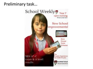
- 6. Overall, I feel that I have made huge progress from my preliminary task as my music magazine looks a lot more stylish and professional. However, I have not kept any conventions the same. This is because my school magazine needed to look more sophisticated and formal rather than stylish. The main element that makes the two magazines very different to each other is the font used. The font I used for the short snippets and sell lines on my school magazine is a very formal font that makes the magazine seem more sophisticated and may come across a bit boring. However, I changed the font for my music magazine to something that is a lot more livelier. I also feel that the font I have used for my indie rock music magazine is more aimed at the younger audience, whereas, the font on my school magazine is a bit too formal for the kids at the school and would be more suited for the parents.
- 7. Another convention that I have changed is the main image on the front cover. For my preliminary task, I have used a mid shot image of a school girl who’s smiling, the smile connotes happy feelings and creates a lively atmosphere. The school magazine front cover image would also attract a very young audience, it would be mainly kids who are at school wanting to read the school weekly magazine. However, on my final draft for my music magazine I have used an almost full length shot of the model who is looking down with most of her face covered by her hair. This is more aimed at teenagers and young adults as it creates a relaxed and calm mood. Also the image could relate to some of the readers which would influence in to them buying it. The image on my indie rock music magazine is also very dark and unusual for a magazine front cover, however, this relates to the music genre as it is very independent. On the other hand, the dark image and use of black and white enabled me to use a brighter and more alerting font colour for the sell lines, bursts and short snippets etc.. To make them stand out catch the readers eye. The standing out of certain texts is what I feel my school magazine is lacking in. On the whole, I feel that the drafts for my music magazine helped me make a use of the main image in order to discover what colour I should use for the text that would benefit my target audience. Comparing the main image on my music magazine to the one on my school magazine shows how much I have progressed and it has made me realise that you have to consider other things like the colour of the font before choosing the right image.