Question 7 Progression
My school magazine only has basic fonts from word featured on it whereas
my pop magazine has a wide range of fonts from different sources like
‘fontspace’ and ‘dafont’, using better and more conventional fonts helps to
give a more professional look to the magazine. From making my pop
magazine I have now learnt about other places to get fonts from and have
found these websites.
I have also learnt from doing my pop magazine that poses and body
language and even clothes can be conventional to a genre. On my school
magazine I did not tae any of these things into account, but for my pop
magazine I made sure everyone looked happy and wore bright clothes to
help make it more conventional.
I have learnt that to make it look more conventional it has to look realistic by
having lots of mini stories and also the issue number, date and price of the
magazine, and so I have now included all of these things on my magazine to
make it more conventional.
I have learnt that specific colours connote different things and that it is
important to choose conventional colours to the genre of music. In my school
magazine I only tried to make the colours match the colours of the school
and not thinking about what they mean, whereas on my magazine I have
thought about and researched different colours and used the most
conventional ones in my magazine like pink and yellow which are house style
along with green.
The mise en scene used in my school magazine is conventional to the genre
as they are in an educational environment and also wearing school uniform,
in my pop magazine the background is plain which is conventional to the
genre but also the all of the clothes and objects used all connote youth and
fun which is conventional to the genre.
The mode of address on my preliminary task is not very conventional , but
after studying the conventions of different genres I have made my pop
magazine in line with the conventional mode of address with tones such as
youth and fun which is conventional to the pop genre and so will appeal to
the target audience.
I have also learnt that to make a conventional pop magazine then there
needs to be lots of images on the front cover, there are only two images on
my school magazine front cover whereas on my pop magazine there are
fourteen.
From making my pop magazine I have learnt that editing is important to
make a magazine look professional, on the first magazine everything is plain
and not edited whereas on my pop magazine images and words are edited to
help it look more conventional.
From doing my media magazine I have learnt that more information needs to be shown on
the contents page, also that it has to be easy to read and understand by the target audience
but also interesting to make sure they want to read on in the magazine, which will make the
magazine and the information in it conventional to the genre. I have done this in my pop
magazine as I have listed information and people that would interest the target audience of
a pop magazine.
I have also learnt that to make the colours used impact whether it is conventional or not,
and to make sure that the house style fonts and colours carry on through out the magazine.
I have used the same colours on the contents page but it is not interesting enough or
colourful enough as there is not much on it so in my pop magazine I have used lots of
colours and text to make it more interesting and conventional. Even the colours of the
different fonts helps to make the magazine more conventional by having the house style
colours and also plain colours like black and white for the titles and main text.
I have learnt that the use of similar and conventional fonts is important to make the
magazine look better and fit in with other magazines in the same genre. Using serif fonts is
conventional to pop magazines which I have found out from doing research into the genre,
and so I have used these fonts throughout my magazine as they represent girls and youth
and so the target audience will like it.
Using images on the contents page is also conventional which I have learnt from doing
research and looking at other magazines, I have used lots of images on my contents page
to help illustrate what will be in the magazine. Also having an image of the front cover to
help show what things are on what pages is conventional to the pop genre which I have
done.
I have learnt about the layout of magazines and what looks conventional and what looks
appealing, making sure that it mainly follows the route of the eye with the main things
along that line. In my school magazine I haven’t used the route of the eye for the
information on the contents page, whereas in my pop magazine I have followed the route
of the eye having the title, main images and information in the line which helps to make the
magazine more conventional.
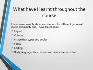
What have I learnt throughout the
course
I have learnt mainly about conventions for different genres of
music but mainly pop, I have learnt about:
• Layout
• Colours
• Image shot types and angles
• Fonts
• Editing
• Body language, facial expressions and mise-en-scene

Question 7 -_progression 567

  • 1.
  • 2.
    My school magazineonly has basic fonts from word featured on it whereas my pop magazine has a wide range of fonts from different sources like ‘fontspace’ and ‘dafont’, using better and more conventional fonts helps to give a more professional look to the magazine. From making my pop magazine I have now learnt about other places to get fonts from and have found these websites. I have also learnt from doing my pop magazine that poses and body language and even clothes can be conventional to a genre. On my school magazine I did not tae any of these things into account, but for my pop magazine I made sure everyone looked happy and wore bright clothes to help make it more conventional. I have learnt that to make it look more conventional it has to look realistic by having lots of mini stories and also the issue number, date and price of the magazine, and so I have now included all of these things on my magazine to make it more conventional. I have learnt that specific colours connote different things and that it is important to choose conventional colours to the genre of music. In my school magazine I only tried to make the colours match the colours of the school and not thinking about what they mean, whereas on my magazine I have thought about and researched different colours and used the most conventional ones in my magazine like pink and yellow which are house style along with green.
  • 3.
    The mise enscene used in my school magazine is conventional to the genre as they are in an educational environment and also wearing school uniform, in my pop magazine the background is plain which is conventional to the genre but also the all of the clothes and objects used all connote youth and fun which is conventional to the genre. The mode of address on my preliminary task is not very conventional , but after studying the conventions of different genres I have made my pop magazine in line with the conventional mode of address with tones such as youth and fun which is conventional to the pop genre and so will appeal to the target audience. I have also learnt that to make a conventional pop magazine then there needs to be lots of images on the front cover, there are only two images on my school magazine front cover whereas on my pop magazine there are fourteen. From making my pop magazine I have learnt that editing is important to make a magazine look professional, on the first magazine everything is plain and not edited whereas on my pop magazine images and words are edited to help it look more conventional.
  • 4.
    From doing mymedia magazine I have learnt that more information needs to be shown on the contents page, also that it has to be easy to read and understand by the target audience but also interesting to make sure they want to read on in the magazine, which will make the magazine and the information in it conventional to the genre. I have done this in my pop magazine as I have listed information and people that would interest the target audience of a pop magazine. I have also learnt that to make the colours used impact whether it is conventional or not, and to make sure that the house style fonts and colours carry on through out the magazine. I have used the same colours on the contents page but it is not interesting enough or colourful enough as there is not much on it so in my pop magazine I have used lots of colours and text to make it more interesting and conventional. Even the colours of the different fonts helps to make the magazine more conventional by having the house style colours and also plain colours like black and white for the titles and main text. I have learnt that the use of similar and conventional fonts is important to make the magazine look better and fit in with other magazines in the same genre. Using serif fonts is conventional to pop magazines which I have found out from doing research into the genre, and so I have used these fonts throughout my magazine as they represent girls and youth and so the target audience will like it. Using images on the contents page is also conventional which I have learnt from doing research and looking at other magazines, I have used lots of images on my contents page to help illustrate what will be in the magazine. Also having an image of the front cover to help show what things are on what pages is conventional to the pop genre which I have done. I have learnt about the layout of magazines and what looks conventional and what looks appealing, making sure that it mainly follows the route of the eye with the main things along that line. In my school magazine I haven’t used the route of the eye for the information on the contents page, whereas in my pop magazine I have followed the route of the eye having the title, main images and information in the line which helps to make the magazine more conventional.
  • 5.
    What have Ilearnt throughout the course I have learnt mainly about conventions for different genres of music but mainly pop, I have learnt about: • Layout • Colours • Image shot types and angles • Fonts • Editing • Body language, facial expressions and mise-en-scene