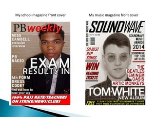
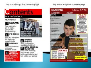
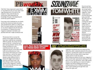
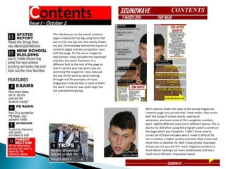
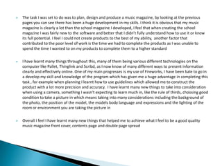
My school magazine front cover My music magazine front cover
My school magazine contents page My music magazine contents page
I feel that I have progressed a great detail
in my products as you can see I have made
huge developments of my skill of the
programs I have used and also my
construction skills along with the
knowledge that goes into designing and
producing a good magazine
If you look at the masthead you can clearly
see that the school one looks very tacky
and unprofessional, whilst it is unfair to say
that it is of poor quality as the masthead
on my school magazine was the best part
in my opinion, it is obvious the music
magazine masthead is far better and
possibly looks like it might actually be real
Looking at my pictures you can clearly see the
difference, when taking the photo for the school
magazine, I quickly took a photo of a pupil who I
had just told to sit down whilst using a poor
quality camera to take the photo
When taking my photos for the music magazine, I
had my artist wear appropriate clothing to fit the
genre of music he represents, used a high quality
camera, set up lighting, put a canvas to make a
brighter and clearer background and took
multiple photos of him in different positions so
that I could carefully go through them and
choose the right ones
You can see how
different the fonts
are as well, when
creating the school
magazine, I have
mainly stuck to
one font that looks
tacky and child
like, with only one
colour, when
creating the school
magazine I used
various fonts, a
swell as fonts off
other websites,
numerous colours
and effects all to
add the
professional look
to the magazine
and to show my
developing skills
and progression
The banners that run across the
bottom of the pages look like they
have been made by tow completely
different people, the school one has
space at the end , chunky font and
poor spacing between words, all this
things contribute to a very
unprofessional look, the music
magazines banner on the other hand
looks very professional as I have
used colours that stand out on each
other and have used all the space
within the banner so that none is
wasted, using a different font to
display the bigger word makes it
more eye catching as well, I did
these things as when researching
real life music magazines I noticed
this is what they did and have used it
in my own products
The title banner on the school contents
page is clearly far too big using fonts that
suit in a far too big size, this clearly shows
my lack of knowledge behind the layout of
contents pages and also proportion sizes
with the page. On the music magazine
title banner I have included the masthead
and then the word ‘Contents’ in a
different font to the rest of the page so
that it catches your eye when you are
skimming the magazine, I also reduced
the size of the word as when looking
through real life examples of music
magazines I noticed that in most of them
the word ‘contents’ was quite large but
not overwhelmingly big
With columns down the sides of the school magazines
contents page you can see that I have made a few errors
with the sizing of certain words, spacing of
sentences, and even some of the navigation numbers
were slightly different sizes and in different places. This is
due to my skill when using the program used to construct
the page which was Fireworks. I didn’t know how to
correct all of these mistakes which made it difficult for
me to achieve a higher quality outcome. Now I have had
more time to develop my skills I have greatly improved
and as you can you see the music magazine contents is
much better looking a lot more professional and has a
much more efficient, impressive layout
 The task I was set to do was to plan, design and produce a music magazine, by looking at the previous
pages you can see there has been a huge development in my skills. I think it is obvious that my music
magazine is clearly a lot than the school magazine I developed, I feel that when creating the school
magazine I was fairly new to the software and better that I didn’t fully understand how to use it or know
its full potential. I feel I could not create products to the best of my ability, another factor that
contributed to the poor level of work is the time we had to complete the products as I was unable to
spend the time I wanted to on my products to complete them to a higher standard
 I have learnt many things throughout this, many of them being various different technologies on the
computer like Pallet, Thinglink and Scribd, as I now know of many different ways to present information
clearly and effectively online. One of my main progresses is my use of Fireworks, I have been bale to go in
a develop my skill and knowledge of the program which has given me a huge advantage in completing this
task , for example when planning I learnt how to use guidelines which allowed me to construct the
product with a lot more precision and accuracy. I have learnt many new things to take into consideration
when using a camera, something I wasn't expecting to learn much in, like the rule of thirds, choosing good
condition to take a picture in which means taking into many considerations including the background of
the photo, the position of the model, the models body language and expressions and the lighting of the
room or environment you are taking the picture in
 Overall I feel I have learnt many new things that helped me to achieve what I feel to be a good quality
music magazine front cover, contents page and double page spread

Question 7

  • 2.
    My school magazinefront cover My music magazine front cover
  • 3.
    My school magazinecontents page My music magazine contents page
  • 4.
    I feel thatI have progressed a great detail in my products as you can see I have made huge developments of my skill of the programs I have used and also my construction skills along with the knowledge that goes into designing and producing a good magazine If you look at the masthead you can clearly see that the school one looks very tacky and unprofessional, whilst it is unfair to say that it is of poor quality as the masthead on my school magazine was the best part in my opinion, it is obvious the music magazine masthead is far better and possibly looks like it might actually be real Looking at my pictures you can clearly see the difference, when taking the photo for the school magazine, I quickly took a photo of a pupil who I had just told to sit down whilst using a poor quality camera to take the photo When taking my photos for the music magazine, I had my artist wear appropriate clothing to fit the genre of music he represents, used a high quality camera, set up lighting, put a canvas to make a brighter and clearer background and took multiple photos of him in different positions so that I could carefully go through them and choose the right ones You can see how different the fonts are as well, when creating the school magazine, I have mainly stuck to one font that looks tacky and child like, with only one colour, when creating the school magazine I used various fonts, a swell as fonts off other websites, numerous colours and effects all to add the professional look to the magazine and to show my developing skills and progression The banners that run across the bottom of the pages look like they have been made by tow completely different people, the school one has space at the end , chunky font and poor spacing between words, all this things contribute to a very unprofessional look, the music magazines banner on the other hand looks very professional as I have used colours that stand out on each other and have used all the space within the banner so that none is wasted, using a different font to display the bigger word makes it more eye catching as well, I did these things as when researching real life music magazines I noticed this is what they did and have used it in my own products
  • 5.
    The title banneron the school contents page is clearly far too big using fonts that suit in a far too big size, this clearly shows my lack of knowledge behind the layout of contents pages and also proportion sizes with the page. On the music magazine title banner I have included the masthead and then the word ‘Contents’ in a different font to the rest of the page so that it catches your eye when you are skimming the magazine, I also reduced the size of the word as when looking through real life examples of music magazines I noticed that in most of them the word ‘contents’ was quite large but not overwhelmingly big With columns down the sides of the school magazines contents page you can see that I have made a few errors with the sizing of certain words, spacing of sentences, and even some of the navigation numbers were slightly different sizes and in different places. This is due to my skill when using the program used to construct the page which was Fireworks. I didn’t know how to correct all of these mistakes which made it difficult for me to achieve a higher quality outcome. Now I have had more time to develop my skills I have greatly improved and as you can you see the music magazine contents is much better looking a lot more professional and has a much more efficient, impressive layout
  • 6.
     The taskI was set to do was to plan, design and produce a music magazine, by looking at the previous pages you can see there has been a huge development in my skills. I think it is obvious that my music magazine is clearly a lot than the school magazine I developed, I feel that when creating the school magazine I was fairly new to the software and better that I didn’t fully understand how to use it or know its full potential. I feel I could not create products to the best of my ability, another factor that contributed to the poor level of work is the time we had to complete the products as I was unable to spend the time I wanted to on my products to complete them to a higher standard  I have learnt many things throughout this, many of them being various different technologies on the computer like Pallet, Thinglink and Scribd, as I now know of many different ways to present information clearly and effectively online. One of my main progresses is my use of Fireworks, I have been bale to go in a develop my skill and knowledge of the program which has given me a huge advantage in completing this task , for example when planning I learnt how to use guidelines which allowed me to construct the product with a lot more precision and accuracy. I have learnt many new things to take into consideration when using a camera, something I wasn't expecting to learn much in, like the rule of thirds, choosing good condition to take a picture in which means taking into many considerations including the background of the photo, the position of the model, the models body language and expressions and the lighting of the room or environment you are taking the picture in  Overall I feel I have learnt many new things that helped me to achieve what I feel to be a good quality music magazine front cover, contents page and double page spread